The new forums will be named Coin Return (based on the most recent vote)! You can check on the status and timeline of the transition to the new forums here.
The Guiding Principles and New Rules document is now in effect.
New here!
Hillman Registered User regular
 Registered User regular
Hey guys,
Just recently joined the forum. Big time fan of Penny Arcade, so it was nice to see an subforum for art here!
Anyways, I've been drawing for well over 12 years now and I gotta say it's my true love(don't tell my girlfriend).
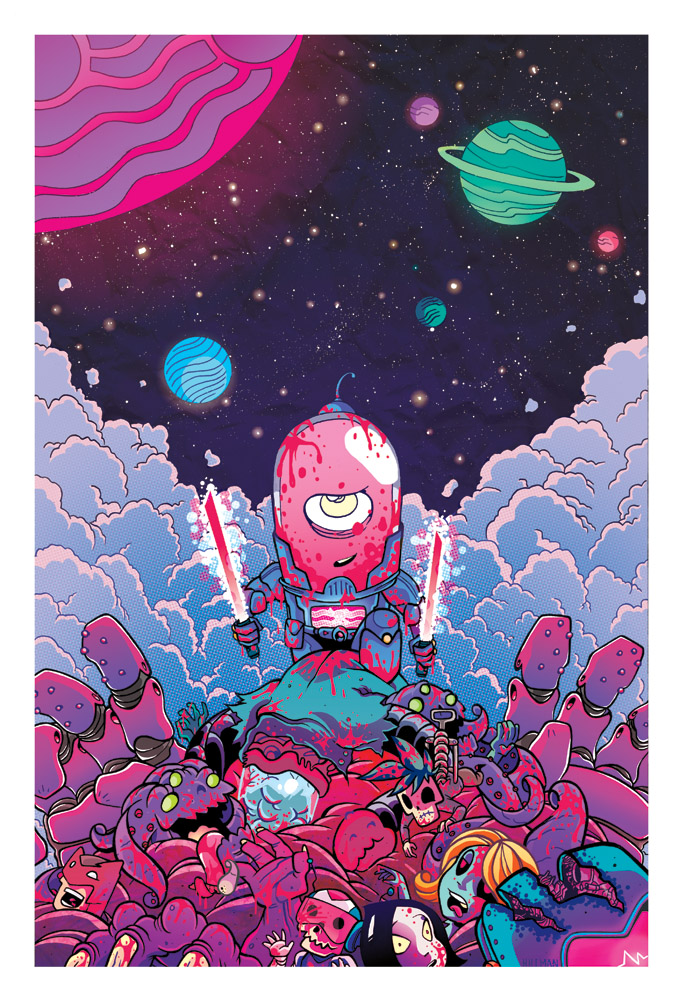
Here's some stuff of mine, you can check out my other works via my website or my DA.
http://www.shanehillman.com
http://bryantheevery.deviantart.com/


Hillman on
0
Posts
INSTAGRAM
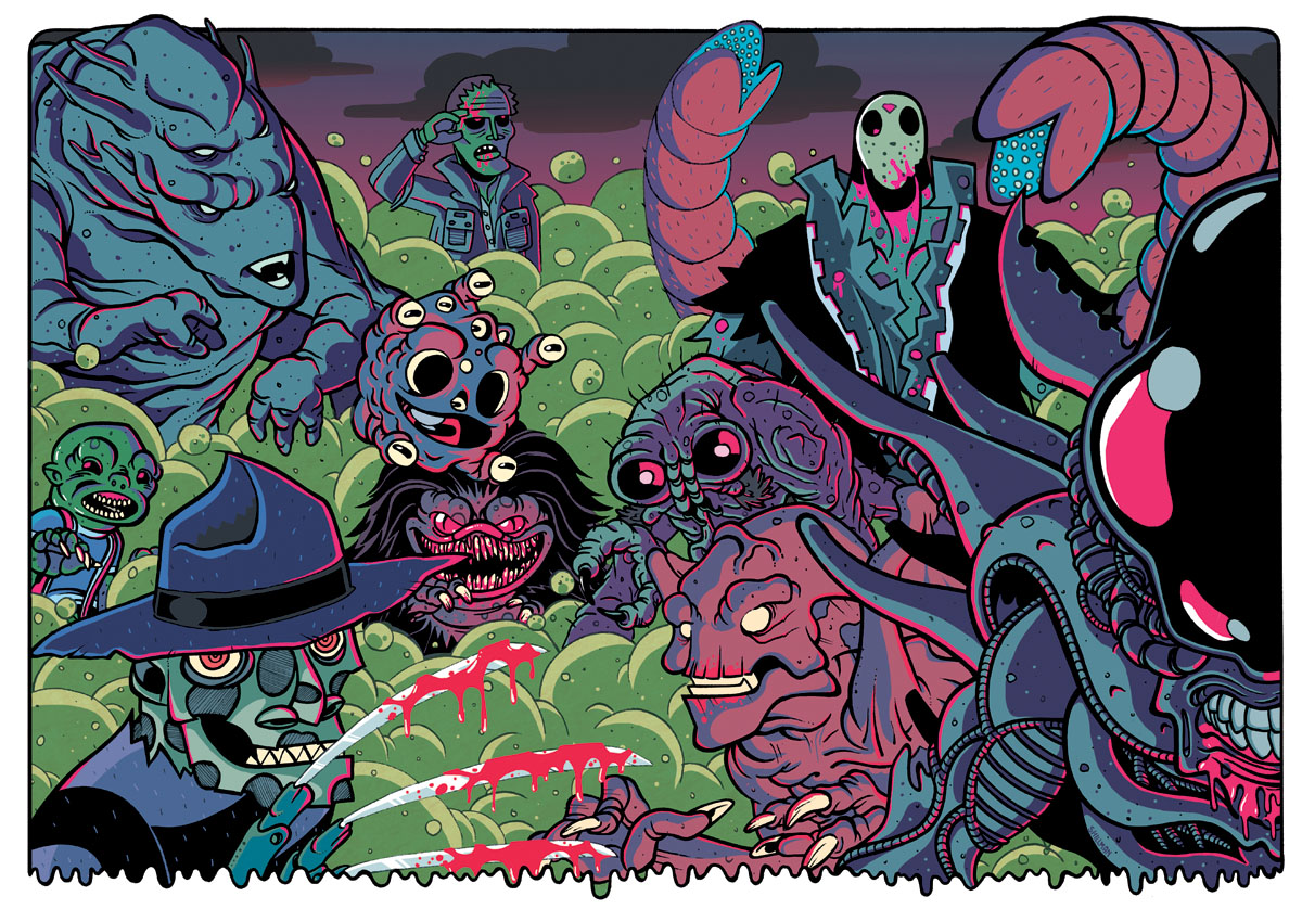
one thing on that last piece though- it seems really heavily weighted to the right
Such awesome colors
A minor gripe with the second one, it took me a second to recognize Jason. The way the sandworms are posed with the tattered shirt sleeves made him look like he had sandworms for arms
Do you ink traditionally or is it all digital?
devArt | twitter | website | blog
I work all traditionally except for colors, which are done in Photoshop CS3.
Tam: I completely agree. I think I might plan on doing the right side for this Halloween so the xenomorph is straight in the center.
http://dailymonsters.blogspot.com
Here is a page from a comic that is part of a anthology due this summer. Colors are by http://pyawakit.deviantart.com/
And for questions about materials, here are some videos regarding my process.
http://www.youtube.com/watch?v=xCSU1HR5NFQ
http://dailymonsters.blogspot.com
devArt | twitter | website | blog
This is Awesome.
immilesaway - Yeah, I cannot do that. I believe strongly in analogue inking. I don't ever think I could fully move towards digital inks. I also inking pretty fast, averaging 4-6 hours per piece, depending on the size/scale.
http://dailymonsters.blogspot.com
For the one with all the movie monsters, I can ID all of them except the guy on the top left. Who is that? I must know.
Gimme
that might make the xeno too much of a focus and distract from the other characters?
aside from that, that pic totally looks like it belongs in a basement hangout and is completely awesome.
steam | Dokkan: 868846562
I want to taste them!
Fight: Yeah, it'll probably throw it off but the xeno is my favorite
http://dailymonsters.blogspot.com
http://dailymonsters.blogspot.com
I'll be livestreaming colors on a Batman illustration shortly. Just thought some of you might wanna drop by! ^_^
http://www.livestream.com/shanehillman
http://dailymonsters.blogspot.com
Im especially impressed by that rad Robocop toy.
artistjeffc.tumblr.com http://www.etsy.com/shop/artistjeffc
Here is the first out of a long list of commissions I have done recently along with a process. You can view the whole coloring process via http://www.livestream.com/shanehillman
My buddy wanted me to do a Batman piece with his rogue gallery, so I started with two concepts of Batman. I went with the one on the left for obvious reasons, haha.
Working through the layout with characters and such finally emerging.
Still stuffing in as many villains as I can.
Final pencils via lightboxing.
Final Inks
Final colors. Took forever to get happy with them but I am still not 100% pleased.
Red variant.
Violet variant.
http://dailymonsters.blogspot.com
Observe;
I'm afraid you've done a Liefeld.
Yeah, he's supposed to be hunched over, although that is my fault for not illustrating that well enough.
http://dailymonsters.blogspot.com
Man. Dem tones. I think I like the yellow splattered batsignal the best.
simple fix- i think just getting some blood spatter on his helmet would mess him up like the rest of em, or add some bumps and detail to his face
either way its a fantastic piece overall, i love love the colors
http://dailymonsters.blogspot.com
INSTAGRAM
"Delicious" might be the best descriptor. I want to eat up your art, Hillman.
he could easily be crouched over and walking, if the view is 3/4 from above it would be even more distorted. By the angle of the eyes i would say we're looking at a 3/4 angle
I love getting to see work evolve. Even with the batman being a little crazy, I love it. (but I love all your stuff)