The new forums will be named Coin Return (based on the most recent vote)! You can check on the status and timeline of the transition to the new forums here.
The Guiding Principles and New Rules document is now in effect.
+ART-O-MATIC JACK+ Earthbound Flash animated musical thing
Automatic Jack Registered User regular
Hullo, AC. I'm an animation brat who draws things, and occasionally stuff. This thread will contain a portion of that stuff, and the aforementioned things.
OLD STUFF
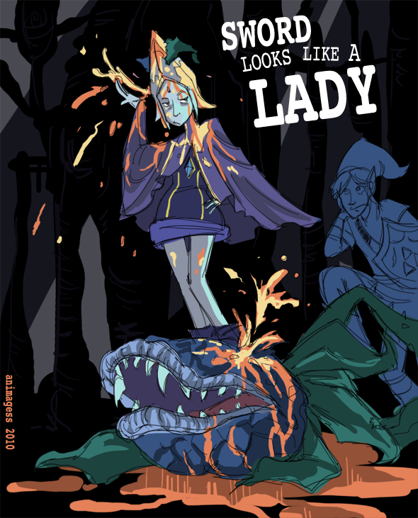
The Deer Head and Diner Trio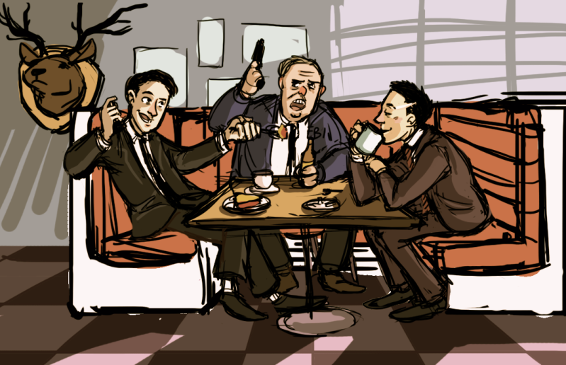 Skyward Sword Looks Like A Lady
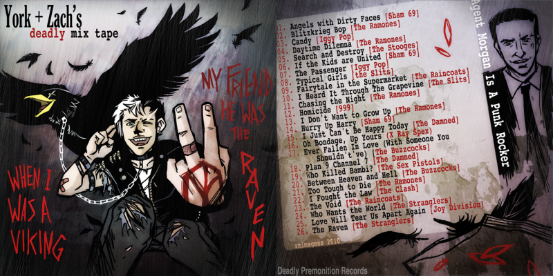
 York and Zach's Deadly Mix Tape
 Agent York's Desktop Wallpaper
OLD STUFF
The Deer Head and Diner Trio


First up: Because I don't play video games all that often, being one of those weirdos who reads PA for the art and the gratuitous italics, it's obvious that the first Xbox 360 game I would ever purchase would be: Deadly Premonition.
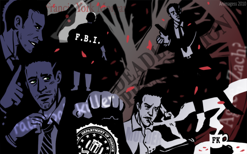
Despite being the right dimensions for a wallpaper, it's pretty useless as a desktop image unless Hunt the Icon Whilst Your Eyes Bleed is your favourite past-time. Dammit, spellchecker, in Canada, "favourite" has a U. Despite its overall tackiness, however, I feel like it kind of fits the subject matter by virtue of being hideously yet (hopefully) endearingly awkward to look at. Just like York's smile. (I purchased DP the day before yesterday. It's been one of the more worthwhile purchases I've ever made.)
Earthbound zombie thing

Despite being the right dimensions for a wallpaper, it's pretty useless as a desktop image unless Hunt the Icon Whilst Your Eyes Bleed is your favourite past-time. Dammit, spellchecker, in Canada, "favourite" has a U. Despite its overall tackiness, however, I feel like it kind of fits the subject matter by virtue of being hideously yet (hopefully) endearingly awkward to look at. Just like York's smile. (I purchased DP the day before yesterday. It's been one of the more worthwhile purchases I've ever made.)
Second: A Flash-animated Earthbound music video, 'bout four minutes long, codenamed PK Flash!. I can't completely just hawk my own site so here's a screenshot from the work-in-progress that won't be posted on the production blog until, say, Halloween:
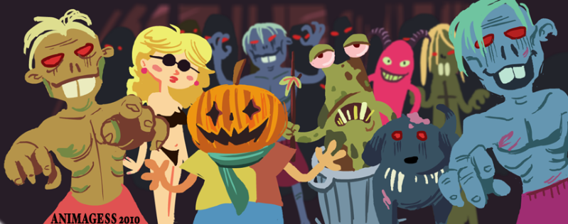
Who among you can guess what part of the game this image hails from? WHO??
That's kind of the look I'm going for throughout the whole project; kind of a kid's book-ish, colorful, cut-out style. I have some sequences that are partially animated in this style, but I'm working on the rough stuff before I get too far into clean-up (the blog has a rough Ness walk cycle, but that's about it).
Automatic Jack on
0

Posts
PS: Yeah all my art right now is of pretty much the same subject... I'll do something Skyward Sword related next time, I promise. Also you should all play DP.
What sort of crits are you looking for/ goals do you have?
The rain does looks pretty PS-ey, but my problem is after a certain point, I get impatient with the idea of more polish. I like working fast and cheap. I also think very broadly in a sense, I suppose, almost to the point of working with cliches. If it's vertical lines, it's rain, end of story. Good thing I don't do this sort of thing for a living; dammit Jim, I'm a storyboarder, not a graphic designer! That didn't stop me from trying, unfortunately. Yeah, the sensibilities I use for one style don't always translate to other styles, but it keeps me entertained.
My goals are to storyboard something for Pixar. There's nothing in this thread that would provide a good means for anyone to help me with that goal, but maybe someday... In the meantime, anyone is welcome to say whatever about anything here. It will all be duly noted, if not immediately acted upon.
This will probably end up being a digital painting of some sort. Composition will change as well. Cooper in particular could look a lot more Kyle Maclachlan-y, but I gotta go to a wedding over the weekend, so this is where the buck head on the wall stops; for now, anyway.
I think it'd be fun to do the Sheriffs as well, Harry in particular. Sarah Breaker and Emily Wyatt could be BFFs.
Progress so far on Project PK Flash!, my summer side project (one of many). Everything's in Flash, but the character animation is, for all intents and purposes, what you might call "paperless classical". Flashical? I finally figured out the best Premiere settings to use, so you can totally watch it in fullscreen HD. The rough blue scribbles that pass for Ness look a lot crisper.
Check out the production blog for less significant updates.