The new forums will be named Coin Return (based on the most recent vote)! You can check on the status and timeline of the transition to the new forums here.
The Guiding Principles and New Rules document is now in effect.
New Comic! I need your eyes, please.
tonjiboy Registered User new member
 Registered User new member

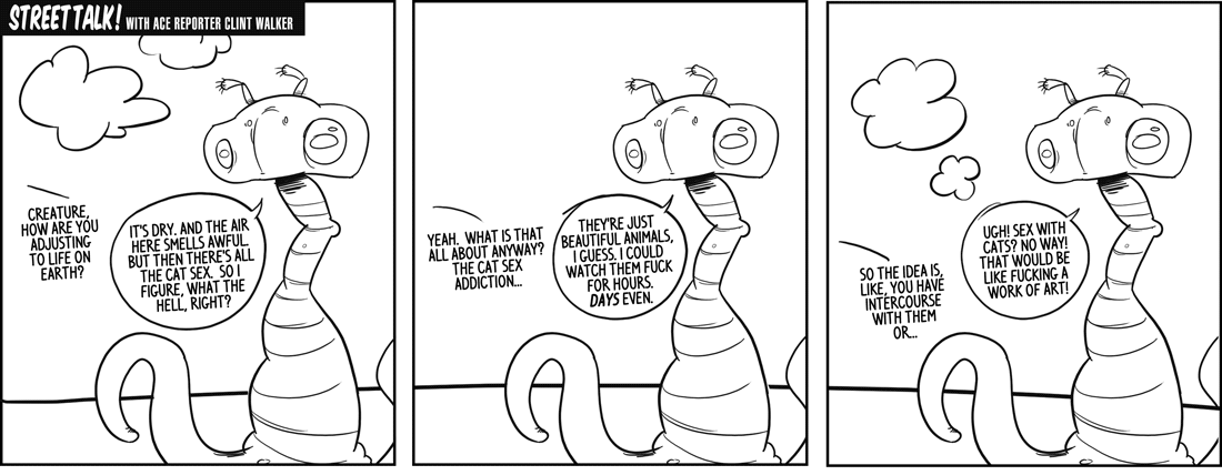
So I took some of the critique from my last comic effort Too Deep to heart and tried a couple of new things to make somethings less obtuse and more varied. The first effort is called Nate and Jackson and is an insider look into the publishing process, loosely based on the real life happenings at Verbicide magazine. The second is The Front based on an idea i had years ago about what would happen if the media (and the world at large) was controlled by aliens who were ironically not that much different than us.
these are meant to be short runs but I'm hoping to do something long form next so i'd like some critiques to get the bugs out now.
so gimme your eyes (figuratively) and let me know what you think. also, literally give me your eyes.
tonjiboy on
0
Posts
THANKS!!!
Visit Mysterium Media Group's Website
If you want some nit-pickyness, I'd shorten the punchline to "That would be like fucking a work of art!" To me a single line sells outrage, as opposed to four where the first two lines over-explain the joke a little. (and the rest of the strip pretty clever)
Aside from that, good times! I'm checking out the rest on your site.
Copy/pasting the art over and over again speaks to a sort of unprofessionalism that will prevent something like this from ever succeeding. Put in the time, draw all three panels.
I completely agree. On occasion this is okay, but I clicked on the links to your other series, and you do this constantly. In fact, the "Too Deep" strip barely changes at all. I noticed this right away and had a hard time not looking for it in every strip.
I understand if you don't have time to draw or whatever...maybe this is the format you're going for, but that makes me kinda wonder what you'd like the people in an art forum to critique about it, beyond this one drawing.
As for the art, I guess I'd like to see a bit more intention. Maybe stronger lines. The creature is a little hard to interpret.
Oh, and melting_doll, I see that you are from Maine. This surprises me. I am also from Maine. It's a Maine party.
3 identical pictars in a row
INSTAGRAM
Same thing, just the same drawing copy and pasted over 3 panels, over all your comics.
Oh God, I went there too. Every comic is the same drawing... over and over again. The only thing that changes is the text. It feels beyond lazy.
http://www.gocomics.com/calvinandhobbes/2008/12/24/
But anyway, a bit sparse, but that's the only crit i can think of, so that's really not bad at all! :P
[SIGPIC][/SIGPIC]