The new forums will be named Coin Return (based on the most recent vote)! You can check on the status and timeline of the transition to the new forums here.
The Guiding Principles and New Rules document is now in effect.
Help me with my illustration final! (Page 2) NSFW/NSF56K to the MAX
RankenphilePassersby were amazedby the unusually large amounts of blood.Registered User, ModeratorMod Emeritus
edited February 2011
Nice stuff.
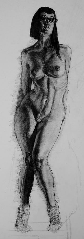
Avoid doing pieces where your model is hiding his/her hands, as it looks like you're avoiding drawing a tricky but important and expressive part of the body. Similarly, finish off the feet. Those are the two most avoided body parts by students, and you've got the technical skill to do them well, from what I can see - prove it. A hiring director looking at a portfolio looks for that sort of thing.
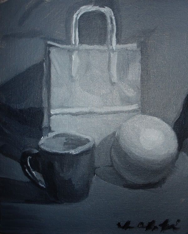
The paintings look nice, too, but your spheres and ellipsoid shapes are a but out of whack. Be a little more careful sighting in the initial shapes and it will push your work a lot further.
Again, nice stuff, looking forward to seeing more.
Rankenphile: Yeah, that really wasn't best ref I could have chosen for the figure study, just the best of the photoset I was looking at. Unfinished feet wasn't a conscious decision, I just kinda ran out of time. I literally finished off the face as quickly as I could then rushed off to class. But, avoiding feet is definitely an issue I have, which is probably why I left it for last, so I'll make a point of working on them for future figure drawings.
I'm well acquainted of my problems with the paintings. I just don't have very good brush control yet. Those are my first paintings ever, though, so I think I'm starting off on a pretty good foot.
Nineteen Hundred on
There was something important here. It's gone now.
Saw some stuff that I think you could easily fix with this piece to make it so much better so I did a little paintover for you.
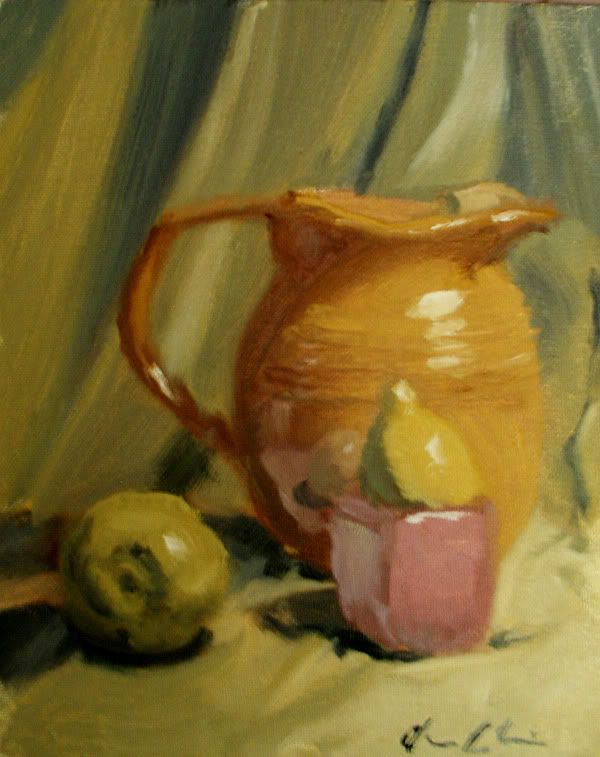
I think you really need to pay attention to the drawing a little bit more. The tea kettle is all kinds of wonky and malformed. You need to make sure your ellipses are symmetrical and all your angles line up. Spend some more time in the planning stage and think of everything as simple shapes (cones, boxes, cylinders and spheres).
Another huge problem is with the flow of light. I am confused as to where the light is coming from because the cast shadows are going to the right but the lightest part of the fabric is in the background on the right side of the canvas. To draw attention to the foreground and create a more believable space, make sure that the lightest part of the fabric is in the foreground. This draws the eye towards the back and establishes a feeling of atmospheric perspective in a small scale.
I also pointed out that all your highlights are roughly the same color and value so there is not hierarchy of focal point. It flattens the space and makes everything look like it's made from the same material. Make sure you have a clear focal point in mind and stick to it. It looks like you spent the most time on the tea kettle but the lemon is clearly the focal point because it's just so bright. If you want to draw more attention to the kettle make the lemon recede into the background a little bit more, it is further from the light source anyway.
Other things I focused on was firming up cast shadows and form shadows, don't forget everything you learn in your drawing classes, they apply to paint as well. I also payed more attention to the play of color. Your objects don't look like they belong in the same space because they don't bounce their color onto nearby objects. I added a reflected light on the kettle from the onion and added some more color from the fabric. There's color bouncing everywhere, you need to train your eye to really see it.
Hope this was helpful. Was this piece from class or is it your homework?
I apologize if this sounds redundant to you (because i'm sure you hear it all the time at Watts), but don't forget about alternating between your cool and warm colors!
It's a lot easier to do this in black and white, but when you throw color on top of the scheme it can be a real headache. From what i've seen how dominant your highlight color is what will really determine the temperature of the object, so make sure to establish it first before you move on.
I hear everything you're saying, Dylan. I was actually in the middle of adjusting colors and values when I ran out of time in class. That's why the flow of light is weird on the drapery. I think I'm starting to think more about the design of the painting, rather than just copying what I see. I've still got a serious problem with color adjusting, though. I don't know if I just have poor brush handling skills or what, but I have a really hard time painting over areas I've already put paint on. Makes it difficult to firm up edges, add highlights, and fix mistakes.
Godfather: I'm at the Academy of Art, actually, not Watts. I'm not really sure what you mean about alternating warm and cool colors?
Nineteen Hundred on
There was something important here. It's gone now.
Open it up in photoshop and run the eyedropper tool over each different value. The brightest value is white with a hint of yellow, the next one a light gray with a hint of blue, the next gray with a hint of red, etc.
Ah, I get it, but how do you decide what color you add for the variations? I'm not sure I ever see anything more than the light source color plus the color of the object.
New from last week:
I was really happy with the sudden improvement in my rendering ability, but I don't think I like my technique anymore. It reads from a few feet away, but get up close and it just looks fuzzy and unrefined. And, I obviously need to force myself to get the whole figure down before I go in for the rendering. I had an hour, this should look more finished.
Nineteen Hundred on
There was something important here. It's gone now.
Yeah, it is. Not sure how that happened. I had a tendency to widen my torsos and elongate my legs. Thought I worked it out of my system, but apparently, it still pops up if I'm not careful.
Nineteen Hundred on
There was something important here. It's gone now.
Anyone who knows anything about plotting cast shadows wanna give me some emergency tutoring? Mostly having trouble with the armchair and the vanity, since they fall on two different surfaces and it's just confusing the hell out of me.
Nineteen Hundred on
There was something important here. It's gone now.
Hey 1900! You're back from the dead... again?
Plotting cast shadows is... fun and simple actually! http://www.idsketching.com/basic/toolbox-shadows/ Hope this helps! If not, I'll try a drawover tomorrow (2AM lolwut)
Where the shadows meets a vertical surface, the line connecting the "base" of the light (the point on the surface under the light point) and the "base" of the point casting the shadow, has to turn straight up. Then shadow of that point is where this line meets the direction line of the light (as usual).
Yeah, we covered that in class, and I thought I picked it up well enough, but whenever I try to apply it to anything more complicated than a cone, my brain just goes haywire. Drawover would be helpful, thanks.
There was something important here. It's gone now.
First - I simplified the shape greatly since I only mean to demonstrate the principle. Constructing an accurate shape of that armchair is probably gonna take quite some time!
The black lines are the simplification, the green lines are construction lines to help us determine what is where in 3d space, and the red lines are the edges we'll be calculating the shadow for. http://mayday.w.staszic.waw.pl/~mayday/upload/1900/1.jpg
Final step: connect the dots: http://mayday.w.staszic.waw.pl/~mayday/upload/1900/5.jpg
Since both the shadows of points 2 and 3 are on the wall, you just connect them. However, the shadow of point 1 is on the floor. Draw a line between it and the point where the shadow of point 2 would be if there was no wall. Now where that line hits the floor/wall edge, turn to the shadow of point 2.
This is basically all there is to it, as long as the walls are vertical.
Now you need to decide how many points of that armchair you want to simulate on the shadow. Of course the more the messier the construction lines will get so it might be difficult to see what's what, but constructing shadows is basically all about determining the lines connecting shadows of any two points.
Yeah, direct drawing is a bitch. In previous classes, I could take time to refine and correct as I went, but in this one I have ten minutes to get everything exactly right in one go. It's tough, but I'm gonna be awesome once I'm actually able to pull it off. And thanks! Celty's a lot of fun to draw.
There was something important here. It's gone now.
I wish I could afford to go to school, or even lived near enough to take classes on the side. I dig your figures and the way you do clothing folds.
Loving your stuff so far keep at it!
Oh my, I guess I glazed over the part where you only had ten minutes to set up the pose! Seeing as how i'm the world's slowest artist, I don't blame you for not landing the proportions in that time frame ahaha
I like the clean line quality! Try varying the line width from time to time, ya?
Well now the width of her thigh is as wide as her waist, and the scale of her pelvis/ass area is still out of whack to the rest of her body, being about 15-20% too big when compared to the torso. To make it clear, the issue is not with the posing of the leg, ie: bringing the knee up to a more foreshortening like you have, it's where it is located the 2 dimensional sense that's the problem I've been trying to get at.
Overlaying my previous drawover to this new version- see where the inner contour of the thigh is attaching to the pelvis, higher up? And how the contours of the leg/ass are brought in and up to jive with the scale? These are the things I've been talking about this whole time, but you haven't really tackled with your changes:
Okay, toned down the size of the leg and reined the hip in a little more. But honestly? I kinda like how exaggerated it is. And I have seen women with proportions similar to this, so I'm not gonna stress out about it too much. On the plus side, all that leg-fixin' means I can now render legs in under 10 seconds. This isn't done by any means, but it's something I can turn in:
Text is a placeholder. My worry now is that the image as a whole just seems kinda boring, and I'm not sure how to fix it.
Nineteen Hundred on
There was something important here. It's gone now.
yeah, honestly, I tend to stay out of anatomy discussions cause it's a serious weak area for me, but actually I basically have the same figure bacon drew on the left in the doodle thread, so it certainly ain't unrealistic. Some people just have really deep and wide pelvises.
Minor update. Adjusted colors, rendered the face a little better. Can someone tell me if her head is sitting on her neck properly? Really should have used a reference for the pose....
There was something important here. It's gone now.
I should preface this by mentioning I'm no great artist myself. I'll just point out a couple things that stick out.
Is it actually supposed to be ED 209? Because if so you really should use reference. If it's just supposed to be a walker-bot, the only thing that sticks out is that the left side doesn't seem symmetrical with the right. That may just be due to that smudgy area around the canopy though.
Are you working on multiple layers? Like one for the background, one for the people, one for the bot? Would make fixes a lot easier. Fixes on a one layer painting are a pain.
Not sure what else I can say to help. Perspective looks good, but you still have the grid lines poking through in some places.
Good luck.
SeraphSword on
Mastery is the result of ceaseless error, combined with ruthless self-appraisal.
Haha, no, it's not actually ED 209. I just painted him in as I was designing him and I thought they were kinda similar.
Update. though I don't think I have any time to keep working on it. It'll probably be turned in just like this. Bleh. Redesigned the mech using the power of perspective, adjusted a couple of things, added a foreground element.
There was something important here. It's gone now.
I'm not feeling the lighting. My eye is wandering all over the drawing. I know you don't have time to rework it but if you could simplify the lighting scheme so it picked out the key elements, it would help you have a more immediately powerful impression.
Posts
looking forward too seeing more stuffs
INSTAGRAM
Avoid doing pieces where your model is hiding his/her hands, as it looks like you're avoiding drawing a tricky but important and expressive part of the body. Similarly, finish off the feet. Those are the two most avoided body parts by students, and you've got the technical skill to do them well, from what I can see - prove it. A hiring director looking at a portfolio looks for that sort of thing.
The paintings look nice, too, but your spheres and ellipsoid shapes are a but out of whack. Be a little more careful sighting in the initial shapes and it will push your work a lot further.
Again, nice stuff, looking forward to seeing more.
Rankenphile: Yeah, that really wasn't best ref I could have chosen for the figure study, just the best of the photoset I was looking at. Unfinished feet wasn't a conscious decision, I just kinda ran out of time. I literally finished off the face as quickly as I could then rushed off to class. But, avoiding feet is definitely an issue I have, which is probably why I left it for last, so I'll make a point of working on them for future figure drawings.
I'm well acquainted of my problems with the paintings. I just don't have very good brush control yet. Those are my first paintings ever, though, so I think I'm starting off on a pretty good foot.
11x14
Saw some stuff that I think you could easily fix with this piece to make it so much better so I did a little paintover for you.
I think you really need to pay attention to the drawing a little bit more. The tea kettle is all kinds of wonky and malformed. You need to make sure your ellipses are symmetrical and all your angles line up. Spend some more time in the planning stage and think of everything as simple shapes (cones, boxes, cylinders and spheres).
Another huge problem is with the flow of light. I am confused as to where the light is coming from because the cast shadows are going to the right but the lightest part of the fabric is in the background on the right side of the canvas. To draw attention to the foreground and create a more believable space, make sure that the lightest part of the fabric is in the foreground. This draws the eye towards the back and establishes a feeling of atmospheric perspective in a small scale.
I also pointed out that all your highlights are roughly the same color and value so there is not hierarchy of focal point. It flattens the space and makes everything look like it's made from the same material. Make sure you have a clear focal point in mind and stick to it. It looks like you spent the most time on the tea kettle but the lemon is clearly the focal point because it's just so bright. If you want to draw more attention to the kettle make the lemon recede into the background a little bit more, it is further from the light source anyway.
Other things I focused on was firming up cast shadows and form shadows, don't forget everything you learn in your drawing classes, they apply to paint as well. I also payed more attention to the play of color. Your objects don't look like they belong in the same space because they don't bounce their color onto nearby objects. I added a reflected light on the kettle from the onion and added some more color from the fabric. There's color bouncing everywhere, you need to train your eye to really see it.
Hope this was helpful. Was this piece from class or is it your homework?
It's a lot easier to do this in black and white, but when you throw color on top of the scheme it can be a real headache. From what i've seen how dominant your highlight color is what will really determine the temperature of the object, so make sure to establish it first before you move on.
Godfather: I'm at the Academy of Art, actually, not Watts. I'm not really sure what you mean about alternating warm and cool colors?
http://img156.imageshack.us/f/25098272.jpg/
Open it up in photoshop and run the eyedropper tool over each different value. The brightest value is white with a hint of yellow, the next one a light gray with a hint of blue, the next gray with a hint of red, etc.
Warm-->Cool-->Warm-->Cool-->etc.
Blend 'em together to get a nice variation
New from last week:
I was really happy with the sudden improvement in my rendering ability, but I don't think I like my technique anymore. It reads from a few feet away, but get up close and it just looks fuzzy and unrefined. And, I obviously need to force myself to get the whole figure down before I go in for the rendering. I had an hour, this should look more finished.
really like your rendering style though
An hour, I think?
20 minutes
2, 2 and a half, it's hard to say. Kinda ran out of things to do long before the time was up.
New paintings:
Anyone who knows anything about plotting cast shadows wanna give me some emergency tutoring? Mostly having trouble with the armchair and the vanity, since they fall on two different surfaces and it's just confusing the hell out of me.
Plotting cast shadows is... fun and simple actually! http://www.idsketching.com/basic/toolbox-shadows/ Hope this helps! If not, I'll try a drawover tomorrow (2AM lolwut)
Where the shadows meets a vertical surface, the line connecting the "base" of the light (the point on the surface under the light point) and the "base" of the point casting the shadow, has to turn straight up. Then shadow of that point is where this line meets the direction line of the light (as usual).
First - I simplified the shape greatly since I only mean to demonstrate the principle. Constructing an accurate shape of that armchair is probably gonna take quite some time!
The black lines are the simplification, the green lines are construction lines to help us determine what is where in 3d space, and the red lines are the edges we'll be calculating the shadow for.
http://mayday.w.staszic.waw.pl/~mayday/upload/1900/1.jpg
Point 1 is easy: http://mayday.w.staszic.waw.pl/~mayday/upload/1900/2.jpg
Point 2: connect the base of the point with the base of the light- where that line hits the edge between the floor and the wall- go straight up. The shadow of the point is of course on the line connecting the light and the point. http://mayday.w.staszic.waw.pl/~mayday/upload/1900/3.jpg (you'll notice I also determined where the shadow would be if there was no wall, that's needed for later).
Point 3: same principle: http://mayday.w.staszic.waw.pl/~mayday/upload/1900/4.jpg
Final step: connect the dots: http://mayday.w.staszic.waw.pl/~mayday/upload/1900/5.jpg
Since both the shadows of points 2 and 3 are on the wall, you just connect them. However, the shadow of point 1 is on the floor. Draw a line between it and the point where the shadow of point 2 would be if there was no wall. Now where that line hits the floor/wall edge, turn to the shadow of point 2.
This is basically all there is to it, as long as the walls are vertical.
Now you need to decide how many points of that armchair you want to simulate on the shadow. Of course the more the messier the construction lines will get so it might be difficult to see what's what, but constructing shadows is basically all about determining the lines connecting shadows of any two points.
First, a few things from a couple semesters ago:
That's me going T_T
And this is me getting bored with drawing the model.
This semester! Which appears to be nothing but lots and lots of clothed figure drawing.
And a couple homeworks. Tried to do each one in ten, ended up taking 45.
One more. Finally taking a digital media class that actually requires use of a Wacom.
And one one more. 10 minute fanart to celebrate getting access to a tablet again.
Also that last image is super neat!
Scanned it in, so might as well:
Loving your stuff so far keep at it!
I like the clean line quality! Try varying the line width from time to time, ya?
@Angel_of_Bacon: And now?
Overlaying my previous drawover to this new version- see where the inner contour of the thigh is attaching to the pelvis, higher up? And how the contours of the leg/ass are brought in and up to jive with the scale? These are the things I've been talking about this whole time, but you haven't really tackled with your changes:
Twitter
Text is a placeholder. My worry now is that the image as a whole just seems kinda boring, and I'm not sure how to fix it.
Is it actually supposed to be ED 209? Because if so you really should use reference. If it's just supposed to be a walker-bot, the only thing that sticks out is that the left side doesn't seem symmetrical with the right. That may just be due to that smudgy area around the canopy though.
Are you working on multiple layers? Like one for the background, one for the people, one for the bot? Would make fixes a lot easier. Fixes on a one layer painting are a pain.
Not sure what else I can say to help. Perspective looks good, but you still have the grid lines poking through in some places.
Good luck.
Update. though I don't think I have any time to keep working on it. It'll probably be turned in just like this. Bleh. Redesigned the mech using the power of perspective, adjusted a couple of things, added a foreground element.
I'd do a paintover but I'm at work, sorry.
INSTAGRAM