The new forums will be named Coin Return (based on the most recent vote)! You can check on the status and timeline of the transition to the new forums here.
The Guiding Principles and New Rules document is now in effect.
Quasi Human (Webcomic site whoring)
biscuittooth Registered User regular
 Registered User regular
OK so I know site whoring is frowned upon, but I'm hoping to get some feedback in addition to maybe picking up one or two readers. Here's my webcomic. It's about a guy adjusting to Fatherhood and raising a kid while coming to terms with being basically just a big kid himself. Occasionally I stray into Irish politics which I guess you folks could care less about, but hopefully you can get the gist!
So please take a look and let me know what you think:


Quasi Human updates Monday Wedneday & Friday.
Thanks for looking!
So please take a look and let me know what you think:


Quasi Human updates Monday Wedneday & Friday.
Thanks for looking!
biscuittooth on
0
Posts
Writing wise, A father and a baby are not overly common as characters in a gag comic which is good. However, the baby talking/talking cat thing seems to parallel family guy pretty closely and was distracting as I read the sample provided. I thought "so can he understand the baby or... wait, I've heard this before." As far as the gags go, the ones focused on parental humor seemed stronger than the political humor, so I would suggest taking that as your angle.
As you don't seem to be focused on three-panel, the setup, expectation, and punchline comedic structure may not be always relevant, but outside of the first comic I didn't feel what you posted was properly planned out in the writing phase (i.e. humorous). This is not to say you have bad humor, just that you didn't convey any in your comic, as most of what was posted here lacked any actual build towards humor. For good comedy you need to establish the situation, build up the reader's expectations, then play with them in some unexpected or absurd fashion to generate humor (the easiest place to see this in simple glory is http://nedroid.com/). Most of your comics stop at the first step, with no build or break in expectations.
For one panel comics, you have to convey all three of these particularly quickly, with situation and expectations built entirely from the art and the punchline being absurd text (or vise versa). This is a lot harder than multi-panels, and takes a considerable amount of planning to pull off.
You have a good base to work with, and a solid art style to start with that's better than most fledgling webcomics. Work harder on your writing/comedy and focus on your parental humor niche and you should do well.
a simple line to indicate a horizon line will ground the figures and suggest a bg more effectively.
some of the panels with isolated objects/figures could use a shadow to help give things a sense of weight..
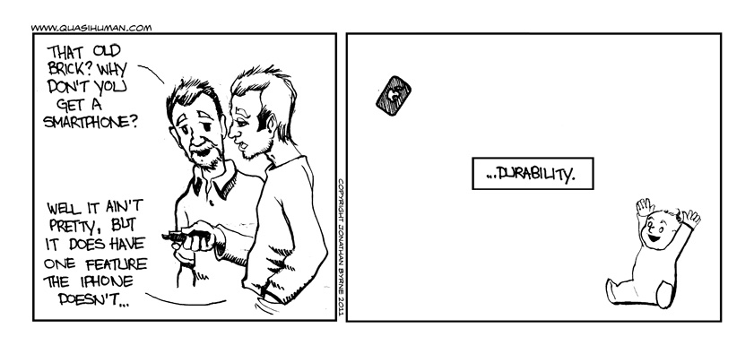
like the baby in the first one.. if he was casting a shadow, it would add to the punchline.. even a small shadow for the phone.
I think the subject setup is cool and like the idea of the parenthood thing in a comic, probably because I do something very similar.
The style seems to switch from comic to comic. That is cool if you are doing it on purpose to create a tone for the comic, but readers might tire of it quickly.
My big crit is the word bubbles, on the D&D one especially. Overlapping lines and tails and general confusion of who is talking is visually frustrating when reading a comic. Some general layout (General Layout "salute") work would help clear up a lot of the confusion. Here is a link to some pretty helpfull word bubble tips. http://webcomictriage.blogspot.com/2007/09/text-and-balloons-6-advanced-techniques.html
P.S. go read nedroid. I thought most of these were pretty funny but everyone should read nedroid anyway.
hopefully this will be more to your liking. I have tried to address some of the issues raised.
The layout is much better on the unicorn but I feel like the baby saying "Dog!" would have been funnier in the last panel. Also redraw your lady friend, people can spot copies, especially when their eyes are always closed.
When it comes to joke comics, you have to ask if things that are good ideas in traditional comics--redrawing figures, changing the camera angles, perspective tricks, and all that--will serve the joke if you use them in a gag strip. The joke here isn't visual humor so much as it it's the words. All you really need to see in this particular comic is the sleeping suit. The characters could almost be off camera and the joke would work just as well.
I'm not trying to champion laziness, but when it comes to simple jokes, you really need to reduce the amount of noise generated by the art so the punchline is in the forefront. The feeling that you need vary the poses every panel has led to many a character staring at the reader making an annoying "amirite?" face.
As far as the writing goes, I'd say it's a better comic if you just cut the last three panels off. I see it as something like this:
The woman's balloons get lost against her cutting surface, since it's so similar to the balloons. It looks like you put them down there so you don't have to cross the tails by putting the balloons in all that extra space up there to the right in the first two panels. Putting her on the right visually enforces the fact that she'll speak second all the time, and it allows you to put the bubbles above her, or in the space between them.
You've got three jokes going on: 1. the guy is a nerdy mythical animal pedant, 2. the dog/cat mixup, 3. wife's apathy/husband's intense caring mismatch. The first joke is by far the strongest, so cutting the others out (to be used in other comics, perhaps?) makes the overall comic stronger. (The cat kind of looks like a dog, though, so maybe not that one.)
All the strips have a certain charm, though, and the art definitely fits the writing, which is nice to see. I think you'll work out most of the kinks as you make more.
being a fresh daddy myself i can tell you have lot's of toddler wisdom to dish out.
take notes from the talented folks around here regarding your art and pacing, but trust me when i say you're on to something here.
I take your point, and thanks for taking the time to sketch out that example. I guess part of the art of comics is as much about knowing what to leave out as what to include.
@ bwanie:
glad you're enjoying them. There's certainly lots of talented folks on this forum.
I'll continue posting here if that's ok, comments and criticism most welcome:
Love it.
great joke, but i was a bit confused on this point as well.
This is really a random nitpick but why is the pegasus/winged horse/pegacorn/dog cream-colored in the build-up strip and white in the follow-up? FWIW I prefer the white.
Thanks, glad you're enjoying my work.
I, too prefer the white. In the earlier strip I had intended to leave it white but sort of felt that it was a little too easy/lazy, if you know what I mean. I may go back and change it at some point.
Poor planning on my part; I normally try and draw the comic as one element...on this occasion however I drew the panels in isolation from each other which results in the confusion about where Chooki (the baby) is looking. After I scanned the individual panels and put them together, I simply didn't notice. Something to watch out for in future - thanks.
Oops :oops: Fixed!
Here's Monday's comic:
Speaking of the cat, I'm not feeling the speaking parts...at all. It seems like it flows against the rest of the comic for some reason. I think it's because this is such a REAL comic to me (these aren't cartoons I'm seeing, these are PEOPLE in my mind - and you establish that wonderfully), that a talking cat ruins that vibe. Same goes for the baby I think. The interactions of the dad and baby, with silence/gestures telling the joke, is just perfect comic reading for me without any extra hokiness. Don't take out the realism of your comic. It's what makes it shine.
nit pick: 2nd panel, the baby should be looking down a bit more at the legos.
I love the baby's expression in panel 3, and goddamn you must have studied the hell out of baby posture and anatomy, because the last panel is exactly how a baby sits. I just want to pick her up and wiggle her around. That sort of stuff sells the characters and world you've established.
I think the absolute, boiled-down essence of your comic is the best I've seen on this forum in the year or so I've been visiting. Great vibe and it's touching as hell. I love it and I think you'll go very far once you work out these little kinks.
Please please please keep them coming.
I was wondering if that's what happened.
It's clean now, I swear!