As was foretold, we've added advertisements to the forums! If you have questions, or if you encounter any bugs, please visit this thread: https://forums.penny-arcade.com/discussion/240191/forum-advertisement-faq-and-reports-thread/
Options

Buddy & Spirrot Page 10

carmofincarmofin Registered User regular
edited May 2011 in Artist's Corner
Haven't done anything for this in 3 years, so bear with me...
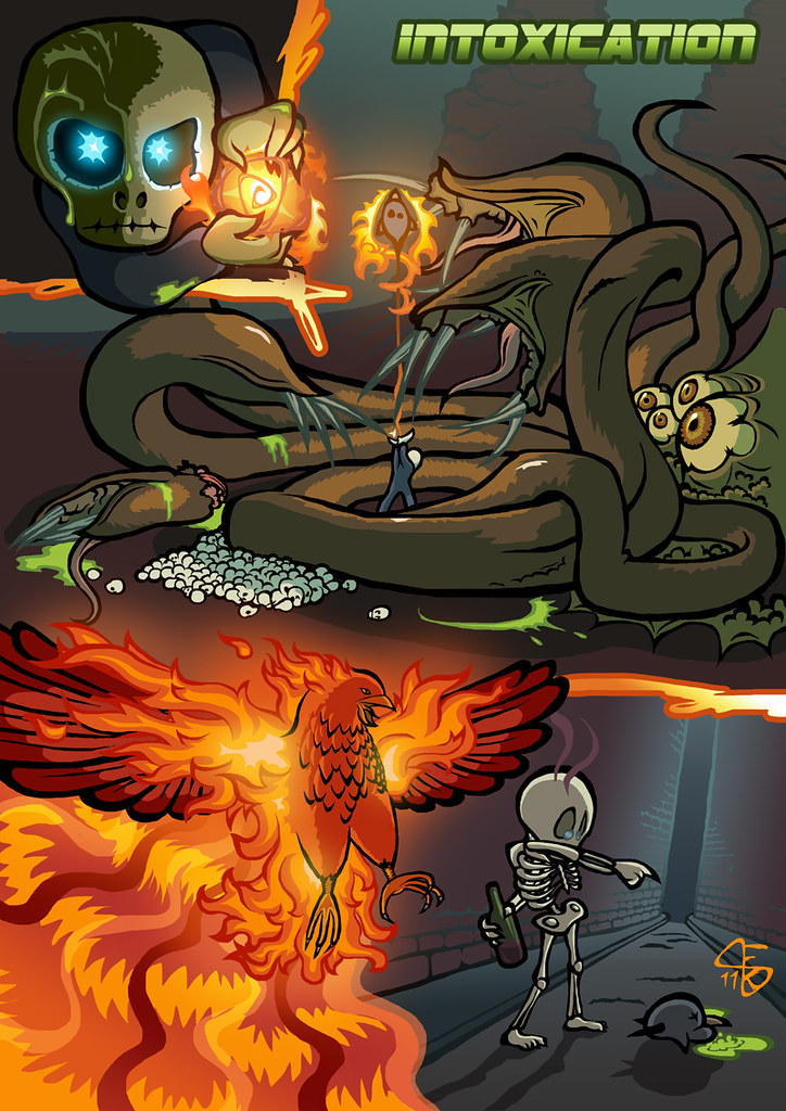
I don't have the other pages uploaded right now and it's all a little abstract. The series is about the journey of Buddy and Spirrot, a skeleton and a raven and simply an attempt of only once doing something for noone but myself.
5756601690_d9e657ff51_b.jpg

PSN | Steam
___
NNID: carmofin
3DS: 2852 6971 9745
Throw me a PM if you add me
carmofin on

Posts

  • Options
    earthwormadamearthwormadam ancient crust Registered User regular
    edited May 2011
    i remember these

    if that pic is any indication, your stuffs look greatly improved

    post some comics

    earthwormadam on
  • Options
    carmofincarmofin Registered User regular
    edited May 2011
    I uploaded the older ones in chronological order, if anyone cares.
    5761040859_1dd18b64df_b.jpg
    5761042891_c8b1368776_b.jpg
    5761592380_6df9f1de8c_b.jpg
    5761592746_562ac14f40_b.jpg
    5761593106_5d597bfb7a_b.jpg
    5761049149_43670cc6a1_b.jpg
    5761593840_d3ac738a94_b.jpg
    One is missing because its somewhere on my laptop, and the last one should be called "ambition" instead of "sensation", but yeah thats that.

    carmofin on
    PSN | Steam
    ___
    NNID: carmofin
    3DS: 2852 6971 9745
    Throw me a PM if you add me
  • Options
    squidbunnysquidbunny Registered User regular
    edited May 2011
    Love these, but I gotta say, apart from the totally rad phoenix drawing, Intoxication's my least favorite. Honestly I think it might just be that font.

    Is it wrong that they strike me somehow as a spookier Snoopy & Woodstock?

    squidbunny on
    header_image_sm.jpg
  • Options
    earthwormadamearthwormadam ancient crust Registered User regular
    edited May 2011
    Yeah intoxication lacks the cohesive color scheme of some of the prettier ones,like realization and decision. I like the different direction you're taking with your comics.

    At the same time, I can't help but think what these would look like without the splattery panel outlines. Sometimes it gets distracting for me, like in isolation, and it makes me wonder if having more boring outlines would give more space and attention to the artwork within.

    earthwormadam on
  • Options
    carmofincarmofin Registered User regular
    edited May 2011
    I hate all the fonts really, I consider them placeholders until I'm finished with all planned pages and can replace them with something fitting then. I guess Intoxination is indeed somewhat different from the rest, but for alcohol I just wanted to create a certain feeling of enstrangement.

    carmofin on
    PSN | Steam
    ___
    NNID: carmofin
    3DS: 2852 6971 9745
    Throw me a PM if you add me
Sign In or Register to comment.