The new forums will be named Coin Return (based on the most recent vote)! You can check on the status and timeline of the transition to the new forums here.
The Guiding Principles and New Rules document is now in effect.

lookin 4 sum critiques

lilchingch0nglilchingch0ng Registered User regular

edited February 2007 in Artist's Corner
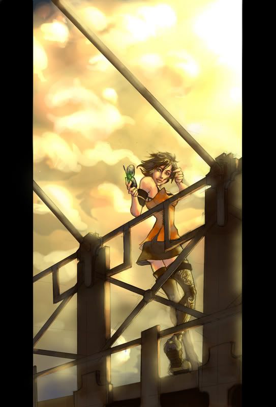
yo guys, i haven't posted on these forums in forever, mostly been lurking the past couple years. thought i'd put something up and get some feedback. thanks!
photoshop2.jpg

lilchingch0ng on

Posts

  • SublimusSublimus Artist. nowhereRegistered User regular
    edited February 2007
    Now I am no expert on lighting, but whatever you've done to the gate thing looks bad. Is that the same thing Gabe did for that GOW fan art?

    It has a good sense of mood, though. And the clouds look nice too.

    But is there like a story behind this? I'm just wondering, because I feel the angle (while a good one) doesn't really add up to whatever you are trying to convey in the piece.

    Sublimus on
  • lilchingch0nglilchingch0ng Registered User regular
    edited February 2007
    the gate lighting was just a really low opacity yellow brushed over...and ya it looks pretty trashy. I think its the same technique gabe uses, when done right thats how alot of artists do that whole glowy effect, obviously i failed at that part lol. there isn't much of a story behind it, it was an assignment for one of my classes, which involved digitally painting and character in an enviroment.

    lilchingch0ng on
  • MufasaJoeMufasaJoe Registered User regular
    edited February 2007
    I like it. Colors are nice. The pose is a awkard. The torso/head tell me shes standing, while the legs tell me shes leaning. Both halves look good respectively, but the middle ground is iffy. The leaning legs seem odd, given that the rail/bridge doesn't seem to be bearing any of her weight. Also, her right hand (our left) looks like there might be an extra digit or a long thumb. I like most everything but the very bottom cloud highlight behind the bridge/gate.

    MufasaJoe on
  • GodfatherGodfather Registered User regular
    edited February 2007
    I like the character as a whole, but it would have been nice if you illustrated how the torso was twisting around via folds in the shirt/tank top/whatever she's wearing. Also, i'm guessing it has to do with the brush choice you picked already addressed in one of the above posts, but i'm getting a blotchy, unfinished feel to this piece. It's a real shame because the character really is a nice piece of work and the messiness really deracts from the work as a whole.

    Godfather on
  • lilchingch0nglilchingch0ng Registered User regular
    edited February 2007
    the torso is definetly off, i was trying to cover up that particular fuckup with the gate thingy (was a last minute assignment...er that is i waited until the last minute). clothing folds would have been a good idea, kinda embarrasing that i didn't think of that at the time lol.

    The whole blotchy thing was an attempt to blend pencil shading and digital color, which apparently requires are helluva lot more refinement than i originally thought. I think it's something i'd like to try again in the hopes i can make it look right. You can see alot of that stuff in Juno Jeong's work.

    lilchingch0ng on
  • Kewop DecamKewop Decam Registered User regular
    edited February 2007
    yea, just check where her ass is and then check where her waist is. It should be that far apart.

    Damn good overall though.

    Kewop Decam on
    pasigfa7.jpg
Sign In or Register to comment.