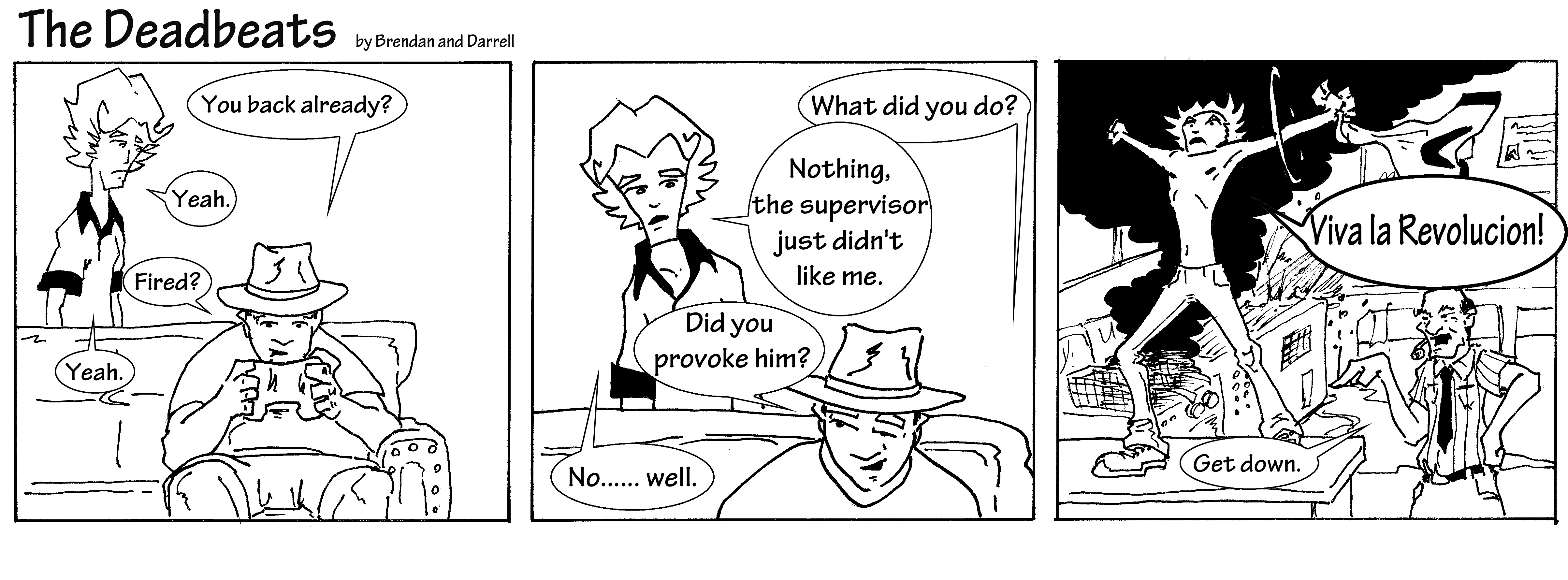
I find the pose of the Manager a bit too "oh well, he's doing a thing" for the situation. If my employee was jumping on a table and shouting rebellious remarks, I'd probably be a bit more emphatic with my body language. Also, the punchline doesn't make a lot of sense without some context. Why is he shouting that? Is he fed up with work, is he just crazy? If the comic is supposed to be a one-off, it certainly comes off as having some back story to it.
Art-wise, the lack of anti-aliasing on the linework is a bit distracting and calls to mind MS Paint, but the upper half of the pose of the guy on the table is really dynamic and conveys a lot of energy. Good job on that.
Yeah, I can show you how to use Gimp for resizing. If you want to get into the jpeg industry, you've got to know how to cut the product for distribution.
Take these criticisms to heart and make the next one better.
The only thing that really sticks out to me is line weight. I would suggest either going the american route and bolding your characters outline a little, or the japanese route of fading your line work as it gets closer to your characters (swap characters with whatever you want the eye drawn towards in the image). And though this isn't so much art as it is layout, you cant go wrong dropping your url somewhere in the panel frame.
Using lines of different weight would go a long way. It can help separate characters from the background and lighter weights can be used to add subtle details without being too distracting.
Like other people have said, some bolder lines would help the readability of your images as well as some coloring or shading.
I think the second comic here has wittier banter, and the punchline has more of a payoff. The first one just kind of ends and leaves me thinking. "So what?" I think the guy in the hat should have less to say, people don't always have to respond verbally one after the other. I think if you took out his dialogue from either the second or final panel it might improve the pacing. Maybe the guitar string in the final panel just needs to "tawng" or "poit" or whatever broken guitar strings say.
The larger text in the last panel of the second comic implies he's saying that louder than the rest of the dialogue. I'm guessing that's not what you were going for.
Do you have any time to commit to drawing outside of the comic?
I think you have potential, right now the jokes, the timing, and the art are pretty average, which is way better than most people starting out. Iron out the lines and don't be lazy with your formatting and you would have a standard to guys quip back and forth with each other comic. If you push yourself further, solidifying your artistic skills and your writing, You might get something more interesting.
What comics are you being influenced by? What artists?
I like the style the characters are drawn in, it's fun. Your humor is also good! I'm assuming the sketchy and open lineart approach is intentional, but I would do a couple things to improve it.
-Vary the lineweight up. The line thickness is pretty much constant throught the drawing. This tends to flatten the whole thing up. Some tricks are making lines on the shaded side or bottom of the form thicker then ones on the lit side/top, lines in the foreground have slightly thicker lines then one further back, lines inside the form could be slightly thinner then the ones outlining the form, etc.
-I would add some gray areas and a few more black areas so the image doesnt look flat. Even if you don't use a graytone with photoshop, you can imply a gray area with cross-hatching or a number of other techniques.
-Don't forget the basic form of your figures. If you go straight into the lineart without laying down the form first, the proportions and structure will probably be a little off in the end. Start with basic shapes and build the features off of that.
 Registered User new member
Posts
Also, are you looking for constructive critique? It would be nice to see a couple of these so we can give you feedback on the comic as a whole.
I'm not sure how you're going to run a webcomic if you don't know how to scale and upload images.
Art-wise, the lack of anti-aliasing on the linework is a bit distracting and calls to mind MS Paint, but the upper half of the pose of the guy on the table is really dynamic and conveys a lot of energy. Good job on that.
Take these criticisms to heart and make the next one better.
You need a bit of colour or differing line weights to help make characters and foregrounds pop off the backgrounds.
I took the liberty of colouring a panel.
here are few more some of the first ones.
thank you for all the feedback, the colored panel looks sweet.
I think the second comic here has wittier banter, and the punchline has more of a payoff. The first one just kind of ends and leaves me thinking. "So what?" I think the guy in the hat should have less to say, people don't always have to respond verbally one after the other. I think if you took out his dialogue from either the second or final panel it might improve the pacing. Maybe the guitar string in the final panel just needs to "tawng" or "poit" or whatever broken guitar strings say.
I think you have potential, right now the jokes, the timing, and the art are pretty average, which is way better than most people starting out. Iron out the lines and don't be lazy with your formatting and you would have a standard to guys quip back and forth with each other comic. If you push yourself further, solidifying your artistic skills and your writing, You might get something more interesting.
What comics are you being influenced by? What artists?
-Vary the lineweight up. The line thickness is pretty much constant throught the drawing. This tends to flatten the whole thing up. Some tricks are making lines on the shaded side or bottom of the form thicker then ones on the lit side/top, lines in the foreground have slightly thicker lines then one further back, lines inside the form could be slightly thinner then the ones outlining the form, etc.
-I would add some gray areas and a few more black areas so the image doesnt look flat. Even if you don't use a graytone with photoshop, you can imply a gray area with cross-hatching or a number of other techniques.
-Don't forget the basic form of your figures. If you go straight into the lineart without laying down the form first, the proportions and structure will probably be a little off in the end. Start with basic shapes and build the features off of that.
Good luck, and keep up the good work!