As was foretold, we've added advertisements to the forums! If you have questions, or if you encounter any bugs, please visit this thread: https://forums.penny-arcade.com/discussion/240191/forum-advertisement-faq-and-reports-thread/
Options

I'll try this again....

Tom LamakieTom Lamakie Registered User regular
edited March 2007 in Artist's Corner
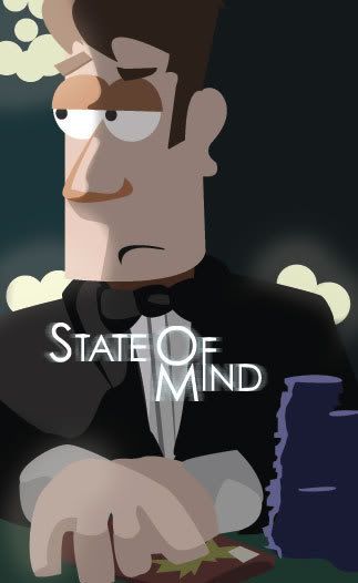
Ok so, I'll try this again I had posted yesturday and this guy slammed me for site whoring so I took it down quickly. I'll try again more cautiously... Here is a promo-poster I made for my webcomic. I did it in illustrator and then moved it into photoshop to do some of the "glow" lighting and the text. comments, concerns, crazy drunkin' ramblings are all welcomed.


StateofMindBond.jpg

Good times....gooooood times

fathead.jpg
Tom Lamakie on

Posts

  • Options
    erisian popeerisian pope Registered User regular
    edited March 2007
    As you try again, you might post a few more examples of your work. Since it's a webcomic, maybe include a few strips. Site-whoring is when you try to get people to go to your site. If you post the images here then that's generally smiled upon!

    erisian pope on
  • Options
    Tom LamakieTom Lamakie Registered User regular
    edited March 2007
    Hey cool, ok here are a few of my strips, and well, hope for the best.


    0047.jpg

    0050.jpg

    0051.jpg

    Tom Lamakie on
    fathead.jpg
  • Options
    TamTam Registered User regular
    edited March 2007
    You spelled "poisoning" wrong. I like the art style in the comics, but the humor is really tepid and overdone.

    Tam on
  • Options
    Smooth LouSmooth Lou Registered User regular
    edited March 2007
    I like the comics, honestly. Better than Anything I've seen in a newspaper in ages.

    The style is pretty good too. I'm no artist, but I love checking this forum from time to time and while your drawings are not all that great, that somehow adds to their charm.

    Smooth Lou on
    metroidlouit4.jpg
  • Options
    UnderHero5UnderHero5 Registered User regular
    edited March 2007
    I enjoyed the comic. Just spellcheck before you finish them. I like the style of the characters too. The second strip made me giggle.

    UnderHero5 on
    -=Evildoers Beware=-
    XBL: UnderHero5
    Steam/PSN: UnderHero5
  • Options
    Tweaked_Bat_Tweaked_Bat_ Registered User regular
    edited March 2007
    The brown background in the last strip needs work... the characters blend into it too much. For me it's fairly over-used humour, but at least it's not about two guys who play video games... m i rite guyz?

    Tweaked_Bat_ on
  • Options
    MagicToasterMagicToaster JapanRegistered User regular
    edited March 2007
    I laughed at the 'Love' joke. However, it seems that your characters are being pulled at the crotch by some invisible force.

    I don't know how serious you are about this poster thing, but I'll still give you some serious advice on making an effective poster. As your poster stands now, it does little to entice me into wanting to follow it mainly because it's not serving any of the fundamental functions that all ads follow. These are:

    Communication - Your poster should communicate what it's about.

    Educations - If noone knows what you're communicating, it's up to you to educate us on what this is.

    Motivation - It should somehow entice me into wanting to follow/learn about what's on the poster.

    I hope this helps you for future poster making. Good luck!

    MagicToaster on
  • Options
    drinkinstoutdrinkinstout Registered User regular
    edited March 2007
    I like the art style a lot although am confused why everyone stands like that...

    but I personally didn't really care for the jokes. :o/

    drinkinstout on
  • Options
    ProxyManProxyMan Registered User regular
    edited March 2007
    Maybe they all have gunts.

    ProxyMan on
    i put on my robe and wizard hat
  • Options
    TamTam Registered User regular
    edited March 2007
    ProxyMan wrote: »
    Maybe they all have gunts.

    wut?

    Tam on
  • Options
    SpilltoySpilltoy Registered User regular
    edited March 2007
    A "gunt" can also be used as a noun, in reference to the huge layer of belly fat that runs into the vaginal area of a particulary fat woman, such that her belly ("gut") and her "cunt" are indistinguishable as two separate body parts. It's is sort of like an extreme case of cameltoe.

    http://en.wikipedia.org/wiki/gunt

    Well, there's a new word.

    Spilltoy on
    I really don't.
  • Options
    TamTam Registered User regular
    edited March 2007
    That is incredibly disgusting.

    Tam on
  • Options
    GinzueGinzue Registered User regular
    edited March 2007
    I lol'd at the love weight one.

    I think more obscure humor is your thing, since the two normalish ones didn't really get laughs out of me.

    Keep it up

    Ginzue on
    Ginzue!
  • Options
    thundercakethundercake Registered User regular
    edited March 2007
    The art is really solid; reminds me a bit of Foxtrot for some reason. It might benefit you to spend a bit more time on the writing bit. I know a lot of webcomics with absolutely horrible art and really funny jokes, and they get plenty of attention, but the ones with fantastic art that fail to grab you often get lost under the bed. I have to say the humor in these is pretty bland.

    I like how you make the backdrops, but I think you need to find a way to distinguish them from the foreground, it all sort of runs together. But I applaud you for not using lines, it really cements the style as your own.

    As for the poster, you might want to resonsider the photoshop effects. You have a simplified style with few details and a very vectorised look and that rarely meshes successfully with filters. The typeface seems out of place with the style, too. Personally I'd go with a blockier type. Also, setting the white type on the near-white of his shirt seems to be a poor design choice. There's a perfectly useful area of dark green that's sitting unused by his head, you could easily fit some type in there.

    It might also help to add some more explanation in there. Even "a webcomic" at the bottom might do. Right now it's not very clear what it is the poster's advertising :)

    Good luck with your comic!

    thundercake on
  • Options
    Tom LamakieTom Lamakie Registered User regular
    edited March 2007
    That is very good advice, I thank you!

    Tom Lamakie on
    fathead.jpg
  • Options
    Tom LamakieTom Lamakie Registered User regular
    edited March 2007
    It seems that I have had overwhelming responce that I have a godo quality of art, san some small tweekes but rather bland writing. The best advice i have had was " If someone doesn;t like your comic, screw'em" But I agree, It does need help. I just don't want to fall into the too obscure and cliche. I guess if making comics was easy everyone would be doing it.

    Tom Lamakie on
    fathead.jpg
  • Options
    NibbleNibble Registered User regular
    edited March 2007
    I'm not a big fan of the square heads, and it looks like all your males are carbon copies with differently-coloured hair and clothing. Also, maybe it's just me, but in the first two panels of the first strip, it looks like the girl has a really big, droopy nose. It took me a while before I realised it was actually the palm of her hand.

    I like the humour, though. the "love" one is particularly good.

    Nibble on
    sig.php?id=178
  • Options
    Tom LamakieTom Lamakie Registered User regular
    edited March 2007
    Oh frank...


    0052.jpg

    Tom Lamakie on
    fathead.jpg
  • Options
    flyingmonkeyflyingmonkey Registered User regular
    edited March 2007
    Ok I actually laughed out loud at the last one.

    flyingmonkey on
    3. And quit this emo-slumming shit. Fuck.
  • Options
    The One 52The One 52 Registered User regular
    edited March 2007
    Same here, that last one made me laugh.

    The One 52 on
    bigbosssig.gif
    The internet does not qualify as grounds where you can act like a bouquet of dick.
  • Options
    EdcrabEdcrab Actually a hack Registered User regular
    edited March 2007
    Yeah, that was a good one.

    I quite like the style, the only thing that really sticks out for me is that every character, man woman or child, has the same head with that big angular chin. A few variant face-shapes would distinguish between 'em, I reckon...

    Edcrab on
    cBY55.gifbmJsl.png
Sign In or Register to comment.