The new forums will be named Coin Return (based on the most recent vote)! You can check on the status and timeline of the transition to the new forums here.
The Guiding Principles and New Rules document is now in effect.
Sketch update [NSFW]
Greatnation Registered User regular
 Registered User regular
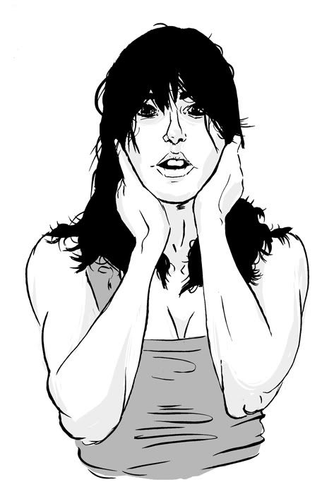
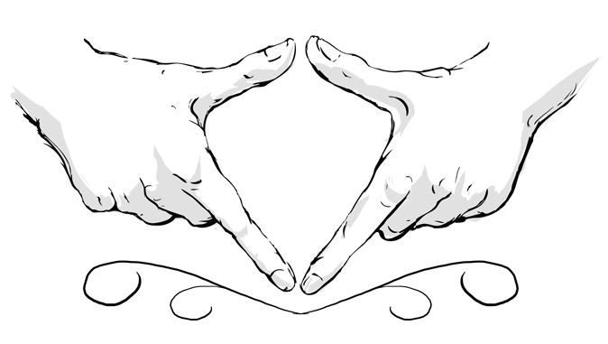
Did these in brush and india ink with some hasty tones added in PS. Thought a few of them turned out alright.
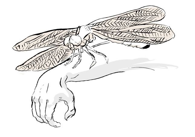
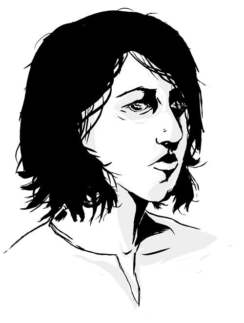
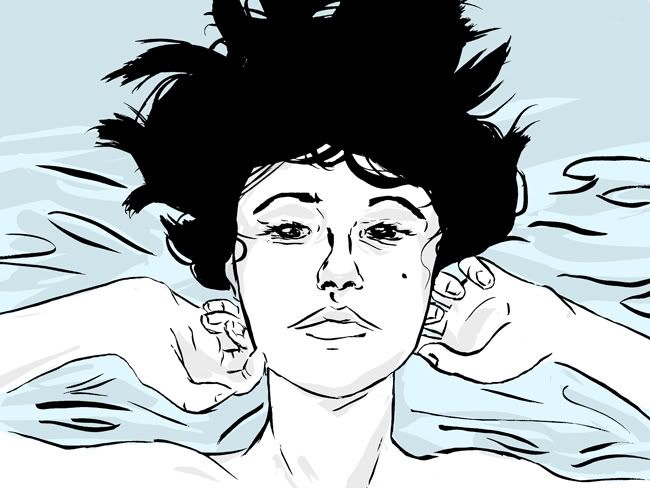
this last one definetly needs alot of work... help appreciated fellas. I think im going to scrap that blue entirely.


this last one definetly needs alot of work... help appreciated fellas. I think im going to scrap that blue entirely.
Greatnation on
0
Posts
If you make mistakes, oh well. It might look bad to you as a line, but it will probably add a lot of charm to the overall piece. [ed: Oh, hey! Example! Like the arm lines in my sig.] Besides, these are studies (which I assume are done quickly?), so there's no harm in repeating them to experiment with the materials!
Kewop's suggestion of ink was is cool and all, but if you want the look of digital colors there's nothing wrong with that! You should try out some ink wash, though. Just make sure you have some bigger brushes!
I really like the first one but something about the face just doesn't seem right. I think everything is too high on the head making it look like she has a big chin and a small forehead. Could just be me though. The arms also look bulgey and lumpy.
Nice stuff though, I'd like to see more.
INSTAGRAM
Toji- You are very much right about the lines. My problem, in alot of places, Is that I would forget to use my whole arm to paint them, and use only my wrist- which contains lots of little jitters when im trying to hold the majority of the brush above the paper, rather than with a pen or pencil where I can smush out the jitters with preasure. Then I would try and go back and fix the jitters in the lines... and well that just didnt work out very well. I will try to post more of these as I do them, I also recently ganked a deer skull from the bio room, that will have some fun oppurtunites in it i think.
Kewop- Yeah, Im aware that they can do that, I prefer the cleanliness of the digital though. Thanks though!
Adam- That first one has a number of flaws that you just pointed out =(. I tried to make it look like her chin was slightly pointed up, but doing so deformed the face a little bit, and the arms do look bulgey, in an attempt to add some forshortening (The elbows are supposed to be pointed at an angle away from her body)
Yeah I think the hands are the best out of the bunch too. Which is good, because the first set of hands there, were the cover image of a program for the Vagina Monologues that I was asked to do (its sign language for vagina)
But overall these are really nice. The hands are fantastic and the face (second to last image) is great.
www.atomic-robo.com