As was foretold, we've added advertisements to the forums! If you have questions, or if you encounter any bugs, please visit this thread: https://forums.penny-arcade.com/discussion/240191/forum-advertisement-faq-and-reports-thread/
Options
New to the forums, wanted to share one of my drawings :)
Thaticanyaks Registered User new member
Registered User new member
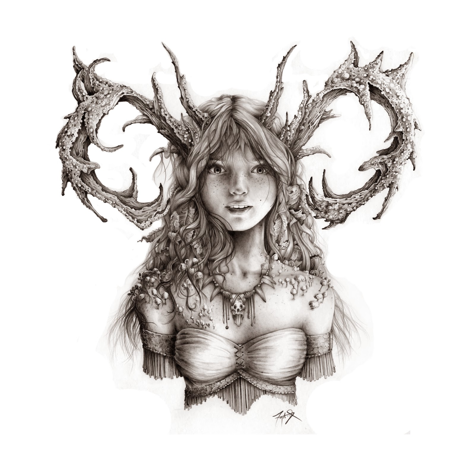
Been reading PA since the first comic, and I adore Gabe/Mike's work. I think he's one of the best illustrator/cartoonist/artist around. Cherish my signed print of the last frame of "The Tithe." So I was really excited to see in his latest comic him and I kinda had the same concept for a character. I'd say great minds think alike but I'm no where near his greatness, regardless I wanted to share my pencil drawing of my character Treuce.
 T-yaks
Thaticanyaks on
+5
Posts
This forums main goal is criticism. Usually it helps when new users talk a little about their goals as an artist, how long they've been at it, and give us a few drawings to go on. If you were looking to get more directly at gabe or tycho, the best way would be to email or tweet at them, they don't look at the forums.
Your rendering looks pretty meticulous, but things are turning up kind of flat. I assume that you've probably learned to draw by looking at and copying photographs. In doing so, you've learned some of the patterns of how light and shadow work, but haven't dug deeper into under standing form. Proko has a pretty good explanation on shading:
Since you clearly aren't shying away from drawing realistically, you would probably really benefit from doing studies on anatomy and form, its a challenge in itself and easy to turn into drawings like the ones you have above.
Oh, I love this. Gorgeous colours.
Like Iruka said, your lighting is very ambient and non-directional, which is holding you back a bit because you've clearly got the control and attention to detail. I think if you pushed it a bit more, your sea-creatures would look spectacular.
You're obviously putting a lot of meticulous care into the shading and rendering, but you're not understanding the light very well and all that effort ends up a bit misguided and flat looking. Some personal study may be necessary on your part, but getting a better understanding of how light works and using that knowledge to create a consistent light source within your rendering will make them much more believable.
You seem to lean towards very intricate and careful work in general, so I would imagine that you'd have a good mindset for observational studies, supplemented with tutorial type material like that proko video. "Go do a still life" may seem a little rudimentary but it's a solid a place as any to start with when tackling light.