The new forums will be named Coin Return (based on the most recent vote)! You can check on the status and timeline of the transition to the new forums here.
The Guiding Principles and New Rules document is now in effect.
Moonlight Boogie
Believe Registered User regular
 Registered User regular
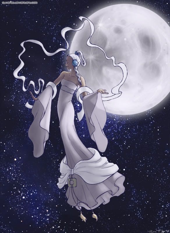
Awhile ago I was asking for help drawing starfields in the Questions thread. Well, I finished that drawing!
Fanart for Avatar: The Last Airbender. This is Yue at the Season 1 season finale. Avid ATLA watchers will get it. I cheated on the starfield when manually drawing it wasn't working (what you see is mostly a Photoshop thing), but other than that, it was all done by hand from memory, only ref used was for the moon.

FYI, this is finished, so it's unlikely I'll make any changes to it, especially considering the file is ENORMOUS (the picture I put up is at 15% zoomed), BUT I will keep any and all crits and advice in mind for the future.
detail shot
detail shot
Fanart for Avatar: The Last Airbender. This is Yue at the Season 1 season finale.

FYI, this is finished, so it's unlikely I'll make any changes to it, especially considering the file is ENORMOUS (the picture I put up is at 15% zoomed), BUT I will keep any and all crits and advice in mind for the future.
detail shot
detail shot
Believe on
0
Posts
Now that I look at it, though, I do see why you say that and kind of agree. Poo.
How would you suggest making it more interesting, though?
The largest problem is the character coloring, and to a lesser extent, her line-work. It's very meh, gradient style, and relatively monotone. You take one color, add some black or white, and it ends up looking drab. Use color to indicate highlight, shade, and depth. I'm by no means an expert on this, but you can take a look around the forum to see those who are. Find what looks good, not "ok" or "decent," but really good, and try to figure out why. Look at the use of color to indicate shape and light.
Next is the difference in detail. The background did turn out good, and when you put a simplistic cartoon over it, both are cheapened. It would take a very deliberate artist to pull that off, and often things look much better when they are styled the same, with the similar detail and care. Unfortunately you indicate that the star field is "mostly a Photoshop thing," and when the strongest element in your piece is something you didn't really do, you're in trouble.
Lastly, the characters line-work itself is really flat. There is not much depth or shape to her body, along with some anatomical issues (for example that near thigh is really short). I'm guessing you would counter with the cloth folds, but honestly, I'm betting that is a memorized formula you carry from one piece to the other, because you see those types of folds in alot of animish/interweb drawings. A question to determine is, could you draw that cloth if it was folded differently?
ex: http://www.doctormacro.com/Images/Simmons,%20Jean/Annex/Annex%20-%20Simmons,%20Jean%20(Robe,%20The)_01.jpg
Wouldn't mind some tips on how to shade the inside of the sleeves, either. I'm not used to transparent cloth (which I did here to practice).