As was foretold, we've added advertisements to the forums! If you have questions, or if you encounter any bugs, please visit this thread: https://forums.penny-arcade.com/discussion/240191/forum-advertisement-faq-and-reports-thread/
Options
Breaking through stagnation [NSFW]
Changer Registered User regular
Registered User regular
Hello everyone. I am Changer, and I do artwork for a fairly niche interest (Mind Control/Hypnosis). As such, one of my biggest fears as an artist is becoming one of those terrible artists who grows comfortable with consistently poor quality artwork simply because catering to a niche leads inevitably to a lot of praise that otherwise would not be given.
My goal is eventually to be a professional artist; something that I "technically" am on account of making a decent amount of money with my art, but I don't really feel like it given how low quality my art really is.
I usually try to find something to specifically try to do better each time I draw. That seemed to mostly work out for the last few years, but I've been suffering from diminishing returns and the last 10-20 drawings I've done are barely distinguishable in quality anymore; but I still have an extremely long way to go before my quality becomes actually good.
I have to stop drawing for a while due to Carpal Tunnel, and am not sure when my arm will be usable again (I'm hoping that it will be soon, but I have no idea), but I figure now would be a really opportune time to gather study materials and research how to get better so when I can use my arm again I might hopefully start improving again.
Problem is; I have no idea what I need to improve aside from the ever vague "everything". When I look at my own drawings I can tell they aren't that good, but I am having an increasingly difficult time figuring out exactly what I am doing wrong, or what I should be doing better.
If any of you could suggest what I need to work on most and what resources would be helpful in learning better, that would be really helpful. I have a couple examples of things I've drawn somewhat recently, which I'll put below.
0
Posts
There were some relevant posts over here that might help: http://forums.penny-arcade.com/discussion/comment/35255271/#Comment_35255271
AOB wrote a good one after mine too.
I'd consider reading through this thread too: http://forums.penny-arcade.com/discussion/126365/sketches-studies-and-stuff/p10 Mabelma really came around to studying and its improving his work a ton, but its a really good illustration on why going back to fundamentals is important, even when you feel like you have a decent amount of it down, its the simplest concepts that end up hurting your work.
That's a bit of a disjointed post, but hopefully it helps.
I'll give the exercises in the drawing with the right side of the brain book a try when my arm is back to being pain free. I read up to the first drawing exercise at least.
I suggest doing some simple shape studies and posting those here, as generally the mistake people make at first is really not taking those initial drawings seriously. You don't just want to draw a cube/cone/sphere and say "Alright! I did it and it looks... whatever. Now, let me draw 10 figures in a complex scene." You want to do your shapes studies to your absolute best ability, and then spend a considerable amount of time getting feedback and assessing what's wrong.
I recommend watching through prokos videos, and looking through the drawbox/ r/artfundemantals links. the reddit will give you a huge amount of activities to embark on, and proko will give you an appreciation for anatomy, while also teaching you how important it is to think of things as basic, geometric forms in space.
Art is like any other subject, it's something you'll have to study to get better at it. You can't just will yourself to improve by thinking that you want your next piece to be better in some abstract, non-specific way. It's like trying to solve an algebra homework problem without hearing the lecture first. Obviously that's a limited analogy, because making art involves creativity. But the sooner your get some serious studying out of the way, the soon you'll be able to achieve your creative vision.
Could you say a little bit more about your goals? What kind of art would you like to make, ultimately? What kind of art job do you want?
As for goals, my main goal is to actually get good at drawing. I make a living off of a patreon campaign for my artwork and a game I have been working on. Kind of an effect of working in a niche interest; I'm not sure I can name even ten other artists who draw original content for the niche I work in regularly, so the bar for entry is much lower. Financial success is not a barometer for quality though; and I want to become a good artist.
I will try to post the results of my shape studies as soon as possible; my wrist and palm aren't hurting today, but my shoulder still hurts mildly when I move my arm. So I'm not sure if my arm is ready to start drawing again yet.
Right, I guess my point was that simply *focusing* on improving a particular aspect (like say, "I want the lighting to be better" or "I want the characters to have more dynamic poses) is a lot different from say, studying real life lighting and anatomy, then *applying* that new knowledge to your work. It sounds like the way you've been thinking about improvement is more abstract, compared to say, studying directly from life/realism. I could be wrong about that, though, since I don't actually know what your studies have been like in the past. Looking forward to seeing some of that stuff in here!
After doing it; the book talks about that most people experience difficulty at the fore-head, and that the conflict is necessary for the shift in the side of brain you are using. I did not get that at all though; I saw the faces and did not see the vase at all while working on it. So I'm not sure what that means exactly, if I made the shift easily, or if I failed to make the shift completely.
I'll attach the drawing to this post. I think I made the faces a bit too far away; I overestimated how long to make the top and bottom lines, but I think I made the faces at least mirror each other to the best of my ability.
The issue of seeing two faces but also seeing a vase is more an exercise for understanding positive and negative space. When you are trying to observe objects, seeing the negative space is just as important to getting the forms right. Most people don't think to look at the spaces where their object is not and analyze what shape that is actually making
When drawing figures, doing this can help you see actual relationships rather than focusing on what your brain thinks a person looks like. You use this in combination with other techniques to measure something thoroughly.
So when I see the vase above, my first thought is "why are all the lines crooked?".
I read what Betty Edwards wrote describing the purpose of this exercise and she claims that it's designed to help demonstrate the difference between "Left" and "Right" brain thinking, which is the flawed language (Betty is an Art Instructor, not a Scientist) that the book uses to describe "symbolized" drawing versus truly observed drawing. She posits that most people use their "Left brain" to draw one face and their "Right brain" to draw the other, which I think is maybe a bit oversimplified and in your case seemingly did not elicit a strong response. I wouldn't worry about this exercise too much and I would instead strongly suggest to move on to the next exercise, which is to reproduce an upside-down drawing.
The upside-down drawing is I think one of the most clear and valuable demonstrations of what it means to get in the observational drawing mindset ("right brain") in the whole book. The phrase "draw what you see, not what you think you see" might at first sound like a tautology, but it's really one of the most important concepts in all of drawing. The upside-down drawing is a good first step in helping to provide context to what it means.
It took me three and a half hours and it turned out terribly.
edit: I'll add a third voice to "ignore whatever pseudo-science mumbo jumbo Betty Edwards burbles", she has no clue what she's talking about and framing it as left vs right side is totally misleading. But the exercises are good and the fundamental message - which is about retraining your brain to stop it taking short-cuts and to pay more attention to the actual visual information coming in - is still valid.
I don't understand what's going on below the thigh, but the rest looks cool.
As far as I can tell, my biggest problem with this exercise seems to be proportions. I can follow the shapes and curves; but the further any point on a line gets from another spot I can use for a distance reference the further off I get distance-wise.
The original is a Picasso drawing, which is actually pretty perfect for this exercise since the cubist abstraction just further serves to reiterate that this exercise is an analysis of pure shape and form meant to discourage thinking "oh that's an eye, I'll draw what I think an eye looks like right here". The point of doing it upside-down isn't so much for you to not recognize that it's a famous drawing as much as to get you to stop thinking about what you think a head or a hand or an arm is supposed to look like.
Don't agonize too much over how long it took or if it was difficult. Sweating a little while you work on something is a good sign that your energies are being focused in a place where you have a lot to learn, which is the whole point. It's not a complete failure either, I can tell you're at least attempting to faithfully replicate the shapes you're seeing, even if it's a bit wonky. The biggest issue, which it seems you have correctly identified, is that not enough care was paid to relative proportions and placement of major shapes, which resulted in things becoming stretched and skewed in a way that spiraled out of control as you worked across the drawing. The whole figure has ended up too narrow and major shapes are misaligned or stretched or not the right size.
I don't know what Drawing on the Right Side of the Brain says about it, but there are measuring techniques and rules of thumb that most artists use to help them keep their proportions in check. Plumb lines and comparative measurement in particular are both effective methods that you should look into. If you've ever seen an artist sticking a pencil out in front of their face, that's what they're doing. These techniques aren't any kind of secret weapon that will fix all your problems, but they can help you keep from stumbling into the weeds on a drawing, or help you figure out what's wrong if things aren't looking right.
I'm not sure about the next exercises with the viewfinder from that book. From the description it sounds like basically just tracing. I had thought I read numerous times that tracing was a bad practice for learning?
Just did a shapes exercise (Based on this: http://www.drawingandpaintinglessons.com/Drawing-Lessons/Basic-Geometric-Shapes.cfm ). I think the Picasso exercise was a bit much for my wrist; as it seems to have gotten sore again. So going to try to focus on exercises I can finish fairly quickly.
1. Change your wacom settings so that you have really really high pressure sensitivity. I was NOT a fan of high pressure sensitivity but you do get used to it. It immensely helps your wrist to not have to press very hard.
2. Get a larger drawing tablet. This forces you to draw from the shoulder instead of drawing by moving your wrist.
3. Go to a doctor and get a wrist brace to wear at night while you sleep.
4. This seems silly... but stretching before and after 'exercise' (IE drawing). There are wrist stretches that can help. Talk to your doctor about this too.
5. Take breaks! Only beginning artists brag about stuff like "I drew for 8 hours straight bler bler bler". When you see a really good or detailed painting that someone did and they say "Done in 54 hrs" or something, this is not straight. It might have taken them over a month at an hour a night. You don't know.
Please take care of your wrist! If you have hope of being a professional, know that the boogeyman of wrist problems will never go away. There ARE industry people who have permanently fucked up their wrists and had to figure shit out surgery, learning to draw with their opposite hand, and or changing/adjusting careers.
I unfortunately can't afford a larger tablet. I could barely afford the one I have now.
Also, unfortunately, I am uninsured, so I haven't been able to see a doctor. I have ordered a sleep wrist brace online though, and have researched stretches for carpal tunnel online.
Usually I do take frequent breaks. The picasso exercise though, the instructions made it sound like I was meant to do it in one sitting, so I did. I only realized how long I spent on it when I was finished and looked at the clock.
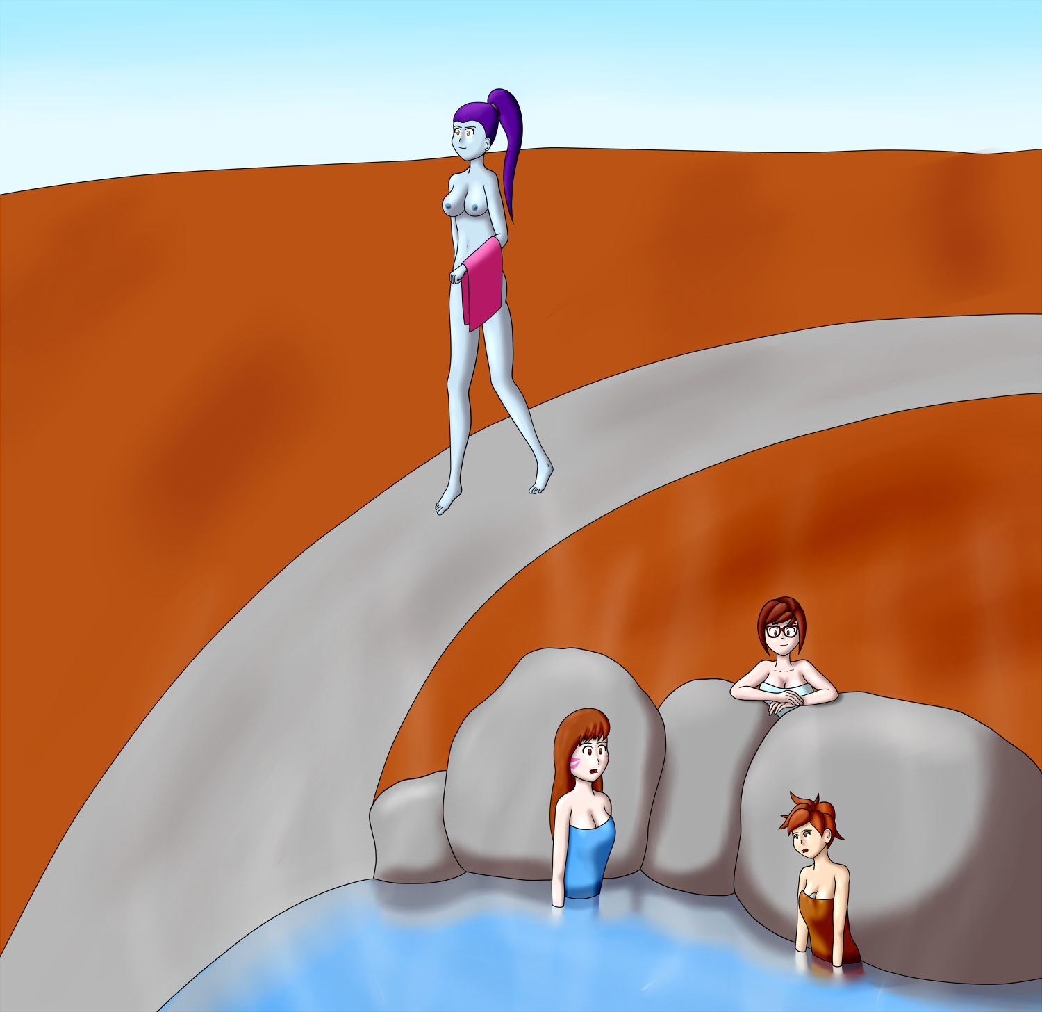
The breasts are kind of super out of proportion, but that was what the requester asked for so.. yeah. Just mentioning that so you know that I know that breasts aren't normally that big. I tried to do the shading better, but it eludes me completely still. I tried to research shading techniques and did it a different way that took at least 4 times as long to do and I swear it looks exactly the same to me as what I usually end up with. Kind of frustrating. T_T
The hands also, I don't think I did very well on this time. I kept trying to redraw them, but somehow I could not make them look any better than this.
Edit: Just noticed that the white on the middle person's shirt collar was transparent. Fixed it on the file I have, but seems I can't replace it on the forum post.
That simple shape study you did, the reference was not the strongest. I suggest the resources linked in this thread: http://forums.penny-arcade.com/discussion/172670/enrichment-simple-shapes-light-and-form/p1
Reluctance to study is way more common early on than burn out is. In the start of trying to learn the foundations of your skills, you do one or two assignments and simply stop because doing something new and actually holding yourself accountable for the results is frustrating.
Having fun is very important! But the easiest way to have fun is to not think of studying as pulling teeth. You are trying to get better because you really, really want to. An analogy is that, I go to the gym because I want to get healthy. Its really easy for me to get in a loop where I regard the gym as a chore and don't go. Over the last year though, I've loaded up my gym music and I made a real effort to enjoy the time I spend concentrating on my health, and now the gym itself is an enjoyable. Its not becoming my passion or anything, but why let my thoughts on something that I ultimately want to do be overall negative?
Taking on the academic parts of art is a challenge, but the more you place that challenge on your work and think about it as part of the journey, the easier it will be for you to sit down and make the time for learning. You'll apply it your work because you're curious about your new skills and how to improve your work, rather than out of obligation. Getting to that head space is what changes artists from people who study every now and then but ultimately never really use it to improve/inform their work, and people who adapt their art and grow rapidly.
I think you are on the right trajectory, but you have to keep the momentum going, and share your studies!
@Liesbeth Ton I do enjoy making art; I just don't like being bad at something I am trying to do.
Working on the box exercises. Just finished my first try on the 3.11 exercise. Some of the lines do not match the vanishing point, looking at it afterward. Feels like some parts of these boxes look weird when angled towards only the one vanishing point compared to the two points in the previous exercise.
Keep your lines strait, dont let them wiggle around, and draw through to the vanishing point so you can see the structure.
Anyways, here are a couple more things I've drawn in the last few months. Been trying to get braver about selecting my own colors for shading rather than using the shade and highlight effect layers. Backgrounds are also giving me issues, though I am trying to give them more attention...
heeeeey i did this exercise in my first lifedrawing class
Apologies in advance, but this going to be a really long post, and is going to lean on even more further reading. It is also going to be a little fractured in writing style since I started writing this during your post back in December and never finished it, and being reminded now I figure it's better to say something semi-incomplete/poorly proofread rather than never getting around to saying anything at all.
This may be an overwhelming amount of stuff to take in in one go, but nothing here is anything I wouldn't give equally recommendation to anybody looking to learn drawing fundamentals- it's just always going to be awkward trying to cram a semester of art school into a single post no matter what.
I'm throwing out references to a lot of books that I'd suggest checking out as your budget permits, and I've put in a couple of images from some of my crits of other artists in here to try to explain some points, hopefully they're helpful.
Since the main crux of this thread has been about essentially you feel you've reached a plateau and need to push beyond it, I'd like to start with talking about deliberate practice, as defined by Anders Ericsson in the book, Peak (Peak: Secrets from the New Science of Expertise by Anders Ericsson
https://www.amazon.com/gp/product/B011H56MKS/ref=oh_aui_d_detailpage_o04_?ie=UTF8&psc=1)- which broadly, is about what defines seperates top performers in any discipline (chess experts, athletes, artists, professional violinists, etc.) from the merely 'good' or 'ordinary' performer. I've written a big long post talking about the book here, which I'd suggest you look over (talking about Peak starts at the line break, though the rest would also be broadly informative to the subject at hand): http://forums.penny-arcade.com/discussion/comment/36660806/#Comment_36660806
The key elements of what separate deliberate practice from general practice are:
-Making sure that their practice is designed to be objectively measurable, that the parameters of success or failure are defined, so it's clear what to strive for and it can be recognized if that goal is achieved.
-Always working on something just beyond their current skill level- not being complacent to work only on things they are currently well capable of, but not reaching for something beyond their capabilities that succeeding would be almost impossible at the current point in time. Trying to cut a second off a lap time, or adding another rep to an exercise, not trying to cut 30 seconds or doubling the number of reps.
-Giving full, undivided mental and physical concentration to the task at hand. They don't think about other things going on in their life, or listen to music, or let their mind wander- all their attention is placed on exactly what they are doing at that moment. As a result, deliberate practice is incredibly exhausting, even if the task isn't physical in nature- and he found that people were incapable of maintaining that level of concentration for more than an hour without taking a break. An examination of the habits of music students for that the best ones arranged their schedules to take a nap after their practice sessions, to recover and allow them to continue practice later on.
-It's not fun. Executing the skills in performance (painting that big illustration, running the race you've been training for, performing the dance in front of the crowd, etc.) may be described as pleasurable and enjoyable and fun, but none of the top people thought the practice was fun, or had that expectation. (A study of a singing class comprised have of professionals and half of beginners/amateurs, found that all of the amateurs found it enjoyable because they came at it with the idea of "this is a time to express myself, let loose, do something fun away from work, etc.- while all the professionals did not find it enjoyable, because they were focused on narrowing in what they were doing wrong and fixing those things, at maximum concentration.)
I'd suggest reading the book, though if you don't have time/money to dive into it right this second, you might start with a free podcast talking about it in brief, found here: http://muddycolors.blogspot.com/2016/11/how-to-become-great-at-just-about.html
So! with that premise in mind, I'm going to try to break down briefly what I see as issues, and what practice you can take up to improve those specific things.
If all this seems like a lot, it is- but even a long-standing professional would be able to produce a list of similar size and detail in reference to improving their own work- it would just be even more narrowly focused. This is not meant to be something for you to try to attack all at once in a mad panic, it's there to be worked through calmly over time, each item given its due with full attention and concentration to push that one specific thing just a little bit further- move on to the next, cycle through and repeat exercises to continue strengthening the skills.
Inking
While in animation/anime one can get away with a bit of dead line weight since the images are moving all the time, and you're usually not looking at any single shot or frame for too long so the important thing is the clarity of the broad shapes rather than the niceties of the linework, in an illustrations/comics/manga this dead line weight winds up looking pretty lazy, like it hasn't been finished. Take a screen cap of an anime and put if side by side with the corresponding panel from the anime it's based on, and almost certainly the manga is going to have had a lot more care put into making sure the line weight is varied and interesting to look at.
Now, in terms of determining the logic behind why you would decide where to make lines thicker than another, there are no genuine hard and fast rules about it-after all, in reality there is no such thing as a 'line' defining the contour of any item, so there's no rules of reality to point to here. As a result, there is a lot of differentiation of style when it comes to inking. However, for a broad beginning tip, usually an artist will employ thicker lines on the side of an object facing away from the light source than the side facing towards it, and parts of objects closer to the 'camera' may have thicker line weights than those further away, to emphasize a feeling of perspective.
There are many other ins and outs of inking- hatching, cross hatching, feathering, solid fills, screentone, etc., and these are all useful to study and practice. There are probably many books and resources about the subject, the one I'm familiar with is The Art of Comic Book Inking. https://www.amazon.com/Comic-Inking-Horse-Comics-1997-10-28/dp/B01FEL0GFI/ref=sr_1_12?s=books&ie=UTF8&qid=1482977074&sr=1-12&keywords=The+Art+of+Comic+Book+Inking
Practice Exercises:
-Make several copies of a pencil/sketch drawing (could be your own, or another professional's). Then, gather reference images of great ink work from various different artists- several examples from each artist (note, whenever referencing other artist's work, always strive to work from the best artists in that field, never settle to work from some dude from a class or on the internet that may be better than you are currently, but is by no means a world-class artist). Compile these reference examples into a reference sheet that you can have on the ready (if you are inking on a computer and have 2 monitors, you can use one of them to keep your ref sheet up in Photoshop- if not, print the sheet(s) out and tape them up in front of you, in eyeshot when drawing.) Then, ink over one of your pencil image copies, trying to match the style of a particular artist on your reference sheet(s) as close as you can. Analyze and suss out the logic of why they are doing what they're doing, what are the distinctive indicators of this style? Repeat with each pencil copy with a different artist. The point of this exercise is to build dexterity, and an ability to have a series of tools you can draw upon when inking your own work.
-As with the last exercise, prepare several copies of a base image to ink over. With each image, ink over it with the idea that the light source is in a different location, and pay attention to how this effects which lines should be thicker and which ones thinner, where hatching/feathering/block shadows become appropriate.
If you don't know any good ink artists off the top of your head, some suggestions you may want to look at is Charles Dana Gibson, Moebius/Jean Giraud, Frank Frazetta, Darwyn Cooke, Adam Hughes. Of course, those are just my suggestions, and you may prefer the look of other artists, and by all means study from them- all I can suggest is again, make sure you're working from the best artists doing any given thing- not studying from average, mediocre, or generic artists because you didn't want to do the research or you thought that'd be easier.
-Foreshortening
The best explaination I've seen for foreshortening is in Burne Hogarth's Dynamic Anatomy, (https://www.amazon.com/Dynamic-Anatomy-Expanded-Burne-Hogarth/dp/0823015521), so that's worth checking out.
-Exercises:
-Constructed figures (see Form section)
-Shading simple volumes, understanding highlight/midtone/core shadow/reflected light
-Undifferentiated 'soft' shading ends up working against form
Another common thing among beginners- in a quest for 'realism' or because pulling off effective hard, 'cel'-type shading proves to be quite difficult even though that it is 'simplified', it's easy to try to go in for a very soft, airbrushy style and hope that this will be a quick way to a better look. But it never really works out that way in practice, and tends to also just betray a lack of knowledge about lighting.
So! Rather than taking a binary view of hard/soft shading, try to work with more subtlety- where the plane changes in the form happen abruptly, such as a corner of a box, the result will be a hard edge between light and shade. Where the plane curves around gradually, the result will be a soft edge. Where the plane changes somewhere in between, a firm edge. Varying your edge treatment according to the form and lighting setup will have a more believable (and subjectively, more visually interesting) effect than simply trying to apply a single edge type throughout.
-Exercise: There is a book called the Charles Bargue drawing course that recommends a technique of defining the shading of an object first with a single tone using simple shapes and hard edges, then taking ains to vary those edge types into hard/firm/soft as appropriate- even with just a single value, this edge manipulation can yield extremely convincing results. It may be worth your time to practice in that manner by copying a plate from the book (it's kinda pricey but GIS should also give you examples), and/or applying the principle in still lives/your own drawings.
-Practice breaking down figures from ref/life into geometric shapes (see: How To Draw The Marvel Way)
-Take the breakdown practice further and try drawing that same pose from a different perspective- like you're doing a Matrix-style bullet time rotation around this figure. Practicing this helps make sure you're making an effort to understand the forms, not just copy them.
Posing/Character
-Exercise: take a series of screencaps from a scene from a movie (preferably one with good actors), looking for frames that capture a specific expression. You may want to sketch out briefly the expression/pose to get an idea of where the weight is, how the eyebrows are working, etc. Then, take a character- either one you've designed, or a character from an existing manga/cartoon/anime/comic, and try to draw out that character using the specific expressions and poses from that series of screenshots. This will be tough because there's a lot of malleability and subtly in a real human face, that will be difficult to capture in full when simplified down- you will have to exaggerate and make a lot of design choices to make sure things remain both 'on model'/'on style', without sacrificing the expression.
-Have to be able to draw the face from any angle- that means understanding the form of the face, not memorizing lines.
-Look for diagonals, feel the weight (Force: Life Drawing for Animators)- use gesture practice to exaggerate and push poses for greater force and clarity. Force is a great book for emphasizing how to push poses to feel like they've got real solidity and exist in a space, making it feel like the character can get up and move around, interact with the world, rather than being a flat representation of a character.
-avoid 'twins', symmetry- act out your poses, take ref, find ref- working purely from imagination
-Making a character feel 'alive', that they've got thoughts going on in their head, that you're depicting that this is not just some automoton that is merely a collection of stock expressions and poses- well, it's hard work. I saw somewhere that Chuck Jones would sometimes have to draw out 100+ different poses of Bugs Bunny, just to hit on the ONE that would get across the expression he was after, that was both entertaining and looked good and communicated well. So if you have to draw a pose over and over and over again, wipe out the whole face a dozen times to get what you want- you're in good company. The pros got to be pros by fostering the grit it takes to stick with something until it it what it needs to be.
-Composition-
-Source of Compositional info (Look at Framed Ink:Drawing and Composition for Visual Storytellers, breaking down shots from movies/photos/illustrations (essential to work from great work here, as much as possible- an Orson Welles is going to be have a lot of thought put into their compositions to not just be beautiful but to convey information about the subtext of a scene- a standard multicam sitcom (Friends, Seinfeld, etc.) is content as long as the actors are generally centered in the frame and everything has some light on it.)
http://www.floobynooby.com/wordpress/drawing-and-composition-for-visual-storytelling/
http://evanerichards.com/posts
-Local color versus Light color
- Pick up Color and Light by James Gurney, paint from life, analyze color as used in movies and other illustrations
-Color is an important too for creating compositional unity/contrast/clarity- in a work of art, it's not just a descriptor of, 'what color is this object'- it's a tool for telling the viewer what's important and what isn't, it's a tool for setting mood.
-The Pixar "Art of" books sometimes have "color scripts"- scene by scene breakdown of what colors are being employed to create mood, usually employing only very abstract representations of the actual physical 'stuff' of a scene. These are a great resource to look at to get a feel for how color contributes to overall 'feel' of a scene beyond just describing the color of an object.
-Hair
-James gurney hint about 'Ribbon' hair
http://gurneyjourney.blogspot.com/2008/04/hair-ribbon-secret.html
Twitter