The new forums will be named Coin Return (based on the most recent vote)! You can check on the status and timeline of the transition to the new forums here.
The Guiding Principles and New Rules document is now in effect.
Ashura's artwork :O
Ashura Registered User regular
Hello. I am Marvin Torres, a 17 year old high school senior under the alias Ashura. My friend introduced me here because he told me that I would become a better artist if I went here. Unfortunately as of now, I am not a very good artist (especially when compared to most of you Conceptart.org members), and I mostly doodle in class. Well, I would appreciate not having harsh criticism, although if you have an extreme beef on a certain drawing then go ahead and let it out. C+C is highly welcome!
I might post more drawings later!
I might post more drawings later!
-Ashura, Ace Defective
Ashura on
0
Posts
I can't color, quite frankly. Everytime I try to color something, it turns out to be quite ugly and anti-aliased. Maybe it's because I use photoshop all the time? Should I use something else? I don't really know what else to use..
I like it, keep up the good work.
Markers? Color pencils? Watercolors? Acrylics? Pastels? You can color with just about anything, and with your sketchy style, it could benefit from some analog colors as opposed to digital. I think color pencils would be especially suited to what you've got going.
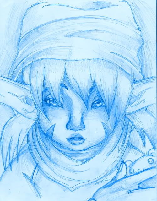
As for the actual pieces, some of it's hit or miss for me. I don't get the abstract stuff at all, but like the 4th one down (pixie-esque girl) is pretty good. Could be that it's the most polished of the bunch, but it actually seems like there's something intentional going on.
Keep things up, and go purchase some Prisma Colors.
Try using tones to seperate parts of the composition, not just line. As in, maybe a darker tone for whats behind and a lighter for whats in front.
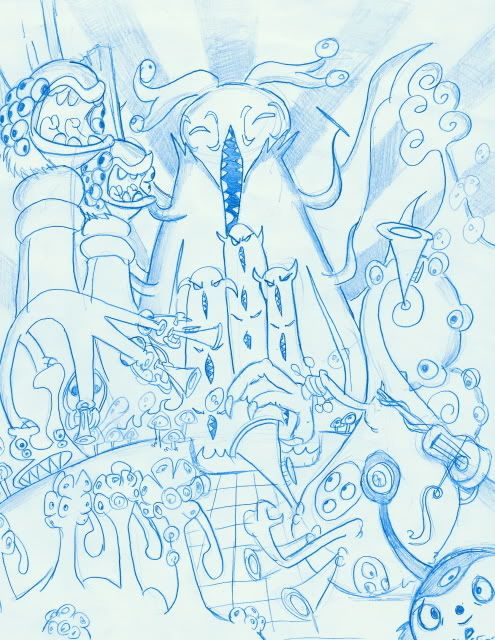
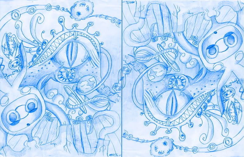
The abstract stuff is more of a stylized concept my friend wanted me to draw for him. It's more of a alienistic world than an abstract sketch.
Markers: I never used them, are they useful in making my artwork stand out more?
Color pencils: I haven't used colored pencils in the longest time, primarily because they're hard to use correctly, and impossible to erase..
Watercolors: I have a problem with using these: I haven't used them for 3 years and my old watercolor paintings look very dull :x . Also, I don't seem to have the money to afford watercolor paint..
Acrylics: I'd love to work with these, but they're too messy and too expensive..
Pastels: Haven't used them since I was in 5th grade, and I never liked them. I've seen really awesome artwork made from using these, but I never got the hang of them. Tastes, tastes, tastes.
I'll buy prisma colors by the weekend; I can't buy them now because I am busy with final exams.
Too many Strong elements? Lack of tones? Well, nobody told me that before about these.. Would you care to explain? Do I have to use a sketching pencil in order to make tones? Just to let you know, I used an office-type lead pencil, 0.7 mm for all of these, from the shading to the lines. I've been prefering these to traditional pencils used for artwork ever since I started drawing. If I have to deviate from them.. then I'm going to have a bit of trouble going professional. I will try and post more artwork this sunday.
To everyone: You see, I usually doodle (began by doodling, and improved by doodling), and I rarely create full-fledged artwork unless I have some incredible incentive to do so. I have never been criticized before, with members on other forums saying that these are flawless pieces of art, so I seem to have overshadowed alot of mistakes. I have limited money but I'll try and improve with all of your suggestions in mind.
Simplifying my light source? Well, I have a tendency to avoid common misconceptions with shadowing but not putting some logic of why and where light is there. Still, Would you explain?
Well, it's nice that you have an excuse for every medium of art, but the fact is these things take practice to do well. Make a trip to your local art store and check the prices. I don't know what kind of water colors you've looked at, but watercolor sets are practically the cheapest thing you can buy. It may not be superb quality, but it's sufficient. As for Prisma Colors, they have a whole line of products, ranging from color pencils (a personal sample at work) to markers to watercolor pencils. And on acrylics, they are one of the least messy paints out there, and cleanup is a breeze.
Basically, if you want to take art seriously, you're going to have to learn to use these types of things. Learning to do all your art digitally might get you a few pats on the back over at deviantart or some such, but it's not going to take you far in the real world. I know the temptation to work with colors than can quickly be "undone" is strong, but learning to work on the fly and anticipate things going unexpectedly is sometimes the beauty of art. As Bob Ross would call them, "happy mistakes" are part of the process, so don't be turned off by the idea of analog colors being difficult to correct.
Don't take this the wrong way, we're trying to give helpful advice, and tons of excuses won't encourage us to be forthcoming with advice in the future.
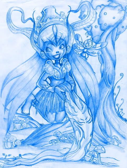
Lack of focal points and visual pathways, essentially. When you're planning out a peice, and especially if your'e planning out a scene (like the 5th one, with the girl and the tree) you want to make a little road for the viewers eye.
Think of the veiwer like theyre driving a car across your picture, you want them to come in at a certain place, then follow a path to look at all the different things, then either leave the picture, go back to the start of the path again, or stop at something important in the picture (a focal point). All this path building is done with a massive array of design and composition elements (everything from your lineart, to shadows, to the behaviour objects/figures themselves)
The problem with your scene peices is that they dont have this visual pathway, instead they have a whole bunch of broken paths, all running into each other. So when a person tries to follow a path with thier eye, they keep hitting dead ends, which is confusing and makes the image hard to understand.
I'd recommend going and finding some art you find attractive to look at (from wherever) and pay close attention as to HOW you look at it. Where does your eye go first? Where does it go next? how does it get there? etc etc.
He speaks the truth. Though digital media is perfectly useful and respectable, its not the best media for learning fundamentals. The reason your photoshop color is probably coming out all gross is because, though the digital color spectrum and the traditional spectrum differ, Color and how it relates to each other is a process that requires a lot of trial, error, and studying. Color is really something to tackle with all media, you learn different stuff from different things. The only mistake you can really make is avoiding everything because your afraid of messing up.
Its not that expensive untill you get to THE HELL THAT IS GOUACHE (sorry personal grudge).
You could at least try inking some of these things.
This board is a great place for serious art critique; that means people will pick apart every flaw in your work and tell you exactly where you stand. You can't get better if you don't know what's wrong. If you wanted I believe you could become a professional artist; keep in mind that like any other trade there is a substantial difference between the hobbyists and the practiced veterans, I think you're off to a fantastic start but there is definitely room to grow.
wii Number 0648 2052 0203 3154
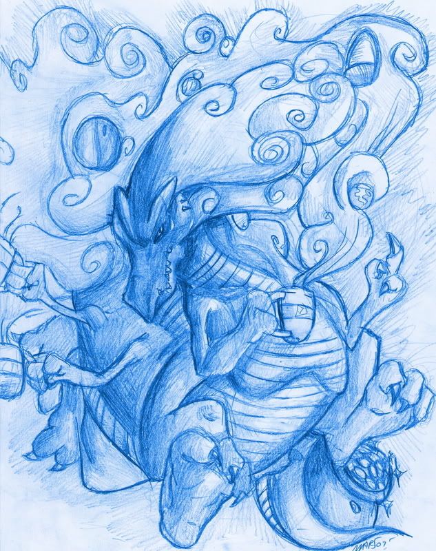
Which is this image:
http://i6.photobucket.com/albums/y235/Ashurasonic/Tyranny_and_Tea.jpg
The dragons hand - he's holding a cup but his claws don't seem to go around the handle of the cup?
The dragons left foot - the left most claw looks awkwardly right-angled, when it should be more diagonal like the other claws, perhaps...
Hmm, the tale looks a little small aswell...
Probably would have looked better if the dragon was red or green rather than blue?
But yeah, looks good but probably could be easily tweaked to be even better...
I will strive to improve constantly, but I won't stress myself too much either since I believe it's counterproductive. I am actually a hobbyist, and I do these for fun, not for professional review. I'm open to critique, but remember that I am not going to work more than I need. I have always pushed myself to be better when I'm in the mood. I do like your suggestion with me using colored pencils. I will try to learn from my mistakes, and I appreciate your help.
I want to anticipate building a tolerance over coloring with colored pencils, hoping to find a style that matches with my sketchy style. But I'm afraid of having to work over 10 hours a day to get there. D=
Thank you.
Ah, I see now. I have not really understood how I can manipulate this "road" you speak of since I was never taught that. I don't critically think when I draw (Like the pixie girl and the tree) the locations of objects and its importance, I just doodle as one does when he or she gets bored in class. I guess you're right; many people that I have shown art to get so confused that they don't understand what this or that is.
Ah, thank you. I'll take note of that when I draw more dragons.
You must think critically about your artwork as you do it. Why would any of us here care to give you any critique at all if there was a chance that you may just not be in the mood for improving? That is in fact what is counterproductive.
You do have potential, but before you begin mindlessly "improving" you are going to need to think long and hard about the work in front of you. You have to want it, it will not come to you.
Yes, you should look at your stuff critically, but having fun is definitely priority one. You're not making a living off of it; you're a hobbyist. Have fun with it. Now that doesn't mean don't try to learn. There is definitely room for improvement, but the process isn't as draconian as some make it out to be.
Now for some C+C:
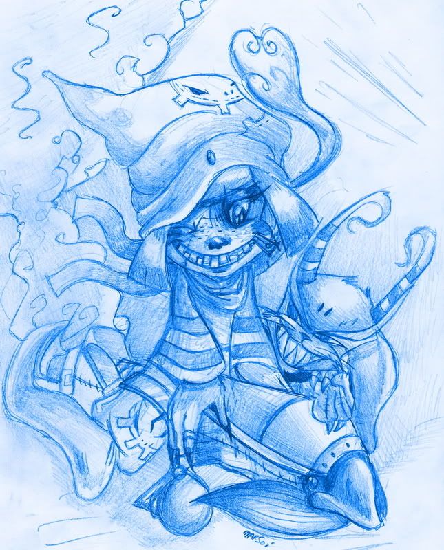
Pictures 2, 3, and 4 do indeed have too much stuff going on. There is no one focus. It's too cluttered and confusing. Still neat, of course. And if you insist on having so much stuff in one picture you could always do some extreme line variation to focus the viewer on one or two spots.
Pictures 1 and 5 are pretty nice. 5 especially. You could work a bit on your hands, and there are a few tangents like the cloud thingie and the right side of the hat bending right into it. And also the rabbit thing's ear is a little too close to her (her?) hair (hair?).
Spectacular:
http://forums.cgsociety.org/showthread.php?t=274320