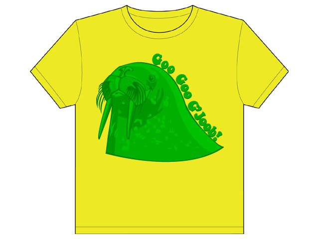
The new forums will be named Coin Return (based on the most recent vote)! You can check on the status and timeline of the transition to the new forums here.
The Guiding Principles and New Rules document is now in effect.
Haha, I posted it on the Crits page of threadless as well, and "The placement is bad" was one of the first things I got (That was with an earlier version, though, where the text was at the bottom)
Are you being sarcastic now, or is it actually good?
I don't think I'm ever sarcastic on these boards. Is that the perception ppl have of my coments?
No, I'm genuinly complementing you. Alot of times I see ppl make text flow in a way that is oposite to the direction that it's meant to be read, yours is spot on!
Oh cool, thanks. And also I'm sorry - I didn't mean to offend you in any way, hehe, I just wanted to make sure you wasn't pulling my leg. (And no, I guess you're never sarcastic.. It's just these boards that have made me kinda paranoid. You never know when you have a flame on your neck ;-))
What's wrong with the placement? Kids only like "off center and down to the person's left side" designs?
I didn't say there was anything wrong with it. But I did a lot of the Threadless 'judging' (which I'm convinced the staff doesn't actually take into account anymore ) and read a lot of the comments, and they never like the placement. XD
I was just curious. I thought it looked fine and was wondering if I was missing something.
I got this idea from a guy at Threadless, to knock it up another beatles notch - like make him a tiny captain on a yellow submarine or some shit. I would really like it to be more trippy. By given the little guy a huge admirals hat or summin...
So, now I need to make it more interesting, apparently. I was thinking some cool abstract graphics for the background. You know like twigs with leaves on em tangling around or something. Any ideas? Or should I go for the whole admiral's hat and strawberry fields show?
EDIT: Ah dang, forgot to make the lighter dots on the lower half. That looks kinda dumb. Will fix.
Helping out is what we do at the AC! You know, I don't really like the text there anymore, the balance of the walrus has shifted with the new lower body.
"The balance of the walrus has shifted", there's a phrase I never though I'd say.
The second one really made me smile. I like the super deformed idea a lot, but something about it just seemed a little off. To me the flippers don't look walrus-y enough. The head is so detailed and then it comes off looking just a little half assed. If you made them a little more walrus, and less dolphin shaped I think it would be perfect. Sorry if that sounds vague, I'll sketch up something in a sec to show you what I mean.
Edit: Kinda like this. Sorry about the poor quality but you get the idea.
I had a little issue with the back flippers, since they're actually curved forward and a walrus doesn't really have a tail - the back flippers make out the tip. So maybe that's a good idea ;-)
Hahaha I'd buy it. Not sure about what you could add though. I like the bigger text but maybe there should be a bit more space separating the words like in the old text. Now that I think about it, if you decide not to clutter it up with a bunch of other crap, you should just add a shadow under the walrus. I think it makes it look more solid. Another sketch to illustrate my point coming up.
Maybe you could make the walrus a lot smaller and have the text curve above it (like the top of a circle)?
That seems like it might be more simple, but possibly less interesting. =\
Alright! Thanks alot for the feedback. I'll definitely go for the shadow, Dangerous.
Also, I'll get to work on the text. Warp it up a notch - I think I'll stick to it flowing down the back, though, Lyrium, because, as you you said, it is more interesting. Of course I'll scale the design downm as well.
And I'll try out a few other color comboes. I won't make the background white, black or grey, though - that's too boring I could go for a mellow light blue or something, though - whattaya think?
I warped the letters some, but I'm not sure if it's good?
And I made some color comboes - what do you think?
(Obviously I went for the trippy feel, with the pink, teal, yellow and green, but threw in the blue-ish grey one for another perspective)
How about a really, really girly one with pink all over the place? :P
The design looks like a perfect size. the color combos are great.
Personally, I'd say that the font doesn't match the walrus at all. The walrus is acurate and realistic. Now, if the walrus was scewed and round and bubbly trippy lookin, then that font would be suitable. OR, maybe if you picked a different font that matches the design you already have.
decoy_octopus on
0
KalTorakOne way or another, they all end up inthe Undercity.Registered Userregular
What color combo do you like best? Say, if you had to buy one of them, which one would it be? (Or would you prefer a whole different color combo, or maybe one of them tweaked a bit?)
Decoy, you may be right. Although, the walrus is deformed quite alot, and with the crazy color, I don't think the text is that much off. But I guess what you're saying is, I should make the walrus more trippy, if it had to fit the whole acid-trip thing (=the text)?
I like the text how it was. Just a little more spacing and I think it'd be perfect. If you really want to add more stuff, maybe a flat colored elipse of an anologous color behind him. I think the color options are great though.
I hate to be a pain, but can you make me a quick visual example of that, dangerous? Nothing fancy, just to illustrate? I think I maybe understand, but I'm not quite sure.
By the way, I do have one more color to use (the design contains 4 atm and it's max 5+tee color), so I could either use that for the said elipse or a shadow, as you mentioned earlier. I tried to make the shadow with existing colors, but that doesn't work out. It has to be more greyish or something.
Sorry I had intended to draw it out but I ran out of time. I was thinking something like this.
Also I didn't realize there was a color limit. Hmm that could be a tough choice. Well whatever you think looks best!
Hmm. To be totally honest with you I hate the colors there. It's a detailed walrus with few colors. That's fine (it's artistic I suppose) but I dunno, it just looks weird to me.
I like the teal the most, but it's so dull. I liked the vibrant yellow and green colors. How about some red on gray? I understand the "Trippy" feeling you're going for, though, so that may not be an option; I also realize I just contradicted myself throwing out a red and gray color combo after I just mentioned the lack of vibrant colors :P Maybe an orange on red?
If you take only one thing from my post though - I wish those letters were like they used to be, curving with the walrus!
I like that shadow a lot. The shirt is overall great. Maybe my first t-shirt purchase on the Internet ever..
SheriResident FlufferMy Living RoomRegistered Userregular
edited May 2007
I realize you already submitted it, but here's what I was gonna say --
I hate that warped text (so I'm glad you went back)
My favorite color combo was the steel blue on grey -- the most 'normal,' I guess. Of the ones you submitted, I like the teal, I guess.
Posts
Great walrus drawing. I'm not entirely fond of the green + yellow color scheme though..
They never like the placement.
Sheri Baldwin Photography | Facebook | Twitter | Etsy Shop | BUY ME STUFF (updated for 2014!)
Haha, I posted it on the Crits page of threadless as well, and "The placement is bad" was one of the first things I got (That was with an earlier version, though, where the text was at the bottom)
Are you being sarcastic now, or is it actually good?
Flickr ... Myspace
I say keep working on it, since it's a good idea and kind of clever. Try a full walrus instead of just a "bust."
I don't think I'm ever sarcastic on these boards. Is that the perception ppl have of my coments?
No, I'm genuinly complementing you. Alot of times I see ppl make text flow in a way that is oposite to the direction that it's meant to be read, yours is spot on!
Flickr ... Myspace
I didn't say there was anything wrong with it. But I did a lot of the Threadless 'judging' (which I'm convinced the staff doesn't actually take into account anymore ) and read a lot of the comments, and they never like the placement. XD
Sheri Baldwin Photography | Facebook | Twitter | Etsy Shop | BUY ME STUFF (updated for 2014!)
I was just curious. I thought it looked fine and was wondering if I was missing something.
Any ideas? Something trippy, maybe - it does refer to an acid trip song
Flickr ... Myspace
I'll get right to it
Flickr ... Myspace
Flickr ... Myspace
I totally ripped you off, Toaster :P
So, now I need to make it more interesting, apparently. I was thinking some cool abstract graphics for the background. You know like twigs with leaves on em tangling around or something. Any ideas? Or should I go for the whole admiral's hat and strawberry fields show?
EDIT: Ah dang, forgot to make the lighter dots on the lower half. That looks kinda dumb. Will fix.
Flickr ... Myspace
"The balance of the walrus has shifted", there's a phrase I never though I'd say.
Flickr ... Myspace
On the other hand, the 60's.
Hmmmm.
Sheri Baldwin Photography | Facebook | Twitter | Etsy Shop | BUY ME STUFF (updated for 2014!)
Edit: Kinda like this. Sorry about the poor quality but you get the idea.
I had a little issue with the back flippers, since they're actually curved forward and a walrus doesn't really have a tail - the back flippers make out the tip. So maybe that's a good idea ;-)
Back to work, hehe.
And thanks again guys, the feedback is awesome!
Flickr ... Myspace
Also I made the text larger - I think that works better?
Flickr ... Myspace
Like, the size of one of the Threadless Select Tees designs.
Maybe scale it down a bit?
Sheri Baldwin Photography | Facebook | Twitter | Etsy Shop | BUY ME STUFF (updated for 2014!)
Aigh, I hear ya. It was just to make it as big as possible, though. You know, so it's easier to see, heh.
Anyways, I need to figure out how to make it more interesting...
Any ideas?
Flickr ... Myspace
Give them a couple color combos (both walrus and t-shirt), they like that.
Sheri Baldwin Photography | Facebook | Twitter | Etsy Shop | BUY ME STUFF (updated for 2014!)
That seems like it might be more simple, but possibly less interesting. =\
EDIT: example
P.S. your walrus is really cute!
facebook.com/LauraCatherwoodArt
Also, I'll get to work on the text. Warp it up a notch - I think I'll stick to it flowing down the back, though, Lyrium, because, as you you said, it is more interesting. Of course I'll scale the design downm as well.
And I'll try out a few other color comboes. I won't make the background white, black or grey, though - that's too boring I could go for a mellow light blue or something, though - whattaya think?
Thanks, I think so too :P (it actually turned out alot cuter than I intended. Initially I wanted it to be more... odd)
Flickr ... Myspace
I warped the letters some, but I'm not sure if it's good?
And I made some color comboes - what do you think?
(Obviously I went for the trippy feel, with the pink, teal, yellow and green, but threw in the blue-ish grey one for another perspective)
How about a really, really girly one with pink all over the place? :P
Also, is the design still too large?
Flickr ... Myspace
Personally, I'd say that the font doesn't match the walrus at all. The walrus is acurate and realistic. Now, if the walrus was scewed and round and bubbly trippy lookin, then that font would be suitable. OR, maybe if you picked a different font that matches the design you already have.
I just wanna pinch his widdle cheeks...
What color combo do you like best? Say, if you had to buy one of them, which one would it be? (Or would you prefer a whole different color combo, or maybe one of them tweaked a bit?)
Decoy, you may be right. Although, the walrus is deformed quite alot, and with the crazy color, I don't think the text is that much off. But I guess what you're saying is, I should make the walrus more trippy, if it had to fit the whole acid-trip thing (=the text)?
Flickr ... Myspace
By the way, I do have one more color to use (the design contains 4 atm and it's max 5+tee color), so I could either use that for the said elipse or a shadow, as you mentioned earlier. I tried to make the shadow with existing colors, but that doesn't work out. It has to be more greyish or something.
Flickr ... Myspace
Sorry I had intended to draw it out but I ran out of time. I was thinking something like this.
Also I didn't realize there was a color limit. Hmm that could be a tough choice. Well whatever you think looks best!
I like the teal the most, but it's so dull. I liked the vibrant yellow and green colors. How about some red on gray? I understand the "Trippy" feeling you're going for, though, so that may not be an option; I also realize I just contradicted myself throwing out a red and gray color combo after I just mentioned the lack of vibrant colors :P Maybe an orange on red?
If you take only one thing from my post though - I wish those letters were like they used to be, curving with the walrus!
I like that shadow a lot. The shirt is overall great. Maybe my first t-shirt purchase on the Internet ever..
... with the feedback from the guys at threadless and you guys in mind - thanks alot!
Flickr ... Myspace
I hate that warped text (so I'm glad you went back)
My favorite color combo was the steel blue on grey -- the most 'normal,' I guess. Of the ones you submitted, I like the teal, I guess.
Sheri Baldwin Photography | Facebook | Twitter | Etsy Shop | BUY ME STUFF (updated for 2014!)