The new forums will be named Coin Return (based on the most recent vote)! You can check on the status and timeline of the transition to the new forums here.
The Guiding Principles and New Rules document is now in effect.
My best friend is an artist...I try to be like him!
Disrupter Registered User regular
 Registered User regular
Hey all, Ive always enjoyed doodling in my free time, though ive never been very good. One of my good friends is a kick ass artist (goes to art school and puts his class mates to shame) and I feel good when I can show him something I did and get his opinions on it, especially if he thinks it doesnt blow. So with that in mind, I figure you guys could help me blow less.
First off, I use the mouse to draw, so I know my edges arent clean, any tips on fixing that? I might get a tablet in a month or two, so hopefully that will help...
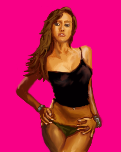
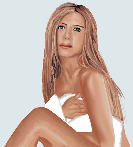
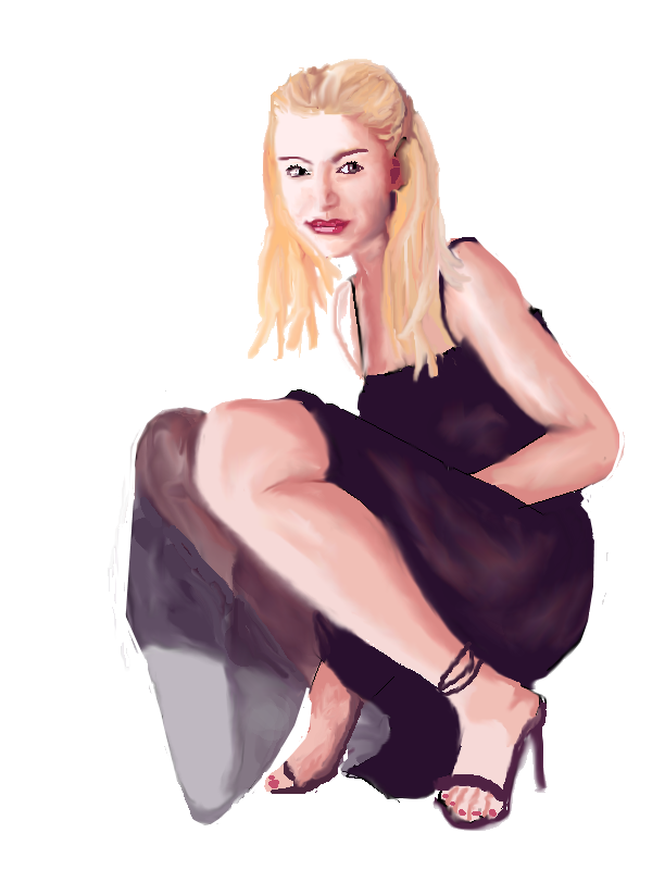
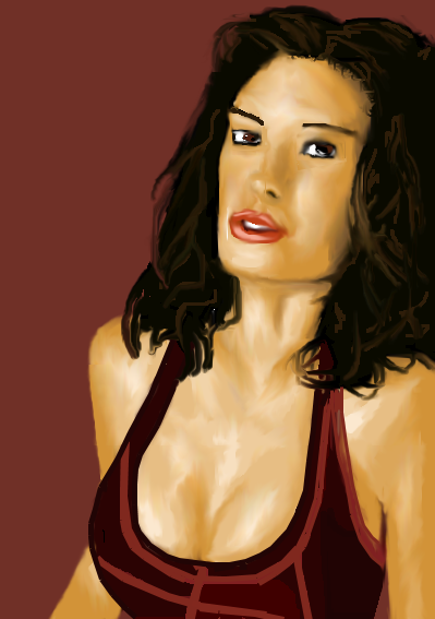
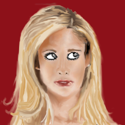
Heres some various celebs ive practiced drawing, some I enjoy (the jessica alba) others I dont at all...(the jennifer aniston) but I figure critique is critique...
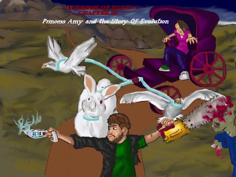
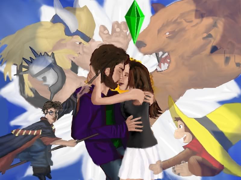
And here are two "desktops" i made for my girlfriend combining some of her favorite things. With these, although skill critiques are welcome I also would like some discussion about how the images are layed out, since these were more creative and not just drawing from life...especially with the second one.
The first one I went with a sort of "cell shaded" attempt at a style...
The second, more realistic...
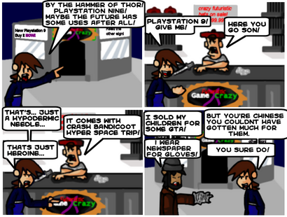
And finally, just because man, I always see people get absolutely destroyed when they post comics, I want to post a comic I used to do years ago (but havent touched in years, but might oneday pick back up if I ever have free time) to see how badly it gets torched. Did I steal PAs style? Is the art even passable? The comic doesnt focus on videogames, but since me and my friends do play them, it did go there every once in a while. In this comic comic me was maliciously fooled into going into the future and is now stuck there...
First off, I use the mouse to draw, so I know my edges arent clean, any tips on fixing that? I might get a tablet in a month or two, so hopefully that will help...
Heres some various celebs ive practiced drawing, some I enjoy (the jessica alba) others I dont at all...(the jennifer aniston) but I figure critique is critique...


And here are two "desktops" i made for my girlfriend combining some of her favorite things. With these, although skill critiques are welcome I also would like some discussion about how the images are layed out, since these were more creative and not just drawing from life...especially with the second one.
The first one I went with a sort of "cell shaded" attempt at a style...

The second, more realistic...

And finally, just because man, I always see people get absolutely destroyed when they post comics, I want to post a comic I used to do years ago (but havent touched in years, but might oneday pick back up if I ever have free time) to see how badly it gets torched. Did I steal PAs style? Is the art even passable? The comic doesnt focus on videogames, but since me and my friends do play them, it did go there every once in a while. In this comic comic me was maliciously fooled into going into the future and is now stuck there...


Disrupter on
0
Posts
And?
And... they will haunt my dreams forever?
And? Do you have anything useful you can offer to help improve the eyes you so declare MESSED UP?
Maybe try to get your anatomy (especially facial structures) straight before embarking on the whole digipainting thing?
Flickr ... Myspace
And as for the facial anatomy. Believe it or not, painting these has helped me learn a lot. I know I should probably sketch more for practice rather then painting because its quicker. But at the same time, the time spent focusing on these paintings has made me focus on what casts shadows where and why, thus helping me learn how the face works. The most recent works I did were the two "desktops" which werent drawn from life pictures and although are less realistic, I hope at least show an improvement in anatomy knowlege.
I guess, how will I learn the details in the anatomy of the face without practice?
And yes, you nailed my "technique" perfectly. I paint hard and then use smudge to try to paint. Do you recommend a tutorial in particular to start with? I notice there is a "ghostly" kind of blur with a lot of the girls and an oddly sinister look to some and Im not sure why...
I had the same issues when I took a painting class last summer. The teacher refused to help me break that and instead said it was my style and the class agreed it looked cool. Woo for not hurting peoples feelings...but not woo for failing to help me grow.
Your art teacher is a numbskull. Or maybe he's just lazy. Saying "it's your style" sure saved him alot of further work.
Flickr ... Myspace
The whites of the eyes; they’re completely white, real eyes will have shadow just like any sphere, particularly just below the eyelids and in the corners.
Fingers and toes, just ew. The fingers on Jessica Alba look like stripes of bacon. Hands are really tough, the only solution is to draw them over and over until you begin to understand the shape. If you look around the site you can find lots of great resources for hands and all sorts of other stuff.
Your proportions are for the most part rock solid; except in the bottom two where they’re suddenly pretty skewed, this is why I suspect you may be tracing. Harry Potter’s lower body is just a blue blob, even though he’s wearing a robe there should be some definition on the legs, same goes for the feet. The kissing couple is so-so, the girl is pretty good but they guys head is way too large; his arm (particularly the forearm) is way too long. Thor, the bear and curious George look really good, kudos if you drew them, if they’re traced you haven’t really demonstrated anything.
As for composition; one thing that really stands out is how you’ve done a transparency with Harry Potter’s arm rather than having it go behind the couple entirely; it takes the focus away from them somewhat, also the fact that Harry is the only character in the piece that’s looking directly at the viewer puts more attention on him than I think you would want.
wii Number 0648 2052 0203 3154
http://www.deviantart.com/deviation/34562471/?q=painter+tutorial&qh=boost%3Apopular+age_sigma%3A24h+age_scale%3A5
(You have to click on that hideously stretched image to make it show up)
Oddly enough the bear and the viking were done from very rough references ( logos for the sports teams they represent). Where as most of my other drawings use an actual pose as a reference, those two were done just from my mind and in the case of the viking, looking at my own arms and hands...
So, compliments on those make me smile
And I agree the focus is on harry way too much and I think its due to his death gaze towards the viewer.
Ill definately check out that tutorial and try to post the resulting improvement in my work.
And, I did (in the past, not so much now) do a lot of pencil sketches in my time, mainly during class. But for purposes of getting critiques, since I have no scanner, the pure digital art is the only option. Plus I have trouble giving any sort of dedication or real effort to a pencil sketch, so the quality is usually pretty crap.
As for the eyes, treating them as spheres might help me a ton, so thanks for that advice.
I owe you an appology for the implication of tracing; honestly you would put a few people in art school to shame yourself. And the fact that you used a mouse for these; wow, just wow.
wii Number 0648 2052 0203 3154
Did you read any other posts in this thread before submitting that?
Flickr ... Myspace
I think the biggest thing would be to tone down the harsh black lines used around the eyes. These paintings mainly use change in color and tone to suggest edges, and then BAM, he starts using lines to define the eye shapes. I would suggest staying consistent while rendering the entire image, and not giving the eyes their own special treatment. If you are using tone instead of line to render your image, make sure you do the same for every part, unless you're going for some kind of emotional or creative/abstract effect. Remember, they aren't actually eyes, they're only a mixture of colors/shades/lines that represent an eye.
Also, they just don't look like eyes.
Do this tutorial. It will blow your mind. http://features.cgsociety.org/story_custom.php?story_id=3165
Anyway, I still think the eyes are an improvement from my earlier stuff.
Is it an improvment? How can I help fix the eyes. Cause I also know that comparing my painting to the original photo, the eyes are one of the main differences. I struggle with them so...
yup and i still maintain that is seems like he's painting badly over photos.
basically you're trying to run, but you don't know how to walk.
break down the face and anatomy. notice that yours has some elements that keep it from looking great. you don't seem to understand the basic structure of the anatomy and face. seem like you're just mimicking waht you see but not really understanding what you're drawing.
here what i would like you to do. break down this picture into basic shapes. see "through" the figure
break down the head as well, don't worry about color, worry about everyting being where it needs to be.
you neck looks almost like it's dead on, your eyes aren't on the same plane where her sockets should be..things like this need to be correct before you need to really worry about tons of color and whatnot.
just my 2 cents.
yeah, but im not...so I dont see how thats helpful. But Ill take it as a compliment since if it looks like im painting over a photo (although be it "badly") i must be doing SOMETHING right.
And,I realize that I am jumping a bit ahead with the full digital painting when perhaps I should be practicing just facial structures and anatomy and what not. But,its not like Im NOT getting the practice by doing what Im doing, its just taking longer I suppose. I think focusing on the tones of color helps me better understand whats casting the shadow and makes me focus on WHY those changes in color are occuring and what structure of the face is causing it.
But really what you gotta do is draw from life and all that stuff we say all the time. Still, better pictures will help.
Yes and no. As a hobbyist what you’re doing is fine; but you're also kind of running in circles. You have a good eye, solid co-ordination considering you’re working with a mouse and you have a good sense of color but if you want to get better (and why else would you be here) you should stop drawing from photos and do some work on live models, 3D objects are a whole different animal (check the figure in perspective thread to see some debate on the subject). Get a mirror and do self portraits; I’m not saying you have to post them (though you should) but if you do one every day for a week you will notice an improvement.
As for your latest work there’s no real improvement from your other pieces. With the eyes try to remember that the lightest part will be near the center; the darkest part will usually be just below the top eyelid and the corners; also it never hurts to add a dot or two of light glare. Some of the problems in the piece are probably due to the mouse but for the sake of critique I’m going to proceed as if that’s not the case; never blame your tools.
The light line on her right shoulder (our left) needs to blend in with the rest of the shoulder, also it’s uncommon for the brightest part of an object to be the very edge. If the light source is in front of the object (coming from roughly the same direction as the viewer) the highlight will never be on the edge and there will be a moderate contrast; if the light source is directly beside the object the highlight will be on the edge but the opposite side of the object would then be a lot darker, if the light source is behind the object the outer edges will be fairly bright but everything in the center will be dark. Ridges will be lighter indents will be darker and the sharpness of a curve will determine the level of contrast.
Go to a room with a single light source; a light bulb hanging from the ceiling is ideal. Get a ball and move it around and watch what happens with the shadows. Do this with other object; make a mental note of where the light and shadow go as you move them. Draw these objects over and over; if you want to get really serious I would say fill a sketchbook from start to finish.
And then there’s shape and form; that’s where most teachers will get you to start but since your focus seems to be color I’ll leave that for now as I’m getting really close to TLDR.
wii Number 0648 2052 0203 3154