The new forums will be named Coin Return (based on the most recent vote)! You can check on the status and timeline of the transition to the new forums here.
The Guiding Principles and New Rules document is now in effect.
this poop just got real
tmccool Registered User regular
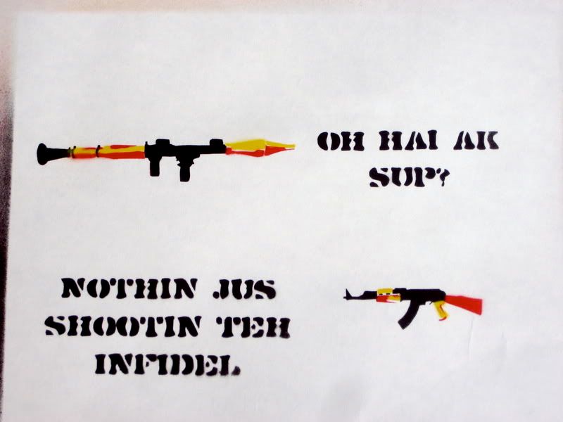
so ive been cutting and spraying all day and this is what ive come up with. im thinking about making prints or tshirts with some of these ideas. now, part of me wants to screen print onto shirts to make it look legit, but the other part of me doesnt want to spend that much money on the chemicals i need (i have screens and a squeegee, so i dont have to buy that stuff).
ive only posted 2 of these in the doodle thread but now that ive got 5 cut out i decided to make my own thread, and because i have more ideas that im planning on cutting out. ive talked to a couple of friends about it but i wanted that special internet opinion, so what i want to know from you guys is if these designs are legit. i really could use some feedback from strangers instead of the parental "awwww thats super." i know we have some art stars on this site so im really banking on some critiques here.
if you read all of that then im sorry im too lazy to capitalize letters and use more punctuation, so here are my sprays already:
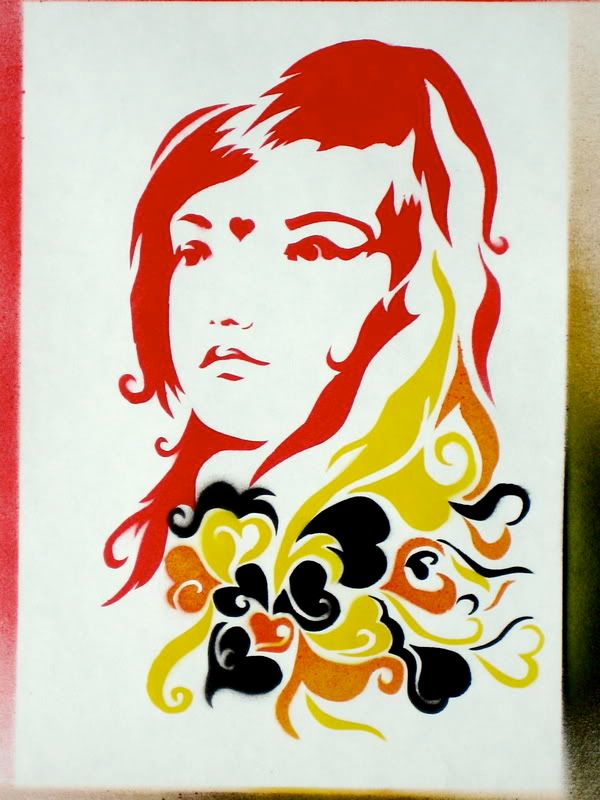
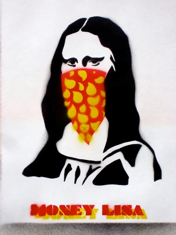
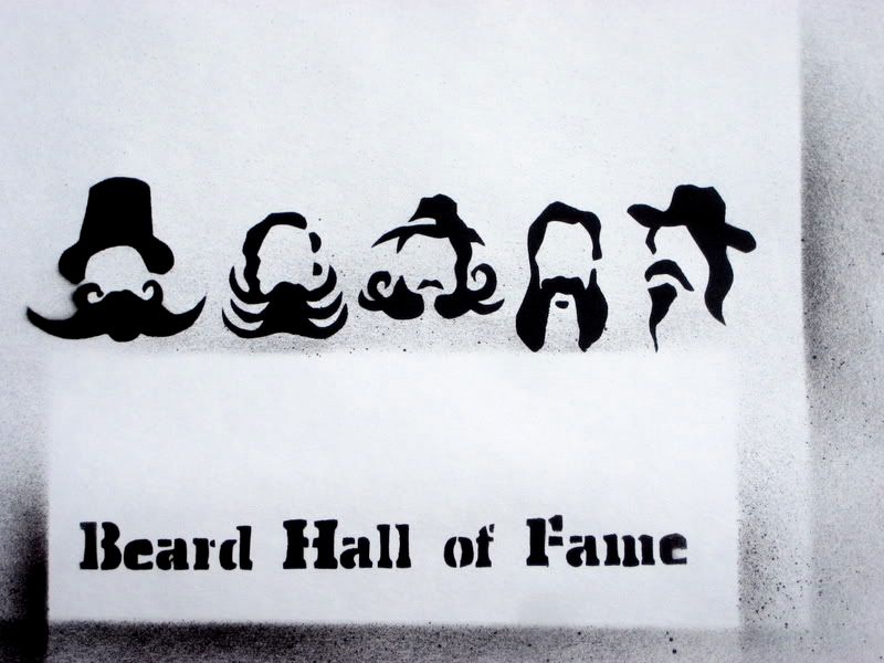
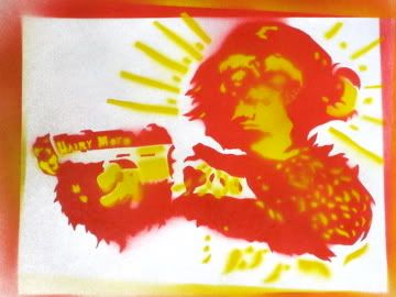


tmccool on
0
Posts
These definitely have some potential...I wouldn't mind seeing some more along the lines of the first one.
I find the first one to be pretty interesting compositionally, thanks to 4 colors and very interesting shapes, but the others are not so great. The beard one is boring, one color, one stencil, small images and big text, yawn. The AK one is also boring, too much text, not enough color, not enough focus on the small images. I'd want the image to be big and dominant and central, to grab the viewer's eye. The first one accomplishes this. The mona lisa one has the right idea but it could use more variation, the single big block of color of the bandana superimposed on the black mona lisa is kind of grating, and it doesn't have much in the way of interesting shapes.
What exactly do you mean by a design being "legit?"
Oh yeah, the monkey one has interesting shapes, but only 2 colors, and it's kind of blurry and small.
;_____________;
I really didn't mean to do that.
The rest, eh. I was never a big Banksy fan.
@bahamutZERO: yes, i call these stencils. that's the commonly accepted name for them.
@Bongo: mona lisa, sure, ak's and rocket lauchers i can understand, monkeys with guns... maybe these have all been done before, but come on man, even the beard hall of fame?
so im definitely going to revisit the monkey drawing, maybe rework a few others. but yeah i like the feedback.
here are two more designs... the first one i did a mock up on my computer that looks a bit crappy because i was using the pen tool with my laptop so i dont have very good lines on it, but i had something like this sitting in my sketchbook and i feel like its more along the lines of the first ones... maybe even a little too similar to it. i also was completely indecisive about whether it should have text and how much.
the second one is a rough sketch for my instructional guide to dancing the thriller. i dont know about you guys, but it makes me laugh when i see it. i just need to draw more michael jackson-esque clothing.
more are on the way
Ditto.
And I know I've definetly seen it sprayed up too (along with everything else to ever go up on one of those threadless style sites).
Maybe this is pure coincidence, but that was a rip off from some other urban graffiti artist in London. If only I could remember his name. The only other thing I remember was that he never liked to have his photo taken, always dressing up in disguises each time he went to paint in public.
Anyways, he later redid that piece on the same billboard with both of them in banana suits.
Theres lots of info on www.stencilrevolution.com, and on the forums there. I also used to stencil a lot.