The new forums will be named Coin Return (based on the most recent vote)! You can check on the status and timeline of the transition to the new forums here.
The Guiding Principles and New Rules document is now in effect.
Before u begin Bashing my work...i must say i kno i need improvement in many areas, which is why i am posting on Forums like this instead of Deviant Art place thingey (even tho i have an account w/ em) ^_^
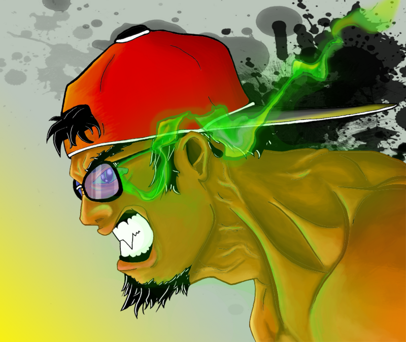
o.o If thats a real self portrait...man, where DID you get the green eye glow? Cause' I gotta pick me up some of that.
>.>
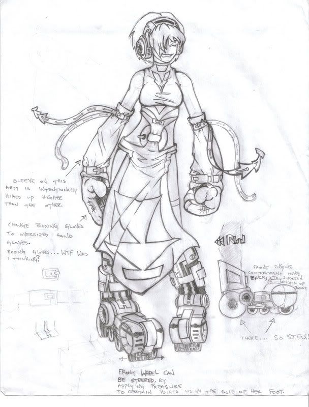
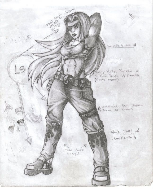
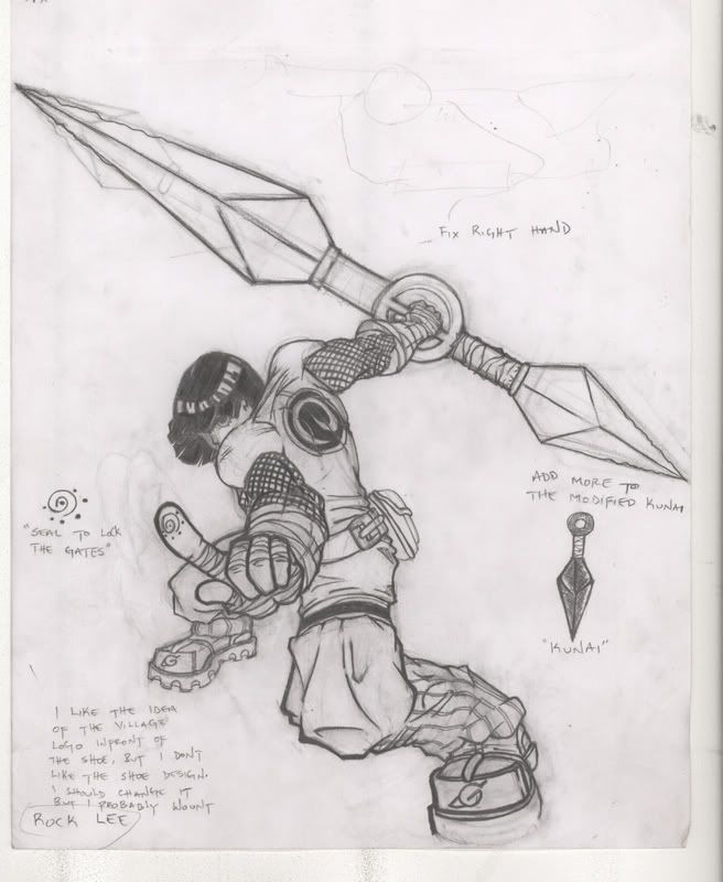
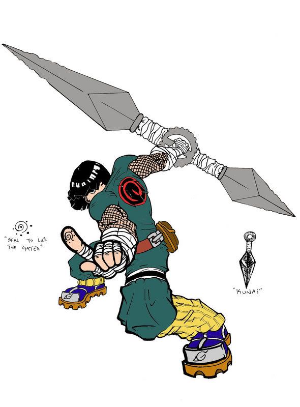
Nah, some really nice work here. 3D art is nothing i've ever tried, so I can't really say anything on it, but looking at your' "by hand" work, I gotta say I love your' pencilwork almost as much as you love the American Comic Book style. Crazy muscles. I'd tone em down a wee bit, but thats just me. The shading you have, though, and the light lines work very, very well. That, and the amazing ability that you seem to posess when it comes to drawing feet and shoes... >.> *envy* Not sure if I like the flat colors on Lee, however. Seems to detract from the piece overall.
I don't know if it's just my affection to not so muscular bodies but maybe toning down the muscless would make them look a bit more natural than they are right now. Welcome to the AC man. Keep posting and good things will follow
BroloBroseidonLord of the BroceanRegistered Userregular
edited August 2007
Everything looks solid, but you need to work on your lighting and composition. None of your pieces really show the kind of dramatic lighting necessary to create more realistic pictures, which I feel is holding them back. Even bear-cat- metal dude (Kylun?), who has a bit of blacked-out shadows going on, lacks consistent rendering across his fur sections to make his lighting work as effectively as it could.
You might want to look at Alex Ross, whose work is strongly influenced by Andrew Loomis, since he does that style really well.
one quick thing i noticed, your neck muscles on your self portrait. barring exaggeration, the muscles look like three triangular pancake thin slabs of meat rather than the actual bulging muscles you were going for. possible reasons behind this: your choice of shading, the bold outlines, the general shape you chose to draw them in.
anyways, the coloring is coming along nicely, big improvement over your other stuff.
So far i have noticed a theme here..."TONE MY MUSCLES DOWN" ^_^. The pics of myself, Kylun, and Juggernaut were my attempts at OVER exaggerating muscles. I tried 3 different approsaches. W/ Kylun i wanted to keep em close to actual muscles but just exaggerate the scale of them. For my self portrait i was going for a crazy mid/early transformation where my muscles were doing whateva they wanted so the bottom line is that the muscles are there but they are COMPLETELY out of wack. and for the juggernaut i wanted to push muscles as far as i could go with out making him look alien (guess i went to far huh). for some odd reason i find drawing realistic muscle structure to be boring which is why i have a tendency to go crazy with em, even on my female characters (IE: SunPyre). you all do make a good point. i NEEED to tone it down. i have to force myself to draw regular old boring muscles and get pro at that before i attempt to exaggerate em.
I dunno...i have a decent understanding of muscle structure but EVEN when i want to draw realistic muscles i end up w/ somethin like this. Its a habit that i need to break
even tho this pic was done a while ago and it sux i'm gonna put it up here to show that i do draw almost normal muscles LOL
BTW..she is wearin a mask
DAMN Mark...thanx for reminding me...i intended to take the think outlines in the neck muscles out...how did i miss that?...O_o
I think you have a good general sense of anatomy, albiet axagerated. I think you also have some kind of handle on technique, moreso in your penciled stuff than your colored.
But I really think you need to work on the design aspect of all these. I feel like every concept and idea posted in this thread has been done maybe 1 million other times. But your own spin on it! You dont want your work to be known as some kind of convoluted jumble of 90's video game and comic book styles.
You have some very nice work here. However you are having a hard time finding a middle ground between your line work(comic stuff) and no line (3-D stuff). If you want complicated shading, no lines. If you want simpler shading, keep the lines. You need to realize that the comic and 3-D styles are very different ways of depicting something before you can combine the two together well.
I see this problem really show itself in your self portrait(which is a cool piece). You gotta decide what style of you want to use for which parts of the picture.
1.Take the lines out of the dude's skin and deepen the shadows of the muscles and veins etc. Also soften the shape of the adam's apple because it's too angular.
2.Put better shading into the hat and take out the lines making the "folds" on it.
3.Edit the eye so it looks like an eye in profile.
4. Add in more details of the ear and make the earlobe thicker.
5. Use reference photos to check your basic anatomy.
Figures are looking a little stiff and disjointed, not overly so, but some gesture drawing may help your figures flow a little more naturally. Toning down the muscles and doing that should help a bunch.
The colors are pretty weak. Try coloring on a base color (something that isnt white filling the BG) and using a different color to shade with rather than a tint of the color you're using already. For instance, try shading with a purple or highlighting with a yellow.
honestly you dont need tutorials. and don't that as a compliment either O_O its not meant as one. the best way to get better is simply to practice. look at artwork you like, coloring styles you like (and i know you have a shitton of them) and just try to emulate what they do. over and over and over again.
following tutorials isn't a bad thing, its just not something you should rely on. but if your itching for some digital painting tutorials, hit up youtube and type in "speed painting tutorials" and you'll get a bunch of stuff.
and i 2nd what someone else said about your style, it has no uniqueness to it, it is clusterfuck mess of all the stuff you like with none of the aesthetic appeal. for instance, when u draw your muscles super bulgy, make them cool to look at, not "omfg his neck is going to explode" kinda thing. when designing complex machinary, dont just slap random nuts and bolts everywhere, give it a shape, a defining feature, and make it FUN to look at, not just complex.
in any case, welcome to ac, stay awhile, its fun here, you'll like it.
What i need are some good photoshop comic style coloring tutorials....but those are IMPOSIBLE to find online.... so HELP!!!!
ohhh yea a video tutorail would be even better
Frankly I don't think you need to be working digitally at all at this point. The way I see it drawing is a natural progression into painting. You start with line and form, work up to light and values, and once that is mastered you finally throw color theory into the mix. Things start to go very wrong usually when people skip steps before they're ready.
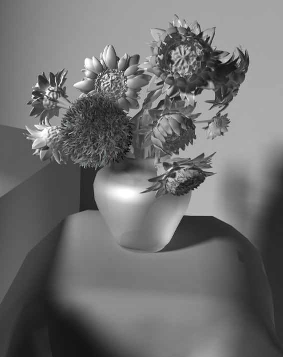
Your 3D renders are convenient because the computer figures out all the shadows for you, but your drawings are much more telling. None of them show a strong command over lighting. You have drawings that are very rendered and even have token lightsources marked in them, but you are clearly struggling to apply the lighting to such complex figures. In the end what you've done is called "local" shading, where you simply make forms whiter towards the light and darker on the other side.
This is NOT how light works in real life. Light bounces off objects depending on what material it's made of and refracts out at different angles casting itself on an object in a multitude of complex ways. It's almost easier to think about light as water flowing over your subject and splashing around than simply as straight rays eminating from a point.
All the photoshop tutorials in the world can't fix this problem for you, but there's good news. All you have to do is pick up a pencil and sketchbook, and observe from life how light really reacts. Look at different shapes and different materials with light at different distances. It seems almost stupid when you think about it- "study light", you see light every second your eyes are open all day. If you stop to look though there are lots of things you can learn about light that are not readily apparent from passive observation though. Once you learn all the rules then you can successfully apply them in imaginary situations.
...so you cry green tears when you're angry? you should see a doctor, man. XP
Anyways. your art has a very nice , strong, line quality to it. however, your figures suffer form some level of dwarfism, something that i noticed is quite common among people that learn drawing from comics. it is best that you start drawing some real life figures.
and speed painting involves more of what you could call a fine art approach (which would not hurt you to know)
I actually JUST started learning the science of light in school. all thanx to 3d studio max. I had no idea about main light, bounce light and reflective light. i will do more studies on how light works and apply them to my drawings. before i started going to the art institute i never did ANY type of digital coloring at all and on my first day i was THROWN into it and expected to excel but as u can see my digital coloring suffers a lot. mostly cus i tend to be lazy and dont take the time to practice as much as i should or study how other ppl do it. dont get me wrong tho, i DO practice just not as often as i should. and it clearly shows in my work. speaking of which....time to go draw somethin. ^_^
Mark, when u get back...see me in some Tekken, your will get OWNED son...
btw i tried speed painting tutorials in youtube n got a ton of fine art painting videos, wusup w/ dat?
ya tekken'd b fun, i learned alot from the players in korea, my sidestep cancels are rediculously fast now, i'm able to ss around any non tracking hits and either sidegrab, or if you continue to hit 2 on a combo, its a backgrab. fun stuff, learn your tracking moves
try typing in speed painting tutorials on google, it should link u to youtube
Hey Mark,
I just finished workin on this pic for my intermediate 3d modeling class. I need your insight on my composition and geometry. BTW i am only about 75% done w/ the dinosaur. I still plan on adding more muscle structure in his tail and neck and define his face a little more, and make the straps on his harness look more like leather.
Everyone else pls feel free to give me an honest opinion
The tail's too straight. I'd make it bigger, too, to balance the dinosaur's front half.
On a different sort of technical note, those chains are going right in front of its eyes. That seems pretty problematic to me for steering, especially since it doesn't really have good forward vision. The angle those chains are going at looks to me like he'd have difficulty applying enough force to turn the dino quickly. On a horse the bit is quite near the end of the horses head, allowing for more leverage. Additionally, you've got the bridle hooked onto its chestplate, which means the weight is going to be constantly pulling back on its head and it's going to want to stop or even back up. Getting that dinosaur to g forward (much less steer it) is going to be a pain with that setup.
I think it'd make more sense to have the 'bit' portion go through a piercing in its nose or something like that...
The guy looks like he's standing on the floor, not a moving dinosaur. I'd expect him to at least have his knees bent...
This was done as a class project. The criteria was to use "symmetry mode" in 3d s max. Which is why the tail is so straight. I will make his tail bigger to balance out the front end of the model. I am having a little trouble following what you are trying to say about the harness and chains. Probably because its 3AM!! However, I do see the chains blocking the dinosaur's vision. BAD ME!! ^.^ Maybe you could save the picture and in Photoshop you could illustrate over the model to show me what I did wrong w/ the harness and how to correct it.
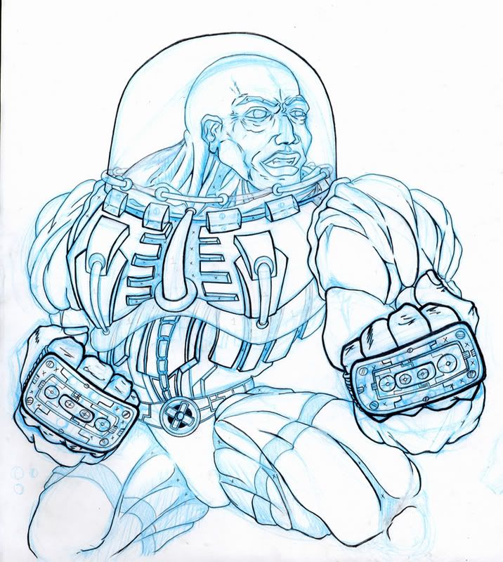
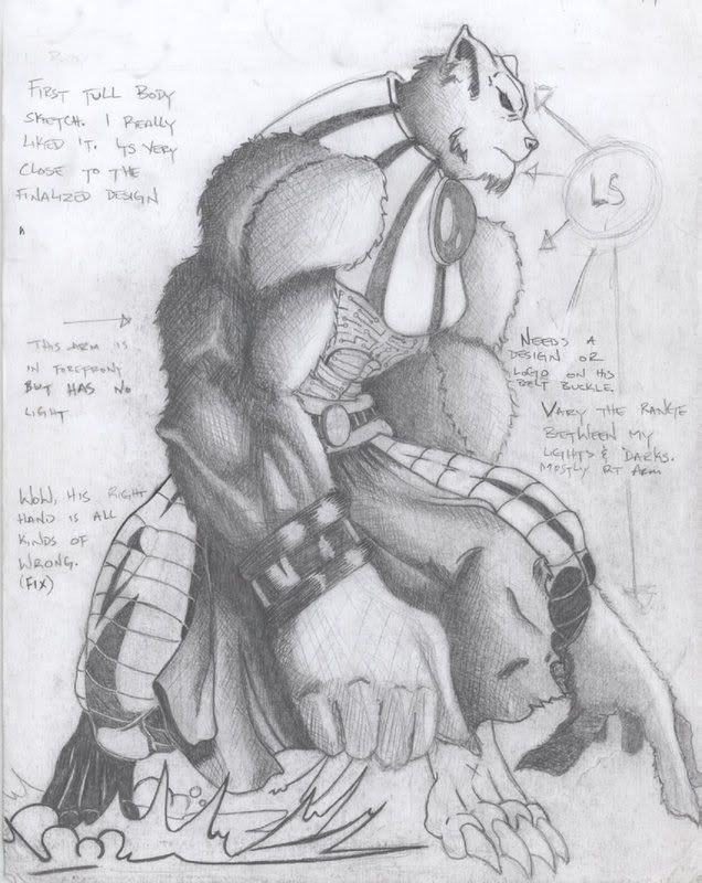
This one's pretty good. The only fixes I can suggest off the top of my head are that he needs a design or logo on his belt buckle. Also, try to vary the range between your lights and darks, mostly on the right arm.
That was just a rough sketch of my redesign for the character Kylun from Marvel Comics. Afterwards i decided to go in a play around w/ the shading more practice than anything else, which is why it isn't complete.
The one below is my final sketch of him and as you can see. i did tone down his muscles ^_^ (yay me). I the colored version he does have a design on his belt buckle.
NakedZerglingA more apocalyptic post apocalypse Portland OregonRegistered Userregular
edited August 2007
I think you have more style than base knowledge. once you build your base skills a little more (and you seem to be well on your way) i think your still will be really great. keep at it.
So, based on my very sketchy knowledge of horses...
Here's a picture of a normal horse:
The red lines show where the normal horse tack goes. The bit is near the front of the horse's face, giving the rider lots of leverage to move the head for steering. The Blue lines show approximately where your tack is arranged on your dinosaur.
Compare:
Due to the differences in anatomy you can't just put the bit at the front of the dinosaur's mouth, so I put it through the nose.
Your guy here already has his arms as widespread as they can go, and he's barely putting any sideways pressure on the dinosaur's face. The angles aren't working well for him. Put the bit up by his nose, and you can get more leverage, and avoid the blocking the eyes problem.
Notice that the horse's saddle does not connect to the bridle up there. That's because when you want a horse to stop or go backwards, you pull back on the reins. The backward pressure on the horse's mouth makes it stop. If you want the horse to go *forward* but you're putting backwards pressure on its mouth, at best you're going to end up with a very confused horse.
This boy is using straight backwards pressure to make his horse rear up:
The force on this horse's face is almost exactly the same as the force you've got pulling back on the dinosaur by its armor.
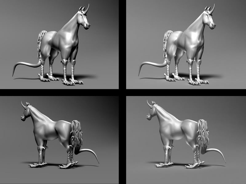
OHHHHHHHHHHHHHHHHHHH now i seee. That does make more sense. I am currently working on a version of the picture w/out thye human on his back. and one more of just the dinosaur's head but with more (lots more) details. Here are my progress. And i will take your advice and try a variation of your suggestion.
Posts
>.>
Nah, some really nice work here. 3D art is nothing i've ever tried, so I can't really say anything on it, but looking at your' "by hand" work, I gotta say I love your' pencilwork almost as much as you love the American Comic Book style. Crazy muscles. I'd tone em down a wee bit, but thats just me. The shading you have, though, and the light lines work very, very well. That, and the amazing ability that you seem to posess when it comes to drawing feet and shoes... >.> *envy* Not sure if I like the flat colors on Lee, however. Seems to detract from the piece overall.
11
21
1211
111221
312211
Wuts the next number?
My Art BLOG!!!
11
21
1211
111221
312211
Wuts the next number?
My Art BLOG!!!
hoobleedyhooblah, start posting in other threads too, if ppl know who the fux u are, they'll be more inclined to visit your thread and post.
11
21
1211
111221
312211
Wuts the next number?
My Art BLOG!!!
You might want to look at Alex Ross, whose work is strongly influenced by Andrew Loomis, since he does that style really well.
anyways, the coloring is coming along nicely, big improvement over your other stuff.
I dunno...i have a decent understanding of muscle structure but EVEN when i want to draw realistic muscles i end up w/ somethin like this. Its a habit that i need to break
even tho this pic was done a while ago and it sux i'm gonna put it up here to show that i do draw almost normal muscles LOL
BTW..she is wearin a mask
DAMN Mark...thanx for reminding me...i intended to take the think outlines in the neck muscles out...how did i miss that?...O_o
11
21
1211
111221
312211
Wuts the next number?
My Art BLOG!!!
But I really think you need to work on the design aspect of all these. I feel like every concept and idea posted in this thread has been done maybe 1 million other times. But your own spin on it! You dont want your work to be known as some kind of convoluted jumble of 90's video game and comic book styles.
I see this problem really show itself in your self portrait(which is a cool piece). You gotta decide what style of you want to use for which parts of the picture.
1.Take the lines out of the dude's skin and deepen the shadows of the muscles and veins etc. Also soften the shape of the adam's apple because it's too angular.
2.Put better shading into the hat and take out the lines making the "folds" on it.
3.Edit the eye so it looks like an eye in profile.
4. Add in more details of the ear and make the earlobe thicker.
5. Use reference photos to check your basic anatomy.
Reference photos:
eyes in profile
ear ref
The colors are pretty weak. Try coloring on a base color (something that isnt white filling the BG) and using a different color to shade with rather than a tint of the color you're using already. For instance, try shading with a purple or highlighting with a yellow.
the 3D stuff, however, is sweet.
11
21
1211
111221
312211
Wuts the next number?
My Art BLOG!!!
11
21
1211
111221
312211
Wuts the next number?
My Art BLOG!!!
Read my post! And practice, practice, practice!:P
ohhh yea a video tutorail would be even better
11
21
1211
111221
312211
Wuts the next number?
My Art BLOG!!!
following tutorials isn't a bad thing, its just not something you should rely on. but if your itching for some digital painting tutorials, hit up youtube and type in "speed painting tutorials" and you'll get a bunch of stuff.
and i 2nd what someone else said about your style, it has no uniqueness to it, it is clusterfuck mess of all the stuff you like with none of the aesthetic appeal. for instance, when u draw your muscles super bulgy, make them cool to look at, not "omfg his neck is going to explode" kinda thing. when designing complex machinary, dont just slap random nuts and bolts everywhere, give it a shape, a defining feature, and make it FUN to look at, not just complex.
in any case, welcome to ac, stay awhile, its fun here, you'll like it.
btw i tried speed painting tutorials in youtube n got a ton of fine art painting videos, wusup w/ dat?
11
21
1211
111221
312211
Wuts the next number?
My Art BLOG!!!
Frankly I don't think you need to be working digitally at all at this point. The way I see it drawing is a natural progression into painting. You start with line and form, work up to light and values, and once that is mastered you finally throw color theory into the mix. Things start to go very wrong usually when people skip steps before they're ready.
Your 3D renders are convenient because the computer figures out all the shadows for you, but your drawings are much more telling. None of them show a strong command over lighting. You have drawings that are very rendered and even have token lightsources marked in them, but you are clearly struggling to apply the lighting to such complex figures. In the end what you've done is called "local" shading, where you simply make forms whiter towards the light and darker on the other side.
This is NOT how light works in real life. Light bounces off objects depending on what material it's made of and refracts out at different angles casting itself on an object in a multitude of complex ways. It's almost easier to think about light as water flowing over your subject and splashing around than simply as straight rays eminating from a point.
All the photoshop tutorials in the world can't fix this problem for you, but there's good news. All you have to do is pick up a pencil and sketchbook, and observe from life how light really reacts. Look at different shapes and different materials with light at different distances. It seems almost stupid when you think about it- "study light", you see light every second your eyes are open all day. If you stop to look though there are lots of things you can learn about light that are not readily apparent from passive observation though. Once you learn all the rules then you can successfully apply them in imaginary situations.
Anyways. your art has a very nice , strong, line quality to it. however, your figures suffer form some level of dwarfism, something that i noticed is quite common among people that learn drawing from comics. it is best that you start drawing some real life figures.
and speed painting involves more of what you could call a fine art approach (which would not hurt you to know)
11
21
1211
111221
312211
Wuts the next number?
My Art BLOG!!!
ya tekken'd b fun, i learned alot from the players in korea, my sidestep cancels are rediculously fast now, i'm able to ss around any non tracking hits and either sidegrab, or if you continue to hit 2 on a combo, its a backgrab. fun stuff, learn your tracking moves
try typing in speed painting tutorials on google, it should link u to youtube
Also, the spelling and grammar in your posts is hurting my brain.
Sorry about the grammatical errors and spelling errors. Its a bad habit of mine, which I need to break out of.
11
21
1211
111221
312211
Wuts the next number?
My Art BLOG!!!
I just finished workin on this pic for my intermediate 3d modeling class. I need your insight on my composition and geometry. BTW i am only about 75% done w/ the dinosaur. I still plan on adding more muscle structure in his tail and neck and define his face a little more, and make the straps on his harness look more like leather.
Everyone else pls feel free to give me an honest opinion
11
21
1211
111221
312211
Wuts the next number?
My Art BLOG!!!
On a different sort of technical note, those chains are going right in front of its eyes. That seems pretty problematic to me for steering, especially since it doesn't really have good forward vision. The angle those chains are going at looks to me like he'd have difficulty applying enough force to turn the dino quickly. On a horse the bit is quite near the end of the horses head, allowing for more leverage. Additionally, you've got the bridle hooked onto its chestplate, which means the weight is going to be constantly pulling back on its head and it's going to want to stop or even back up. Getting that dinosaur to g forward (much less steer it) is going to be a pain with that setup.
I think it'd make more sense to have the 'bit' portion go through a piercing in its nose or something like that...
The guy looks like he's standing on the floor, not a moving dinosaur. I'd expect him to at least have his knees bent...
This was done as a class project. The criteria was to use "symmetry mode" in 3d s max. Which is why the tail is so straight. I will make his tail bigger to balance out the front end of the model. I am having a little trouble following what you are trying to say about the harness and chains. Probably because its 3AM!! However, I do see the chains blocking the dinosaur's vision. BAD ME!! ^.^ Maybe you could save the picture and in Photoshop you could illustrate over the model to show me what I did wrong w/ the harness and how to correct it.
11
21
1211
111221
312211
Wuts the next number?
My Art BLOG!!!
This one's pretty good. The only fixes I can suggest off the top of my head are that he needs a design or logo on his belt buckle. Also, try to vary the range between your lights and darks, mostly on the right arm.
The one below is my final sketch of him and as you can see. i did tone down his muscles ^_^ (yay me). I the colored version he does have a design on his belt buckle.
11
21
1211
111221
312211
Wuts the next number?
My Art BLOG!!!
O_o Base knowledge? I WANT THAT!!!!:shock:
11
21
1211
111221
312211
Wuts the next number?
My Art BLOG!!!
Here's a picture of a normal horse:
The red lines show where the normal horse tack goes. The bit is near the front of the horse's face, giving the rider lots of leverage to move the head for steering. The Blue lines show approximately where your tack is arranged on your dinosaur.
Compare:
Due to the differences in anatomy you can't just put the bit at the front of the dinosaur's mouth, so I put it through the nose.
Your guy here already has his arms as widespread as they can go, and he's barely putting any sideways pressure on the dinosaur's face. The angles aren't working well for him. Put the bit up by his nose, and you can get more leverage, and avoid the blocking the eyes problem.
Notice that the horse's saddle does not connect to the bridle up there. That's because when you want a horse to stop or go backwards, you pull back on the reins. The backward pressure on the horse's mouth makes it stop. If you want the horse to go *forward* but you're putting backwards pressure on its mouth, at best you're going to end up with a very confused horse.
This boy is using straight backwards pressure to make his horse rear up:
The force on this horse's face is almost exactly the same as the force you've got pulling back on the dinosaur by its armor.
11
21
1211
111221
312211
Wuts the next number?
My Art BLOG!!!
felt like it. lol
11
21
1211
111221
312211
Wuts the next number?
My Art BLOG!!!