The new forums will be named Coin Return (based on the most recent vote)! You can check on the status and timeline of the transition to the new forums here.
The Guiding Principles and New Rules document is now in effect.
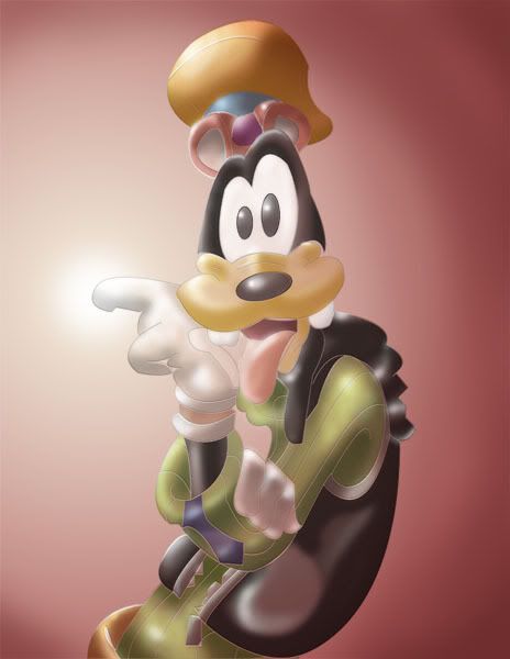
my photoshop renderings
sketchy62 Registered User regular
 Registered User regular
photoshop is probably the weakest skill i have.
up until yesterday i had no idea how people got those crisp lines when drawing with photoshop.
cuz mine was always very rough, and looked BAD.
well yesterday my friend showed me a quick tutorial on paths.
and i checked the help section when i got back.
now i feel taht i figured out the stepping stone.
so i got to work today and tried this rendering of goofy.
(used reference image)
please let me know what you guys think, and what i can do to get better, other than the general
"practice makes perfect" speech.

sketchy62 on
0
Posts
well it was too dark before.. so i added some highlights.
plus his finger is glowing so i thought the light from the glow would reflect onto him.
is it too bright?
bring it down a lil?
can u be more detailed?
the colors! they hurt my eyes!!!!
*edit*
not rly tho, its more like its very bright thats all. why is this? you put a highlight everywhere there isnt a shadow. contrary to popular beleif, highlights do not exist in each and every space devoid of shadow. less highlights plz
It's too soft. The colors are too grey-ish. Warmer colors.
CUZ THERE'S SOMETHING IN THE MIDDLE AND IT'S GIVING ME A RASH
o_O that doesn't mean "too much saturation" in fact, thats the exact opposite of too much saturation
GEH. Sorry. This, again, is why I'm not familiar with colors at all.
I meant to say :: There's too LESS Saturation.
;-)
anyhoo, mr sketchy 62, one thing u should also try is using any non pure white tone for your highlights. In general a very light yellow/orange/blue/violet color will work just fine and give your image a bit more "personality."
Desaturated is the word that you're looking for there.
The highlights are too much in this image. Also, you generally shouldn't use white for highlights. Also, why is his finger glowing?
magic... haha
anyways
thanks for all the helpful tips.
im currently workin on a another rendering project... but i feel that this one is gonna tke all day -___-
ill be back when im done! woo hooooooooooooooo
Seriously, try to avoid lens flare.
Also, it's been mentioned, but the highlights are way too bright and make him look plastic-y.
...what?
My Website | My "photo-a-day" 2010
as for the 2nd rendering project... i need a break from it...
i was tryin to render a car... pretty much by first attempt on it... lets juss say im moving at an INCREDIBLY slow pace.
it took me about 2 hours juss to do the rims.
i think i bit off more than i can chew.
*edit*
grifter rehashes my post and gets all the credit...
grifter i hope you contract scabies
but u do realize i juss learned htis yesterday.
a beginner tryin to render a car realisticlly is freakin hard.
however you are right... i guess i should finsih what i started.
imma take a break, and get back to it. :]
i juss hope i dont end up hating photoshop when im done with it.. LOL
oh you'll hate it, you'll probably want to kill yourself several times over during the process. BUT, once its all done with, and you look at your final product, you'll feel your time was well spent, and you'll get this warm fuzzy feeling deep down inside.
I hate inking in photoshop... but if I ink on paper I have no ctrl+z button on life.
Edit: But to be for real. It's not bad really. Better then what I could do. All it needs is a little more of a lighter gradient to shade with or something.
touche
That’s why the god of draughtsmen invented mylar and electric erasers.
Just as you bring down the mallet on your neighbour.
But seriousely, Its very good for a beginner, but yes, It is too bright.
Also, near the belly on the black jacket, its goes white>light grey> black. Try to soften the differences a bit.