The new forums will be named Coin Return (based on the most recent vote)! You can check on the status and timeline of the transition to the new forums here.
The Guiding Principles and New Rules document is now in effect.
My Digital Art thread. Critiques Highly appreciated.
Mykonos Registered User regular
3) My third one and last one for a good a while. I'm gonna spend some time practicing and applying some of the suggestions you all have given, but until then I would just like to present what is by far my favorite piece of work. 

This piece was actually based off an original sketch I had posted in this forum earlier. This is the original for those interested

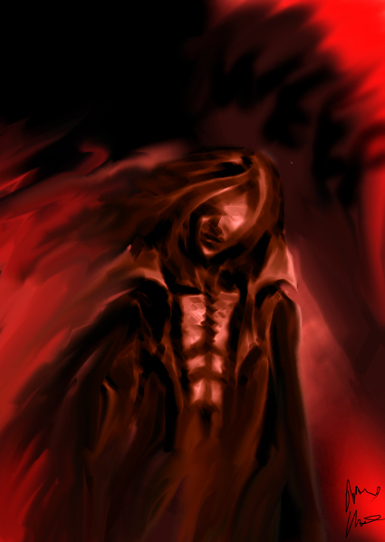
2) Here is another painting I just got finished with. You guys have been really helpful giving me some heads up advise and I would love if you could disect this piece as well.

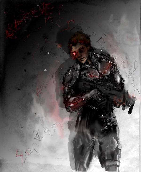
1) So after about a month now of experimenting with photoshop, i scanned one of my old sketches and decided to start work on my first digital painting. I was kinda intimidated at first, but once i got the hang of things it was breeze and hella fun! This is the finished work:

Everything you see there was done by hand using a wacom tablet. After scanning my sketch all I had essentially used it for was a point of reference. Ultimately, I had over 20 layers going on to make sure i get the specific details i wanted, which is my noob way of saying "experimenting w/out screwing it up." I used some layer affects to spice it up, in particular with the flowing lights on his suit. Ultimately I was unsatisfied with his awkward pose, so I did my best to sort of warp into into a more comfortable position.

This piece was actually based off an original sketch I had posted in this forum earlier. This is the original for those interested

2) Here is another painting I just got finished with. You guys have been really helpful giving me some heads up advise and I would love if you could disect this piece as well.

1) So after about a month now of experimenting with photoshop, i scanned one of my old sketches and decided to start work on my first digital painting. I was kinda intimidated at first, but once i got the hang of things it was breeze and hella fun! This is the finished work:

Everything you see there was done by hand using a wacom tablet. After scanning my sketch all I had essentially used it for was a point of reference. Ultimately, I had over 20 layers going on to make sure i get the specific details i wanted, which is my noob way of saying "experimenting w/out screwing it up." I used some layer affects to spice it up, in particular with the flowing lights on his suit. Ultimately I was unsatisfied with his awkward pose, so I did my best to sort of warp into into a more comfortable position.
[SIGPIC][/SIGPIC]
"I was born; six gun in my hand; behind the gun; I make my final stand"~Bad Company
"I was born; six gun in my hand; behind the gun; I make my final stand"~Bad Company
Mykonos on
0
Posts
It still looks a little unfinished (his pants, the gun), and I'd recommend you stay away from trying to work with too many layers simultaneously - while it's great for preserving details and letting you go back and try effects with the ability to undo later on, it can really screw around with your ability to have your paints blend and merge into one another, which is really important for getting things like tone and coloured lighting correct (this is even more of an issue with Painter than Photoshop).
"I was born; six gun in my hand; behind the gun; I make my final stand"~Bad Company
I'd work on modulating your highlights.
Your highlights, midtones and shadows all change in value as you move towards or away from your light source. So do a little touching up and don't make your shadows and highlights all of similar brightness/darkness.
edit: this explains it way better
I roughly blocked in a few corrections to help you.
If my corrections offend you for any reason I can delete the pic.
You also might want to consider putting a few highlights in the hair. Hair is shiny.
"I was born; six gun in my hand; behind the gun; I make my final stand"~Bad Company
Now the thing is- and I'm not sure if this is because of how you understand it or just of how you chose to articulate your point- you seem to be advocating indicating light and shade primarily based on the proximity of any given point to the light source. Closer, brighter. Further away, darker. Well and good, it makes sense so far.
But a couple things. First off, in your diagram you've indicated the idea of a light source, as well as the progression from light to dark, as a primarily two-dimensional phenomenon. Put your light source on the right facing left, make all the stuff on the right side real bright, all the stuff on the right real dark. Unfortunately, When dealing with three-dimensional objects and lights that do not just come from left, right, up, or down, but in front and behind as well, this simplified understanding falls apart. For example, If a light source is shot dead center on an object you'll find the center lit up brightly and darkness cropping on on all sides. Now, this still corresponds to what you wrote to certain degree, but not the diagram you drew. You can see this is what he actually did on the right leg (his left)- you can see it doesn't really work correctly, and is a very common mistake among people just starting out (which is why I'm railing on about it the first place, because I'm sick of seeing it).
Also, this understanding seems to imply that the idea of creating form through light is primarily a function of the light's falloff. And while, yes, a light's intensity does indeed fall off over distance- and this is something that can be used to indicate form to a certain degree and in certain situations, this knowledge pales in comparison to understanding the idea of indicating form through plane. After all, unless the primarily light source of a scene is a candle or some other very dim light source, the falloff over the distance of say, a human being, tends to be rather negligible. If you stand outside in the daytime, your head will not appear appreciably brighter than your feet simply because it is technically closer to the sun- some other way has to be used to indicate the form under such lighting conditions.
Understanding how the tone changes as the form turns away from the light is essential to creating convincing form. This requires more than simply assuming a tonal value based on the distance from the light, or distance from the nearest edge, but a thorough understanding of how the object is constructed as a three-dimensional object.
Now, maybe none of this is coming as news to either of you folks here, but well.
I have to admit I am a bit of a no-holds-barred grade A anal retentive dickhole when it comes to lighting, so pardon me for my rants. :P Just don't want anyone to get off on the wrong foot because of some solid, but incomplete knowledge, like
Rant:
In any case, it's still a lot better than the first crap I did in Photoshop, heh.
Twitter
I purposely did not provide a completely reblocked piece because I have had problems with people stealing my corrections and calling it "their work" in the past. That's why I only painted over a section of his picture.
(I was also posting this rather late which probably didn't help me)
Secondly, since, the OP was having problems blocking basic lights and darks and the unfinished nature of the picture made it hard for me to determine the exact location with light source. I also felt there was no good going into reflected light, light/darks within shadows because the basic lights and darks weren't all there.
At any rate the OP now has some good notes to work from.
OP:
You should also consider looking up some pictures of body armor to see how light falls on it and practice drawing from life. Looking up Anable's weekly posts on basic drawing may also prove helpful since you have some proportion issues. The dude's right hand isn't attached to the wrist at the right angle and you need more definition around the pelvic area so his legs look like they're turning with the top half of his body.
"I was born; six gun in my hand; behind the gun; I make my final stand"~Bad Company
I didn't use any filters.
Twitter
Perhaps he meant brushes?
"I was born; six gun in my hand; behind the gun; I make my final stand"~Bad Company
Filters are fun but they don't have much of a place in serious illustration or photo manipulation. Mr. Bacon (seems) to just have a lot of practice drawing the human figure which is why his picture looks the way it does.
Regarding your second piece:
I think you should take some more time blocking in the figure because even the parts of him that aren't melting into the background are hard to discern. Follow the technique Mr. Bacon linked in the longer post.
Also, are you putting your background and figure on different layers?
Ah I see. Yeah after looking over what he did I noticed the actual changes which could only be done by a brush or something.
As for the second one, yes, i had created two layers, one for the character, and the other for the background. With this one I cropped out the character from another painting I was working on, and added the layer ontop of the background layer. I then went ahead and changed the color balance to replace the white with red, added a heavy brush filter. I then flattened the image and used the smudge tool to try and blend him in the background. I wanted to have a sort of nightmarish, chaotic feel, so i went a bit messy with the smudge.
"I was born; six gun in my hand; behind the gun; I make my final stand"~Bad Company
I recommend you sit down with one or two hard round brushes and one or two layers and learn how to get by with just those before you start trying fancy shit.
Yeah That's pretty much what I did with the final piece I put there. I used only two layers, one for the characters and one for the background, and just used black and white at different opacities. I did use some smudging though to refine the little details, but besides that i stood away from everything else.
"I was born; six gun in my hand; behind the gun; I make my final stand"~Bad Company