The new forums will be named Coin Return (based on the most recent vote)! You can check on the status and timeline of the transition to the new forums here.
The Guiding Principles and New Rules document is now in effect.

Photoshop paint

AgoodzAgoodz Registered User regular
edited October 2007 in Artist's Corner
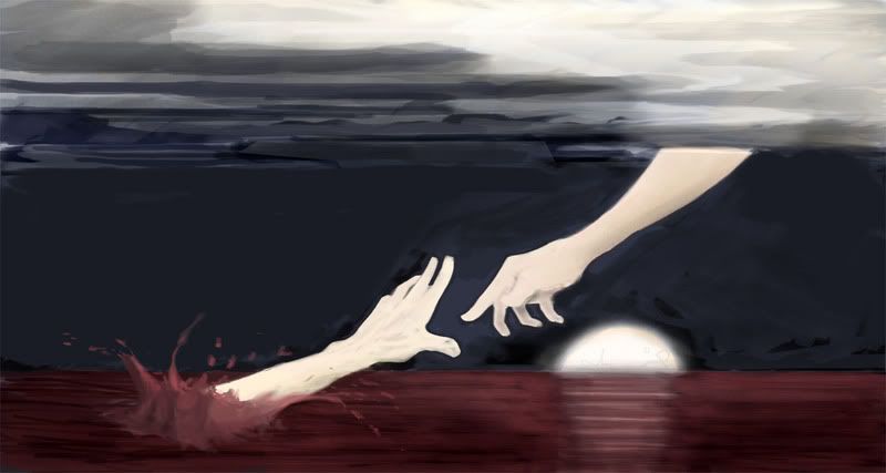
I made this weird little thing today

rescuesmall.jpg

I kind of wanted to make it more finished, but its not going much of anywhere... any suggestions?

(I have some other ps paintings upon request)
Agoodz on

Posts

  • ManonvonSuperockManonvonSuperock Registered User regular
    edited October 2007
    i would change the format, a tighter, round composition maybe. possibly change the position of the top hand, so that the michaelangelo reference is more subtle, and it looks more like the hands are trying to grab each other, just the top one being moe nonchalant about it, i would also ditch the sun/moon.

    ManonvonSuperock on
  • AgoodzAgoodz Registered User regular
    edited October 2007
    It's actually not supposed to be a reference to the sistine although it looks like an obvious ripoff... just an idea I had daydreaming, honest. The top hand's apathetic pose is intentional. I'm kind of hesitant about removing the moon altogether but I might make it smaller/not rest on the horizon.

    Agoodz on
  • GlalGlal AiredaleRegistered User regular
    edited October 2007
    You might want to add the arm reflection(s) onto the water, and add highlights from the moon to the splash to give it depth, as it looks rather flat right now.

    Glal on
  • AgoodzAgoodz Registered User regular
    edited October 2007
    Here's a couple other things so this thread isnt wasted

    desertcopy.jpg

    streetcopy.jpg


    Might not be able to post for a while, have fun tearing me a new one.

    Agoodz on
  • NightDragonNightDragon 6th Grade Username Registered User regular
    edited October 2007
    The problem with pieces like the last one is that when you mix rendered material and manually-done material, the rendered material usually jumps right out because it's so exact, when the manual work isn't. It takes incredible skill to mesh the two together, and even then, you can usually pick out a few things that were probably rendered.

    If anything, use the rendered material as a reference, or paint over it manually, and that way the whole picture will mesh much more.

    NightDragon on
  • AgoodzAgoodz Registered User regular
    edited October 2007
    The problem with pieces like the last one is that when you mix rendered material and manually-done material, the rendered material usually jumps right out because it's so exact, when the manual work isn't. It takes incredible skill to mesh the two together, and even then, you can usually pick out a few things that were probably rendered.

    If anything, use the rendered material as a reference, or paint over it manually, and that way the whole picture will mesh much more.

    I know what you mean... the "rendered" stuff I actually did by hand and used perspective alterations on though. I tried to mesh it in but I guess it was a piss poor job. Im still fairly happy with the way the street scene came out though.

    Agoodz on
  • DeeLockDeeLock Registered User regular
    edited October 2007
    you have an obsession with sun/moon sets.

    you need much more dynamic shadows to really get the idea of a sun set across.

    also!

    try a painting without the sun on the horizon.

    DeeLock on
  • Creambun 007Creambun 007 Registered User regular
    edited October 2007
    It's the plastic wrap filter you threw onto the street. Get rid of that and it should remove the whole "rendered" feeling.

    Creambun 007 on
    Diggity.
  • ManonvonSuperockManonvonSuperock Registered User regular
    edited October 2007
    The street painting really throws me off. The distance from the ground suggests the camera is at eye-level. Let's say an average person is around 5'10 or so. That makes your left wall about 12' high, and the right one about 6'5" This also puts the lamp posts at about 6 foot. Much shorter than any lamp post ever. If I walked straight into this shot, I would hit the bridge of my nose on the top corner of the front-most lantern.

    Also, what is the skull sitting on? Where is it in relation to the post? Why don't the other posts have that?

    Are those buildings or brick fences? Who would have a brick building that doesn't clear 7 feet? Who would have a brick wall on such an ornate street with no decorative moulding at the top? Why do the bricks on the top row of the left wall get cut in half as they approach the horizon?

    The bricks should also be protruding out further than the mortar, so there whould be appropriate highlights and shadows on both. The skull, on a design note, should also not be pointing straight at the camera, especially with so little else in this scene, it's too visually demanding.

    Nicely rendered skull and rose, though.

    ManonvonSuperock on
  • Big Luke NastyBig Luke Nasty Registered User regular
    edited October 2007
    The pools of light should not be around the circular base of the lights, instead it should be directly underneath the actual lanterns. You should have indirect light on the walls as you do, but the posts' shadows should be in them too. As it is, the foot of the posts has the greatest concentration of light, and the posts themselves do not cast shadows.

    Big Luke Nasty on
    rawr
  • MykonosMykonos Registered User regular
    edited October 2007
    i'm interested in seeing what else you could do besides background and abstract work. Can you paint human figures by anychance? Also, just for emphasis, stay away from those filters. It makes your work look way to inconsistent.

    Mykonos on
    [SIGPIC][/SIGPIC]
    "I was born; six gun in my hand; behind the gun; I make my final stand"~Bad Company
Sign In or Register to comment.