The new forums will be named Coin Return (based on the most recent vote)! You can check on the status and timeline of the transition to the new forums here.
The Guiding Principles and New Rules document is now in effect.
So I'm trying to be a bit more dynamic (er...pics are real big)
Mykonos Registered User regular
Hey guys, here's my third digital art dump for ya'll to crit.
This here would is my next big piece, or wallpaper worthy as I dub it. I think there may be too much going on at once, but it was taking me so long to do in the end I'd figure I'd just go ahead and have fun with it and just go nuts and hope for the best

This here is my first attempt at speed art...but it still took me about an hour to do.

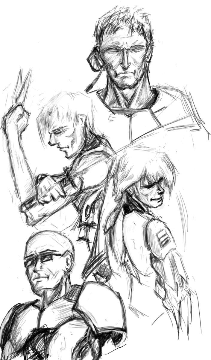
And finally a basic concept sketch usin my wacom

This here would is my next big piece, or wallpaper worthy as I dub it. I think there may be too much going on at once, but it was taking me so long to do in the end I'd figure I'd just go ahead and have fun with it and just go nuts and hope for the best

This here is my first attempt at speed art...but it still took me about an hour to do.

And finally a basic concept sketch usin my wacom

[SIGPIC][/SIGPIC]
"I was born; six gun in my hand; behind the gun; I make my final stand"~Bad Company
"I was born; six gun in my hand; behind the gun; I make my final stand"~Bad Company
Mykonos on
0
Posts
The guy on the left is positioned a little weird for him to be traveling in the direction it suggests he's heading. Mostly it seems like his legs are dangling in a way that implies he's going at a downward angle, not directly towards the other character.
That's probably solvable by turning the body a bit more and using lighting to give the character more depth. Right now, if I look at his right arm individually and his left arm individually, I have no way of knowing which is closer and which is further. Same problem exists with the legs. The foreshortening on the left character is much better in this regard (i.e. the gun).
Keep it up, though. Working on dynamic poses is haaaaaaard, so I admire your drive to challange yourself.
Our first game is now available for free on Google Play: Frontier: Isle of the Seven Gods
Second Your poses are kinda stiff, get in a life drawing class if you aren't already.
Lastly and second most importantly, the colors are no good. I'm sure there are some decent lighting tutorials around that could give you specific ideas on the techniques but basically it looks now like you are thinking "skin: peach, kneepad: white, scarf(?): green" then painting without thinking of how the whole scene looks in the context of the light. Something that shade of green will almost never look like that in real life. This is random photo i found on GIS: photo. See how the light across the image affects the color of the scarf even more than the actual color of the scarf itself?
the actual color is
"I was born; six gun in my hand; behind the gun; I make my final stand"~Bad Company
remember that a shadow isn't just black, its a desaturated version of your base color. which means when u want to place a shadow, use a slightly darker value but shift it more towards gray.