The new forums will be named Coin Return (based on the most recent vote)! You can check on the status and timeline of the transition to the new forums here.
The Guiding Principles and New Rules document is now in effect.
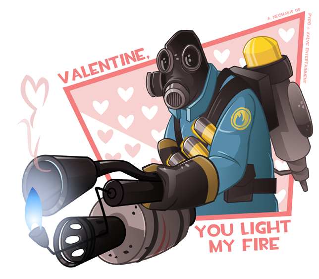
This is incredible.
The colours are just FABULOUS.
My only complaint is that the flame looks weird... it's too dark at the end and its edges are too sharp somehow. I'm not sure if that's what it's about but it stands out in a weird way.
This is incredible.
The colours are just FABULOUS.
My only complaint is that the flame looks weird... it's too dark at the end and its edges are too sharp somehow. I'm not sure if that's what it's about but it stands out in a weird way.
Yeah I agree. The tip is too dark and the edges could be a bit softer.
refresh page for update
i changed the flame and added the bracer things to the propane tank. it was just sort of floating there precariously without support.
There's a painful tangent on the flame as well. It's lining up with the roundish part of the flamethrower barrel. Either separate or overlap it. Other than that, it's freakin' beautiful.
tangents are such sneaky little assholes
you think you've avoided all of them, and then you find out one's been staring you in the face the entire time, taunting you with it's tangenty asshole-ishness
anyways, fixed, refresh the page to see the edit.
got started on the scout
inks and base colors, i'll add the fanciness after work
I feel like that last one needs to be a pop-up card in order to work.
The composition of the pyro is really strong, but the scout one has a little to much weight on the left side. I also think it needs a lot more red to make it feel Valentine-y.
Loved last years crop and these are looking to be just as good.
Compared to the other one the Scout looks so empty. The box on the Pyro Guy was half-filled with red, it gave it a lot of pazaz, this one is missing that zaz. Can I ask you a question? Do you draw the line weight variation by hand or do you just trace it once with the pen and then apply some sort of brush?
i draw it by hand: http://www.beavotron.com/vector.html
i'm actually considering updating that tutorial, making it a bit easier to understand and possibly using a more complex sample image.
i might even do it with one of these valentines.
i agree about the scout lacking something. I am going to play around with him a little tonight to add some more pizazz like the pyro has
i'll probably post a bunch of different layouts and let you guys pick which one looks best
because damn do i ever suck at layouts.
HacksawJ. Duggan Esq.Wrestler at LawRegistered Userregular
edited January 2008
Oh, beav, if you haven't thought of something for the Heavy already, might I suggest you have a picture of him holding his gun, getting ready to nuzzle it, with a caption bubble saying "Kiss me!", and a caption at the bottom saying "Will you be my Sasha?"
heres the crappy webversion, but have higher res maybe post later, i'm @ work
edit: sorry if this is a threadjack, i thought it was for everyone.
Anubis09 on
"We never discuss the positive or negative cultural aspects the distinctive type of music has on todays youth or the sexual intricacies of deep bass rythms as accompanies by strong guitar accords" - N_O
WetbackMcMoneyfingers. Or a Mexi-Jew. - awesome!
iruka, that's a good idea i'll give it a shot
hacksaw: haha unfortunately, heavy's has been chosen, he's going to be saying "my heart feels heavy when you're not around, valentine"
i still haven't thought of captions for spy and/or soldier, so ideas for those would be wonderful
anubis: it was intended for mine in particular for crits and stuff, but i have no issue with other people posting theirs, yours looks great
well if you want me to i'll delete mine and fill the space with a crit.
yours look awesome as always
Anubis09 on
"We never discuss the positive or negative cultural aspects the distinctive type of music has on todays youth or the sexual intricacies of deep bass rythms as accompanies by strong guitar accords" - N_O
WetbackMcMoneyfingers. Or a Mexi-Jew. - awesome!
iruka, that's a good idea i'll give it a shot
hacksaw: haha unfortunately, heavy's has been chosen, he's going to be saying "my heart feels heavy when you're not around, valentine"
i still haven't thought of captions for spy and/or soldier, so ideas for those would be wonderful
For Spy, you could have something like "I can't hide my love for you!"
The pic would be of the Spy running away, possibly on fire, wearing a cardboard mask with a heart on it.
his left knee is on the wrong side in relation to the way is foot is turned, i realize. i changed his feet like a billion times. so that will be fixed when i ink.
thanks!
squirm: unfortunately i'm an idiot who saved over the original sketches of the other two
they were really sloppily done in photoshop, i did a lot of tweaking on the last two in illustrator.
i find when i use a pencil like i did with the heavy i get much nicer results since i seem to spend a bit more time on them.
i actually downright hate sketching with a tablet, but since the scanner is upstairs in the nether regions of my household, i do it anyways... i'm lazy.
HacksawJ. Duggan Esq.Wrestler at LawRegistered Userregular
edited January 2008
For the soldier, the only thing that hits me right away is "Don't be a maggot: be my Valentine!" and the picture is of him making a heart shape with his fingers with a big, dopey grin on his face.
iruka, that's a good idea i'll give it a shot
hacksaw: haha unfortunately, heavy's has been chosen, he's going to be saying "my heart feels heavy when you're not around, valentine"
i still haven't thought of captions for spy and/or soldier, so ideas for those would be wonderful
For Spy, you could have something like "I can't hide my love for you!"
The pic would be of the Spy running away, possibly on fire, wearing a cardboard mask with a heart on it.
this is totally it
for sure
i think for soldier, i'm going to have him doing the rocket launcher jump and saying something along the lines of "your love launches me off to new heights, valentine"
it's kind of similar to the scout is my only real concern, but i can make it look different.
Posts
The colours are just FABULOUS.
My only complaint is that the flame looks weird... it's too dark at the end and its edges are too sharp somehow. I'm not sure if that's what it's about but it stands out in a weird way.
Tumblr Behance Carbonmade PAAC on FB
BFBC2
thanks!
My Portfolio Site
i am going to take over the internet with e-valentine cards.
illustrator cs2
refresh page for update
i changed the flame and added the bracer things to the propane tank. it was just sort of floating there precariously without support.
you think you've avoided all of them, and then you find out one's been staring you in the face the entire time, taunting you with it's tangenty asshole-ishness
anyways, fixed, refresh the page to see the edit.
got started on the scout
inks and base colors, i'll add the fanciness after work
finished scout
crits are always appreciated
medic is next
you've outdone yourself
The composition of the pyro is really strong, but the scout one has a little to much weight on the left side. I also think it needs a lot more red to make it feel Valentine-y.
Loved last years crop and these are looking to be just as good.
this is inspiring and so freaking clean
thanks all
move him to the middle-right of the top of the box and move the text to the outside of the upper left corner?
does that make sense?
i'm actually considering updating that tutorial, making it a bit easier to understand and possibly using a more complex sample image.
i might even do it with one of these valentines.
i agree about the scout lacking something. I am going to play around with him a little tonight to add some more pizazz like the pyro has
i'll probably post a bunch of different layouts and let you guys pick which one looks best
because damn do i ever suck at layouts.
thanks again, all
heres the crappy webversion, but have higher res maybe post later, i'm @ work
edit: sorry if this is a threadjack, i thought it was for everyone.
WetbackMcMoneyfingers. Or a Mexi-Jew. - awesome!
hacksaw: haha unfortunately, heavy's has been chosen, he's going to be saying "my heart feels heavy when you're not around, valentine"
i still haven't thought of captions for spy and/or soldier, so ideas for those would be wonderful
anubis: it was intended for mine in particular for crits and stuff, but i have no issue with other people posting theirs, yours looks great
yours look awesome as always
WetbackMcMoneyfingers. Or a Mexi-Jew. - awesome!
and anyone else, feel free to post your videogametines!
The pic would be of the Spy running away, possibly on fire, wearing a cardboard mask with a heart on it.
better?
rough sketch for heavy:
his left knee is on the wrong side in relation to the way is foot is turned, i realize. i changed his feet like a billion times. so that will be fixed when i ink.
EDIT: lol @ the sad Heavy.
squirm: unfortunately i'm an idiot who saved over the original sketches of the other two
they were really sloppily done in photoshop, i did a lot of tweaking on the last two in illustrator.
i find when i use a pencil like i did with the heavy i get much nicer results since i seem to spend a bit more time on them.
i actually downright hate sketching with a tablet, but since the scanner is upstairs in the nether regions of my household, i do it anyways... i'm lazy.
this is totally it
for sure
i think for soldier, i'm going to have him doing the rocket launcher jump and saying something along the lines of "your love launches me off to new heights, valentine"
it's kind of similar to the scout is my only real concern, but i can make it look different.
Engi suggestion:
"A Valentine is sappin' my heart"
Our first game is now available for free on Google Play: Frontier: Isle of the Seven Gods