The new forums will be named Coin Return (based on the most recent vote)! You can check on the status and timeline of the transition to the new forums here.
The Guiding Principles and New Rules document is now in effect.
My cel-style art
Beto_Machado Registered User new member
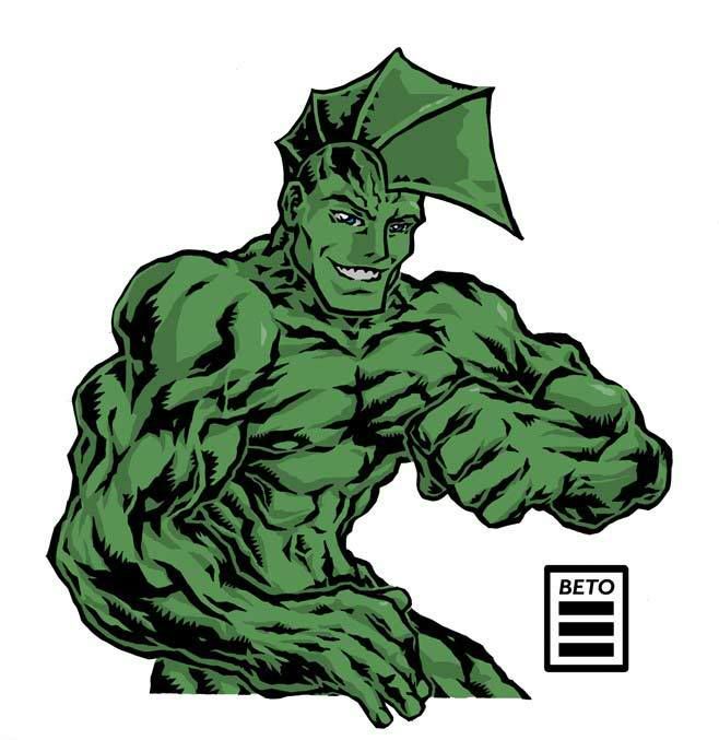
Some of my stuff. I'm very much into the cel animation look, specially 90's anime. First 5 are my characters (i'm starting to animate a series of short web episodes - it also involves cosplay, martial arts, 3D models, a fanzine and a color comic), last one is Erik Larsen's The Savage Dragon. The pages are over a year old, so they're not 100% but i wanted to show some sequentials, which i haven't drawn in a while.
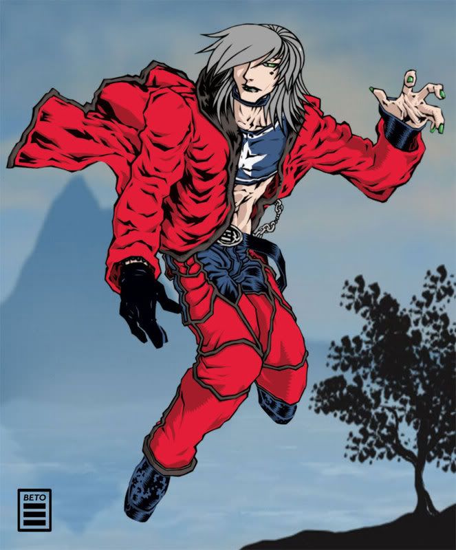
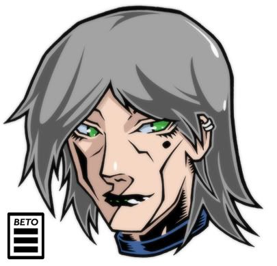
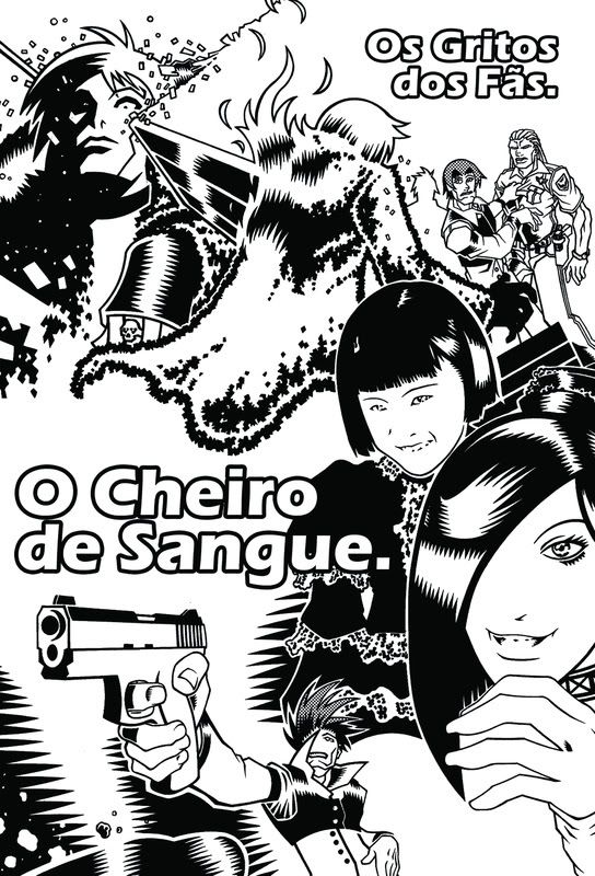
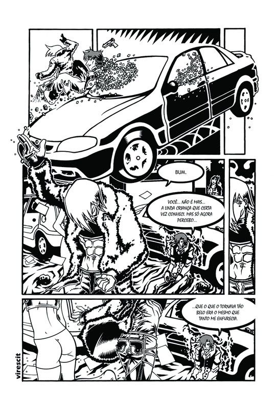
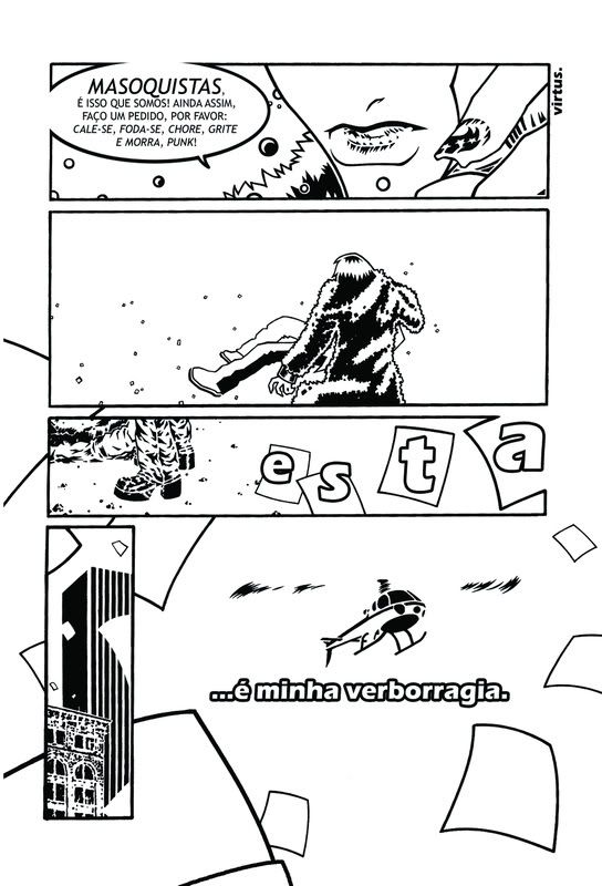
The BG of the first pic is a placeholder done following a tutorial. The actual image has a white BG.
Thanks.


The BG of the first pic is a placeholder done following a tutorial. The actual image has a white BG.
Thanks.
Beto_Machado on
0
Posts
Great stuff there, I like your style!
More, please!
Great black and whites, though you may wanna take a look at the woman on the far right cover...i think her eyes are a bit higher than they should be.
Are you by chance a fan of Peter Chung? Your initial style with the silver haired character seems heavily influenced by his works. Major props to you if you are.
"I was born; six gun in my hand; behind the gun; I make my final stand"~Bad Company
I like to doodle then start straight inking over it, following some of the random lines from the doodling. That makes it seem more organic and lively to me. All my favorite artists have a "fly by their pants" feel and frequently make mistakes because of it. It gives me a "why did he do this?" feeling that i really like.
When i draw more like this
it doesn't feel completelly natural or interesting to me.