As was foretold, we've added advertisements to the forums! If you have questions, or if you encounter any bugs, please visit this thread: https://forums.penny-arcade.com/discussion/240191/forum-advertisement-faq-and-reports-thread/
Options
~Cruor Luna. Paz's jan-march dump(NSFW)~
pazshadow Registered User regular
Registered User regular
Hey guys, thought I'd drop some of the shizz that ive been working on these last few months, enjoy!
I'll start off with Some stuff Ive been doing for school (they force me to actually paint!)
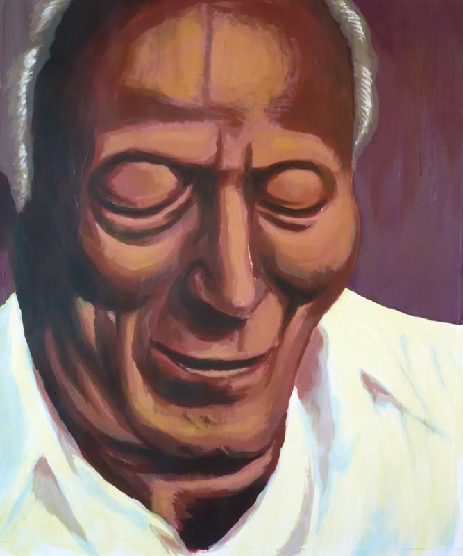
My Grandfather
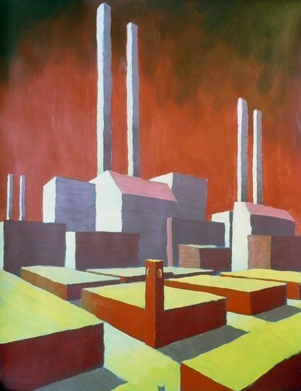
An excercise in multi-vanishing points.
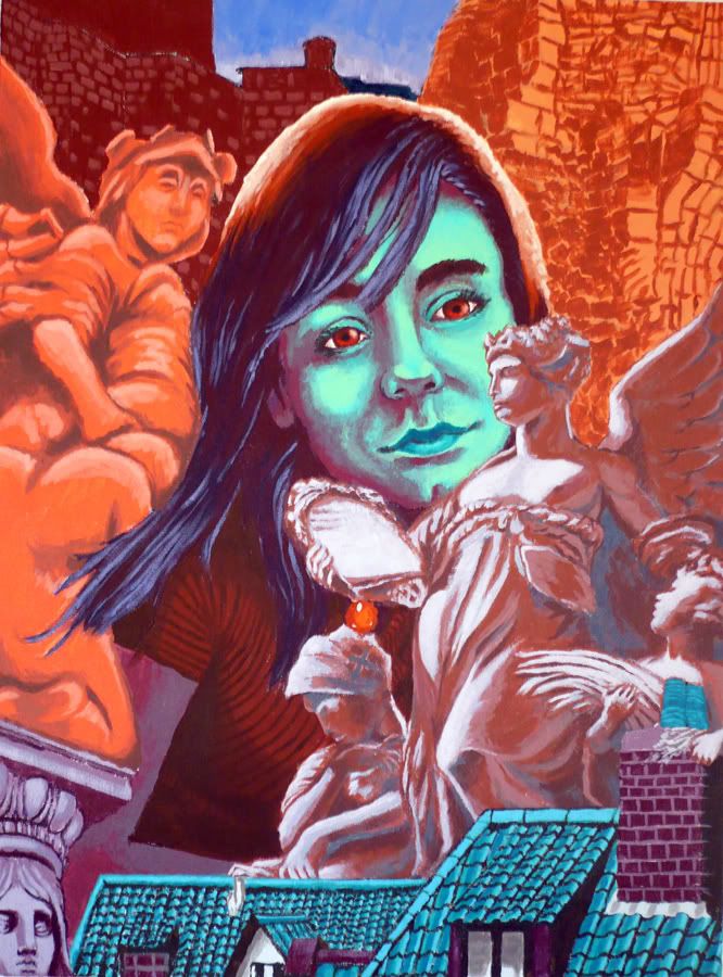
This piece is actually much more finished than this, but i had to hand er in for review, and its on a pretty big canvas, so its hell to photograph= Using complimentary colors in photo montage with narrative.. or some such...
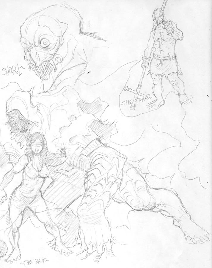
SKETCHES!!!!
Ive been playing around with my usual attempts at worldbuilding (ive made many, finished none!), this one is a steampunk, very wierd and complicated. So many of these creatures and dialogue are from the story.
Monster!
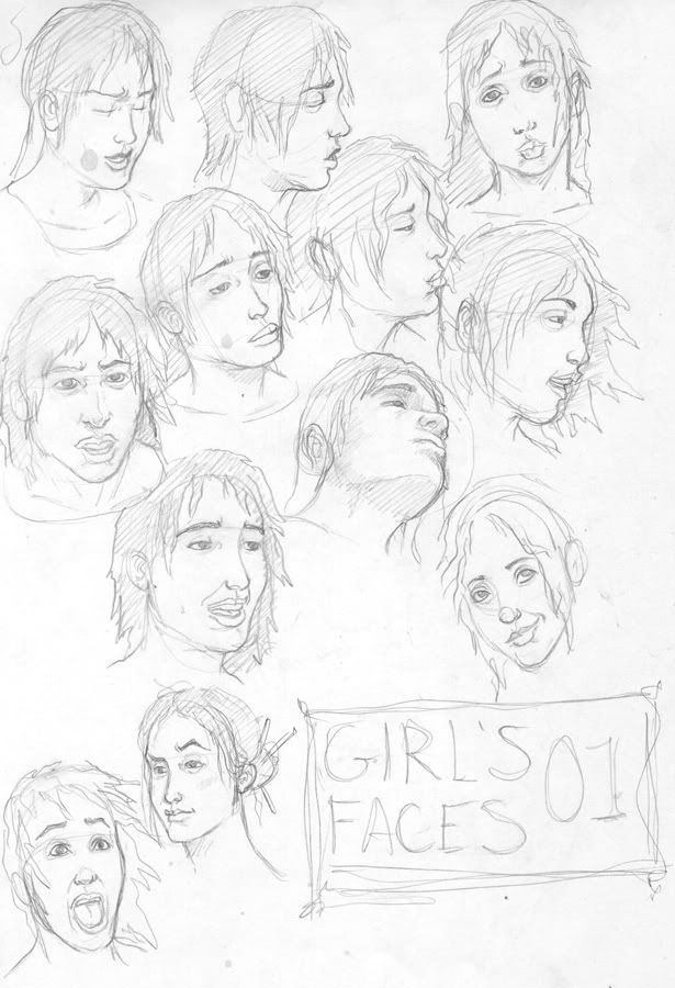
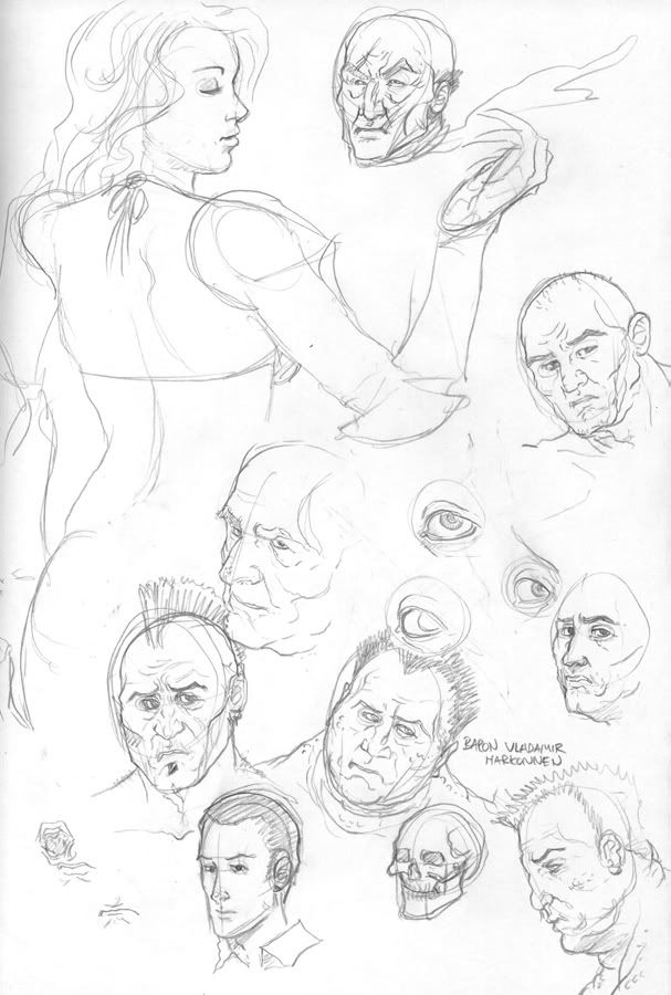
faces.
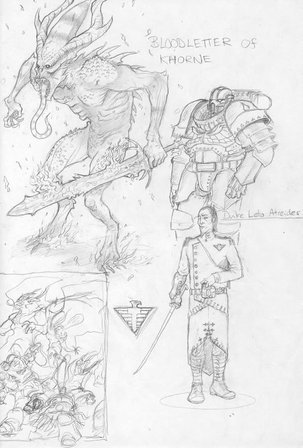
40k on the brain...plus dune. I love dune toooo much. (almost as much as Tolkien's myth cycles)
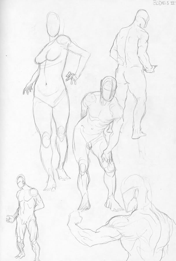
nudes.
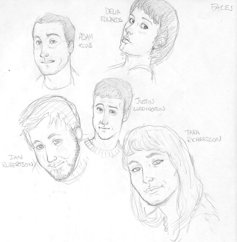
friends of mine
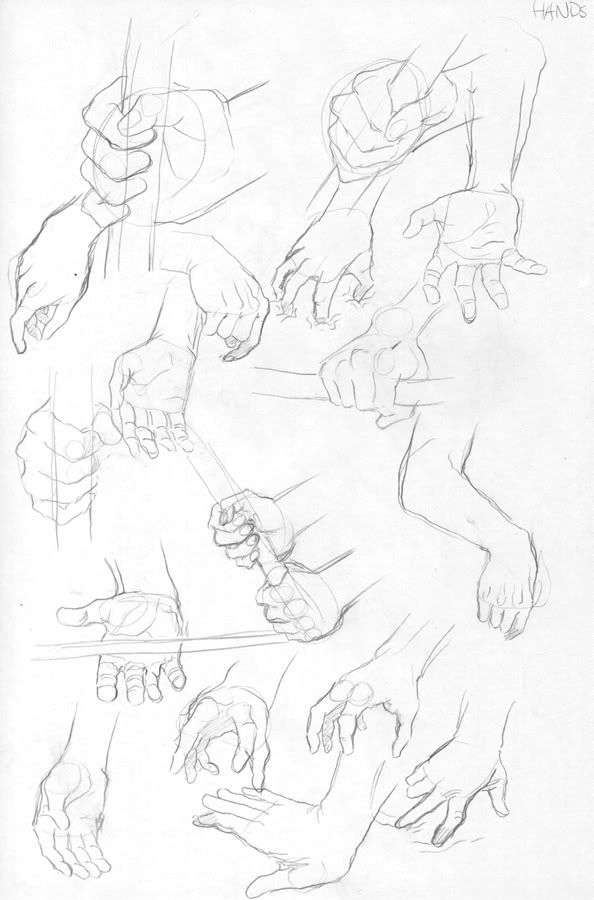
hands
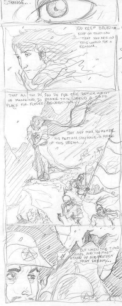
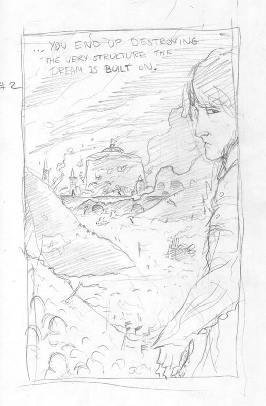
This... well these are thumbnails for random scene from story, now outdated, but i wanted to see if I could drum up these to match the visual i had in my head (i see the scenes like movies).
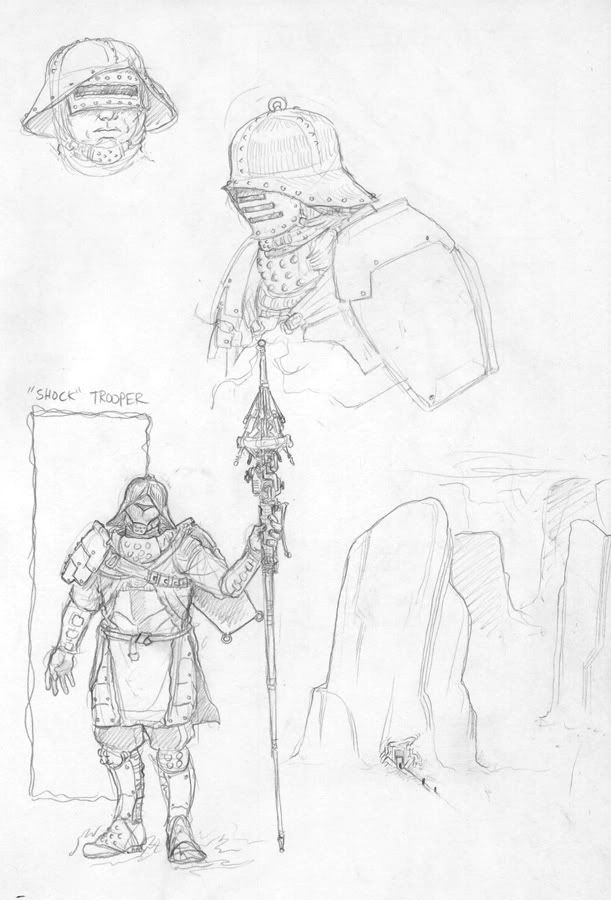
Armour design
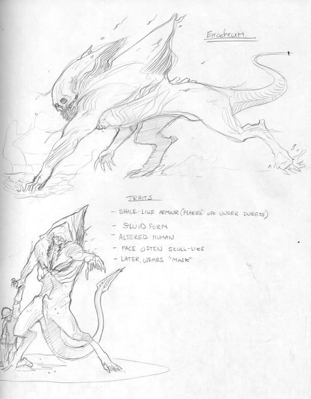
monster design, shows up throughout story
And finally, faces!!!
enjoy, and, as always, I appreciate all crits and comments.
I'll start off with Some stuff Ive been doing for school (they force me to actually paint!)
My Grandfather
An excercise in multi-vanishing points.
This piece is actually much more finished than this, but i had to hand er in for review, and its on a pretty big canvas, so its hell to photograph= Using complimentary colors in photo montage with narrative.. or some such...
SKETCHES!!!!
Ive been playing around with my usual attempts at worldbuilding (ive made many, finished none!), this one is a steampunk, very wierd and complicated. So many of these creatures and dialogue are from the story.
Monster!
faces.
40k on the brain...plus dune. I love dune toooo much. (almost as much as Tolkien's myth cycles)
nudes.
friends of mine
hands
This... well these are thumbnails for random scene from story, now outdated, but i wanted to see if I could drum up these to match the visual i had in my head (i see the scenes like movies).
Armour design
monster design, shows up throughout story
And finally, faces!!!
enjoy, and, as always, I appreciate all crits and comments.
pazshadow on
0
Posts
impossiblé
also, does your friend Justin look like Alan Ruck in real life?
your work is real slick, some of your anatomical sketches are beautiful, and the shock trooper is looking good, would be nice to see some coloured n ting.
magic- thanx dewd, yeah they'd have to be effortless, cause im lazy:P
Much jealousy is aimed in your direction.
Also Shock-Trooper is awesome.
The paintings don't really excite me that much. They're pretty much not paintings at all; they're drawings. That's fine, if that's how you want to paint, but there are many qualities of acrylic (at least, I think it's acrylic!) and paint in general that you're not exploiting. If there's not a medium requirement, I'd suggest switching to gouache. You might find it's easier to draw with, and you'll get a lot better edges. I don't know if it's just the photos or what, but the colors are pretty unappealing and muddy. The colors are either too saturated, or too muddy (way too many colors mixed together, or colors that don't mix well). They really are well drawn, though.
I'd suggest doing some value studies in pencil, since you're familiar with it. It will improve your rendering skills with paint, too.