As was foretold, we've added advertisements to the forums! If you have questions, or if you encounter any bugs, please visit this thread: https://forums.penny-arcade.com/discussion/240191/forum-advertisement-faq-and-reports-thread/
Options

halp! character design WIP

Crazy Old MoriseCrazy Old Morise Registered User regular
edited March 2008 in Artist's Corner
looking for crits on color, anatomy, etc.

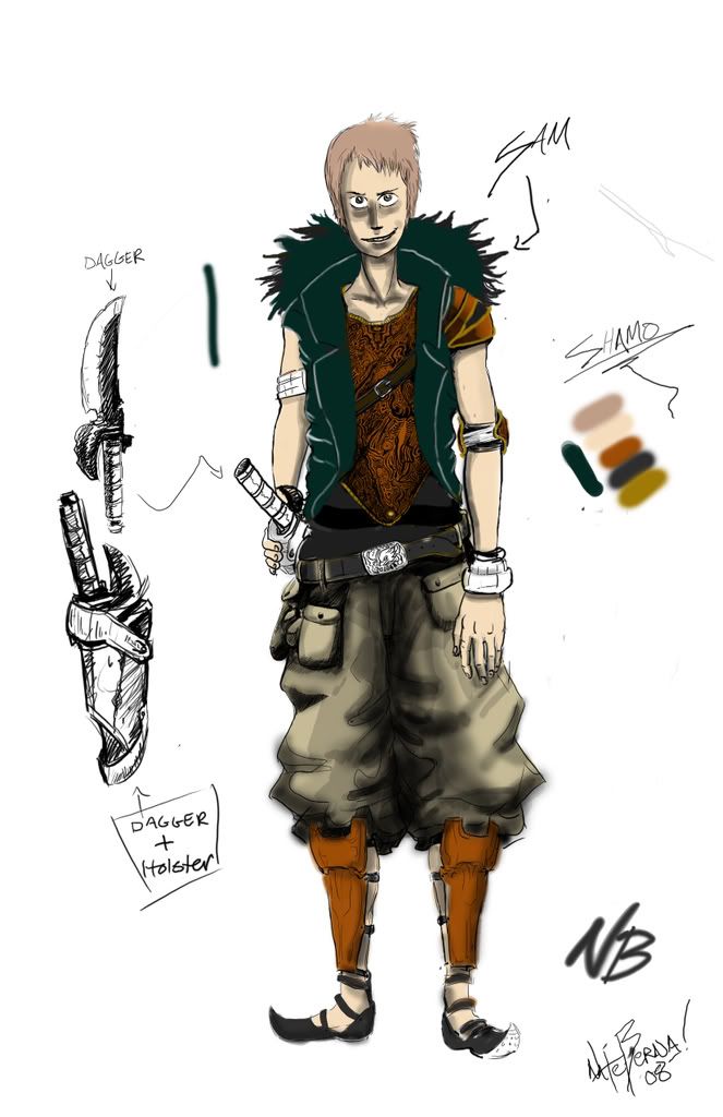
composition not so much.

CHARAdesignCOLR2copy.jpg

Crazy Old Morise on

Posts

  • Options
    amateurhouramateurhour One day I'll be professionalhour The woods somewhere in TennesseeRegistered User regular
    edited March 2008
    Maybe make a little more of a brow line over the eyes? his face looks a little static compare to the rest of him. Also either slightly shorten the extended arm or lengthen the one holding the knife.

    Color is great, design is great, actually the color is amazing, what was your base for it?

    Oh yeah, maybe extend the neck just a little bit on each side, to match the size of the head.

    really, really good design though.

    amateurhour on
    are YOU on the beer list?
  • Options
    CorgiCorgi Registered User regular
    edited March 2008
    The perspective on his left arm is a little wonky. The palm of the hand usually faces the outer side of the leg and not the top. Try making it a 3/4th profile of the hand and not the complete back of it. But other than that,and what amateur said, its pretty rad.

    Corgi on
  • Options
    LlyLly Registered User regular
    edited March 2008
    There is no anatomy to crit really, it's all hidden by huge clothing ( i suspect this is because you aren't confident in anatomy, which is fine. It's bloody hard ). What is visible is that the shoulders are too narrow, he has no hips, and one arm is longer than the other. His upper legs seem to start too low and are way too long.

    Colouring wise the detail on the shirt is nifty, but there is really no defined light source anywhere. You are also shading with black (just making colours darker for shadow) which produces a very boring and flat appearance, try using other tones as shadow to add interest and make it look more realistic.

    Lly on
  • Options
    MustangMustang Arbiter of Unpopular Opinions Registered User regular
    edited March 2008
    There are all sorts of issues with the arms. I can appreciate that the left arm (his right) is meant to be bent, however it doesn't look bent, he just looks like a polio victim, you need to redo the line-work there. The right arm (his left) is positioned incorectly, (like corgi said) it should be rotated with the thumb facing toward frame, also it's a little long. Have a look at yourself in the mirror and you'll notice how an arm should hang naturally, granted you can rotate it with the kuckles forward, but it's generally not a natural stance. The fingers also look a little distorted and the right (his left) shoulder appears a lot larger than the left. Also try shading the face with natural skin tones rather than flat black, it'll look more natural.

    Apart from that I quite like it, I really love the dagger sketches, especially the holster, very cool design. Just tidy it up and it could be quite good.

    Mustang on
  • Options
    NakedZerglingNakedZergling A more apocalyptic post apocalypse Portland OregonRegistered User regular
    edited March 2008
    his right arm (our left) doesn't look bent. it just looks really short

    NakedZergling on
  • Options
    Crazy Old MoriseCrazy Old Morise Registered User regular
    edited March 2008
    thanks so far guys, when I look at a drawing for a really long time I end up missing really obvious stuff. I'll post an update tomorrow.

    Crazy Old Morise on
  • Options
    MustangMustang Arbiter of Unpopular Opinions Registered User regular
    edited March 2008
    when I look at a drawing for a really long time I end up missing really obvious stuff.

    Likewise, nature of the beast unfortunately.

    Mustang on
  • Options
    xbainxxbainx Registered User regular
    edited March 2008
    This is a style choice, but the shoes are a a bit too elfish. Not battle ready. Also how the hell do I post som eof my work on here, like from my computer, not a website.

    xbainx on
  • Options
    xbainxxbainx Registered User regular
    edited March 2008
    This is a style choice, but the shoes are a a bit too elfish. Not battle ready. Also how the hell do I post som eof my work on here, like from my computer, not a website.

    xbainx on
  • Options
    MustangMustang Arbiter of Unpopular Opinions Registered User regular
    edited March 2008
    You don't, you need to upload to an image hosting site (eg www.imageshack.us) and then link it here.

    Mustang on
  • Options
    Kewop DecamKewop Decam Registered User regular
    edited March 2008
    I dunno if this was mentioned, but those elbows are extremely far off.

    also, i find the character to be a mix of uninteresting cliches

    Kewop Decam on
    pasigfa7.jpg
  • Options
    DerrickDerrick Registered User regular
    edited March 2008
    I will agree with Lly on the modeling. Using black isn't really a smart idea in this instance. I would say try 3 shades, bare minimum, for flesh tones. 2 warms and a cool color also if you want to start developing a more realistic style.

    The pants area just looks dirty. Clothes generally have fairly stark shadow contrasts, so don't be afraid to use some real edges in there.

    Derrick on
    Steam and CFN: Enexemander
  • Options
    RankenphileRankenphile Passersby were amazed by the unusually large amounts of blood.Registered User, Moderator mod
    edited March 2008
    I dunno if this was mentioned, but those elbows are extremely far off.

    also, i find the character to be a mix of uninteresting cliches

    says the dude with the Cole Train sig

    Rankenphile on
    8406wWN.png
  • Options
    KochikensKochikens Registered User regular
    edited March 2008
    I may seem like a dick for saying this, but reminds me a lot of Balthier. Crazy detailing on vest, though, looks nice.

    Kochikens on
  • Options
    NibCromNibCrom Registered User regular
    edited March 2008
    If this is for a character design, I think it would help you to come up with many many designs before spending too much time on one piece of art.

    NibCrom on
  • Options
    SynapsidSynapsid Registered User regular
    edited March 2008
    I dunno if this was mentioned, but those elbows are extremely far off.

    also, i find the character to be a mix of uninteresting cliches

    says the dude with the Cole Train sig

    I lawl'd.

    Synapsid on
Sign In or Register to comment.