The new forums will be named Coin Return (based on the most recent vote)! You can check on the status and timeline of the transition to the new forums here.
The Guiding Principles and New Rules document is now in effect.
Digital Painting Still Lifes
DeeLock Registered User regular
 Registered User regular
I want to make this into a sort of group exercise concentrating on digital painting, color and observation.
The challenge is to take a piece of fruit, or any other simple form lying around, and do a color still life of it.
I'm going to post my process of that i went through to create a painting of an apple (hopefully more people will join in to get some community going!)
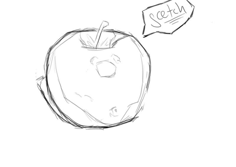
Step 1: Sketch
The only thing that i am focusing on in this step is to get the basic form of the object down, as well as the placement of the shadows and major landmarks, not so much on details.
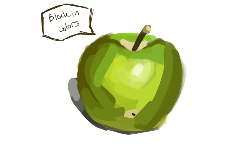
Step 2: Block In Color
Again not going for realism, just using a hard brush to get the colors i can readily observe on the subject. This is probably the most important step.
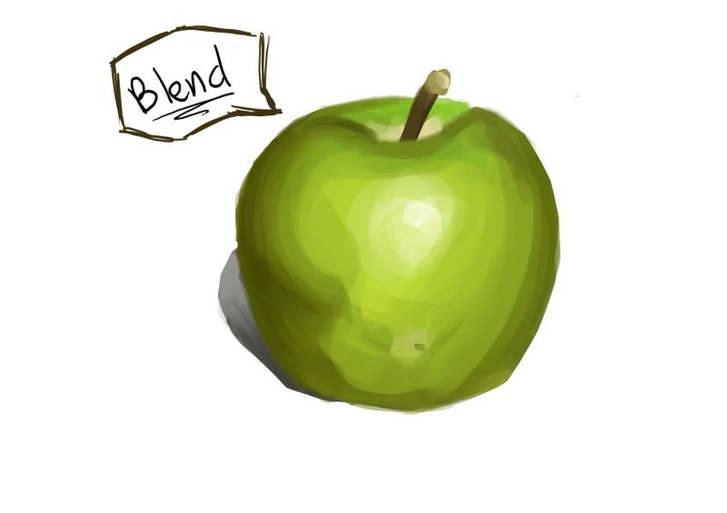
Step 3: Blend
Just using the eye dropper tool and a hard brush with opacity set to pen pressure.
More blending.
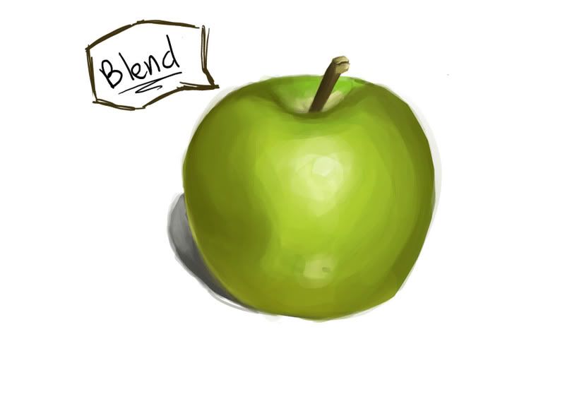
Step 4: Details
Finally we add a few details.
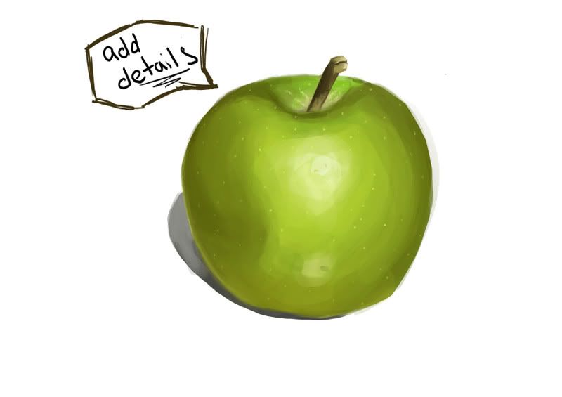
Hope that this inspires some works to be generated, it would be great if everyone could post their process shots to to let us in on your painting technique and possibly give some more specific critique.
Edit: Whoops misspelled sketch in the drawing...whatever...i'm too lazy to fix it.
The challenge is to take a piece of fruit, or any other simple form lying around, and do a color still life of it.
I'm going to post my process of that i went through to create a painting of an apple (hopefully more people will join in to get some community going!)
Step 1: Sketch
The only thing that i am focusing on in this step is to get the basic form of the object down, as well as the placement of the shadows and major landmarks, not so much on details.

Step 2: Block In Color
Again not going for realism, just using a hard brush to get the colors i can readily observe on the subject. This is probably the most important step.

Step 3: Blend
Just using the eye dropper tool and a hard brush with opacity set to pen pressure.

More blending.

Step 4: Details
Finally we add a few details.

Hope that this inspires some works to be generated, it would be great if everyone could post their process shots to to let us in on your painting technique and possibly give some more specific critique.
Edit: Whoops misspelled sketch in the drawing...whatever...i'm too lazy to fix it.
DeeLock on
0

Posts
Oh it's such a nice day, I think I'll go out the window! Whoa!
I'm not just talking to giga gopher but to everyone. Spend a long while blocking in colors to get it just right!
A green apple is not just green, but yellow, brown, tan etc...
Lets get some more up in here!
It's a picture of a little stand for some old Intel camera. It was the simplest thing to draw on my desk.
That's a terrible picture of it taken off of Amazon.
I know I posted this before, but I don't think anyone even saw it, and it's my most recent (and only) painting from life.
I've seen that before...how bout you do a new one?
You need to use bigger brushes, otherwise it's going to look really sketchy and unfinished. Try a hard brush with opacity set to pen pressure.
As far as your subject goes...it's really really boring...try a piece of fruit...it really helps to train your eye to see color and value unlike what you have going on here.
Glad you're back by the way.
Thanks for the advice, Dee. I'll try those things on my next Still Life painting.
The Scoundrel & The Bastard
My Comics Thread
:P
Oh, and sorry for breaking your thread, Dee. I'll be good.
More tutorials please! Or recommend some if you don't have time.
Work on defining your edges without an outline.
And work more on observation...you're missing a lot of colors that are in your subject.
Good work though!
Glad to see some submissions stacking up.
PS: I'll have another "tutorial" next week...i've got some work to do in the next few days.
For comparison:
The one I did a couple of years back
vs.
The one I did a couple of minutes ago
Here's what I had before:
What I have now:
Oh it's such a nice day, I think I'll go out the window! Whoa!
yo..that is fucking PIMP.
i bet dee is gonna freak on the outline! haha. but i like it.
is that painter or ps?
can you do one like that and post steps like dee did? i love those textures but can never seem to do stuff like that. i would love to see how its done.
AAAAAAAAnyways...
Fedora: i really like it! The top of the apple is really flat, especially the stem. I know you're good enough to fix it.
Giga Gopher: Better...I'm still not really sure where the light source is coming from though...maybe a cast shadow would help...and some more definition of shadows. Try to think of it as a sculpture a three dimensional form. The entire painting as it is is pretty flat.
I wanna see some more steps people!
The reason why the outline is NOT an issue in fedoras image is because while there is lots of hue variance within the image, there is little to no value work going on within the apple itself. The lack of value renderings makes the image really flat, which is consistent with the outlines method.
Hope that didn't seem too rant-ish, but I thought I would point this out as it is relevant to not only digital painting, but painting in general.
RESIST THE MACHINE
edit: in retrospect, the can does have a bit of a lean to it doesn't it. Here's what it would've looked like, had I done it properly.
Yes i understand perfectly how line is "supposed" to be used, and i agree SUB that we're taught the way you say. BUT thats the beauty of art, There's no real rules. Like music, different art speaks to people in different ways. What some people think is shit, others may love immensely. I actually like the look of lines around rendered items (sometimes) BECAUSE it's not supposed to look like that, it draws me in. ..i actually love line art in general. (My favorite artist being Mucha). This prob stems from a childhood of comic book reading.
But here's my proof that some art that is shit people like....ROB LIEFELD!!!!!! How the fuck does this guy keep getting work?!?!?!?
These are studies. The point of them is to capture what you see in front of you, in order to better understand how things work. Which will in turn, make you creative works better.
Exactly. The point of this exercise is to train our eyes to better see color and form in a three dimensional object. It has nothing to do with "artistic expression" or "style," but cold-hard academia.
It's not a question of liking either, if a 2d line is put next to a slightly three dimensional painting it will look flat. No matter how much you like or dislike the style.
BTW: Flundra: That's definitely in the spirit of this thread. Work on your edges, it's all a bit muddy. Try to flip your paintings horizontally every once and a while, this really helps to see problems that you may not have noticed. It also helps to see what is actually there; if you stare at something long enough it stops being what it is and it turns into what you see in your mind. All in all it looks good, but try to spend more time observing and blocking in colors. You might need to spend more time on every step in fact, take your time and try your very best to get everything just so.
in reality i did it in inks
It looks much better without it...
And not that there's anything wrong with your apple NZ...i've just seen that posted before...why not give it another go with a fresh piece?
it was a joke, i was trying to make it look like i painted it on a computer, when really i did it with an ink brush.
Hiking Essentials
Why then does nothing appear black?
how you make your little brown imperfections? I can't figure them out.
(please ignore the stem.)