Options

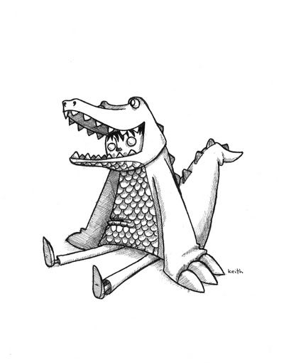
i'm new, here's my art. [new piece 9/10]

quid squidquid squid Registered User regular
edited September 2008 in Artist's Corner
i'm new here so i thought i would start off by showing everyone what i do. i have a degree in illustration and one in toy design. do a lot of gallery shows (i am 8-bit #3, crazy 4 cult, and a bunch more). anyways, here are a couple examples...


knifefight.jpg

normsitting.jpg

norm.jpg

krakenattack.jpg

if you want to see more work check out my site http://www.wonderingart.com

let me know what you think and if people like what they see i'll post more. i am also interested in posting in progress work to see what advice people can give and help me with.

quid squid on

Posts

  • Options
    DeeLockDeeLock Registered User regular
    edited August 2008
    Lovely!!!

    DeeLock on
  • Options
    Endless_SerpentsEndless_Serpents Registered User regular
    edited August 2008
    Damn, that stuffs smooooth.

    All in all great work, lemme just say I love your black and white work above all.

    Endless_Serpents on
  • Options
    beavotronbeavotron Registered User regular
    edited August 2008
    great great work, welcome!

    beavotron on
  • Options
    IrukaIruka Registered User, Moderator mod
    edited August 2008
    That suit can never be orange, and I hope thats an alligator and not a dragon, you bastard.

    welcome though, I really love the first one. Smooth, as serpents said.

    Iruka on
  • Options
    quid squidquid squid Registered User regular
    edited August 2008
    Iruka wrote: »
    That suit can never be orange, and I hope thats an alligator and not a dragon, you bastard.

    welcome though, I really love the first one. Smooth, as serpents said.

    don't worry, it is an alligator. his name is norm. for some reason the images are squished a little, is there a height restriction for images on the board?

    glad you guys enjoy, i will post new stuff as i am working on them. i have a couple pieces due for the new Crazy 4 Cult in a week or so, so i'm sure i'll come looking for advice on that.

    quid squid on
  • Options
    IrukaIruka Registered User, Moderator mod
    edited August 2008
    I'm okay with your alligator suit, then. And I believe photobucket goes about resizing things unless you tell it not to.

    Iruka on
  • Options
    quid squidquid squid Registered User regular
    edited August 2008
    Iruka wrote: »
    I'm okay with your alligator suit, then. And I believe photobucket goes about resizing things unless you tell it not to.

    glad you approve of norm ;) he's actually part of a series of characters i do called Animal Crackers.

    i've never had a problem with photobucket resizing my images before. i use it all the time to post on my blog.

    oh, and i forgot to say "thanks" for all the welcoming comments.

    quid squid on
  • Options
    SlainbylichSlainbylich Registered User regular
    edited August 2008
    I enjoy the sword of daedalus reference in the first image.

    Slainbylich on
  • Options
    KalTorakKalTorak One way or another, they all end up in the Undercity.Registered User regular
    edited August 2008
    The guy in the first one looks a lot like my brother...

    :(

    Really awesome work. I love the alligator suit, and the octopus made me laugh and I don't know why.

    KalTorak on
  • Options
    KunkohKunkoh Registered User regular
    edited August 2008
    Damocles..... it's really more of a dagger. ;)
    I think you've been watching too much SG1 - Daedalus :)

    Kunkoh on
  • Options
    SlainbylichSlainbylich Registered User regular
    edited August 2008
    Well I need to do something while I wait to die. :P I knew it started with a D, at least my college education gave me that. haha. It's good art anyway.

    Image #4 reminds me of a particular tv show, I can't remember which one, but something in the back of my brain says "youve seen this before".

    Slainbylich on
  • Options
    KunkohKunkoh Registered User regular
    edited August 2008
    I wish I could say that I remember because of my classical background in Greek, Roman & Egyptian mythology.... so I will.
    It's better than admitting I only remember because of the Rocky Horror Picture Show song!... which alas is the real reason. Now forget you read this. FORGET DAMN YOU!

    Kunkoh on
  • Options
    MustangMustang Arbiter of Unpopular Opinions Registered User regular
    edited August 2008
    It's too neat, stop being so neat.
    It makes us messy ones look bad.

    Mustang on
  • Options
    LaliluleloLalilulelo Richmond, VARegistered User regular
    edited August 2008
  • Options
    GrennGrenn Registered User regular
    edited August 2008
    Welcome & Great work, I'd love to see some of your process. Keep postin'!

    Grenn on
  • Options
    KealohaKealoha Registered User regular
    edited August 2008
    you wouldn't happen to have neighborhood #1 tunnels in 1280x800 would you? My god, it's fantastic. All of your stuff is good. Love dinobytes, too. Just noticed some of your stuff, at least the kraken series, is for sale. I'd buy it if I had money. Also, sorry if asking for a bigger size of that is uncalled for.

    Kealoha on
    !! ! ! !!
  • Options
    TamTam Registered User regular
    edited August 2008
    You have neat drawingses.

    Tam on
  • Options
    quid squidquid squid Registered User regular
    edited August 2008
    Kealoha wrote: »
    you wouldn't happen to have neighborhood #1 tunnels in 1280x800 would you? My god, it's fantastic. All of your stuff is good. Love dinobytes, too. Just noticed some of your stuff, at least the kraken series, is for sale. I'd buy it if I had money. Also, sorry if asking for a bigger size of that is uncalled for.

    i have a bunch of other art i will be putting up for sale next month. i have a solo show in LA that i will be putting all my older unsold work in. anything left over after that month will go up on my site for sale. if you're in LA the show is scheduled for the 16, i will be posting more info as soon as i have the final details.

    i'll see what i can do about getting you a larger image. i'm assuming you want it for a wallpaper?

    quid squid on
  • Options
    ProjeckProjeck Registered User regular
    edited August 2008
    could i get this in a 1680x1050 resolution? it is the bomb diggity

    Projeck on
  • Options
    u63ru63r Jon "Bad Wasabi" Wood Registered User regular
    edited August 2008
    quid squid wrote: »
    knifefight.jpg
    The name "Damocles" mean anything to you?

    u63r on
  • Options
    KealohaKealoha Registered User regular
    edited August 2008
    quid squid wrote: »
    Kealoha wrote: »
    you wouldn't happen to have neighborhood #1 tunnels in 1280x800 would you? My god, it's fantastic. All of your stuff is good. Love dinobytes, too. Just noticed some of your stuff, at least the kraken series, is for sale. I'd buy it if I had money. Also, sorry if asking for a bigger size of that is uncalled for.

    i have a bunch of other art i will be putting up for sale next month. i have a solo show in LA that i will be putting all my older unsold work in. anything left over after that month will go up on my site for sale. if you're in LA the show is scheduled for the 16, i will be posting more info as soon as i have the final details.

    i'll see what i can do about getting you a larger image. i'm assuming you want it for a wallpaper?

    yeah, you're correct. and unfortunately I won't be in LA, but good luck nonetheless.

    Kealoha on
    !! ! ! !!
  • Options
    CrowlestonCrowleston Registered User regular
    edited August 2008
    u63r wrote: »
    quid squid wrote: »
    knifefight.jpg
    The name "Damocles" mean anything to you?

    I played Rocky in my college production of RHS. Thought I would just throw that out.

    Crowleston on
    useless but necessary objects of society.
  • Options
    quid squidquid squid Registered User regular
    edited August 2008
    Crowleston wrote: »
    u63r wrote: »
    quid squid wrote: »
    knifefight.jpg
    The name "Damocles" mean anything to you?

    I played Rocky in my college production of RHS. Thought I would just throw that out.

    lol...what?

    anyways, if any of you had a chance to look at my site, what style are you more attracted to? i go from style to style and sometimes i think it makes things harder on me getting my work noticed. i guess the only real drastic difference is between the serious stuff and the pen/ink and more humorous stuff. i know galleries try to stick with a person doing one type of thing, but i never seem to be happy sticking with one style. do you guys also see this as a problem or should i just do whatever i feel fits the illustration better? i get relatively good responses about all the styles (except when i tried to do the serious style in acrylic...i guess the line quality of the illustrator version is a strong point and it is harder to replicate as clean in acrylics).

    quid squid on
  • Options
    KealohaKealoha Registered User regular
    edited August 2008
    I'd say that pigeonholing yourself into one style would be a bit of an unnecessary constraint. Maybe when you're older you should have one style, but you never know. Maybe somehow the drastically different approaches you take now will someday meld into one unique style. As long as you maybe limit your shows to one particular style at a time, you could try that.

    But I'm not really part of the art world, so I don't know if that would be best.

    Kealoha on
    !! ! ! !!
  • Options
    quid squidquid squid Registered User regular
    edited August 2008
    Kealoha wrote: »
    I'd say that pigeonholing yourself into one style would be a bit of an unnecessary constraint. Maybe when you're older you should have one style, but you never know. Maybe somehow the drastically different approaches you take now will someday meld into one unique style. As long as you maybe limit your shows to one particular style at a time, you could try that.

    But I'm not really part of the art world, so I don't know if that would be best.

    well, you not being part of the art world is a very valued point of opinion. you are the one coming into a gallery knowing nothing about me or my work in the first place, and that opinion goes far. i am always interested to know what people think of my work, and what people are more interested in seeing and what they enjoy looking at.

    quid squid on
  • Options
    ProjeckProjeck Registered User regular
    edited August 2008
    Projeck wrote: »
    could i get this in a 1680x1050 resolution? it is the bomb diggity

    please? :C

    Projeck on
  • Options
    Erik the HackErik the Hack Registered User regular
    edited August 2008
    quid squid wrote: »
    normsitting.jpg

    Yeah, I really dig your style. You have talent. This one is my favorite of the four you posted. 8-) I wish I could draw like that...

    Erik the Hack on
    sig1.gifsig2.gif
  • Options
    quid squidquid squid Registered User regular
    edited August 2008
    so, i am looking to make new shirts soon. i originally did this as a print with crayon drawn on top...i took the colors out and added the blue background for a shirt design. what do you think? anything i should change? it's based on imagery by the 80's painter Basquiat, who is one of my favorite artists. would you buy this?

    normshirt_basquiat.jpg

    ps. ill get you guys some bigger wallpaper images soon, i just have to finish some pieces for some shows and i can get around to it.

    quid squid on
  • Options
    KealohaKealoha Registered User regular
    edited August 2008
    I'm not sure if I would buy that on a t-shirt, but it seems more like a kids thing to me anyway, and it's adorable.

    I think something really sweet would be to have that on a polo where the other companies normally have their signs.

    Kealoha on
    !! ! ! !!
  • Options
    quid squidquid squid Registered User regular
    edited August 2008
    is there another color i should use for this design?

    a polo type shirt would be awesome and something i've wanted to look into. it's mainly a matter of money and wondering how much i have to simplify my design to make into the patch.

    quid squid on
  • Options
    DeeLockDeeLock Registered User regular
    edited August 2008
    I don't like the line that you've underlined "Norm" with.

    It looks more like you wrote something and then crossed it out...well not exactly...but it's a little too dirty for the overall feel of the piece.

    DeeLock on
  • Options
    quid squidquid squid Registered User regular
    edited August 2008
    DeeLock wrote: »
    I don't like the line that you've underlined "Norm" with.

    It looks more like you wrote something and then crossed it out...well not exactly...but it's a little too dirty for the overall feel of the piece.

    the added elements (name, line, and crown) are from a piece i just did recently where i took a print and added crayon to it. it is based on pieces from the artist Basquiat, used the crown and dirty looking text and linework in his pieces. at one point he was a huge inspiration to me and my work and that's what this piece is about.

    i need to center the bottom elements more, something looks off with the alignment to me. would it help if maybe i made the line smaller?

    quid squid on
  • Options
    IrukaIruka Registered User, Moderator mod
    edited August 2008
    Basquiat... Didnt he do very textured, layered, colorful work? Seems like just taking the crayon out of that context isnt working here, at least in the text. You could explore the balance between smooth and textured way more.

    I probably wouldn't wear that, as is. Its just a character that while pretty neat doesn't mean a whole ton to me, and isnt doing anything particularly interesting.

    Iruka on
  • Options
    quid squidquid squid Registered User regular
    edited August 2008
    Iruka wrote: »
    Basquiat... Didnt he do very textured, layered, colorful work? Seems like just taking the crayon out of that context isnt working here, at least in the text. You could explore the balance between smooth and textured way more.

    I probably wouldn't wear that, as is. Its just a character that while pretty neat doesn't mean a whole ton to me, and isnt doing anything particularly interesting.

    he did more graffiti art in the 80s, some of his later stuff was more colorful though. i was taking more of the icon of the crown and lines for this. he would use white chalk on surfaces, spraypaint, etc. which is where the crayon comes in here. the character i use is part of a story and he is in kindergarten...which is why i used the crayon. i've used it on pieces in the past with the same character and was keeping with that.

    i'd add more color, but i'm trying to keep the price down.

    quid squid on
  • Options
    IrukaIruka Registered User, Moderator mod
    edited August 2008
    Well if your selling it to an audience that already knows what it is, I guess its fine. Crayon as a concept doesn't bother me but there isnt anything very kindergarten in the drawings/handwritting itself.

    Iruka on
  • Options
    quid squidquid squid Registered User regular
    edited August 2008
    here's my new canvas

    night-at-opera.jpg

    i'm doing a show based on the rolling stone top 500 albums of all time, where you pick an album and do a painting on the cover. so i chose Queen A Night at the Opera. i have no clue what i am going to do yet.

    i want to try to include pieces from each song on the album. i'm thinking the majority of the piece will be pen/ink with a little bit of acrylic in some choice areas.

    quid squid on
  • Options
    quid squidquid squid Registered User regular
    edited September 2008
    still working on the album cover design, but here is a new piece i did this past week. i am currently working on a show for January where I will be doing similar pieces with ink on wood. does anyone have experience doing a process like this? my friend, who will also be showing in this show (www.aaronkratenart.com) uses a spray varnish to coat the wood with 2 or so coats and then lets it dry for a couple days. then uses a repidiograph (sp?) pen to draw. i was having problems with the spray varnish not coating the wood canvas too well, seemed like it was seeping into the wood or not drying correctly.

    twilight72.jpg

    i just recently had a solo show, any pieces that have not sold are still up at http://keithnoordzy.bigcartel.com i will try to put up a complete gallery of all the pieces in the show (there's about 9 missing)

    quid squid on
  • Options
    YogYog Registered User regular
    edited September 2008
    I absolutely love your cult stuff.

    Yog on
    IA! IA! IA!
  • Options
    GCGalGCGal Registered User regular
    edited September 2008
    Really love that first piece and about 4 others from your website. good job.

    GCGal on
Sign In or Register to comment.