The new forums will be named Coin Return (based on the most recent vote)! You can check on the status and timeline of the transition to the new forums here.
The Guiding Principles and New Rules document is now in effect.
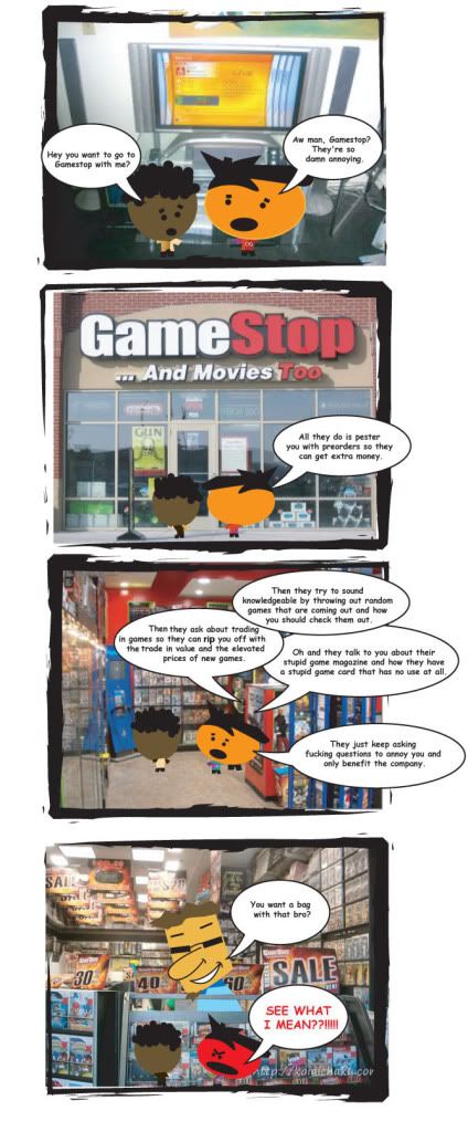
Honestly? This is highly forgettable. From the character designs, to the terrible use of stock photo backgrounds to the flat joke, there just simply isn't anything significant here that would make me want more.
You need to work on your writing, and the character designs need developing. I understand the joke, but even if it was worded better it still wouldn't be funny. Got any other comics? Post them and give people a better idea of what stage you are at with your writing/art so that you can get better feedback. Its hard to judge someones creativitiy on a single piece of work. Also, is it just you who works on it? Maybe talk about your ideas with friends, have someone else help write/illustrate it. Its a lot more fun with two people than by yourself! Keep working on it.
EDIT
Also looked at your site. It'll be really difficult to get a fan base as there are already many websites/blogs dedicated to gaming from a 'gamers point of view'. But yeah, try to offer something interesting and original that no one else does, or make it better than the rest. How many people are working on it? Goodluck with it.
That was terrible, and I knew it'd be terrible from the first panel. You might be able to go somewhere with the art style, but the writing was atrocious and completely unfunny, harping on a subject that had barely any comedic potential in the first place, which was already run into the ground at least five years ago. Even if the rest had been funny, the third panel killed it dead. Way too much text without an ounce of humor in it.
I really feel like you didn't flesh these characters out at all before throwing them into some panels with a photographic background. The little-headed black kid's shirt keeps changing color. If it was shading you were trying to do, it would have helped get that message across by also shading his head and hair, and actually giving him a shadow on the ground. Otherwise, it looks like he just keeps changing his shirt between panels. The most promising character in this whole strip is the GameStop guy, because he has SOMETHING to him other than a South Park-esque head shape and the circle tool.
Your font is way too small. It is also way too Comic Sans. http://dafont.com or other such font sites let you download new fonts for free, and they usually have a "comic" section with fonts that you could probably use.
I said "font" like a thousand times there. Font, font, font, font, font!
Lastly, don't use photos as your backgrounds, ever ever ever! I'm sure there are people somewhere that can pull it off ("professional" webcomic "artist" Tim Buckley does it and it still sucks, though, so good luck with that), but it's not working. Do something else. You have really simple characters; the background doesn't have to be photo-realistic.
The whole comic feels like a tacked-on addition to another gaming blog; something you don't want to make better, you just want something quick and easy to show off on your site. If this isn't the case, then hopefully you'll come back with some fleshed-out characters with faces that stay consistent panel to panel and 100% less photographed backgrounds.
edit: Also, I used to be the manager at a local GameStop. Yes, the company sucks, but that damn GameStop card is NOT useless, dammit! 10% of used games and accessories WHAT WHAT
I appreciate the feedback. This is an early sketch and it is still be worked on. I'm in charge of the writing and my uncle is in charge of the illustrations so we're going back and forth on trying to improve it. Sorry about the size, thought it was bigger when I uploaded it.
ogmaster on
O.G. = Original Gamer
Visit my blog for review, videos, and video games news, www.original-gamer.com
I think the character designs would work if your artist actually drew backgrounds, and they looked good. Also, zooming in on the characters would it help it. Imagine the same character designed that way, or even with thick black outlines around the characters.
However, it's a gamer comic, which means it's one of thousands, and for the most part that means you're shooting yourself in the foot.
falconire on
0
MustangArbiter of Unpopular OpinionsRegistered Userregular
edited September 2008
Please don't infract me Mr. E, and all the other boys were spamming threads and I just wanted to be cool. You were young once, don't you remember what it was like?
Mustang on
0
NakedZerglingA more apocalyptic post apocalypse Portland OregonRegistered Userregular
edited September 2008
Its kinda a weak version of a tired joke....but a better attempt than a lot.
the art is lackluster, the writing is subpar, the composition is horribly hamhanded and overall i would say to completely start over with a new concept.
i took a glance at the third panel and decided i wasn't going to read it and just skipped it. work on fitting the words into the bubble with less free white gaps all over. also, using stock speech bubbles makes it look very cliparty
Anything where youre relying on limited cartoons over photographs for artwork is going to look kinda hokey.
Some people can pull it off by tossing the photo in a filter but I think this approach is only useful for the artist to produce fast work and does not impress an audience.
As for the writing its extremely verbose. Way too much being said without anything being said.
The joke is a typical one common in daily newspaper comics but can still be funny if you extensively shorten your dialogue.
It may work better if the characters are already at the store ... instead of "OMG lets not go there" say "OMG why are we here" that way they are already esablished in the scene where the pay off will be.
Think about it like this for a while and you may get to the puch line much faster.
Posts
EDIT
Also looked at your site. It'll be really difficult to get a fan base as there are already many websites/blogs dedicated to gaming from a 'gamers point of view'. But yeah, try to offer something interesting and original that no one else does, or make it better than the rest. How many people are working on it? Goodluck with it.
up the size of your font
That being said, this comic needs a heapin' helpin' of "show, don't tell"
Your font is way too small. It is also way too Comic Sans. http://dafont.com or other such font sites let you download new fonts for free, and they usually have a "comic" section with fonts that you could probably use.
Lastly, don't use photos as your backgrounds, ever ever ever! I'm sure there are people somewhere that can pull it off ("professional" webcomic "artist" Tim Buckley does it and it still sucks, though, so good luck with that), but it's not working. Do something else. You have really simple characters; the background doesn't have to be photo-realistic.
The whole comic feels like a tacked-on addition to another gaming blog; something you don't want to make better, you just want something quick and easy to show off on your site. If this isn't the case, then hopefully you'll come back with some fleshed-out characters with faces that stay consistent panel to panel and 100% less photographed backgrounds.
edit: Also, I used to be the manager at a local GameStop. Yes, the company sucks, but that damn GameStop card is NOT useless, dammit! 10% of used games and accessories WHAT WHAT
Visit my blog for review, videos, and video games news,
www.original-gamer.com
However, it's a gamer comic, which means it's one of thousands, and for the most part that means you're shooting yourself in the foot.
i took a glance at the third panel and decided i wasn't going to read it and just skipped it. work on fitting the words into the bubble with less free white gaps all over. also, using stock speech bubbles makes it look very cliparty
Some people can pull it off by tossing the photo in a filter but I think this approach is only useful for the artist to produce fast work and does not impress an audience.
As for the writing its extremely verbose. Way too much being said without anything being said.
The joke is a typical one common in daily newspaper comics but can still be funny if you extensively shorten your dialogue.
It may work better if the characters are already at the store ... instead of "OMG lets not go there" say "OMG why are we here" that way they are already esablished in the scene where the pay off will be.
Think about it like this for a while and you may get to the puch line much faster.