The new forums will be named Coin Return (based on the most recent vote)! You can check on the status and timeline of the transition to the new forums here.
The Guiding Principles and New Rules document is now in effect.
Drink Around the World Shirt (be brutal)
LuisNin Registered User new member
Registered User new member
Drink Around The World Shirts (be brutal)
First off, I just want to say that I'm a big fan of the way you guys do things here. You don't mince words and you give awesome critiques. It is because of this that I humbly come to you, oh lords of images, and ask for your advice.
I recently designed a tshirt:
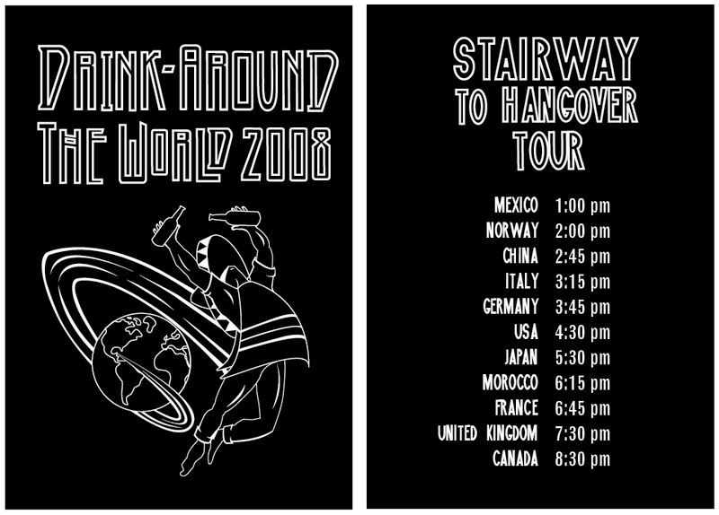
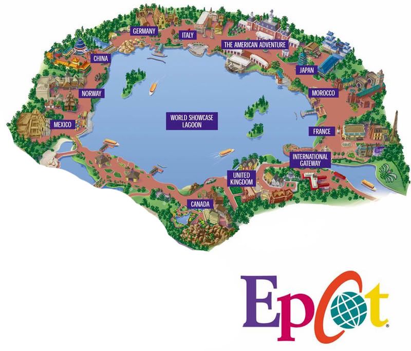
This shirt will be for an event we'll be holding in three weeks called "Drink Around the World". During this event, my friends and I go to Disney's Epcot Center in Orlando Florida, and drink at all 11 countries in their world showcase.
It's a very fun and special event, and we always like to make it extra special by designing a t-shirt. This year we decided to go for a rock theme, and made the tshirt a tribute to Led Zeppelin's classic Icarus shirt.
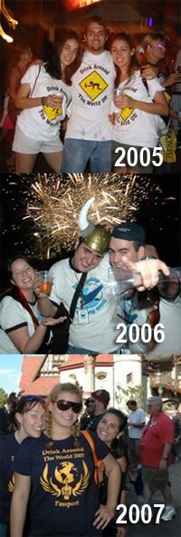
We've been doing this event for the past three years, and we have a fairly large group of people going this year.
Please let me know what you think. What sucks about it, and what I can improve. All your comments are very much appreciated.
EDIT: Oh, here's the shirt I was trying to emulate:

First off, I just want to say that I'm a big fan of the way you guys do things here. You don't mince words and you give awesome critiques. It is because of this that I humbly come to you, oh lords of images, and ask for your advice.
I recently designed a tshirt:
This shirt will be for an event we'll be holding in three weeks called "Drink Around the World". During this event, my friends and I go to Disney's Epcot Center in Orlando Florida, and drink at all 11 countries in their world showcase.
It's a very fun and special event, and we always like to make it extra special by designing a t-shirt. This year we decided to go for a rock theme, and made the tshirt a tribute to Led Zeppelin's classic Icarus shirt.
We've been doing this event for the past three years, and we have a fairly large group of people going this year.
Please let me know what you think. What sucks about it, and what I can improve. All your comments are very much appreciated.
EDIT: Oh, here's the shirt I was trying to emulate:
LuisNin on
0
Posts
Other than that I like it.
Oh yeah and why does the boozer have to be a Mexican? It's like just about as racially incensitive as you could get man.
I'm kid. Man I want to come to this...
INSTAGRAM
I didn't get that it was a Zeppelin reference until you pointed it out. The Mexican character just seems too incongruous with the type. Using the Led Zep font doesn't really do enough to make the reference clear.
The illo is OK but could do with some variance in line thickness. Also perhaps center the illustration to the text (rather than to the left, as it appears now).
But... at the end of the day, it's a shirt for drinking in and by the time you hit Morocco I'm pretty sure you won't care. :P Sounds like a good day out, have fun dude.
You'll notice the original Led Zepplin guy has a thicker line running around his outer shape, thicker than the lines that make up the detail.
Also, the wings are really the iconic part of the led zepplin image. Have you thought about incorporating them at all? I'd probably try to do big splashes of liquor that vaguely resembled the wings?
I know your emulating the led zepplin shirt but that drawing has alot less going on, but I really think your design could benift from some solid white shapes.
On another note, I think that usuing the globe is a little unnecessary. you could just have the figure in that pose and just dress him in odd bits of clothing from different parts of the world.
Any suggestions?
If the president had any real power, he'd be able to live wherever the fuck he wanted.
I think the beer splashes would benefit from some variation in line weight, as opposed to just a solid stroke but it's not a big deal... still works as it is.
But hey, your shirt, do whatever.
You guys are freaking awesome. I can't believe you guys take the time to deliver so much awesome advice. Anyone who doesn't take it is dumb.
I just finished sending the shirts to print. Here are the finals:
FRONT
BACK
Note: I was on a time crunch, so I just purchased the girl holding the Bass from a Stock Illustration site and modified her into a French girl. If I had a little more time, I would have drawn her myself.
SLEEVE
They should come out really nice. I'm printing them on fitted, Charcoal shirts for a vintage rock look.
Thanks for all the help and advice guys!
If you're in Orlando FL next weekend, pass by Epcot and say "hi!"