As was foretold, we've added advertisements to the forums! If you have questions, or if you encounter any bugs, please visit this thread: https://forums.penny-arcade.com/discussion/240191/forum-advertisement-faq-and-reports-thread/
Options
So, I draw stuff. Now with Catman. (nsf56k)
Munch Registered User regular
Registered User regular
I've been posting here for a pretty long time, offering crits and using crits of other people to help improve my own art, but just the other day I got a scanner, so I went ahead and scanned a bunch of stuff from my sketchbook. Any general crits for repeat mistakes will be appreciated. I'll be posting some of the older stuff first, so if you see a varying level of quality or anything, that's why.
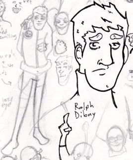
1- Ralph Dibny, world famous Elongated Man. He's also one of the oldest things I have in my sketchbook, so he gets posted first. I know his ear is too small and low, and his left one shouldn't really be visible.
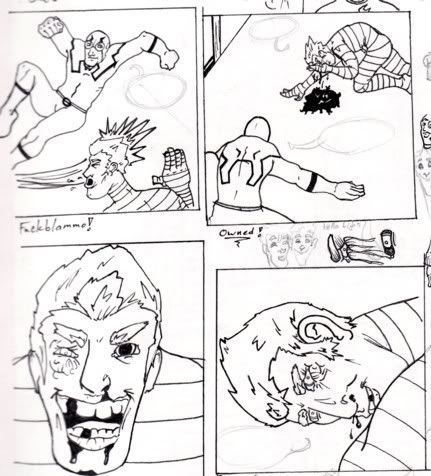
2- I hadn't drawn a series of panels since I was like, twelve, so I figured I'd give that a shot here. Once again, this is probably two to three months old now, but I'm still happy with some parts of it. The bottom two panels aren't supposed to run in sequence either, the fourth is just a replacement for the third. Also, I realise that the guy who got kicked in the face is suddenly injured on the wrong side of his head in the fourth panel.
3- Full sketchbook page. Not much to say about it. I was screwing around with watercolor paints mostly.
4- More random stuff.
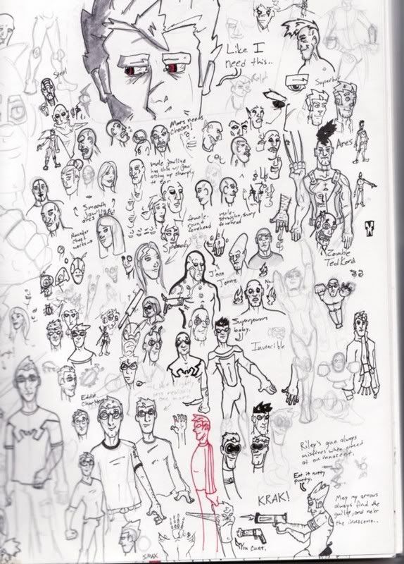
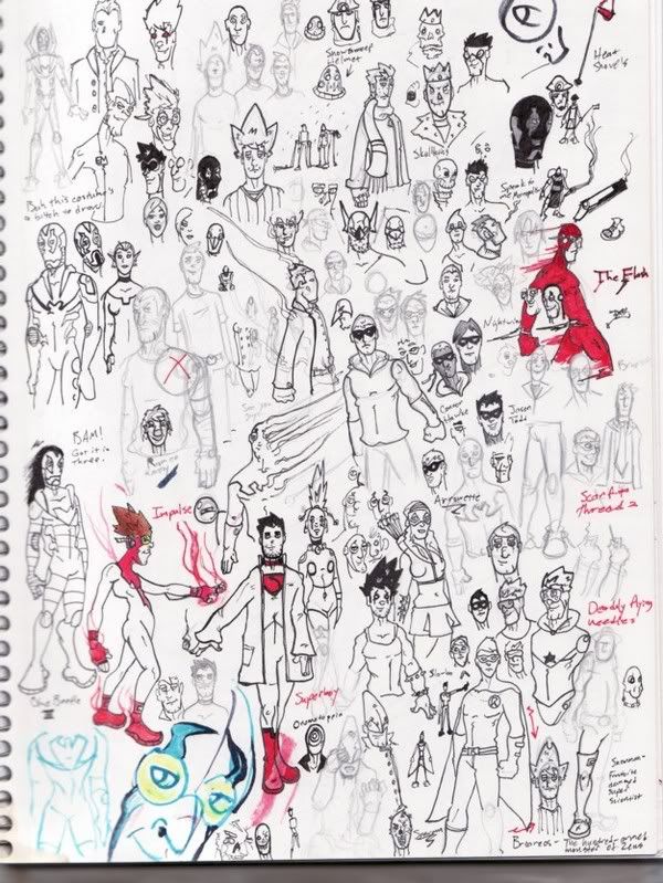
5- I really like how Invincible and Martian Manhunter look on this page.
6- I was into this thing for a while where I'd draw with a red marker first, then go over it with my Microns, trying to build up a little more confidence with my lines. It worked for a while, but then I started to rely on it too much, and couldn't draw as well with a pencil anymore, so I stopped.
7- Speaking of which. Here's DC Comics' Metamorpho and his main cast, with my scanner causing some blurring on the left. Also? I really like drawing Metamorpho's head for some reason.
8- See?
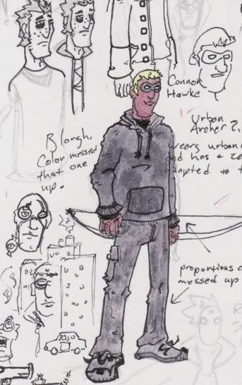
9- Here's a redesign I was playing around with for Connor Hawke, another DC character. Connor's multiethnic, but that's never been represented in the comics very well, so I was trying to give him kind of a more black nose and lips. I also totally screwed up the proportions on his arms, and gave him some weird paw instead of a hand.

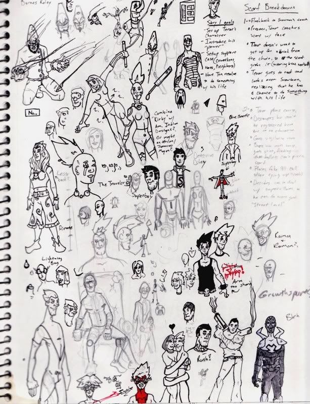
10- Just for fun, a picture of my favorite comic character, Blue Beetle. I dig the goggles. You'll be seeing him on a lot of my sketch pages.
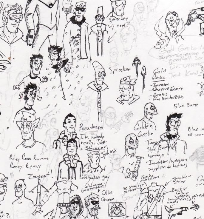
11- Some of my original characters. Off to the right you'll see the Gold Gecko and the Blue Burst, homages to DC's Blue Beetle and Booster Gold that I want to do a story with at some point. Also, more Connor Hawke at the top there.
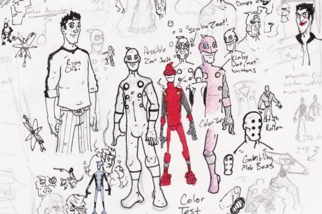
12- Trying to design a costume for Zoot, the main character of a superhero webcomic I want to do at some point. I was kind of going for a Kirby New Gods feel. Don't know if I quite succeeded though. To his left is a headshot of DC's Ryan Choi, that somehow grew a body while I was working on it. I've never been very good at drawing subtle features of different races, so I wanted to try to draw an asian guy without making him look terrible. Nightcrawler's head is also down there by Zoot's knee.
13- More of Ze Amahzing Nightcrawla (!) and Michael Chabon's Amazing Escapist.

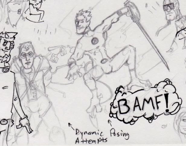
14- Some ink sketches for Zoot's costume, as well as some more Elongated Man and Etrigan the Demon. For me though, the real highlight of this image is that thought balloon. I've decided that if I ever get around to launching a superhero webcomic I'm going to not only use thought bubbles instead of captions for narration, but I'm going to hand draw them in as well. I just think they look cool.
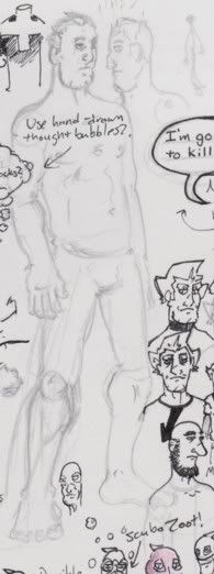
15- The naked dudes I draw probably hate me, because I always draw them without wangs.
16- Tenor Tooley, a character I want to do another comic with. Just playing around with a more sketchy style.
17- Tenor again. His nose is a lot of fun for me to draw for some reason.
So there you go. Just kind of an introductory post with some art. Now that I have a scanner, I've got a little more motivation to do finished pieces, so I'll be trying to pump out some more finished stuff.
1- Ralph Dibny, world famous Elongated Man. He's also one of the oldest things I have in my sketchbook, so he gets posted first. I know his ear is too small and low, and his left one shouldn't really be visible.
2- I hadn't drawn a series of panels since I was like, twelve, so I figured I'd give that a shot here. Once again, this is probably two to three months old now, but I'm still happy with some parts of it. The bottom two panels aren't supposed to run in sequence either, the fourth is just a replacement for the third. Also, I realise that the guy who got kicked in the face is suddenly injured on the wrong side of his head in the fourth panel.
3- Full sketchbook page. Not much to say about it. I was screwing around with watercolor paints mostly.
4- More random stuff.
5- I really like how Invincible and Martian Manhunter look on this page.
6- I was into this thing for a while where I'd draw with a red marker first, then go over it with my Microns, trying to build up a little more confidence with my lines. It worked for a while, but then I started to rely on it too much, and couldn't draw as well with a pencil anymore, so I stopped.
7- Speaking of which. Here's DC Comics' Metamorpho and his main cast, with my scanner causing some blurring on the left. Also? I really like drawing Metamorpho's head for some reason.
8- See?
9- Here's a redesign I was playing around with for Connor Hawke, another DC character. Connor's multiethnic, but that's never been represented in the comics very well, so I was trying to give him kind of a more black nose and lips. I also totally screwed up the proportions on his arms, and gave him some weird paw instead of a hand.
10- Just for fun, a picture of my favorite comic character, Blue Beetle. I dig the goggles. You'll be seeing him on a lot of my sketch pages.
11- Some of my original characters. Off to the right you'll see the Gold Gecko and the Blue Burst, homages to DC's Blue Beetle and Booster Gold that I want to do a story with at some point. Also, more Connor Hawke at the top there.
12- Trying to design a costume for Zoot, the main character of a superhero webcomic I want to do at some point. I was kind of going for a Kirby New Gods feel. Don't know if I quite succeeded though. To his left is a headshot of DC's Ryan Choi, that somehow grew a body while I was working on it. I've never been very good at drawing subtle features of different races, so I wanted to try to draw an asian guy without making him look terrible. Nightcrawler's head is also down there by Zoot's knee.
13- More of Ze Amahzing Nightcrawla (!) and Michael Chabon's Amazing Escapist.
14- Some ink sketches for Zoot's costume, as well as some more Elongated Man and Etrigan the Demon. For me though, the real highlight of this image is that thought balloon. I've decided that if I ever get around to launching a superhero webcomic I'm going to not only use thought bubbles instead of captions for narration, but I'm going to hand draw them in as well. I just think they look cool.
15- The naked dudes I draw probably hate me, because I always draw them without wangs.
16- Tenor Tooley, a character I want to do another comic with. Just playing around with a more sketchy style.
17- Tenor again. His nose is a lot of fun for me to draw for some reason.
So there you go. Just kind of an introductory post with some art. Now that I have a scanner, I've got a little more motivation to do finished pieces, so I'll be trying to pump out some more finished stuff.

Munch on
0
Posts
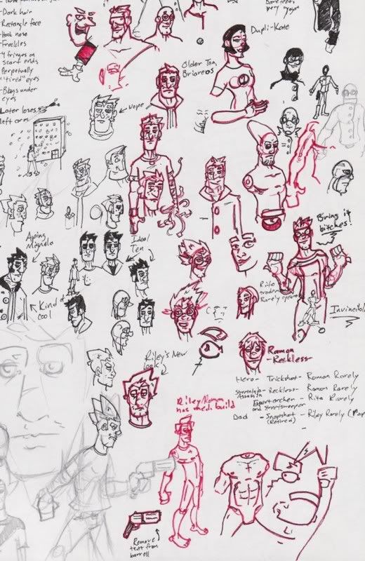
On the subject of drapery, instead of simply adding lines to areas that seem devoid of lines, think about how the fabric is pulled, stretched, compressed, etc. by the movement of the body. Check out your clothes as you wear them and start really looking at where the fabric folds!
Yeah, I've got a bad habit of trying to scrunch a ton of ideas and little half-finished sketches onto one page of my sketchbook before I move on. And when it comes to clothing and folds, I'm clearly a big fan of the, "Eh, I'll just draw a few lines across the chest and maybe a dent down on the belly" school of thought. Actually, Martian Manhunter's cape in the pic above is a pretty bad offender.
Tumblr Twitter
There's some good motion there in Thor vs MM but it could be more interesting to make them not so wimpy looking! Pump them up, put some tension and angles in the joints, enforce the pull back on that punch. I think you need to look at some photos of how heads connect to bodies, they are lacking in necks a bit. I want to see some finished work and much bigger, page filling battles.
A wise australian armadillo once told me not to worry about every little detail. Let the viewers eyes fill in some of the details. I think the same advice would benefit you too. Especially in the face department. Hit the high points with your pen and leave the little details to the viewer.
Also line variation. Like in your second page up there a little line variation would help break up the picture into seperate objects.
I beefed up both characters' legs and calves a bit, completely redrew Martian Manhunter's head, and reposition it so it attaches to his neck a bit better, changed Thor's hair to be blowing in the same direction as MM's cape, and thickened up the lines a bit in places. I also created a really annoying tangent between Thor's armband and MM's arm. Can't believe I didn't notice that. Thor's right shoe is also looking pretty bad, and MM is suffering from McFarlane Cape Syndrome.
Still, for my first serious attempt to have two characters interacting with each other, at a size larger than I'm used to drawing, I'm pretty happy with it. I think I'm going to move on and handpaint it with watercolors, and maybe ad in some clouds or mountains or something just for a little window dressing.
Tumblr Twitter
Tumblr Twitter
Early ink sketches, just trying to work out how he'd be posed, and brainstorming on how to change his costume a bit.
Semi-finalized pencils.
Tumblr Twitter
I work all day tomorrow, and won't be able to update this again until tomorrow evening. So if anyone else has some crits, feel free.
Tumblr Twitter
Just a thought.
You're the second person who's said that my figures look stiff in this thread, so now I'm paranoid, since I've never really seen that as much of a problem. I did do a small sketch reowrking his pose though, turning his torso at a 3/4 angle that I think will help make him more natural and interesting looking.
That's actually drawn on a standard piece of printer paper (8x11?), so it's a pretty good size. As for "feeling the strokes", I actually do draw pretty loose, I just like to tighten the pencils up for easier inking. I'm also not too concerned about his forearm obscuring his chest, since that was one of the points of this picture. I'm used to drawing people standing straight with their arms to their sides, and this was a way to get away from that. Now, I do think I failed a bit in making his right arm look interesting looking, but I plan to change that before I ink it.
Anyhow, this will be updated later this evening with the final pencils. Thanks for the crits.
Tumblr Twitter
Initial reworked pencils. I basically just tried twisting his torso to the right a little, made the bottom of his right hand face the viewer to make it a little more interesting looking, and played with the fingers a bit so they didn't look so much like oven mitts.
Inks. For some reason I get really jittery when I ink, and I kept messing up certain spots, so the eyeholes in his mask wound up goofy looking, and his belt came out a little crooked and shaky. Those eyes bug the hell out of me though. Argh. Also went ahead and dropped in a generic empty hallway background, since I never really do much in the way of setting.
Tumblr Twitter
Perspective seems to be an issue here, as is the pose.
Like it has been said before your figures all seem stiff. This most recent one is interesting, but that pose is weird. Try that position, stand up, bend your knees but keep your back straight.
It looks unnatural and isn't great for balance. Try hunching this figure's back forward. Use 'swooshy' curved guidelines for mor dynamicnessly awesome poses. \
http://www.itchstudios.com/psg/art_tut.htm < bottom of this page is what I mean by 'swooshy'
Your anatomy is off in most instances, even for comic book style characters. There are books I can suggest and methods I could reccomend, but mostly you just have to start drawing from life. Next, the poses are extremely stiff. I know that's been said a few times, but that point really needs to be reinforced. You've got to loosen this stuff up and the best way to do that is by *ta-da* drawing bigger- 8x11 isn't very big. 11x14 is standard comic size, wich is then scaled to fit on a comic page (7x10? I don't know, someone wanna fill that in?). The alleyway behind... Catman... is bland and uninteresting, not to mention it makes obvious huge flaws in your perspective. The picture would have been better minus the background, or possibly not making it so big; that is to say, never go all the way to the edge of the page. Make margins, they'll do wonders.
Also, I can reccomend books and it would be stupid not to, so here are some:
Loomis's: Figure Drawing for all it's Worth
Drawing on the Right Side of the Brain (for learning how to really get the most of live drawing sessions)
And I geuss comic books- if you really want to emulate thier style the best thing to do is to check them out. But I would suggest developing your own style. Not to say you aren't, but I still have the same feeling of "I've seen this somewhere before," with your stuff.
Yeah, the whole hallway perspective thing was just me playing around with it, since, well, I really sort of suck at backgrounds and perspective. Originally the character's body was supposed to be turned even more, so that the body would almost be in profile, with the head looking at the viewer, but I kind of messed it up and rather than scrap it, I just decided to push through and finish it. Ah well. Also, I actually have that site you linked to bookmarked already. But I do see what you mean with "swooshy" lines, and I'll try to keep it in mind.
I actually do a little bit of life drawing here and there, but not nearly enough. And saying that my anatomy is off in most instances doesn't really help me too much, as that can cover anything from the fact that I like to give characters too much chin, or draw their arms a little short, to not giving characters enough cranium in 3/4 view. Specifics are always appreciated, even if they do make me cringe a bit reading them. As for the whole draw bigger thing, I get that and all, but I really don't think I'm at the point skill-wise where buying a bunch of big paper or Bristol board will be worth the investment. I'm sure there's plenty more I can learn just by drawing in my sketchbook.
Hah, yeah I already addressed the hall/alley, but basically it was just me saying, "Hey, can I do that very well?" Apparently the answer is a resounding, "No Munch, you can't. And go die in a fire."
I've skimmed through Figure Drawing for All It's Worth, but most of my artistic reading comes from Hogarth's books. And really, while I read a frightening amount of comics, I'm not out to emulate anyone's style really. I mostly study comics for panel composition.
Anyhow, thanks for the crits as always. Also, let me point out that while my drawing may not immediately reflect some of the crits I've gotten here, I'm always keeping them in mind as I try to improve.
Tumblr Twitter
There will always be more you can learn from drawing in a sketchbook, but there are sketchbooks bigger than 8x11. I have dozens of $4 sketchbooks lying around that are 11x14. They usually come with 30 pages instead of 70 but it's well worth it.
You're right, but I just don't like doing point by point stuff. Also, you have a ton of stuff there, and it's easier for me if I just tell you to pick up anatomy books. But, alright, I'll go into specifics on Catman here. First and foremost, he looks like he's wearing adult diapers, and that's because you've either over extended the pelvis or he's got a gigantic ass. His right (his right) leg is twisting to the right, wich can be done, but would be wholly uncomfortable. The calf on that same leg is a small blob placed at the top of the leg and, even strained, actually extends to the heel. The ankle on the left leg is too small to hold a man's wieght. His chin, as you said, is gigantic. These are points that could be explained to you better in books, and that's why I suggest them. I'm not an educator, so I don't know how to translate this very well. I will say that you should be much more creative with your character design. Not just gloves and boots, ya'know? Keep at it.