The new forums will be named Coin Return (based on the most recent vote)! You can check on the status and timeline of the transition to the new forums here.
The Guiding Principles and New Rules document is now in effect.
My comic BLEED
oysterboy Registered User regular
Hey everyone.
As some of you know already, I've been working on a comic called BLEED.
It's been picked up to compete to become an ongoing series on Zudacomics.com and the competition goes until I think December 26,2008!
It's very cutthroat and takes aloooot of votes to win so if you like what you see please take a minute to sign in and vote, rate, and favourite!
BLEED is drawn and written by myself and co-written by Luiza Dragonescu.
Check it out here:
SOME INFO
Zudacomics.com was created by DC Comics to find new creator-owned ongoing series by letting readers chose from 10 potentials a month.
The series with the most VOTES, highest RATING, most FAVOURITES, and most PAGE VIEWS is declared the winner at the end of each month.
That comic then becomes an ongoing series and is published on Zudacomics.com and in print.
HOW YOU CAN HELP
1. The best way is by VOTING for it! (The vote button is on the Competition Page and on the Comic Information drop-down on the Comic Page itself.) All you gotta do is quickly register and sign in.
2. You can also make it one of your FAVORITES or give it a high RATING. (The favorites button and a five-star rating scale are in the Comic Information section of the Comic Page.) Even VIEWING and COMMENTING helps determine which comic is ultimately number one!
3. You can even download a banner from the Support Page to post on your web page. Nothing helps like bringing in more people to favorite, rate, comment and especially VOTE!
Thanks for any support you can throw my way.
Sincerely,
Adam
(Also feel free to check out my blog at www.AdamAthertonPresents.blogspot.com)


oysterboy on
0
Posts
but did you clear this post with the mods?
because it sounds more like a site/projectwhore post than asking for feedback or crits (=what this forum is supposed to do).
edit: also, a pet peeve of mine: Your blacks arent blacks... I don't know if it's an artistic choice or just something you overlooked/ somehting you can't see on your monitor. But you're using a lot of almost-but-not-quite-blacks.. I think it looks kinda messy when compared to the nice linework..
I think it's because your photoshop work is darker than your scanned lines...
I AM looking for feedback. Right now I'm not allowed to display the pages anywhere while it's competing on Zuda so you gotta go there to see them. If you don't vote, or don't want to that is totally fine. I mean it wouldn't hurt, which is why I provided the info on how to vote, but this post is about the work itself.
The_Glad_Hatter - Thanks for the congrats. I didn't clear it with the mods. I can edit my post and remove the info on how to vote if that would help, but I can still just put the link to the pages and can't post them here. I'll add some other artwork to this thread I'm seeking feedback on as well.
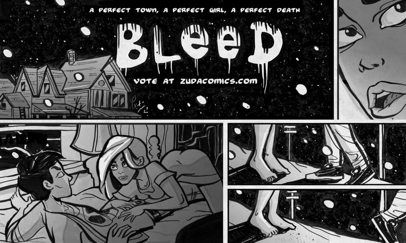
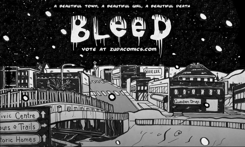
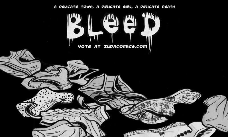
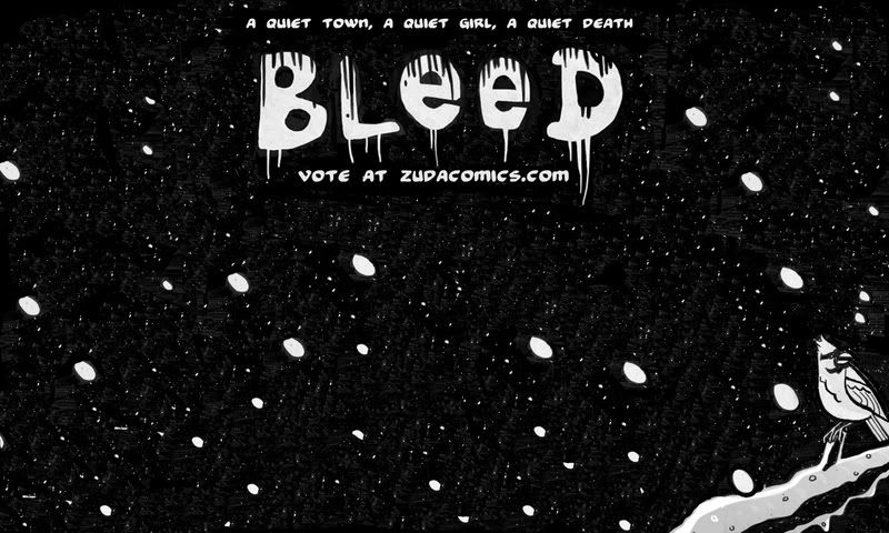
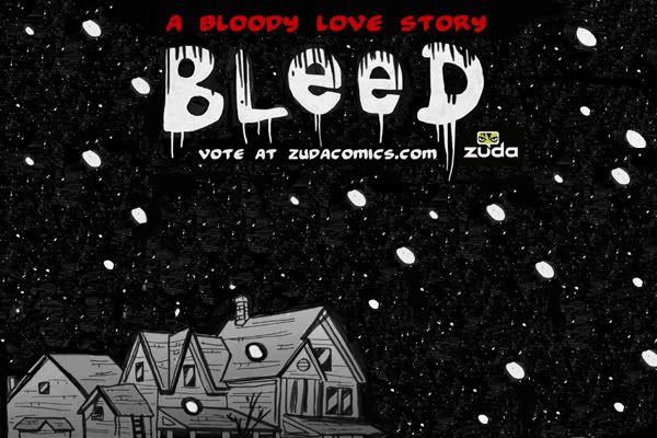
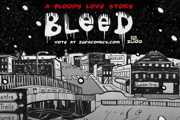
JohnTWM - The first one isn't a page either. They're images to represent the comic at a glance. I should have explained. Thanks for the comments on the outline widths. I was playing with using varying widths to suggest depth and it's kind of the first time I've REALLY focused hard on doing so, so there are still some kinks and I think like you mention, there may be too many bold lines distracting attention. Thanks.
I see what you're saying about the plug and all. I did say to vote if you LIKE what you see though, I'm not asking for votes from anyone who doesn't actually think it deserves one.
"It's very cutthroat and takes aloooot of votes to win so if you like what you see please take a minute to sign in and vote, rate, and favourite!"
I just know alot of people may check it out and like it, like it better than the others, but not vote just cause they don't want to bother. I want those people to know that I know it's a bother and that I really appreciate their support.
bombardier - I'm totally looking for crits and feedback. Forget the voting, what do you think about the comic, do you think there's anything that could be improved? writing wise, or art wise.
Here's a head study for a character of another comic I'm working on:
That however, is all i can really pick out of it.
I would say you need to stick with or incorperate the style you have going with your pencils. They are far better in their looseness, and you're inked versions of her (and the guy) provided at the very top are weak. The simplification via big fatty lines just doesn't seem to work, at least the way you're doing it.
Im not going to the Zuda site unless I see something posted here thats remotely indicative of what your comic would be.
Cover page + 5 actual scripted pages of content is a very basic submission and you dont even provide us with that.
All youve shown here is you can draw a town, and not a particularly well drawn town and throw "vote for me" script on it.
If you really expect to win this you are going to have to do a hell of a lot better then that.
I see what are you saying about trying to capture depth with the outline widths, the problem is that the width of the line is the same for everything. Example: the line around her is the same as the one around the lamp behind her, as well as the foot post of the bed. This makes them seem like they are more in the same plane to me, it actually takes away from the feeling of depth. Also the bed post and lamp look flat. I would actually look at the last landscape pic you posted, the shot with the bridge, your use of thick black outlines seemed much more.. judicious in that one and it works a lot better.
On a side note have you even bothered to read the Rights Agreement?
http://www.zudacomics.com/rights_agreement
I know a lot of artists out there would love to put out 4 pages a month and get paid $1,000.00 for their efforts, but if you value your work signing away damn near all your rights to the material and its use is a pretty HUGE piece to swallow.
Regardless of what I think of your work be careful here mate, winning may be nice but the fine print my turn that dream come true into a nightmare.
that link gave me a migraine so let me ask a simple question....if Martin Scorsese wanted to turn your webcomic into a film, who would the studio pay, you or zuda?
"I was born; six gun in my hand; behind the gun; I make my final stand"~Bad Company
Shiboe - Thanks! Another valid crit. I liked how the inks worked for this story cause it fit with the style and atmosphere, but for the next project I'm going to work on involving the sketches here I'm going for more mature artwork and I'll definitely try to keep things how they are with the pencil work. The only problem is, at least for me, trying to keep the same life in the lines when going over them with ink. I might try a style where I just use darker pencil and do shading with pencil as well, etc. I'm going to explore my options. Thank you so much.
Castle_Builder - Don't worry about voting. I'm really just looking for crits. I am contractually unable to post the actual pages anywhere other than Zuda though which is why I can only provide these images in an attempt to make you go check out the actual pages there.
As for having to do a hell of alot better to win, it's actually in the lead right now, and if you look at the competitors you'll see that alot of the art and styles are still in the developing stages and there can be flaws spotted in them all. It doesn't take a flawless masterpiece to win, just an interesting and unique concept and art. Thanks for your crits, and you're right about the Zuda agreement page. I did read it and it is pretty harsh. hahah but just starting out it should help an artist get some good attention which is valuable. It would be a terrible idea for an established artist to publish something on zuda though, for the reasons you listed, cause they could easily find better contracts. Thanks for all your info and comments and advice. It's much appreciated.
JohnTWM - lol no problem. Castle's an alright dude. He had some valid things to say. Thanks for the crits on the inking. I used a brush tip marker for those pages which doesn't offer alot of range in thickness and I'm still learning to control brush tips. But on some further pages along, around page 11 or 12, I started trying out actual brushes with ink and that seems to be offering me more range, but still learning to control the brush better.
Mykonos - haha You really put it into perspective there. And I would have to say Zuda would get paid, and I'd probably get 1% royality if I read the agreement right, which is robbery, but it's still likely more than I am making in the industry right now.
Toji Suzuhara - Yeah I know. That was just for those images. I took images from the actual comic and pieced together some quick displays in photoshop. I assure you there's none of that going on in the actual page art though. It's ALL traditional, except the grayscaling. Way to spot those flakes though man.
I noticed a friend of mine from this forum when I used to post many months ago took their valuable time to sign up and leave me a few encouraging comments too. Thanks to him.
Comic looks okay though.
"I was born; six gun in my hand; behind the gun; I make my final stand"~Bad Company
A built in following?
ManonvonSuperock - It offers you a paid contract, built in following, attention, and they do all the promoting and all the other work for you.
If anyone hasn't seen it yet it's at
How you can support this comic and help it become an ongoing series:
Vote for it, give it a high rating, add it to your favourites.