The new forums will be named Coin Return (based on the most recent vote)! You can check on the status and timeline of the transition to the new forums here.
The Guiding Principles and New Rules document is now in effect.

Teaching myself illustrator

The SpecialistThe Specialist Happy FaceHappy PlaceRegistered User regular
edited November 2006 in Artist's Corner
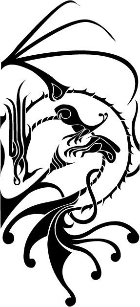
Dragon_WIP_by_d1sconnect.jpg


Ok I drew this quite a while ago but I finally picked up a copy of illustrator and am in the process of teaching myself the ins and outs. I know there's not much here to actually critique but I would like some brutal opinions.

I decided to work on one of my black and white tattoo designs because that seemed like the easiest thing to try out for a first time.

I posted this on deviantart but it's been less than helpful so far. Once I get the kinks worked out of this I'm going to try my hand at some of my colored artwork.

So... any thoughts? Suggestions for practicing with this program? Scathing remarks about a possibly obnoxious new topic?

y54ucrle5wx0.png
Origin Handle - OminousBulge
XBox Live GT - TheOminousBulge

The Specialist on

Posts

  • NightDragonNightDragon 6th Grade Username Registered User regular
    edited November 2006
    It took me way too long to figure out what it was. It's a nice design, aesthetically, but the subject is not readily seen...which hurts its graphic appeal.

    I think one of the reasons it's so confusing is the fact that you've got huge "pieces" of graphic, and very small, detailed "pieces" of graphic, all trying to represent a dragon, but everything (the dragon and the extra-stuff) is so abstracted/similar that the additions you've made have no separate personality.

    I rewrote and deleted a few sentences over and over, and for now, that's the only way I can think to explain it. If you need an elaboration - because I apparently can't express myself adequately - just ask. :P

    NightDragon on
  • ScosglenScosglen Registered User regular
    edited November 2006
    It took me a good 10 seconds to figure out what it was as well, and even then I had to check the filename to be sure. I'd say you have more design problems than illustrator problems in this one.

    Scosglen on
  • The SpecialistThe Specialist Happy Face Happy PlaceRegistered User regular
    edited November 2006
    I was actually thinking something similar. My thinking was that I could go either way. I could trim that tail up a little bit, because the top of the image doesn't have anything nearly as thick, or I could try to "thicken" the rest of it except for the tail. It seems like a balance issue.

    The wing just doesnt balance out the tail, and I admit that I got a bit lazy. The original has a bit of shading on the orb in the middle and in the membranes of the wings. It's more balanced, but certainly not as clean as this.

    The more I think on it though, the more I doubt I will do anything else with this. One more black and white but I'm eager to get my hands on some color.

    The Specialist on
    y54ucrle5wx0.png
    Origin Handle - OminousBulge
    XBox Live GT - TheOminousBulge

  • GreatnationGreatnation Registered User regular
    edited November 2006
    i would put larger light colored shapes behind the black linking it all together.

    Greatnation on
  • DaveTheWaveDaveTheWave Registered User regular
    edited November 2006
    I won't say anything about the design other than I like it (deviantartlol). Regarding Illustrator, I don't know how good you are with it, but you will need to get used to the pen tool. It's your second best friend. Your best friend is the pathfinder tools (window>pathfinder). Get used to the alignment tools and the cool combine/subtract/difference tools. Other than that, experiment with functionality of holding CTRL, ALT and SHIFT with different tools. They do amazing things.

    Hope this wasn't too insulting/useless.

    DaveTheWave on
    [SIGPIC][/SIGPIC]
  • The SpecialistThe Specialist Happy Face Happy PlaceRegistered User regular
    edited November 2006
    Not at all insulting. My illustrator skills really are that basic. I ordered a wacom the other day and I'm waiting for it to get here in the mail now. This picture was done with a mouse.

    Edit: What's wrong with deviantart though? I see pretty talented artwork posted on there.

    The Specialist on
    y54ucrle5wx0.png
    Origin Handle - OminousBulge
    XBox Live GT - TheOminousBulge

  • Tweaked_Bat_Tweaked_Bat_ Registered User regular
    edited November 2006
    There is some decent stuff on dA, I'll admit, but the problem is, it's not really a place to get any sort of constructive crits, atleast in my experience.

    Comments consist of "nice pic/photo lol" or "OMG SO COOL <3<3<3<3".

    Apart from that, your work doesn't get recognized unless you whore your stuff out around dA constantly, by posting random comments and favourites all over the place, in order to get people to notice you and stop by your gallery... it get's tiring, and frustrating when someone with shittier work than yours is getting more page-views, simply 'cause they have the patience to whore their stuff more than you :P

    Tweaked_Bat_ on
  • darkdemondarkdemon Registered User regular
    edited November 2006
    Every time I try to 'teach' myself Illustrator in the least bit it ends in bitter anger and frustration.

    I suppose for a tattoo you have to have something that's recognizable at a short distance as well. Detail is good but it shouldn't look like a black splot from a meter of 10 away.

    darkdemon on
    heyquitit.PNG
  • The SpecialistThe Specialist Happy Face Happy PlaceRegistered User regular
    edited November 2006
    There is some decent stuff on dA, I'll admit, but the problem is, it's not really a place to get any sort of constructive crits, atleast in my experience.

    Comments consist of "nice pic/photo lol" or "OMG SO COOL <3<3<3<3".

    Apart from that, your work doesn't get recognized unless you whore your stuff out around dA constantly, by posting random comments and favourites all over the place, in order to get people to notice you and stop by your gallery... it get's tiring, and frustrating when someone with shittier work than yours is getting more page-views, simply 'cause they have the patience to whore their stuff more than you :P

    Yeah I definitely get that vibe, you go to the forums section and theres whole forums devoted to getting comments on your work. Technically I joined DA like three years ago but was deployed to Iraq shortly after and havent really picked up a pencil or pen since then. Things seem to have changed quite a bit at deviantart.

    Still though, a lot of the work there is just jaw-dropping.

    The Specialist on
    y54ucrle5wx0.png
    Origin Handle - OminousBulge
    XBox Live GT - TheOminousBulge

  • The SpecialistThe Specialist Happy Face Happy PlaceRegistered User regular
    edited November 2006
    Hopefully this isn't too irritating. But like I said earlier, Deviantart is damn near useless for real constructive criticism.

    3quarterWIP.jpg

    As I said earlier, I was eager to work on some color in illustrator. As a finished product I know it sucks. But I'm more worried about my shading job (so far). The neck isn't complete and I really don't know if I like green anyway.

    Edit: I'm not hung up on dragons, but I'm working on drawing 3/4 view heads for fantasy type creatures. I'm trying to get a character concept together and a dragons head is the closest shape I want.

    The Specialist on
    y54ucrle5wx0.png
    Origin Handle - OminousBulge
    XBox Live GT - TheOminousBulge

  • LlyLly Registered User regular
    edited November 2006
    The shading needs to cover way more than a few millimetres on a few edges, otherwise it doesn't help the viewer understand the form at all. Decide where the light is coming from and then figure out what would be in shade/darker and colour accordingly. On first glance i didn't even see the shading on this.

    Lly on
  • MagicToasterMagicToaster JapanRegistered User regular
    edited November 2006
    Ultra kudos for using dark green as the line art color!

    MagicToaster on
  • The SpecialistThe Specialist Happy Face Happy PlaceRegistered User regular
    edited November 2006
    Lly wrote:
    The shading needs to cover way more than a few millimetres on a few edges, otherwise it doesn't help the viewer understand the form at all. Decide where the light is coming from and then figure out what would be in shade/darker and colour accordingly. On first glance i didn't even see the shading on this.

    I was actually torn over that too, but I got scared of covering too much with shading and erring in the other direction. I'll rework it a bit and see if I can't improve the shadows.

    t Toaster: Thanks :D

    Edit: you know, I think it's the right eye and eyebrow that is bugging me the most, I just couldn't get it right in the original sketch and redoing it in illustrator has proven to be a little painful.

    The Specialist on
    y54ucrle5wx0.png
    Origin Handle - OminousBulge
    XBox Live GT - TheOminousBulge

  • SublimusSublimus Artist. nowhereRegistered User regular
    edited November 2006
    What you have done so far is put in the dominant tonal accent. Take the middle tone between the two, and make a major plane break of where the light hits it, and where it doesnt. Then break the light side and the dark side into two more light and darks. Then just repeat as long as you would like.

    Here is a quick crude paintover.

    dragon.jpg

    [edit] And that horn in the middle is reading strangely. You may want to fix the perspective of the base, and re center it. its a little off center towards the viewer.

    Sublimus on
  • The SpecialistThe Specialist Happy Face Happy PlaceRegistered User regular
    edited November 2006
    Thanks sub, that was a big help. Here's what I have so far, but I know it's still not finished.

    3quarterWIP-1.jpg

    Not really sure why it's off center now though lol...

    The Specialist on
    y54ucrle5wx0.png
    Origin Handle - OminousBulge
    XBox Live GT - TheOminousBulge

  • OrikaeshigitaeOrikaeshigitae Registered User, ClubPA regular
    edited November 2006
    Because the forward-facing slope is not parallel to the other two horns' forward facing slopes.

    makes it seem like it's jutting out at a perpendicular angle.

    Orikaeshigitae on
  • The SpecialistThe Specialist Happy Face Happy PlaceRegistered User regular
    edited November 2006
    yeah it's supposed to poke up higher than the other horns, almost forward facing. At least thats how I intended it to work. This has taught me a valuable lesson in layers because now I'm wishing like hell I had made that horn on a completely different layer... I have an idea that might be a quick fix.

    BRB

    Edit: Grrrrr..... I can't move that horn without screwing up a lot of other stuff. I'm too lazy to go back over all that stuff too. Just gonna have to make sure I do my layers right next time.

    The Specialist on
    y54ucrle5wx0.png
    Origin Handle - OminousBulge
    XBox Live GT - TheOminousBulge

  • OrikaeshigitaeOrikaeshigitae Registered User, ClubPA regular
    edited November 2006
    You could do that, but the forward slope needs to go the same way as the rest of the head, otherwise it'll read like it's on a different plane.

    Orikaeshigitae on
  • SublimusSublimus Artist. nowhereRegistered User regular
    edited November 2006
    Do the same thing you did with the shadows, to the yellow highlights, and it should pop.

    Sublimus on
Sign In or Register to comment.