The new forums will be named Coin Return (based on the most recent vote)! You can check on the status and timeline of the transition to the new forums here.
The Guiding Principles and New Rules document is now in effect.
The idea of the second one is trite and overused. Also, is he holding his dick?
Other than that, I like most of it. Theres a couple things I don't like about them, but simply personal opinion to the subject, not the style or technique of your work.
Nice work. Those later portraits are pretty sweet.
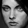
That earlier portrait with the girl needs some work though. Her face looks kinda funny, due to the strong lines/dimples you drew around her mouth/nose region. Her face can basically be summed up by this emoticon: :-3
Like I said, the later stuff is pretty cool. I especially like the portrait of the dude in the black jacket, with the green lighting... I think the title is called dinard?
Thanks for the comments guys, sorry it took me so long to post back.
Forbe: True, overused, trite, more of a feeling though, and wanting to slap something down. I agree though, not my strongest work.
thevo1ta: Thanks, glad ya liked em.
Natri: Much Appreciated.
Tweaked_Bat: Yea, I gotta admit from the nose down on the portrait of Carol it's a bit off. I need to go back and rework that. Oh and it's not "dinard" it's "clinard" which is my last name, hehe.
~Tim~
t i m on
God put me on this earth to accomplish a certain number of things. Right now I am so far behind that I will never die.†Bill Watterson
Love it most of your blondes faces look a lil on the...old and worn side, maybe thats what you were going for though. They all look like Kurt Cobane's Wife. Anyway Love the rest espically the 'POWER' one.
The portrait of Carol you have there looks like she has a Hitler mustache. Either get rid of that shadow, or make it look like an actual shadow would there.
Loving the WW1/trench warfare stuff you have up there. Very nice. I myself am a fan of that era, I just love the style they had in that war and you did a great job capturing that I think.
Things look pretty solid for the most part, but there's one thing I don't like, and that's how rigid and square your muscles look, especially the abs in the 3rd and 4th picture; they look unrealistic. I like your softer, rounder things, like the polka dot bikini girls. Just keep practicing, I guess. Also, the first nazi guy has weird proportions, and a very tiny head.
eminkey2003 on
I am Man-yam, part man, and part yam. I love yams and I love mans, and what a yam-man I am.
Posts
Other than that, I like most of it. Theres a couple things I don't like about them, but simply personal opinion to the subject, not the style or technique of your work.
That earlier portrait with the girl needs some work though. Her face looks kinda funny, due to the strong lines/dimples you drew around her mouth/nose region. Her face can basically be summed up by this emoticon: :-3
Like I said, the later stuff is pretty cool. I especially like the portrait of the dude in the black jacket, with the green lighting... I think the title is called dinard?
Poast Moar.
Forbe: True, overused, trite, more of a feeling though, and wanting to slap something down. I agree though, not my strongest work.
thevo1ta: Thanks, glad ya liked em.
Natri: Much Appreciated.
Tweaked_Bat: Yea, I gotta admit from the nose down on the portrait of Carol it's a bit off. I need to go back and rework that. Oh and it's not "dinard" it's "clinard" which is my last name, hehe.
~Tim~
one question
why does the guy shooting himself have his hand in his pants?
Also, DJ Girl is sweet cause dj girls are hot
Dear satan I wish for this or maybe some of this....oh and I'm a medium or a large.
- great animation focused website http://www.catsuka.com
COBAIN!
It's CobAIN
EDIT:
Tauntaun and Wolverine :^: :^: