The new forums will be named Coin Return (based on the most recent vote)! You can check on the status and timeline of the transition to the new forums here.
The Guiding Principles and New Rules document is now in effect.
Chico's Obeah Shack (NSFW/56k)
ChicoBlue Registered User regular
 Registered User regular
I draw sometimes.
I do the comic stuff in Manga Studio Ex because the inking tools in it rock and it has some other nifty features.
I rarely paint, but when I do, I do it in Photoshop.
Robcham started up a fancy magical thread in SE++ and I started drawing things for it.
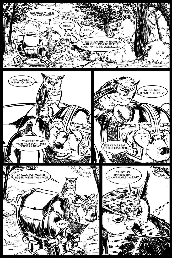
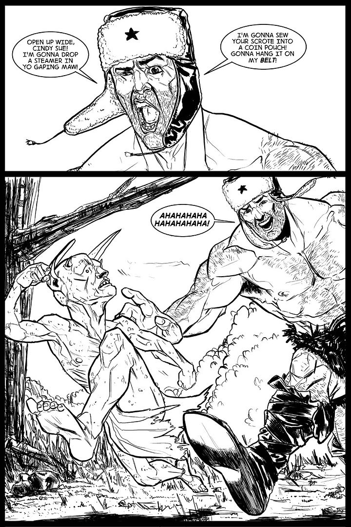
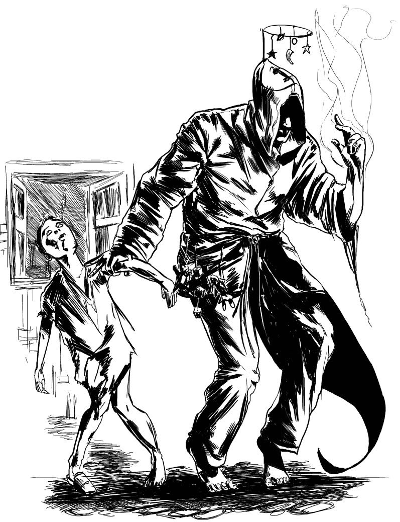
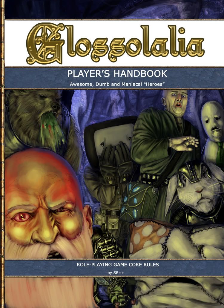
And recently I did this cover thing for a RPG wiki they are doing.
It started like this
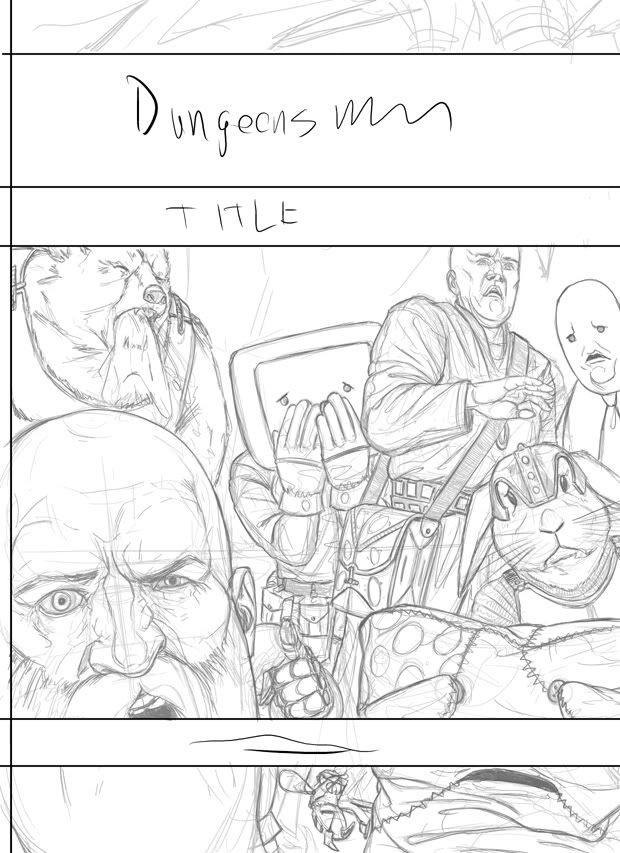
and ended up like this
And now I'm working on a sort of Monster Manual cover, which features my good buddy FAQ. He is a big red dragon that spouts spiders instead of flames.
It started off like this
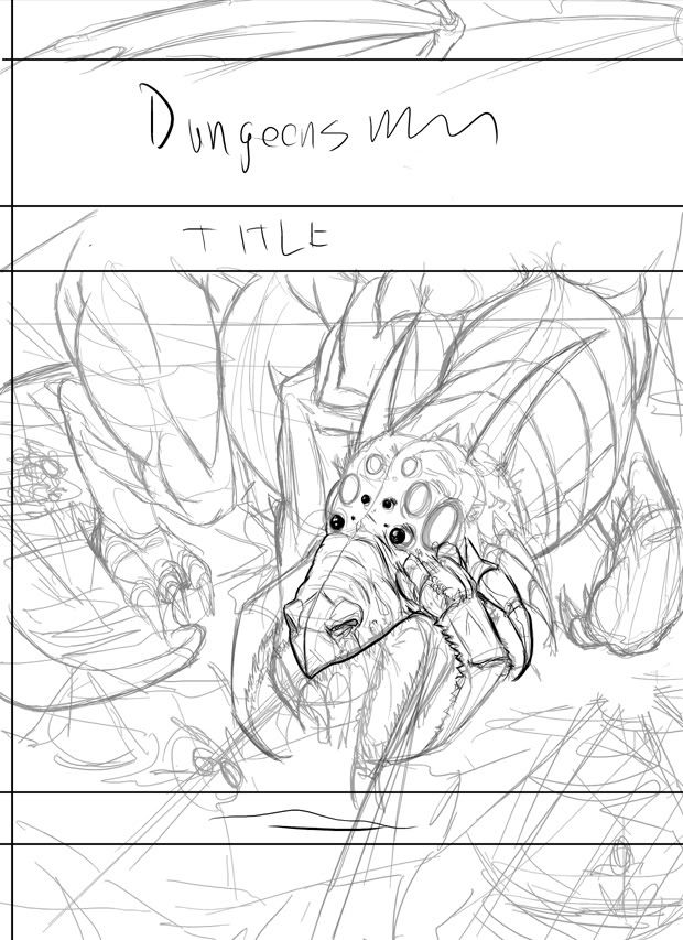
But I decided that I hated that layout and went back to thumbnails.
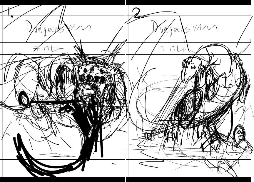
I'm thinking that number 2 is a bit better and I'm probably going to go with that.
I need to draw more environments. And cars. And environments with cars in them.
TEAR INTO ME. DO IT. EAT ME.
I do the comic stuff in Manga Studio Ex because the inking tools in it rock and it has some other nifty features.
I rarely paint, but when I do, I do it in Photoshop.
Robcham started up a fancy magical thread in SE++ and I started drawing things for it.


And recently I did this cover thing for a RPG wiki they are doing.
It started like this

and ended up like this

And now I'm working on a sort of Monster Manual cover, which features my good buddy FAQ. He is a big red dragon that spouts spiders instead of flames.
It started off like this

But I decided that I hated that layout and went back to thumbnails.

I'm thinking that number 2 is a bit better and I'm probably going to go with that.
I need to draw more environments. And cars. And environments with cars in them.
TEAR INTO ME. DO IT. EAT ME.
ChicoBlue on
0
Posts
I will give you good crits when I have digested what I've seen. Until then:
There's a rushed feeling to your scenery- superfluous marks in the bushes and brush, tree texture lines are willy nilly, and grass just seems to be a few zigzags. Basically, the scenery feels cheap compared to the characters.
As a remedy, I'd suggest using a bigger brush for bigger things- block in a tree and then go in with the small brush to add in the details and pay better attention to small details.
The only beef I really have with the painting is how orange the bald dude's lips are. I really like how you did Projeck (the pillow is Projeck, right?). In fact, the cloth rendering is just ace- please teach me. As far as that monster manual cover, it's hard to tell what's what in the first thumbnail. If that's the dragon's head in the right half, I like that composition better than number two.
I plan on spending a big block of time in the future to just studying outdoor environments. Bark and foliage and whatnots. At the moment I don't really know what I'm doing with those elements.
I didn't really notice how orange his lips were until you pointed it out. Obviously he's wearing magical lip gloss. That pillow is totally a Projeckish fellow, only without an eye patch for some reason.
There's not really any set method to how I do cloth. I just work it like everything else in the image, petting and picking and stroking until it looks right. For the most part when I paint this junk, I'll use a hard circular brush with pressure set to opacity.
Still tweaking and fretting and playing with those two thumbs. Cleaned them up a bit.
I like the first one because it's more dynamic than the second one. The only problem is that it doesn't really show a whole lot of the dragon, what with the three big title bars blocking big portions of it off. I think it might make it a bit harder for some people to discern that it actually is a dragon.
Drawing dragons is good times.
in theory, you'd show the whole dragon on the inside of the book
the cover is just for looking balls awesome
Tumblr blargh
Cool stuffs!
INSTAGRAM
Oh, woah, woah. :whistle:
Rank: I think I might do some little sketches of your turdkin a little later on. They have captured my imagination. Also, thanks for that bundle of .pdfs. They are pretty rad.
Beavo: Your mother is a dick. A dick that loves dicks. My dick especially.
Robcham: Give me kisses.
Earthwormadam: I agree. I liked the other one a bit more, though.
Bombardier: Captain K is obviously a prophet.
A few portraits from the forumer portrait thread.
Been working little bits at a time on the FAQDragon piece. Got almost everything figured out in the penciling, and I'll play around with the rest of the design during painting.
Spiders will come later. They will be flaming spiders because that gives a nice strong light source. I'm going to see if I can devise some sort of spider brush a little later on.
It's not creepy because he is actually able to realize any creepy fantasies in the realist (and creepiest) of ways? I submit that it is still, in fact, creepy.
Also, this stuff is all way awesome, I had a good laugh at both the comics. I'm not especially keen on the cover's colors, but I suck with color so am not equipped to critique beyond that. =/
YES!
Shiboe: Thanks. Colours are definitely something I'm trying to get better at.
Erios: Thank you, kind fellow.
A few more portraits.
I haven't touched a real life pencil in quite a while and I'm going to start doing more still life thingies.
Some pencil warm ups.
Still Life
The skull isn't really a skull. It's really a piggy bank that my parents got for me when they were down in Vegas. The sockets are painted black and the teeth have heavy black outlines. I probably would've worked on this a bit more, but the sun decided to set.
Actually, i was lying. I was trying to be 'funny' so i could make you 'LOL'.
Your stuff is looking awesome. I'm especially loving the skull and that players hand book illustration. Cool stuff. You say you havnt touched a pencil in a while. I think you should do more pencil studies. They're looking nice.
i know this will sound odd, but my dad would absolutely love that and i may actually link him to it
Belruel: This thread is not the only thing I'd like to fill up with my things.
Winter_Combat_Gentleman: I'm gonna! I've gotta get some proper traditional art pieces down for a portfolio that I can submit to the Alberta College of Art and Design. I will probably post them here.
Okay, so my good buddy trentsteel asked me to help him out with some concept art for a movie that he's going to be making. He needs some things to show some people so he can get some government cheese.
He gave me a pretty loose description of what he wanted. Chick in a bikini vomiting up tentacles on a somewhat rocky lake beach.
Concept One:
Thumbnails. He decided on number 2.
Cleaned up the thumbnail a bit. Still a few bloops and bads in it, but since this is digital, I can just rush into the full piece half cocked and change anything I need to with incredible ease.
Busting in some tones. Just trying to figure out the lighting.
Scrubbing and playing. She's starting to take shape.
Went in and gave the tentacles more love. I got out the soft edged brush and made her skin look really smooth. I also decided that I wanted to knock those mountains back a bit. I fixed up her feet real good, and changed her hands up a bit. I also decided it would look good if there was some vomit on the ground. Threw in some texture on the rocks.
I shrank her head down a little bit, and pulled her shoulder over a bit. I gave her some pretty hair. I decided that the weird clouds and trees in the upper right corner wasn't doing it, so I just tore it down a bit and put a proper moon up there. I gave the vomit some love. Smoothed out and tinkered with the some edges. I also threw on an Overlay layer and tweaked the values a bit.
Thumbs for the next concept.
love those chico, does she have an anarchy tattoo under her suit still?
Tumblr blargh