The new forums will be named Coin Return (based on the most recent vote)! You can check on the status and timeline of the transition to the new forums here.
The Guiding Principles and New Rules document is now in effect.
For the Silent Hill fans...
Zephonate Registered User regular
Okay, so my first piece of artwork that I posted here didn't get much praise (understatement), so instead, I'm going to try showcasing a work I've done completely in Photoshop.
Me and a few pals of mine in my Video/Film class have decided to make a fan film based around the Silent Hill universe. Much like the games, it will be its own self-contained story, have lots of nods/homages to the games themselves, character refrences, thematic similarities, and the trademark fog and "otherworld", but will weave its own original story. I am currently penning the screenplay and handling most of the camera work.
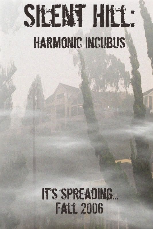
Anyways, this is a mock-up of a very basic poster design idea I had. The first act of the film takes place in a high school, and I took the liberty of photographing my own school (which will also be the filming location) for the poster's shot. I added the fog and text later in Photoshop. Let me know what you guys think.
Me and a few pals of mine in my Video/Film class have decided to make a fan film based around the Silent Hill universe. Much like the games, it will be its own self-contained story, have lots of nods/homages to the games themselves, character refrences, thematic similarities, and the trademark fog and "otherworld", but will weave its own original story. I am currently penning the screenplay and handling most of the camera work.
Anyways, this is a mock-up of a very basic poster design idea I had. The first act of the film takes place in a high school, and I took the liberty of photographing my own school (which will also be the filming location) for the poster's shot. I added the fog and text later in Photoshop. Let me know what you guys think.
[SIGPIC][/SIGPIC]
"For a few seconds Oskar saw through Eli's eyes. And what he saw was...himself. Only much better, more handsome, stronger than what he thought of himself. Seen with love."
--John Ajvide Lindqvist, Let the Right One In (Page 446).
"For a few seconds Oskar saw through Eli's eyes. And what he saw was...himself. Only much better, more handsome, stronger than what he thought of himself. Seen with love."
--John Ajvide Lindqvist, Let the Right One In (Page 446).
Zephonate on
0
Posts
This is a wonderful idea!
It's very easy to tell that the fog was added as a filter. Were the area really foggy, the roof of that lower building wouldn't be so well lit.
Point taken about the lower roof. Was the comment that it was a good idea sarcasm or serious?
"For a few seconds Oskar saw through Eli's eyes. And what he saw was...himself. Only much better, more handsome, stronger than what he thought of himself. Seen with love."
--John Ajvide Lindqvist, Let the Right One In (Page 446).
It's a really common type of title. I'd reccommend finding something else!
Just keeping in tradition with the series. :P
"For a few seconds Oskar saw through Eli's eyes. And what he saw was...himself. Only much better, more handsome, stronger than what he thought of himself. Seen with love."
--John Ajvide Lindqvist, Let the Right One In (Page 446).
"For a few seconds Oskar saw through Eli's eyes. And what he saw was...himself. Only much better, more handsome, stronger than what he thought of himself. Seen with love."
--John Ajvide Lindqvist, Let the Right One In (Page 446).
Do something more than typing on top of a photo and I will be more helpful.
Bad form Jack; bad form.
But I'd say it'll do for a commercial poster. Maybe you could manipulate the photo to make it look more like Silent Hill which is really sleazy and ghost town like.
- great animation focused website http://www.catsuka.com
While the text and the fog are certainly appropriate (though I much prefer the the ultraentropic otherworld environment), and you get bonus points for using your own photography, I'll be damned if this isn't a painfully boring poster. It's not so much that there's anything glaringly wrong with it so much as it is simple to the point of blandness. As Grifter mentioned, it really just looks like you slapped text over a photograph and called it good, which is lame.
Your first mistake was using a prefabricated font and doing absolutely nothing to it to make it look less prefabricated--there are too many repeated letters (making the fact that you used a font very obvious) in the text to get away with leaving it as it is. If you're not going to go through the trouble of creating the letters yourself, at least tamper with them enough to make them look remotely original, or at least not so obviously repetitive.
And on a similar note, it probably wouldn't have hurt to try to imitate the style of the text used in SH related print/packaging/etc. I realize that the font you used is a SH font, but said font is never used for the actual words Silent Hill, which ought to look as such (<--this is a link, by the way).
Your second mistake was adding the fog (which looks fine to me) and stopping there. Even if your text was a little more inspired, it would still be a pretty boring text-on-picture poster. You've got all KINDS of brush textures and blending options at your disposal with Photoshop, this would definitely benefit from some extra distressing. Look at sommore actual Silent Hill material for reference and get to experimenting, or look for tutorials on the internets. I'm sure there are fucktons, as people tend to dig that grungy look.
Seriously, though. That bit in my last critique about posting in the doodle thread?
Yeah.
Yes, putting scary text on a picture is hardly a creative endevour...
Lexxy pointed out some important issues. I agree with all of them, especially the one about the font. Establishing a font heirachy would help improve future works. You already used a scary font at the top... you don't need to use it at the bottom as well.
This is the equivalent of writing everything in bold. If everything is in bold... it's kind of hard to determine what word is more important that the other. The title is always more important. Using a diffrent font at the bottom is a good idea.
Also, the top text is way to close to the edge. Not only does it look bad, it's also not functional. Should this be a real poster the top text could get cut off at the press or be hidden by a frame.
Another problem I'm seeing is that the poster is tall... you make it seem taller than it is by having all those vertical elements on it. This in itself is not a problem... what makes it an eye sore is that it''s so empty!
Nothing you've shown really smacks of effort.
Anything worth doing, is worth doing right.
We have Silent Hill, Silent Hill 2, Silent Hill 3, and Silent Hill 4: The Room.
Only one has a subtitle, and it's an article and a noun, not an adjective and a noun.
I can't believe I'm arguing this
Now that's a phrase I don't hear nearly often enough.
The comments regarding putting more effort into my work are very valid. I threw this thing together in about twenty minutes with just a very basic idea in my head. Had I spent more time on it, and gone for the "dark world" side of Silent Hill, it may have turned out better.
For the record: I never claimed this piece to be good. I simply asked for opinions.
P.S. To address the adjective/noun argument, I was more referring to the "Restless Dreams" and "Born from a Wish" scenarios in Silent Hill 2.
"For a few seconds Oskar saw through Eli's eyes. And what he saw was...himself. Only much better, more handsome, stronger than what he thought of himself. Seen with love."
--John Ajvide Lindqvist, Let the Right One In (Page 446).
- great animation focused website http://www.catsuka.com
"Harmonic Incubus" sounds like a Boards of Canada song, not a horror movie.
SILENT HILL
Hills of Silence
The poster would is fine for a high school production, you may even get several "Wow, that's awesome!"s. People here look at it with a much more critical eye (which you requested). As has been already covered, it's a pretty boring and bland poster. However, were I familiar with the school and saw it in that context it might resonate a bit more. Points for that.
I don't rate this as much better, mostly I just played around with filters and other photoshop doodads, I didn't change the font although the advice given to you on that was already pretty sound. Basically I just changed things around to create a more fitting atmosphere, bit darker and more gritty among other things.
Thats mostly what bothered me about it was the picture just looked bland it didn't evoke anything in me.
Tumblr Behance Carbonmade PAAC on FB
BFBC2
Horror film posters are deceptively simple. Shocking image, movie title, little blurb. You've got everything there, sans blurb, but it's missing a lot of creativity. You could try looking at other horror posters to see what they're doing.
I'd use a closer picture of the school/building, i'm sure you could make it look a lot more imposing and menacing than what it looks like now, "hey it's a foggy day mansion".
ninja edit.