The new forums will be named Coin Return (based on the most recent vote)! You can check on the status and timeline of the transition to the new forums here.
The Guiding Principles and New Rules document is now in effect.

Kicking it up a krotch

PROXPROX Registered User regular
edited April 2009 in Artist's Corner
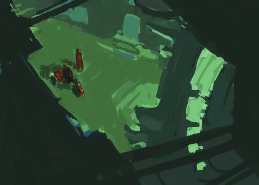
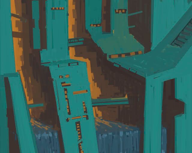
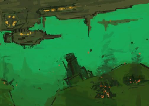
Yo! I've been doing stuff. I noticed my portfolio lacks something that is really finished, so i am going to bring an environment to finish. I have a few comps. Which do you guys think i should work on?
enviro.jpg

enviro2.jpg

enviro3.jpg

enviro4.jpg

dam_sketch.jpg

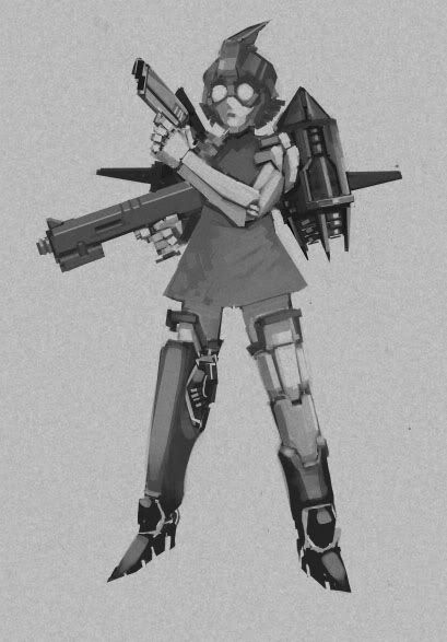
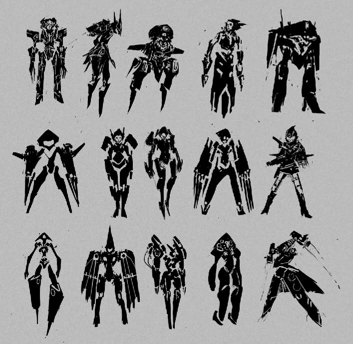
I also have some character sketches
silhouette.jpg

rockety.jpg


Basically im trying to get one more piece into my portfolio in time for GDC on the 25th.

PROX on
«1

Posts

  • TamTam Registered User regular
    edited March 2009
    there's no k in notch

    Also, these are awesome. The green and orange one reminds me of Krypton.

    Tam on
  • SublimusSublimus Artist. nowhereRegistered User regular
    edited March 2009
    Why the hell has no one else responded to this? This is some killer stuff, prox.

    Personally if you're going to take one of those enviros to final, I would suggest #3. I think it has the most potential for interjecting some sort of subtle narrative. Which is the personality of an environment IMO.

    Sublimus on
  • MalkorMalkor Registered User regular
    edited March 2009
    I likes one and four the best. They both seem 'epic'. The fourth one reminds me of the Drow from the Forgotten Realms.

    Malkor on
    14271f3c-c765-4e74-92b1-49d7612675f2.jpg
  • D-RobeD-Robe Registered User regular
    edited March 2009
    I like #1 a lot.

    D-Robe on
    Cheese.
  • winter_combat_knightwinter_combat_knight Registered User regular
    edited March 2009
    Your direction with developing characters is good. Nice work. Post more please.

    winter_combat_knight on
  • NightDragonNightDragon 6th Grade Username Registered User regular
    edited March 2009
    I like the first and second environments a lot.

    Character sketches are awesome as usual, though I'd suggest changing some up a bit for the future - these all seem very "triangular sharp" on the lower parts.

    NightDragon on
  • MalkorMalkor Registered User regular
    edited March 2009
    The first picture reminds me of old school computer games where the scene would unfold by starting off pixelated.

    Malkor on
    14271f3c-c765-4e74-92b1-49d7612675f2.jpg
  • ShiboeShiboe Registered User regular
    edited March 2009
    I think the first or third are best to bring up to finished. If first you might need to work on spaceship placement and space "stuff."

    Shiboe on
  • PROXPROX Registered User regular
    edited March 2009
    Thanks for the feedback. going with no1. gonna need some more dev on it.

    PROX on
  • PROXPROX Registered User regular
    edited March 2009
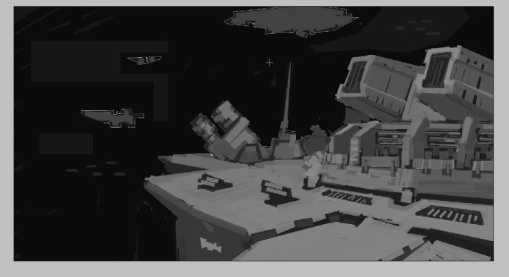
    I kinda wnat to do this thing now just cuz big cannons and ship are everywhere. How about a construction scene?

    spacebuild.jpg

    PROX on
  • NightDragonNightDragon 6th Grade Username Registered User regular
    edited March 2009
    Set a basic value range, man. You can do it.

    Make a black and white thumbnail.

    NightDragon on
  • Sam :)Sam :) Registered User regular
    edited March 2009
    Very nice work. They are all excellent. I like the third one "enviro3.jpg" personally.

    Sam :) on
  • spellchromespellchrome Registered User regular
    edited March 2009
    PROX wrote: »

    enviro3.jpg


    I really like Enviro3 too. Be nice to see it as a larger painting. The perspective / angle's right on. I really like in some of the darker areas how there are brush strokes that are similar in color, but off enough to add some movement and detailing.

    I like your silhouette.jpg as well.

    Nice work PROX.

    spellchrome on
  • PROXPROX Registered User regular
    edited March 2009
    I def need to do a b/w version of these scenes in order to get organized.

    Also new VERY rough concept:

    factoly.jpg

    line tool was stiffening me up. what do you guys think?

    Thanks for feedback!

    PROX on
  • TamTam Registered User regular
    edited March 2009
    That's really nice

    Mirror's Edge-y

    Tam on
  • NightDragonNightDragon 6th Grade Username Registered User regular
    edited March 2009
    verreh cool! :D

    NightDragon on
  • PROXPROX Registered User regular
    edited March 2009
    Thanks! I was told the orange does not match the blue well.

    PROX on
  • NightDragonNightDragon 6th Grade Username Registered User regular
    edited March 2009
    yeah, I actually thought you'd just done that to make the separation of the parts more apparent to yourself. If that's the color scheme you're thinking of, I don't think I like it.

    But as far as the shapes and composition and idea go: yes.

    Now a valyoo raaaainj!

    NightDragon on
  • Sam :)Sam :) Registered User regular
    edited March 2009
    PROX wrote: »
    Thanks! I was told the orange does not match the blue well.
    I think the opposite. It looks awesome. The orange makes sense thematically as it's a construction site/plant/factory.

    Sam :) on
  • NibCromNibCrom Registered User regular
    edited March 2009
    Sam :) wrote: »
    I think the opposite. It looks awesome. The orange makes sense thematically as it's a construction site/plant/factory.

    +1. Plus the colors are complementary. Ho ho! Applied color theory!

    NibCrom on
  • winter_combat_knightwinter_combat_knight Registered User regular
    edited March 2009
    Although your images are at a very basic level (in terms of detail i mean, not skill) i find that they work because they are visually interesting. the compositions/angles/colours work well together, and create some interesting shapes. I think if you where to develop this one further, it would be sick! I also like the robot girls. Cute in a scary kinda way.

    *thumbs up*

    winter_combat_knight on
  • TamTam Registered User regular
    edited March 2009
    PROX wrote: »
    Thanks! I was told the orange does not match the blue well.

    I'm going to have to disagree. It's bold. Don't shy away from it.

    Tam on
  • PROXPROX Registered User regular
    edited March 2009
    Thanks for feedback! Im going to try and make orange work, but not just cuz complimentary hur hurrr
    speedy paint:
    babylon.jpg

    PROX on
  • D-RobeD-Robe Registered User regular
    edited March 2009
    Slanty!

    D-Robe on
    Cheese.
  • PROXPROX Registered User regular
    edited March 2009
    basic value idea:
    rough_value.jpg

    PROX on
  • PROXPROX Registered User regular
    edited March 2009
    assembly_comp.jpg

    PROX on
  • GurtPerkGurtPerk Registered User regular
    edited March 2009
    Awesome stuff here! Really digging the environments.

    But I'll go ahead and disagree with most the people who responded here on ONE thing. Those first comps, the third one is the best in my opinion. I read it like the POV of someone hiding and the two characters were stalking the town, looking for you. Real cool stuff.

    GurtPerk on
  • KendeathwalkerKendeathwalker Registered User regular
    edited March 2009
    I think you sshould decrease the contrast on that slanted shape in the back. Bring it closer to your value study. Right now its a little to important.

    Kendeathwalker on
  • NightDragonNightDragon 6th Grade Username Registered User regular
    edited March 2009
    very nice black and white, mang! :) I'm liking it a lot.

    NightDragon on
  • PROXPROX Registered User regular
    edited March 2009
    Thanks for the feedback. Imade some adjusments.
    assembly_comp2.jpg

    PROX on
  • winter_combat_knightwinter_combat_knight Registered User regular
    edited March 2009
    Ahhh. Nice update from the small thumbnail. Perspective is spot on.

    winter_combat_knight on
  • D-RobeD-Robe Registered User regular
    edited March 2009
    I like.

    D-Robe on
    Cheese.
  • McGibsMcGibs TorontoRegistered User regular
    edited March 2009
    very homeworld-ee. much love.

    McGibs on
    website_header.jpg
  • crawdaddiocrawdaddio Tacoma, WARegistered User, ClubPA regular
    edited March 2009
    I'm not sure the perspective is completely spot on; a few of the vertical elements (they're not really columns, I suppose, are they?) seem to get further apart as they go down. They do seem like the get narrower, though I'm not sure it's at a sufficient rate to allow the apparent distance to increase the way it does. Then again, I could simply be missing something. Other than that, though, it looks great.

    crawdaddio on
  • NibCromNibCrom Registered User regular
    edited March 2009
    Yes. Yeeeeeessss.

    Edit: There's kind of a weird tangent going on with the left-hand side of the ship and the grabber. Love the way it's going though!

    NibCrom on
  • KendeathwalkerKendeathwalker Registered User regular
    edited March 2009
    ...your value study is rock solid

    The actual piece is getting away from it and where it departs it gets weaker.

    Kendeathwalker on
  • KazhiimKazhiim __BANNED USERS regular
    edited March 2009
    That is totally Homeworld

    the Kadeshi didn't have anything like that!

    Kazhiim on
    lost_sig2.png
  • PROXPROX Registered User regular
    edited March 2009
    still going. Im pretty slow. I wish i were faster.
    assemb_comp2.jpg

    PROX on
  • BuckwolfeBuckwolfe Starts With Them, Ends With Us Registered User regular
    edited March 2009
    Slow, or not, that still pretty exemplary.

    Buckwolfe on
  • PROXPROX Registered User regular
    edited March 2009
    Thanks buck! This thing is gonna get cluttered pretty fast. I'm gonna put engines on it in the step before, then outer shell, then cockpit.

    PROX on
Sign In or Register to comment.