The new forums will be named Coin Return (based on the most recent vote)! You can check on the status and timeline of the transition to the new forums here.
The Guiding Principles and New Rules document is now in effect.
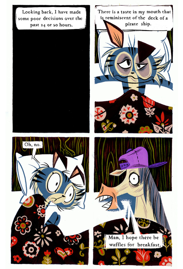
Feedback on my comic about cats
P-Frank Registered User regular
I've been making comics with my girlfriend for almost 5 years now. A few months ago we started making this comic. We've received a few critiques on the earlier comics about the bright palette and awkward pacing, which I think have been remedied later on (too much background detail, no room to breathe). I am still trying to get the hand of being punchy and less wordy with my writing, but I am happy with the flowery language that I use in it. Four panel grids are also an interesting beast that I am still getting the hang of.
It has been a really rewarding experience working on the comic thus far, I've learned more in 3 months than in 3 years. I remember posting my other comic work here years and years ago and it got pretty much torn to shreds, but I am game enough to give it another shot.
If theres something here that doesn't conform to the rules of the forum, let me know. Thanks!
P-Frank on
0
Posts
My only crit would be to maybe tone down some of the colors. On your website there is so much color going on that while it is visually grabbing, it is also hard to focus on anything. The toolbar at the top of the page for instance, is hard to make any of the tet out on top of the images.
This also seems to carry over to the comics. The colors look great, but in comic form they make it kinda hard for my eyes to progress though the panels. I think it may be mostly in the earlier comics...
Still though, to see a classy old fashion style in webcomic form is a refreshing change. And it's not about 2 dudes playing videogames in an apartment. (You totally win the internets)
INSTAGRAM
I totally love your stuff.
i added you on deviantart about a month or so ago
i don't know if i read correctly, but i was under the impression that these are done with real paint
Quite right, the comic is painted and inked with a brush
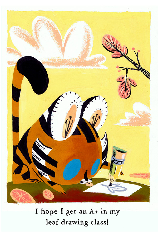
Thanks for the kind words! The colours are part of the style, drawn from old Mary Blair paintings, retro art, golden books. Part is due to the paint we use (barely diluted gouache, which is very bright) and partly due to choice. We had a bit of background clutter and a lack of contrast early on, which made the colours a problem. Now, not so much in my opinion, but I respect those who believe otherwise. It seems pretentious to say so, but we aren't so much into letting people breeze through the comic, there aren't a lot of words and the plot is slow, so you may as well take in the paintings
Thanks! First we made colour sheets with instructions on how to mix each characters paints. We keep mixing to a minimum as well as the number of colours. Despite the bright look, there are very few colours (especially in comparison to most webcomics).
Then the comic is pencilled out, usually two at a time, so they can be painted at the same time (so blue on both comics is painted, then black etc...). When the painting is done, which takes at least 10 hours, I write the tight script. Becky plays off my script, then I play off her drawings (and she does some great animated expressions, so its easy to play off). I print the dialogue out in blueline and then its penciled over, scanned back in and the boxes are erased, then we up the contrast so it looks darker. Gives it a hand drawn look. The bubbles are overlaid as blue squares in photoshop, then printed out, penciled over. Sometimes we take the lines out, so its a sketchy white box, or we leave them in.
the two of you combined are a force
and i straight up love everything you do
the comic design is so unique, the story is interesting, you have thumbs up all around from me, but some of the critics around here are a bit harder to please.
which isn't a bad thing, it's good to get harsher criticism amongst the asspats i guess haha
I dig the art though. Makes me think of 50s/60s jazz cartoon illustrations, like the backgrounds for the early Pink Panthers.
Simply because the style is a throwback to old 50s style children's book illustration style
think dick and jane:
sans serif fonts then to give a more "modern" mechanical feeling
the serif font adds to the old fashioned feel of the illustration
making it sans serif would detract from that charming old fashioned style
so i say keep the font.
then the answer would be to expand the text bubble or decrease the font size, not to change the font.
a sans serif font would not work as well with the illustration style.
now that i think of it, I think Eisner used some hand-drawn serif fonts inside of some of his work, maybe it was in A Contract with God. I'll see if I can find some scans.
however, I think slightly larger balloons, or even having the dialog like a caption for each panel both could work well. Generally, the rule of thumb is to have enough white space around your text to fit an "M" from whatever font you are using.
I think the worst I've ever seen published was Mouse Guard, though. That text is like needles in your eyes- too much white space between the letters, and too little around it.
Oops, here I am critiquing the web design again. I guess what I'm getting at is the comic itself is delightful.
I've got nothing to add here. Keep it up!
We felt upper and lower-case fonts were required, we soften it by hand-tracing the printed font, but I understand it can still be rigid for some (see: Achewood).
Agreed, we're going to try be a little smaller with the font, a little bigger with the bubbles. Becky has already begun drawing things a little smaller and giving the text more breathing room. Not her fault really, I am just a wordy bastard.
Thanks! Let us compromise by darkening the background tile image a few shades. I just did it, I will upload it in the next couple days.
We are big fans of Genndy Tartakovsky, the man behind those shows. I am looking forward to his new Cartoon Network show. You should check out the Golden Books he worked on, as the art is beautiful.
Thanks!
Awesome! I have yet to hear someone talk about the designs, so that is really refreshing and makes me rather happy, as there were a few months on and off of designing those characters.
Thanks to you all for the kind comments and very fair criticisms. If there are anymore questions, comments or critiques I'd be glad to hear them.