The new forums will be named Coin Return (based on the most recent vote)! You can check on the status and timeline of the transition to the new forums here.
The Guiding Principles and New Rules document is now in effect.

Painting and Practicing- dancers 1/20

lyriumlyrium Registered User regular
edited January 2011 in Artist's Corner
Now that it's summer I actually have time to draw, and I'm very excited! I made a thread so that hopefully I can get some helpful feedback as I keep putting drawings in here.
Here are a few things so far:

Some contrast practice while looking at black and white photographs
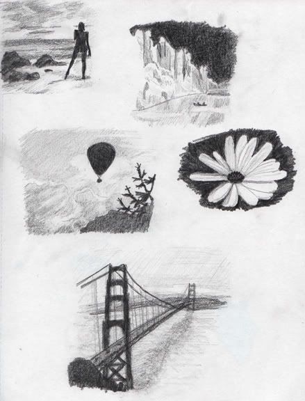
last.jpg

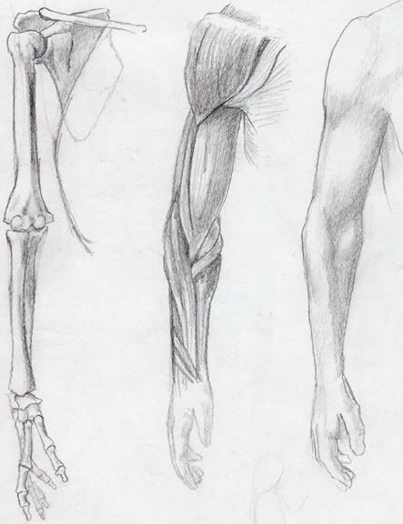
More from the anatomy book

summer092.jpg

Just some quick ideas of which animals I might want to put on the quilt for my new neice
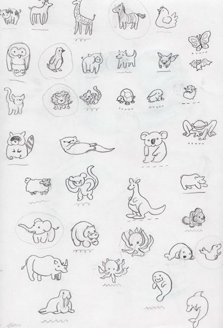
summer093.jpg

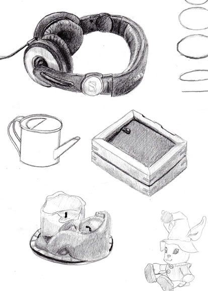
Stuff on my desk

summer094.jpg

I like summer :)

lyrium on
«13456

Posts

  • AJAlkaline40AJAlkaline40 __BANNED USERS regular
    edited May 2009
    I can't wait to see how the quilt ends up turning out. My mom is very excited about it.

    Also, I spy my present in the lower right hand corner of the last one. :D

    AJAlkaline40 on
    idiot.jpg
  • lyriumlyrium Registered User regular
    edited May 2009
    Well, here are some more drawings. These are animals from the zoo and the butterfly house. I tried drawing with a mechanical pencil for these, and I liked it for the lines but it was a little difficult for me to put value down with it.
    Does anyone have any suggestions of some useful studies I should do? I'm kind of just going off of what seems like a good idea to practice, but I would love to hear any input you have.

    summer095.jpg

    summer096.jpg

    summer097.jpg

    summer098.jpg

    Let me know what you think.

    lyrium on
  • The_Glad_HatterThe_Glad_Hatter One Sly Fox Underneath a Groovy HatRegistered User regular
    edited May 2009
    i'm kinda surprised that i have the same anatomy book (great book!) AND the same headphones (good quality, but DAMN do they hurt my ears after a while).

    As for interesting ways to practice. If i'm not mistaken, there are some great links to tutorials and info in the OP of the questions thread here.

    The_Glad_Hatter on
  • MustangMustang Arbiter of Unpopular Opinions Registered User regular
    edited May 2009
    i'm kinda surprised that i have the same anatomy book (great book!) AND the same headphones (good quality, but DAMN do they hurt my ears after a while).
    tyler-durden.jpg

    Sorry lyrium, I don't have any worthwhile critiques, everything looks nice.

    Mustang on
  • lyriumlyrium Registered User regular
    edited May 2009
    Haha, yeah, I like them a lot and I have tiny little ears so it takes a long time for them to hurt at all. Thanks for reminding me about the links in the discussion thread; I had forgotten about that!
    Mustang wrote: »
    i'm kinda surprised that i have the same anatomy book (great book!) AND the same headphones (good quality, but DAMN do they hurt my ears after a while).
    tyler-durden.jpg

    I don't care who is who as long as I get to [strike]sleep with Edward Norton[/strike] blow up buildings.

    lyrium on
  • The_Glad_HatterThe_Glad_Hatter One Sly Fox Underneath a Groovy HatRegistered User regular
    edited May 2009
    Mustang wrote: »
    tyler-durden.jpg
    :lol:
    +10 points to gryffindor!

    also, i just noticed the EM. Gist link in the OP was dead, but it's one of my favourite tutorials (because it neatly introduces 4 classic ways to draw). you can find it here

    The_Glad_Hatter on
  • lyriumlyrium Registered User regular
    edited May 2009
    Thanks a lot Glad Hatter! I just read it and it seems really useful.
    Today I felt like drawing some crabs. I may color the girl in the crab suit.

    summer099.jpg

    I also went back and replaced the other images with scans. If I'm going to make a sketchbook thread I may as well do it correctly :)

    lyrium on
  • lyriumlyrium Registered User regular
    edited May 2009
    Well, I guess the crab girl could use an armadillo boy for a friend.
    I might color these guys after work so they look a little more interesting.

    summer0910.jpg

    lyrium on
  • yogurtyogurt Registered User regular
    edited May 2009
    'm likin the sheet of little animals, like it even more if they where colored in maybe illustrator or flash :)

    yogurt on
  • lyriumlyrium Registered User regular
    edited June 2009
    It would be a lot of fun to color them I think :)
    but for now I have them here in fabric! This is the finished quilt for the niece I'll have soon. I had help putting this together.

    front.jpg

    seal.jpg

    elephant.jpg

    lion.jpg

    pengy-1.jpg

    zebra.jpg

    flat.jpg

    Oh, and I colored these guys a bit ago. They were in the doodle thread.

    summer0910color2.jpg

    The quilt kept me busy so I haven't had much time to do a lot of drawing lately :P

    lyrium on
  • shanemabusshanemabus Registered User regular
    edited June 2009
    it seems like you draw animals very well, sometimes it looks like you start to rush and proportions become off. i really dont have any real criticism there.

    on the kids it seems like you have trouble with the hands, feet, faces, and shading. the right feet on both kids are at weird angles, they dont look like they sit flat. your faces are also at weird angles like you have trouble drawing them, i say this because you can only see half of both of their faces.

    i was going to suggest this before i saw these, but if you can you should try to practice drawing in the park or in a public place so you can draw some people or scenery. its fun to draw outside and it can help with shadows

    your work is really good so its hard to judge it without sounding like a jerk

    shanemabus on
  • MustangMustang Arbiter of Unpopular Opinions Registered User regular
    edited June 2009
    Man, you and my mum would get on so well, she loves this kind of stuff.

    Mustang on
  • D-RobeD-Robe Registered User regular
    edited June 2009
    There is so much cuteness here I might puke.

    D-Robe on
    Cheese.
  • ManonvonSuperockManonvonSuperock Registered User regular
    edited June 2009
    holy fuck. that is adorable. i want to do one now.

    ManonvonSuperock on
  • LeggraphicsLeggraphics Registered User regular
    edited June 2009
    omg that quilt is so cute. Awesome work

    Leggraphics on
  • lyriumlyrium Registered User regular
    edited June 2009
    Shane- Thanks for the input. As it happens, drawing people while they lounge about is something that I do enjoy doing, though admittedly I've never tried it in a park (more often with sleeping people on trains and in lounges). I never really focused on using it for help with shadows though so I will definitely try focusing on that next time. Maybe I will scan in some people-drawings.
    As far as hands and feet and faces go, those are definitely on the list of things to study :P I've been a little busy lately though with another project.

    My dad wants me to do the image for the cover of his CD. These are just some quick ideas I got down.

    The pencil idea:

    pencil.jpg

    Thinking about how I might do the lines in ink:

    ink.jpg

    And a few sketches in paint:

    4inked.jpg

    (without the ink):
    4uninked.jpg

    I also did this in photoshop so I could show him what it could look like if I did it digitally:

    pencilcolor.jpg


    I'm glad you guys think the quilt is cute!
    D-Robe wrote:
    There is so much cuteness here I might puke.
    Then my goal is achieved, because this is probably what my neice's response will be, too :P

    lyrium on
  • MustangMustang Arbiter of Unpopular Opinions Registered User regular
    edited June 2009
    So far the pencil is working the best, you need to capture it in colour somehow.

    ....how horrible is that for a critique? Just fix it, somehow.

    I think what I'm trying to say, if I am trying to actually say anything of worth, is that with the pencil variant, the linework is far more deft in it's delicate lines and it's powerful ones, mainly on the tree. When you're just inking, you're losing it because you're using just a flat black. Where as the pencil has dark and light lines, as well as thick and thin lines.

    Mustang on
  • srsizzysrsizzy Registered User regular
    edited June 2009
    yes, your ink and paint lines are very thick and do not capture the form as well as your pencil lines. when transferring to digital, it's always possible to turn pencil lines to darker "ink" lines, as long as you keep your lines clean.

    srsizzy on
    BRO LET ME GET REAL WITH YOU AND SAY THAT MY FINGERS ARE PREPPED AND HOT LIKE THE SURFACE OF THE SUN TO BRING RADICAL BEATS SO SMOOTH THE SHIT WILL BE MEDICINAL-GRADE TRIPNASTY MAKING ALL BRAINWAVES ROLL ON THE SURFACE OF A BALLS-FEISTY NEURAL RAINBOW CRACKA-LACKIN' YOUR PERCEPTION OF THE HERE-NOW SPACE-TIME SITUATION THAT ALL OF LIFE BE JAMMED UP IN THROUGH THE UNIVERSAL FLOW BEATS
  • lyriumlyrium Registered User regular
    edited June 2009
    Yeah, it's a little tough because my dad doesn't just want a cute little painting of a bird by the water. His favorite of my little sketches is the first one, which is the most vague. I do agree with what you're saying though about how the lines in the pencil make it more interesting to look at. The thing is though that I don't think he wants a lot of lines, mostly just color, so it will be tougher to get a nice looking form across for me.
    Let's see, for example he was saying that he really liked the way that these doodles I did with paint looked, and so that was kind of my basis for what I've shown him so far.

    panda.jpg

    flowerbird.jpg

    I've never really tried to do a nice looking finished piece like that before, though.

    lyrium on
  • shanemabusshanemabus Registered User regular
    edited June 2009
    personally i think that inking can be done very well if you develop the style
    i wish i owned a scanner cause i do alot of ink doodles, to give you an example

    if i was going to illustrate a CD cover i would research the the music content and try to make my art
    similar to the style of the music

    look for hidden meanings and metaphors to base your work on. it will make the whole project seem to flow coherently. do the same with the colors you pick

    art is not only paintings but it can also be interperated in music and illustrations

    shanemabus on
  • lyriumlyrium Registered User regular
    edited July 2009
    Oh, I agree that ink can look awesome, it's just that I really don't know what I'm doing with it at this point :P
    I feel like I understand my dad's music pretty well. There aren't any lyrics, but I've been listening to him play my whole life so that helps. I'd need to be fricken Degas to paint something as pretty as his music though, haha. Here is what I ended up with, which I'm happy with because he really really liked it :)

    dadsfinalyay.jpg

    In other news, I really haven't updated the thread in a while. Here are some things I've been up to, some of which were in the doodle thread.

    newbook169.jpg

    cranes.jpg

    rainbowfishsized.jpg

    newbook209.jpg

    frog.jpg

    I've also been working on hands and such, as per the suggestions given (which I am thankful for). I will post those once they are scanned.

    lyrium on
  • lyriumlyrium Registered User regular
    edited July 2009
    As promised, some hands:

    newbook210.jpg

    newbook211.jpg

    Turns out I suck at hands :P

    lyrium on
  • VistiVisti Registered User regular
    edited July 2009
    I suggest taking a look at Bridgman's the book of a hundred hands (Man, I was just about to write "the feast of a hundred hams" there..)

    Not only because just looking at Bridgman sketches is pretty awesome, but also because he goes really, really indepth with every bone, muscle and.. I can't remember what I wanted to write there. But hey! Hands!

    Yours aren't look too bad, but I'd suggest thinking about the segments of a finger rather than just the outline. How does it connect? Are the shapes really straight or are they bumpy? Are they bumpier where they connect?

    Visti on
    [SIGPIC][/SIGPIC]
  • lyriumlyrium Registered User regular
    edited July 2009
    Oh thank you for the better reference! I was just using this for the hands: http://www.posemaniacs.com/tools/handviewer/ (after the first three links the rest are hands), which I was kind of unhappy with because they aren't real hands with bones and wrinkles and things. I'll see if I can track that book down.

    lyrium on
  • VistiVisti Registered User regular
    edited July 2009
    There's also a complete Bridgman that'll serve you for life if you get it where he meticulously details everything about the human body, how to draw it and also some general pointers and an entire book on how cloth drapes. He's one obsessive compulsive guy.

    The beauty of Bridgman (or any drawn reference, be it Loomis, Hogarth, Da Vinci etc) rather than referencing from even real life is that it really distills down what you need in a drawing to have stuff portrayed accurately. The 3d renders on that site simplify it a bit too much, so that they don't individually convey space or form, they just have it because, well, they're 3d. I'm rambling now, though. I'm not even sure that made sense.

    Referencing from life is important, too, though. And hands are hard! Real hard! But if you get that book, you'll have so many "Oh, snap - That's awesome" moments.

    Visti on
    [SIGPIC][/SIGPIC]
  • shanemabusshanemabus Registered User regular
    edited July 2009
    i like the cd cover it has that water color wash look to it, if that makes any sense to you, and almost like you let the colors bleed a little. what was the technique?

    i agree with what visti said about your hands looking like outlines and im not trying to create enemies here but you dont need a book to draw hands you have two perfectly goods ones already(i hope, sorry). i mean just draw with one hand and use the other as reference, same with feet. thats what i do if i have trouble drawing hands in specific angles.

    you can even set up a light source if your inside.

    i really like the fish composition as well was that photoshop?

    shanemabus on
  • lyriumlyrium Registered User regular
    edited July 2009
    The cd cover was done with gouache and then ink over it. I did try to let the colors bleed into each other for a vague feel to everything. That's what my dad likes.
    Haha, don't worry I do indeed have two hands. Funny- I've drawn my feet before but found the hands to be a little trickier. Either way I definitely need a better reference than a clump of gray polygons, that's for sure.
    I'm glad you like the fish. I drew him in pencil and then colored him in photoshop with a tablet.

    lyrium on
  • lyriumlyrium Registered User regular
    edited July 2009
    More practicing.

    newbook214.jpg

    newbook216.jpg

    lyrium on
  • VistiVisti Registered User regular
    edited July 2009
    I approve the hell out of that last page! Keep at it!

    Visti on
    [SIGPIC][/SIGPIC]
  • winter_combat_knightwinter_combat_knight Registered User regular
    edited July 2009
    nice studies.

    winter_combat_knight on
  • shanemabusshanemabus Registered User regular
    edited July 2009
    these are very well done

    shanemabus on
  • lyriumlyrium Registered User regular
    edited July 2009
    Thanks guys! Yeah, I took my time with those.

    Today I got some ideas down for my brother's logo.

    sinisterautomotivelogoideasred.jpg

    Some more practice

    newbook217.jpg

    I'll throw in the tag I made for Adam in the graffiti thread.

    gooba.jpg

    lyrium on
  • earthwormadamearthwormadam ancient crust Registered User regular
    edited July 2009
    <3<3<3

    Those logos are pretty cool, I think I prefer the top right one. I would just tighten it up a bit and make the tail thin out more gradually instead of being pretty much all thin.

    Those lips are really nice looking, I tried kissing the second one down from the top left but she moved at the last second and pecked my cheek.

    Tease!

    earthwormadam on
  • FlayFlay Registered User regular
    edited July 2009
    Those studies are aces! Gotta draw me some o' them.

    Flay on
  • VistiVisti Registered User regular
    edited July 2009
    Flay wrote: »
    Those studies are aces! Gotta draw me some o' them.


    :^:

    These are way tight.

    Visti on
    [SIGPIC][/SIGPIC]
  • NightDragonNightDragon 6th Grade Username Registered User regular
    edited July 2009
    Because nobody's mentioned it yet...
    Those studies are very well done. :P

    NightDragon on
  • lyriumlyrium Registered User regular
    edited July 2009
    Thanks for all of the encouragement, everyone! It's very motivating =)
    For the facial features I've been drawing from photos I find on shutterstock.com, but sometimes it kind of sucks because the watermark is right over what I'm trying to draw. Does anyone have any suggestions for better reference sites?

    lyrium on
  • MetalbourneMetalbourne Inside a cluster b personalityRegistered User regular
    edited July 2009
    Deviant art probably

    Metalbourne on
  • TamTam Registered User regular
    edited July 2009
    I like the second logo on the first column. The S looks very smug and the A looks very mischievous.

    When you're doing those studies, spend a little more time building up solid values- some parts look a little spotty.

    As for references, I find that bing turns up pretty good results.

    Tam on
  • lyriumlyrium Registered User regular
    edited July 2009
    By spotty do you mean uncertain/innacurate or actually like a spotty texture? If it's the former then I will just focus and take more time, but if it's the latter then I could really use some tips on getting the graphite to lay nicely into the paper without those spots showing up. I am using recycled paper so that might make a difference?

    lyrium on
Sign In or Register to comment.