The new forums will be named Coin Return (based on the most recent vote)! You can check on the status and timeline of the transition to the new forums here.
The Guiding Principles and New Rules document is now in effect.
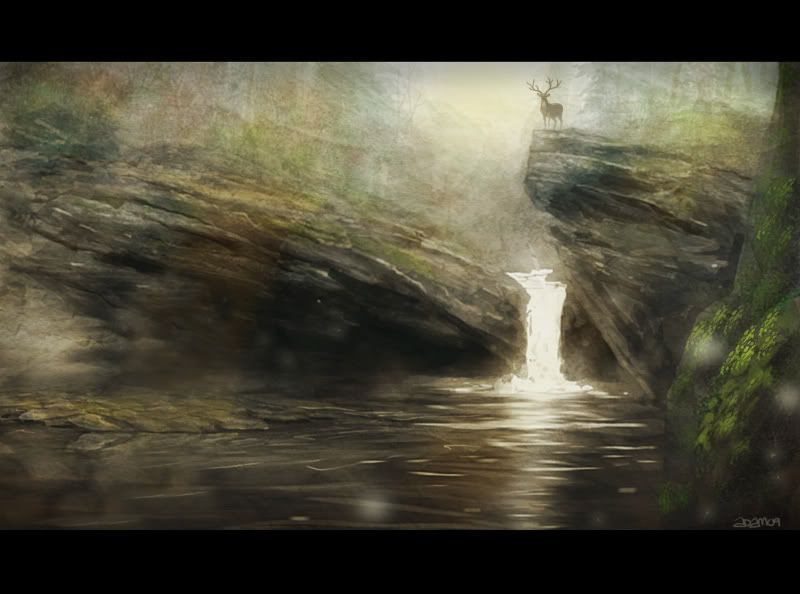
loving that last one. it's so bambi meets modern day matte painters.
your colors and backgrounds are excellent, i feel your characters are the part that need a bit of work
you and i seem to be opposites, we should just work together or something haha.
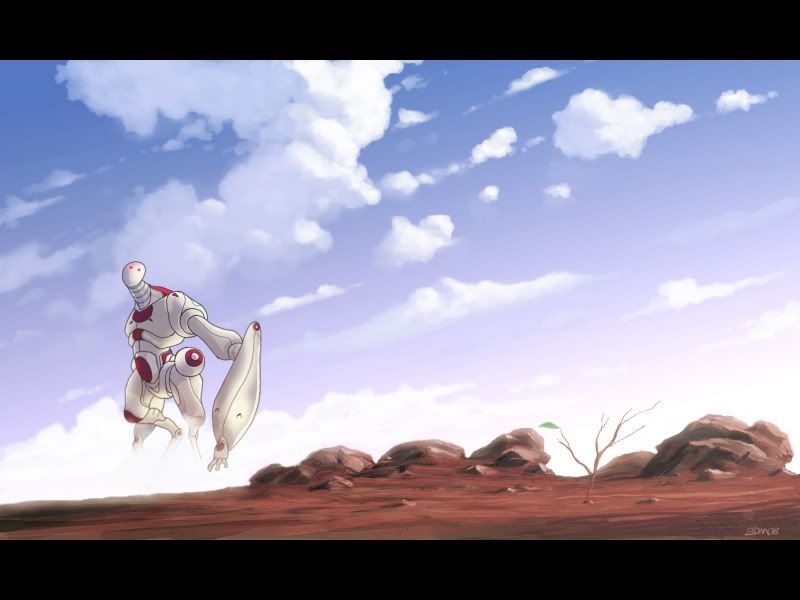
The strong outlines used on your characters in contrast to the incredibly well done environment is inconsistent and therefore it makes it look a bit odd. I'm sure you can find some style to incorporate through heavy lined figures into these types of environments but another alternative would merely be just dumping the line and moving to just simply applying the 5 variant shades on the form. Which i'm guessing is what you don't want and you like the idea of making the figures themselves pop out in such a way.
edit: if thats the case you might want to try the same type of outlining though and different colors + black, black may work in darker situations but in lighter places different outlines may help it more.
Also that is why your last one most likely looks the nicest, if you heavily outlined the deer with a black line then it would probably take away from it. Alot
Beavotron....awesome name...nice website too! Thanks and yeah maybe one day we can collab
Loomdun...Thanks for the crit! For my comic stuff...i'm trying to go for an 80's anime vibe...I want each
panel to look like an animated cell (at least this is what i'm going for! ) Hence the outlines and more detailed
backgrounds. I do try and vary the line color a bit in some other pieces as you'll see my stuff is all over the place stylewise lol I still have lots to learn.
Desperaterobots... I must make you love my watery reflections...this is my new mission! you WILL love my watery reflections.....LOVE...see..the more I say it...the more it works....right? LOOOOVE lalalalaaaaa
And here's one to grow on tonight....was experimenting with some custom brushes and came out with this.....
They Came At Dusk
I had a feeling that was the case, it could possibly be that your lines are to consistant in thickness as well. such as the robot one in the first one, its all the same on the poor little robot.
Hey I know you from another site hahaha Looking good man I really enjoy how you use the colour and brushwork to create a mood in you images. Good luck with Goldilock it is looking pretty sweet
I don't know why but for some reason the young lovers pic and engineer pics gave a me Taiyo Matsumoto/Jean Giraud Moebius vibe. Specially the thing they ride around in young lovers. If that makes sense or not, I'm geeking out. However, the anatomy on "the twins" drawing suuuucks. He's got a sagging grapefruit for a deltoid and forearms that look like popeyes. I see so much talent in the rest of your work that I can only assume the anatomy was a conscious choice, I'm just saying it doesn't read well and is distracting.
Sorry for crits on drawings you haven't posting, kind of a faux pas i Know. Awesome stuff.
Desperaterobots i checked out your paintings....awesome...I'd love the red city one like, huge on my wall.
D-Robe i have that game sitting right here...Portal was AWESOME..but i've still barreelly played HL2...one day when i get time i gotta get back into it.
Loomdun that's mostly style choice...all my characters will have a 3px outline...I have some older pieces i can post where i was all about varying line thickness...which is all gravy...I'm into it. Just for my most recent comic stuff I wanted to try a lil something more animated-ish-ness? if that makes sense. Thanks for the crits.
Dear Dudette Beavotron...thanks for checkin it out and i'll def post more of that stuff here for realz.
Stplmstr hey man thanks for the good words. Still have lots to learn about brushes and color and mood but i reccommend the ImagineFX magazines to anyone who wants photoshop help (looking at one now)...they rule. Sides looks cool btw I like the colors and it has nice motion.
MufasaJoe you kinda made my day with those references...They are huge influences as well as the stuff from Jodorowsky on The Metabarons and Miyazaki stuff. Hrrmm I never really noticed the shoulder...guess it is mostly style choice? LOL (cop out)
Ok here's one for DesperateRobots
The Iron Miyazaki
Another from Goldilock...
Daniel and Olivia Haze at their Colorado Estate.
Here's a character from a story that I've put on the backburner for now.
The Spirit Fox Pass
I'm not sure if the lighting works in this one. The lightsoure doesn't seem to be anywhere specific (though considering the bloom, that might be intentional). The sunset seems to be in the background but the light is hitting the couple from somewhere to the left.
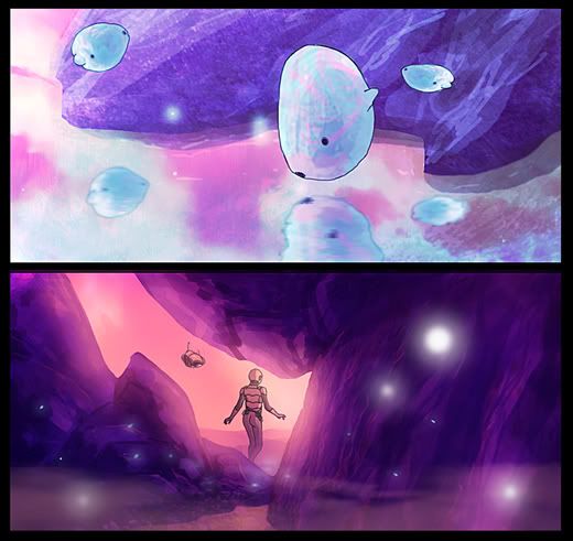
I really like your color choices. On some pictures (Like the blue floating fish and Daniel and Olivia making out) the texture you have is just a bit too distressed/flat/grainy. You may want to sub due them or paint into them some more, because its taking away from other nice qualities in the pictures.
Flay... You're right I do have the sun kinda in the back and to the left. It's not super sundown and I didn't want them to be purely silhouettes so that's what ya get
Loomdun...thanks again
Arden....That is the only Spirit Fox Pass thing art ..... for now.. But I do have more in that genre I can post.
Iruka....Thanks I'm glad you like! I do loves me some grain though. Searching for the happy medium
Here's another character from a story
I have floating around called MAGUT - Mobile Armored Grub UniT
Thats great form, the face makes me lawl, but I don't really feel that outline thing going on at all with him the black lines is nullified by the almost equally dark background/body, I'm not sure if thats what you were going for because I can clearly see the lines, but it doesn't seem to do what you wanted them to.
Thanks for the comment as always Loomdun! This one I did in a different style. Wasnt exactly going for that animated feel here. I wanted to keep it more painterly and detailed.
I don't usually post here but I thought your MAGUT piece was too sick to not comment on it. Please let me know where I can subscribe to your newsletter
"sick" like the kids use it.
Sebbie on
"It's funny that pirates were always going around searching for treasure, and they never realized that the real treasure was the fond memories they were creating."
uuuh, Loom, I'm not sure if you're so right about that. He obviously has a stylized anatomy; have you ever seen anime? You deal with total realism, whereas almost all things animated are to some degree stylized. I think the biggest problem is that the left shoulder is pushed forward at the wrong angle, a mistake you repeated in your draw-over. The underarm doesn't attach to the pectoral muscles like that. And then you've got an entirely different angle on the abdomen/chest, pushing her ass way up in the air so that somehow the hips are visible. The back could have a little more curve, but it doesn't need that much.
anyways, I think the anatomy is fine on that except for the left shoulder/upper arm pushing out too far forwards from the angle we're seeing her. the slightly longer limb style is fine, and I tend to like it (i.e. Ghost in the Shell or Cowboy Bebop).
I have to say, also, that I prefer your fully-rendered characters with the kind of rendering you do. I don't think your landscapes are quite sharp enough for the cell-shaded characters over them. For instance: animated shows have fully painted backdrops which don't class with the characters. I feel like yours do clash to an extent because the backdrops are looser and not as defined.
srsizzy on
BRO LET ME GET REAL WITH YOU AND SAY THAT MY FINGERS ARE PREPPED AND HOT LIKE THE SURFACE OF THE SUN TO BRING RADICAL BEATS SO SMOOTH THE SHIT WILL BE MEDICINAL-GRADE TRIPNASTY MAKING ALL BRAINWAVES ROLL ON THE SURFACE OF A BALLS-FEISTY NEURAL RAINBOW CRACKA-LACKIN' YOUR PERCEPTION OF THE HERE-NOW SPACE-TIME SITUATION THAT ALL OF LIFE BE JAMMED UP IN THROUGH THE UNIVERSAL FLOW BEATS
Loomdun...Thanks for your comments! Not too sure about that draw over though...Now it looks like she's balancing on her left elbow. Doesnt look too comfortable.
I'll have to go with SrSizzy on this one. Not saying my anatomy is perfect by any means and I still have LOTS to learn...but I do think her left shoulder is up a little high and out....It conflicts a little with the horizon/perspective lines.
(and your comments dont annoy me ) hopefully my environments will grow on ya...more to come!
Whenever I see this thread, the title makes me think I'm going to see arts from someone who works for LucasArts. So in that it is disappointing, but your art makes up for it.
Damn George Lucas....DAMN HIM!
I promise when I make movies... I'll have actual sets.
Loomdun...Thanks for your comments! Not too sure about that draw over though...Now it looks like she's balancing on her left elbow. Doesnt look too comfortable.
oh right, the reason why I said it felt twisted was because her body felt angled and her arms where facing forward, I should of included the other half of the drawing but also there's no way someone can stand that high up and have there arms resting that low (try it)
if you where looking at her from the angle your indicating that shes resting on a platform, the platform itself would actually be angled this way
loom, You kinda changed the composition and took out the gesture of the figure, which in stylized thing such as this can be way more important than it being completely correct. he needs some perfecting but I think you're going in a different direction.
X, I like the flatness your people have but I will say you may need to define your forms alittle more. some shapes on that girl in the arm and chest area dont seperate at all. you seem to like pretty uniform line and fairly low contrast, which means you need to be careful and particular about your lighting.
oh okay, I was just stating what angle you where viewing her from, I wasn't actually recommending changing the composition but was saying if you saw that much side of her and her arms where resting like that on the. Uh, edge, thingy. The view itself would probably be more in this angle. But I mean i'm probably wrong
what loom was saying about the length of her arms and the twisting is true, even if you want to stylistically want to make her arms longer, they're still twisting kinda weird. but his drawover and redraw is a different angle of the same scene.
i think if you got someone really thin and took a picture of them in that pose, you could exagerrate those feeatures to get the anatomy more correct.
the rest of this thread is pretty amazing though duder. your landscapes are fantastic
I just... Give up on words, look, this is what your looking at, if you really wanted that much side from the perspective you had, you could do something like on the left.
The view point which you mister stroker applied is more even to her chest to ledge, therefore you wont see not only as much as her bottom, but because its more from the front view you wont see as much as her side.
LIKE THIS
I dont understand why this is so hard to get across
This feels like its going to turn into another thing like the necks incidient from cakes thread. so i'm just ugh no more talking
that is whyyy I made the environment a different perspective, it was the viewpoint you made her being seen from. JIAIJAEOWIJRAWTEJAKWJTLAJWT
Ok...so I set up the pose in 3D and placed the camera and it looks like I def needed to poke her butt out more and play with her shoulder. Its a little exaggerated but i'm cool with that. It's not perfect but hey...thanks for all the comments here's the set up and the new edited version and some concept stuff...
Here's my character, Cinder....gonna color her eventually...
Posts
your colors and backgrounds are excellent, i feel your characters are the part that need a bit of work
you and i seem to be opposites, we should just work together or something haha.
edit: if thats the case you might want to try the same type of outlining though and different colors + black, black may work in darker situations but in lighter places different outlines may help it more.
Also that is why your last one most likely looks the nicest, if you heavily outlined the deer with a black line then it would probably take away from it. Alot
Loomdun...Thanks for the crit! For my comic stuff...i'm trying to go for an 80's anime vibe...I want each
panel to look like an animated cell (at least this is what i'm going for! ) Hence the outlines and more detailed
backgrounds. I do try and vary the line color a bit in some other pieces as you'll see my stuff is all over the place stylewise lol I still have lots to learn.
Desperaterobots... I must make you love my watery reflections...this is my new mission! you WILL love my watery reflections.....LOVE...see..the more I say it...the more it works....right? LOOOOVE lalalalaaaaa
And here's one to grow on tonight....was experimenting with some custom brushes and came out with this.....
They Came At Dusk
:winky: hehe. right up your alley.
Unrelated, that last piece reminds me of Half-Life 2. I like it.
there are things on your blog that are way nicer as far as character work goes than the things you have posted.
post some of thems.
www.stplmstr.deviantart.com
Sorry for crits on drawings you haven't posting, kind of a faux pas i Know. Awesome stuff.
D-Robe i have that game sitting right here...Portal was AWESOME..but i've still barreelly played HL2...one day when i get time i gotta get back into it.
Loomdun that's mostly style choice...all my characters will have a 3px outline...I have some older pieces i can post where i was all about varying line thickness...which is all gravy...I'm into it. Just for my most recent comic stuff I wanted to try a lil something more animated-ish-ness? if that makes sense. Thanks for the crits.
Dear Dudette Beavotron...thanks for checkin it out and i'll def post more of that stuff here for realz.
Stplmstr hey man thanks for the good words. Still have lots to learn about brushes and color and mood but i reccommend the ImagineFX magazines to anyone who wants photoshop help (looking at one now)...they rule. Sides looks cool btw I like the colors and it has nice motion.
MufasaJoe you kinda made my day with those references...They are huge influences as well as the stuff from Jodorowsky on The Metabarons and Miyazaki stuff. Hrrmm I never really noticed the shoulder...guess it is mostly style choice? LOL (cop out)
Ok here's one for DesperateRobots
The Iron Miyazaki
Another from Goldilock...
Daniel and Olivia Haze at their Colorado Estate.
Here's a character from a story that I've put on the backburner for now.
The Spirit Fox Pass
I'm not sure if the lighting works in this one. The lightsoure doesn't seem to be anywhere specific (though considering the bloom, that might be intentional). The sunset seems to be in the background but the light is hitting the couple from somewhere to the left.
edit: but looking at the shadows you are right flay
And also agreeing with flay.
Loomdun...thanks again
Arden....That is the only Spirit Fox Pass thing art ..... for now.. But I do have more in that genre I can post.
Iruka....Thanks I'm glad you like! I do loves me some grain though. Searching for the happy medium
Here's another character from a story
I have floating around called MAGUT - Mobile Armored Grub UniT
Desperaterobots....thanks bud!
Sebbie...I'm glad I could get ya to post...that totally made my day I don't have a newsletter but I gotta blog!
Here's a quicky but I liked the way it turned out
I was thinking "Tron Manga" personally.
your form feels twisted, it feels like its trying to do this because of how you made the arms
oh and you made the back a bit flat
I think its because the arms are to long, there trying to fit what it shouldn't be able to fit
anyways, I think the anatomy is fine on that except for the left shoulder/upper arm pushing out too far forwards from the angle we're seeing her. the slightly longer limb style is fine, and I tend to like it (i.e. Ghost in the Shell or Cowboy Bebop).
I have to say, also, that I prefer your fully-rendered characters with the kind of rendering you do. I don't think your landscapes are quite sharp enough for the cell-shaded characters over them. For instance: animated shows have fully painted backdrops which don't class with the characters. I feel like yours do clash to an extent because the backdrops are looser and not as defined.
I'll have to go with SrSizzy on this one. Not saying my anatomy is perfect by any means and I still have LOTS to learn...but I do think her left shoulder is up a little high and out....It conflicts a little with the horizon/perspective lines.
(and your comments dont annoy me ) hopefully my environments will grow on ya...more to come!
Winter Combat Knight....thank you good sir
Damn George Lucas....DAMN HIM!
I promise when I make movies... I'll have actual sets.
oh right, the reason why I said it felt twisted was because her body felt angled and her arms where facing forward, I should of included the other half of the drawing but also there's no way someone can stand that high up and have there arms resting that low (try it)
if you where looking at her from the angle your indicating that shes resting on a platform, the platform itself would actually be angled this way
X, I like the flatness your people have but I will say you may need to define your forms alittle more. some shapes on that girl in the arm and chest area dont seperate at all. you seem to like pretty uniform line and fairly low contrast, which means you need to be careful and particular about your lighting.
i think if you got someone really thin and took a picture of them in that pose, you could exagerrate those feeatures to get the anatomy more correct.
the rest of this thread is pretty amazing though duder. your landscapes are fantastic
The view point which you mister stroker applied is more even to her chest to ledge, therefore you wont see not only as much as her bottom, but because its more from the front view you wont see as much as her side.
LIKE THIS
I dont understand why this is so hard to get across
This feels like its going to turn into another thing like the necks incidient from cakes thread. so i'm just ugh no more talking
that is whyyy I made the environment a different perspective, it was the viewpoint you made her being seen from. JIAIJAEOWIJRAWTEJAKWJTLAJWT
Here's my character, Cinder....gonna color her eventually...
just practicing....