The new forums will be named Coin Return (based on the most recent vote)! You can check on the status and timeline of the transition to the new forums here.
The Guiding Principles and New Rules document is now in effect.

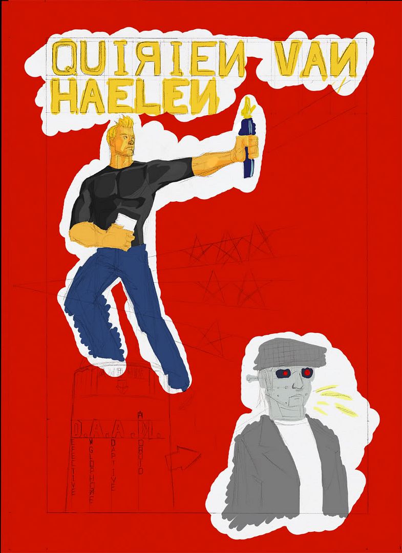
Argh commission for a friend WIP

Spectre-xSpectre-x Rating: AWESOMEYESRegistered User regular
edited December 2006 in Artist's Corner
He is paying me €20,- for this, and it is due tomorrow, and I only started today argh whatever I'll probably finish it in time.

The basic idea was the have my pal be a robot translator for a poet friend of his. My pal is also a poet, and he performs from time to time. Also, his poet friend had to be all heroic and stuff.

Here's the piece:
DaanposterWIP.jpg


I decided to go with a design based on those old Soviet propaganda things. I am still learning how to colour, so I'm just trudging along here for a bit, trying to see what works, and I would like some comments on my thing, any tips or whatever, you know the drill.

Any errant blotches of colour are to be cleaned up later.

Spectre-x on

Posts

  • MagicToasterMagicToaster JapanRegistered User regular
    edited December 2006
    The color scheme makes it look very comunist.

    MagicToaster on
  • Spectre-xSpectre-x Rating: AWESOME YESRegistered User regular
    edited December 2006
    Yes, that is sort of the point. In case it was a compliment: Thank you! That is what I am going for.

    Spectre-x on
  • RavenshadowRavenshadow Registered User regular
    edited December 2006
    Spectre-x wrote:
    ...I would like some comments on my thing...
    :winky:

    if you want to go for a communist propaganda type thing have you thought about limiting the colors to maybe red, white and black and going with something more... "stark"? Like a KMFDM album cover?

    example:http://www.amazon.com/Hau-Ruck-KMFDM/dp/B000AMJD92/sr=8-1/qid=1166133747/ref=pd_bbs_sr_1/105-7878902-7800423?ie=UTF8&s=music
    Just a thought... I think too many colors is gonna ruin the propaganda poster style.[/img]

    Ravenshadow on
  • Spectre-xSpectre-x Rating: AWESOME YESRegistered User regular
    edited December 2006
    Actually, communist propaganda posters used a lot of colours outside of white, red and black, most notably yellow and stuff. I'm going for a classic propaganda look, not a more modern "Che Guevara shirt" type look.

    Spectre-x on
  • erisian popeerisian pope Registered User regular
    edited December 2006
    In the vein of Ravenshadow's idea what about making the figures solid shapes (you know, like bathroom sign figures)? You could make them yellow or black and that would help limit the pallette.

    maybe.

    erisian pope on
  • GrifterGrifter title goes here 32, 64Moderator mod
    edited December 2006
    Spectre-x wrote:
    Actually, communist propaganda posters used a lot of colours outside of white, red and black, most notably yellow and stuff. I'm going for a classic propaganda look, not a more modern "Che Guevara shirt" type look.

    For reals! Old school commy posters sometimes simple prints but a lot of them were painted prints as well.

    http://posters.nce.buttobi.net/russ1.htm

    Grifter on
  • MagicToasterMagicToaster JapanRegistered User regular
    edited December 2006
    MagicToaster on
  • KazhiimKazhiim __BANNED USERS regular
    edited December 2006
    Spectre-x wrote:
    Actually, communist propaganda posters used a lot of colours outside of white, red and black, most notably yellow and stuff. I'm going for a classic propaganda look, not a more modern "Che Guevara shirt" type look.

    The background would look better with alternating stripes of different shades of red

    Kazhiim on
    lost_sig2.png
  • Spectre-xSpectre-x Rating: AWESOME YESRegistered User regular
    edited December 2006
    Right-o, I finished it.

    Daanposter.jpg


    This was totally worth more than twenty bucks. I hurt everywhere.

    Spectre-x on
  • CheerfulBearCheerfulBear Registered User regular
    edited December 2006
    It's funny because the backwards N is pronounced like an I in Russian. :lol:

    CheerfulBear on
  • mullymully Registered User regular
    edited December 2006
    it looks like there's pencil lines underneath.. i think you could really step this up a notch if you deleted that layer, and maybe did a bit of outlining with a slightly darker colour than whatever you're outlining over.

    but hey, he only paid you 20 bux so i wouldn't expect you to go too overboard.

    the hair on your dude is very well executed. spikey! :D

    mully on
  • Spectre-xSpectre-x Rating: AWESOME YESRegistered User regular
    edited December 2006
    I actually left the pencil lines in because I like them, and otherwise the details become completely unnoticable.

    And no way I am going back to that to trace the lines for just twenty bucks.

    Oh dear god I'm suffering from post-traumatic stress syndrome I think

    I need to work on my posture.

    Spectre-x on
  • MalesherbezMalesherbez Registered User regular
    edited December 2006
    Even if you don't want to go back and work more on this, it definitely looks unfinished. This sort of style usually calls for strong and bold lines, which this is definitely lacking

    Malesherbez on
  • PhonehandPhonehand Registered User regular
    edited December 2006
    his legs look funny

    Phonehand on
    pmdunk.jpg
  • GrifterGrifter title goes here 32, 64Moderator mod
    edited December 2006
    You should have done the lettering and the starburst digitally instead of drawing it. Also you should have measured between the stars better since they aren't evenly spaced between the rows. The D in DAAN is starting to float off of the pedestal. In any case, for $20 you could have taken a lot more short cuts on this piece. I don't think that you're really being very efficient with your computer and thus you're getting fucked into spending way too much time on a simple piece for $20. Don't spend anymore time on it though. It's only $20. They can deal with all of the flaws. Just remember in the future that you don't have to draw every damn thing when you can do it more easily. Plus, you're not a professional letterer so until you become more proficient in that aspect you should not try to put drawn letters into a commission piece. You may like the lines and they may add the detail needed in your piece but given the style of colouring that you used, it looks really sloppy. I was hoping that you'd have gone with a more painted look than what you've used. Anyway, I'm sure this piece has taught you a few things about what you should and should not do for $20. I look forward to the next piece you do with the suggestions people give you taken into consideration.

    Grifter on
  • galengalen Registered User regular
    edited December 2006
    If you're going for a propaganda poster look, lose the lines. Also, keep your forms and shading at least mostly angular. Keep your color palette minimal, limit it to reds, yellows and black and white.

    galen on
Sign In or Register to comment.