An update on recent technical problems and more from the admin: https://forums.penny-arcade.com/discussion/250292/on-technical-difficulties-mod-coverage-and-other-things/p1?new=1
Options
Need some Graphic design help, (also you can talk about my stuff)
BlindPsychic Registered User regular
Registered User regular
Hey guys. So I'm working on these postcards as mailers, and I need some opinions on the designs.
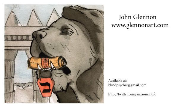
This one here is the new design, I think it looks a little too business-cardy. I want to use this image but I'm not sure how best it will work.
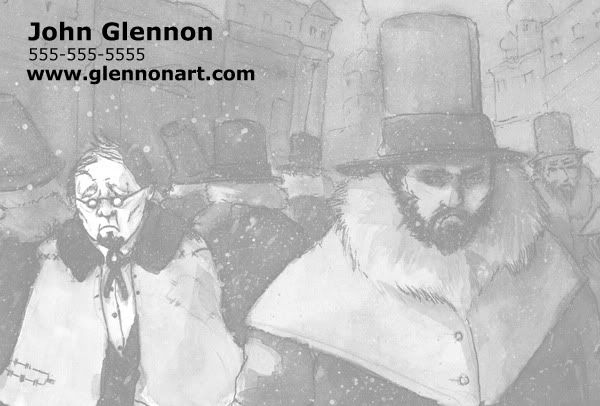
This is the front of a different set that I made, I like how this one came out, but at the same time, I wanted to use this picture without the opacity cranked down.
www.glennonart.com is my site, if someone wants to pull in some other images they think will make a better pair.
This one here is the new design, I think it looks a little too business-cardy. I want to use this image but I'm not sure how best it will work.
This is the front of a different set that I made, I like how this one came out, but at the same time, I wanted to use this picture without the opacity cranked down.
www.glennonart.com is my site, if someone wants to pull in some other images they think will make a better pair.
BlindPsychic on
0
Posts
Secondly: I also think you should really consider using a different typeface. That strong, san-serif font is really not playing well with the image you paired it with.
Thirdly: Since these postcards are going to have a back, why can't you just put all of your contact information back there somewhere? I'm not really a graphic designer so I may not be the best person to make that suggestion, but I feel like if your artwork is the thing you really want them to look at, A) DON'T make it transparent and
fix that pronto, this is your portfolio we're talking about here
second of all, get some page titles on your site
third, just a sec, looking at your gallery
Whats the html to add the title? Is it just <title></title> ? I'm doing it by hand
you don't need a www at the beginning of a url. This isn't 1998. And is your twitter really that big of a sales tool? Especially one titled "Anxiousmofo"?
For that matter, get a gmail address of john.glennon@gmail or something along those lines and have it autoforward to your normal gmail. It is a lot more professional looking than telling someone "Yeah, my name's john glennon, and I'm a professional artist who wants to work for you, so call me 'blind psychic', k?"
not trying to be rude, by any means. But its simple things like that, when you're trying to sell your services, that'll make a difference in your appearance.
The twitter thing I set out as a promotional tool, I don't know if I'll use it though.
Yeah, new account set up on gmail. I think I might have camped john.glennon ages ago, but either way someone has it. Gonna use glennonart like the website.
I appreciate your time on the post card, but its not really what I'm shooting for. For me the etchings and that train one are two separate things and I really don't want to project two different directions for my stuff. I feel like the b+w pic in the op tied with the lion one or something similar in mood would be better. The black background just makes me think of like, one of those bar or party promo cards more than anything.
And dude, I've taken far worse critiques, its no prob.
edit again: It seems I do have the title tags in there set up, but they're not displaying correctly.
When you have their names, create a custom postcard for them that says "Robert, isn't it time you got a new illustrator?" Then at the back I'd write something like "Why don't we meet for coffee to talk about it?" Add your number.
This is a lot of work, but it gets REALLY good results. But all elements have to be working together, even the images must be relevant to the message, because if you just put a random stone lion or 18th century England, it kinda doesn't go with the message.
Edit: I can't really say because it's not the original size, but I think the aspect ratio is off on your cards.
The cards are slightly larger I think, I designed them with the bleed in mind, and was using the measurements the site I'm using gave me.
How do you think I should unify my message better?
Toaster's idea is really good. I'm gonna do that the next time I look for work
And yeah Visti, thats why I ask, I know nothing about fonts except that I like Futura and Verdana.