As was foretold, we've added advertisements to the forums! If you have questions, or if you encounter any bugs, please visit this thread: https://forums.penny-arcade.com/discussion/240191/forum-advertisement-faq-and-reports-thread/
Options

SF digital art and whatnot

stinkyfingersstinkyfingers Registered User regular
edited October 2010 in Artist's Corner
Hi, im an artist looking to become good enough to become professional. I was reffered to this site by a freind because of the amount on CC you get compared to other sites. Right now im just trying to saharpen my skills in general. Any feed back wuld be apreciated. thanks.

heres a recent one.

ironwarunflatcontrast-1.jpg
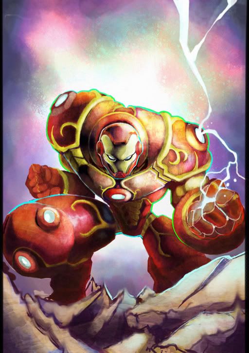
not ironman, man. I took libertys with the design.

I dunno. 30+ hours of photoshop, man i love texture spam.

stinkyfingers on

Posts

  • Options
    MaximasXXZMaximasXXZ Registered User regular
    edited August 2010
    It looks very good as a whole image, but it's very difficult to tell your skill based on an image like this. The Ironman figure itself looks very good, with some questionable things going on in the torso in terms of structure and overall finesse. Photoshop can do wonders, but generally I personally find the use of smearing tools and so forth to be annoying (which you've gone ahead and done all over the ground).

    Overall though, it's a solid image. I think posting more work would be great, possibly less stylized?

    MaximasXXZ on
    zombiegirl8ki.gif
    TL_Sigblock.jpg
    PSN: MaximasXXZ XBOX Live: SneakyMcSnipe
  • Options
    NibCromNibCrom Registered User regular
    edited August 2010
    I think your image would be stronger if you got rid of the florescent blue and green outlines. They don't seem to fit with the lighting or environment. They're also not in the CMYK gamut, which even if your aren't going to print it, always looks odd to me. As Maximas said, there seems to be some shortcuts you took with the anatomy. If you better defined the geometry before coloring and adding textures, the piece would be stronger. The terrain does not have the same level of polish as the rest of the piece. I would consider spending more time on it so it matches the rest of the piece better. Overall, I think it's a pretty strong piece.

    Welcome to the AC. Post more!

    NibCrom on
  • Options
    MagicToasterMagicToaster JapanRegistered User regular
    edited August 2010
    NibCrom wrote: »
    I think your image would be stronger if you got rid of the florescent blue and green outlines. They don't seem to fit with the lighting or environment. They're also not in the CMYK gamut, which even if your aren't going to print it, always looks odd to me.

    Because of my inability to draw, I'm gonna keep clear of any anatomical critiques, but I'm gonna back up NibCorn on this. The green outline looks odd, and I instantly knew it was out of gamut... it's too bright to print right*

    ironwarunflatcontrast1.jpg

    The left has your original RGB file and the left a CMYK conversion, notice how the green dies down considerably into a dull muddy color. The blue, surprised me at how close it stayed to the RGB equivalent... but it's still pretty dull.

    *You can print a vibrant green, but it would require the use of a spot color and that you do it on a flat press, not a digital printer.

    MagicToaster on
  • Options
    bombardierbombardier Moderator mod
    edited August 2010
    I think it would be helpful to see some more work that has taken you maybe an hour to a few hours tops to give us a better picture of your process and structure habits.

    bombardier on
  • Options
    stinkyfingersstinkyfingers Registered User regular
    edited October 2010
    Hey yall, how long its been? Sorry for not responding, I forgot about this forum...

    bombardier wrote: »
    I think it would be helpful to see some more work that has taken you maybe an hour to a few hours tops to give us a better picture of your process and structure habits.

    ill be posten some sketches soon!
    NibCrom wrote: »
    I think your image would be stronger if you got rid of the florescent blue and green outlines. They don't seem to fit with the lighting or environment. They're also not in the CMYK gamut, which even if your aren't going to print it, always looks odd to me. As Maximas said, there seems to be some shortcuts you took with the anatomy. If you better defined the geometry before coloring and adding textures, the piece would be stronger. The terrain does not have the same level of polish as the rest of the piece. I would consider spending more time on it so it matches the rest of the piece better. Overall, I think it's a pretty strong piece.

    Welcome to the AC. Post more!

    The major critique I got on it where the Green and the crappy ground.

    Thanx man! I have another Illustration done, but I know where to go with it. Ill post the finished version of it when im finished.

    MaximasXXZ wrote: »
    It looks very good as a whole image, but it's very difficult to tell your skill based on an image like this. The Ironman figure itself looks very good, with some questionable things going on in the torso in terms of structure and overall finesse. Photoshop can do wonders, but generally I personally find the use of smearing tools and so forth to be annoying (which you've gone ahead and done all over the ground).

    Overall though, it's a solid image. I think posting more work would be great, possibly less stylized?

    I see ill post some sketches in the future.

    I started to question the torso after I had it done. I should of made his waist larger.

    lol, I got lazy when I smeared the ground. Bad me.

    Thanx for your time! I apreciate it!

    ninwhip.jpg

    WIP, core of shadow FTW

    any suggestions, any critiques at all apreciated. COncept as well as the art itself. References?

    your concept could make it into the final epice.

    stinkyfingers on
  • Options
    bwaniebwanie Posting into the void Registered User regular
    edited October 2010
    i'm feeling a little uncomfortable staring into his nonexistant crotch

    bwanie on
    Yh6tI4T.jpg
  • Options
    NakedZerglingNakedZergling A more apocalyptic post apocalypse Portland OregonRegistered User regular
    edited October 2010
    Looks like you're just copying joe mad. Can we see non stylized stuff?

    NakedZergling on
  • Options
    stinkyfingersstinkyfingers Registered User regular
    yoyo, I whent back and updates a previus painting. irks me less now.,

    bB2.jpg

    I have been doing 3d but nothing impressive.

    crits and comments welcome

Sign In or Register to comment.