As was foretold, we've added advertisements to the forums! If you have questions, or if you encounter any bugs, please visit this thread: https://forums.penny-arcade.com/discussion/240191/forum-advertisement-faq-and-reports-thread/
Options

A zombie dude walking a zombie dog. Need cnc on latest update please.

Arden CaneloArden Canelo Registered User regular
edited October 2010 in Artist's Corner
I really like this idea I had so I wanted to make a thread about it so it would get more attention than the doodle thread. I wanna push it to the best it can be!

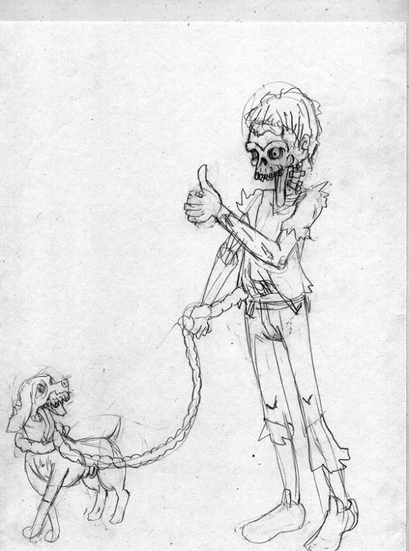
Here is the first sketch I did of it.
cleverzombie.jpg

Here's after some photo ref's and digital lines over the pencils.
CleverZombiesmall.jpg

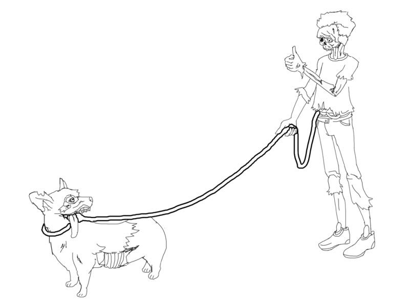
Now, I'm no anatomist, but I'm trying to learn - so say anything that needs to be said and I'll see what I can do. Like the dog's ribs, those needs some work. I'm pleased with it over all though.

Arden Canelo on

Posts

  • Options
    NappuccinoNappuccino Surveyor of Things and Stuff Registered User regular
    edited October 2010
    I think I prefer the exaggerated cartoon look of the first sketch. The second might be more accurate but considering its a zombie walking his dog with intestines, i don't think you have to shoot for complete realism here :)

    Nappuccino on
    Like to write? Want to get e-published? Give us a look-see at http://wednesdaynightwrites.com/
    Rorus Raz wrote: »
    There's also the possibility you just can't really grow a bear like other guys.

    Not even BEAR vaginas can defeat me!
    cakemikz wrote: »
    And then I rub actual cake on myself.
    Loomdun wrote: »
    thats why you have chest helmets
  • Options
    AumniAumni Registered User regular
    edited October 2010
    Does the line of the intestines need to be that thick?

    Also the Zombie's pose looks awkward, even for a zombie.

    The first sketch also seems to have more character than the 2nd image. The zombie's skull is more interesting [and maybe even more accurate] and the dog's pose is a lot cuter [Just need to move his right rear foot forward].

    Aumni on
    http://steamcommunity.com/id/aumni/ Battlenet: Aumni#1978 GW2: Aumni.1425 PSN: Aumnius
  • Options
    Arden CaneloArden Canelo Registered User regular
    edited October 2010
    @Nap - I'll make another sketch with that in mind.

    @Aumni - intestine line does not need to be that thick no. will change in next version and make it look like intestines. Seems you guys like the first sketch better. Let's see what a redraw in ol' pho sho does for it.

    Arden Canelo on
  • Options
    Linespider5Linespider5 ALL HAIL KING KILLMONGER Registered User regular
    edited October 2010
    GREAT idea, I have to say.

    I kinda like the original sketch more, though. The uniform line weight in the updated version strips it down a lot, and it loses some of the emphasis in the posture of the figure. The sketchier look might be more appropriate with a decomposing body, but that's just me. Keep up the good work!

    Linespider5 on
  • Options
    Arden CaneloArden Canelo Registered User regular
    edited October 2010
    Proooogresssssssssssss? :Creeper: D:
    CleverZombiesmall2.jpg

    @Line - Yeah hmmm uniform line weight is pretty boring... I'll work on that.

    Arden Canelo on
  • Options
    NappuccinoNappuccino Surveyor of Things and Stuff Registered User regular
    edited October 2010
    the dogs front legs probably should be like that- its right leg/paw seems like it shoudl be more behind the left one

    Nappuccino on
    Like to write? Want to get e-published? Give us a look-see at http://wednesdaynightwrites.com/
    Rorus Raz wrote: »
    There's also the possibility you just can't really grow a bear like other guys.

    Not even BEAR vaginas can defeat me!
    cakemikz wrote: »
    And then I rub actual cake on myself.
    Loomdun wrote: »
    thats why you have chest helmets
  • Options
    AlecxantAlecxant Registered User regular
    edited October 2010
    the lack of a background or setting really doesn't help at all. It appears that the zombie is floating. Also the zombie looks like he's leaning forward or something. He's really rigid, and not in a zombie-dead-body-rigid way. It's kind of awkward. Work on making the zombie look more natural, and stick in at least something to bound the figures to the ground.

    Honestly, I think you were a lot more effective with the original sketch.

    Alecxant on
  • Options
    Arden CaneloArden Canelo Registered User regular
    edited October 2010
    I think I took everything into consideration that was said above with this recent attempt. I hope?

    I scanned the new sketch in a little light, but plan to go over it with some graphite like brushes in pho sho.
    That's my quick try at a background, with a new light source being a torch...suspended by something.
    The zombie's pose is something I came up with by drawing myself in the mirror so its probably not the best.
    I like that the zombie's line of sight seems to go more in line with the dog's now though.

    CleverZombie3.jpg

    Arden Canelo on
  • Options
    ninjaininjai Registered User regular
    edited October 2010
    Looks much more dynamic. Perspective is off try raising the horizon quite a bit, but great improvement overall

    ninjai on
  • Options
    Arden CaneloArden Canelo Registered User regular
    edited October 2010
    So, I worked on this more and realized that I was done with it at this point. I don't even like it, but I don't hate it. It gets the basic message across, although somewhat more crappily than I had originally planned.
    CleverZombiefinal.jpg
    I want to use the concept again, but the linework just got all shot to hell and then I added colors and... yeah gonna have to redo this guy some time in the future.

    Arden Canelo on
  • Options
    AumniAumni Registered User regular
    edited October 2010
    Start with more consistent blocks of colors. The tree is an easy example where it shows how sloppy your color work is. The scratchy brush you used for the background did nothing for the picture. Try using a solid round brush to fill in the blocks, then layer on more details/highlights/shading.

    You started to have some nice shading on the pants, if you carried that through the rest of the piece it'd look a lot better.

    Keep it up man! Love the idea you have here.

    Aumni on
    http://steamcommunity.com/id/aumni/ Battlenet: Aumni#1978 GW2: Aumni.1425 PSN: Aumnius
  • Options
    Arden CaneloArden Canelo Registered User regular
    edited October 2010
    I made my tablet rise from its grave! I have a feeling this looks better, so I'll press on from here with shadows and a proper light source.
    CleverZombiefinal-1.jpg

    Arden Canelo on
  • Options
    IrukaIruka Registered User, Moderator mod
    edited October 2010
    So just a few suggestions, I am not great at light myself and you'll have to forgive me. this is really quick and not really right:

    lightcrit.jpg

    My first suggestion is to start with a unified background color. If the overall color of the background isnt going to be really light, theres not much reason to leave any white back there. then I would try and thing harder about the really simple shapes that are making up your characters, and how your light would hit them. The best thing to do is keep it simple at first.

    lightcrit2.jpg

    Iruka on
  • Options
    Arden CaneloArden Canelo Registered User regular
    edited October 2010
    I want to have your babies more than ever, Iruka. Thanks for being so dang cool. Radical even.
    I'll take your advice and apply it as best I can.

    Arden Canelo on
Sign In or Register to comment.