As was foretold, we've added advertisements to the forums! If you have questions, or if you encounter any bugs, please visit this thread: https://forums.penny-arcade.com/discussion/240191/forum-advertisement-faq-and-reports-thread/
Options

My comic characters

KrazedKrazed Registered User regular
edited June 2007 in Artist's Corner
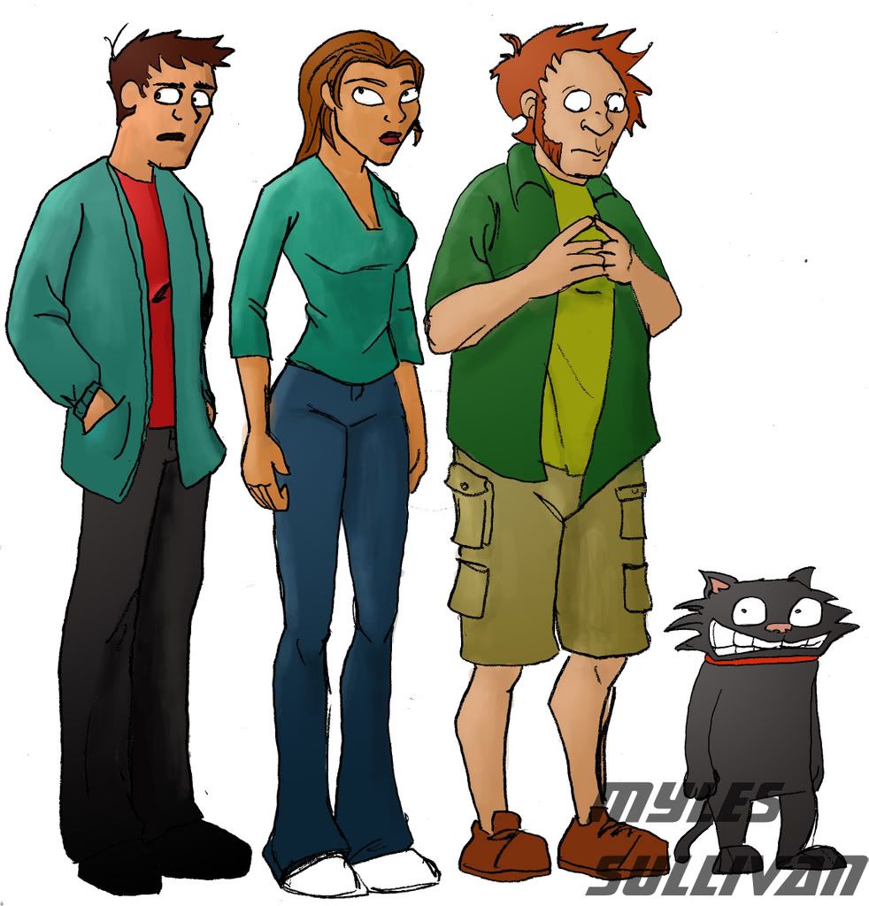
Been a while since I've posted. Just want to hear all your opinions on my comic characters. Not webcomic, but comic...

CrazedCharactersJPEG.jpg

Krazed on

Posts

  • Options
    NakedZerglingNakedZergling A more apocalyptic post apocalypse Portland OregonRegistered User regular
    edited June 2007
    are you looking for opinions on the characters or the art?
    as far a characters go, they are as average as average gets. having no background or any idea what you're going for i don't know what you're expecting people to say.
    you have average guy, transvestite, hippie and homosexual cat...what more can anyone say?

    NakedZergling on
  • Options
    MagicToasterMagicToaster JapanRegistered User regular
    edited June 2007
    It's alot easier to judge things when you don't have to scroll side to side, up and down to see every thing.

    crazedcharactersjpeghq8.jpg

    Upon viewing your image as a whole, anatomical mistakes become more evident. Notice how they are all the same height but their torsos and legs are different lengths.

    Design wise, these are very boring looking characters. I don't really feel like wanting to know more about them. Also the color choices are very similar on all three, which makes them even more boring.

    For some reason that cat reminds me of this one.

    MagicToaster on
  • Options
    NakedZerglingNakedZergling A more apocalyptic post apocalypse Portland OregonRegistered User regular
    edited June 2007
    eek the cat was the balls!

    NakedZergling on
  • Options
    KrazedKrazed Registered User regular
    edited June 2007
    The reason they all are the same height is because I drew them separatly, in the comic, the red-head is the tallest, and the girl is the shortest. Also, I know the clothes and the general appearence are bland. It was intended. I just wanted to get the basic look down and chose relatively basic colors. I realize now I should have said that, I was mostly wondering about the anatomy. Despite the height, what else is wrong (and I know there is a lot).

    Krazed on
  • Options
    MagicToasterMagicToaster JapanRegistered User regular
    edited June 2007
    Maybe I didn't express myself correctly. The problem is not that they're the same height, it's that even though you've put them on the same scale their proportions don't match. Notice how high up the girls crotch is when compared to the other two. Also notice how short the orange haired guy's shins are in comparison to the other's.

    With the exception of the orange haired dude, everyone seems to be missing the top part of their skull.

    And lastly, what bugs me the most is that text... you just put it there on top of the characters. Doesn't that bother you at all? It's not easy to read... but that's not my issue. My issue with that text is that it's showing us how you structure things on a page. Is this how you layout your comic, too?

    MagicToaster on
  • Options
    srsizzysrsizzy Registered User regular
    edited June 2007
    Work on:
    - Cleaner lines
    - Anatomy
    - Coloring
    - Form
    - Value

    srsizzy on
    BRO LET ME GET REAL WITH YOU AND SAY THAT MY FINGERS ARE PREPPED AND HOT LIKE THE SURFACE OF THE SUN TO BRING RADICAL BEATS SO SMOOTH THE SHIT WILL BE MEDICINAL-GRADE TRIPNASTY MAKING ALL BRAINWAVES ROLL ON THE SURFACE OF A BALLS-FEISTY NEURAL RAINBOW CRACKA-LACKIN' YOUR PERCEPTION OF THE HERE-NOW SPACE-TIME SITUATION THAT ALL OF LIFE BE JAMMED UP IN THROUGH THE UNIVERSAL FLOW BEATS
  • Options
    KrazedKrazed Registered User regular
    edited June 2007
    Maybe I didn't express myself correctly. The problem is not that they're the same height, it's that even though you've put them on the same scale their proportions don't match. Notice how high up the girls crotch is when compared to the other two. Also notice how short the orange haired guy's shins are in comparison to the other's.

    With the exception of the orange haired dude, everyone seems to be missing the top part of their skull.

    And lastly, what bugs me the most is that text... you just put it there on top of the characters. Doesn't that bother you at all? It's not easy to read... but that's not my issue. My issue with that text is that it's showing us how you structure things on a page. Is this how you layout your comic, too?

    Sorry about the text, I slapped it on there real quick. Its not supposed to be the focus. In the comic, I make sure to have enough room for the text and a balance between it and the drawing. I see what you mean about the anatomy, such as the shins and the shape of the head. Also, I was lazy with the coloring and the lining. I just scanned my pencil art and then made it darker, I usually make sure the lines work.
    I'll stop going on and on. I think I'll post my first page, which I'll actually take my time on. Also, I'll be sure to get the anatomy right, I can't let laziness take over.

    Krazed on
  • Options
    Grim OutlookGrim Outlook Registered User regular
    edited June 2007
    your cat doesn't have any whiskers

    how will he know if he can fit his head into tight spaces?

    how?

    Grim Outlook on
Sign In or Register to comment.