As was foretold, we've added advertisements to the forums! If you have questions, or if you encounter any bugs, please visit this thread: https://forums.penny-arcade.com/discussion/240191/forum-advertisement-faq-and-reports-thread/
Options
Trying to make up for lost time, and here's where I am.
TheJoe Registered User regular
Registered User regular
Hello.
I decided to act on my life's regrets, and start cartooning again (held part time comics jobs in the 90s). I'm trying to embrace the new medium of the internet where the comics aren't being shrunk, and realize I really missed an opportunity in the past decade. No better time than now to catch up on lost time eh?
I still love to draw by hand, although I'm making progress with a small Intuous 5. Although I find many webcomics pleasing to the eye, I find the very smooth and monotonous line drawing lacking the organic aesthetics seen in comics such as Pogo, Bloom County, and Calvin & Hobbes. I'm slowly finding some brushes in Photoshop that look more like liquid ink, but then I'm not comfortable enough looking up while drawing down on the Intuous. I'm actually holding out for the Surface Pro as it's cheaper than Cintiq and more portable. In the mean time, I'm making it a point to draw a minimum of 30 minutes a day on paper.
My webcomic is still an infant, rolling around in it's own feces because I'm trying to find my style and technique. On top of that, I'm partly colorblind and trying to find a color scheme that looks good to me as well to non colorblinds. . So without further ado, let me regurgitate a few pieces so far, a bit of info about it, and if anyone has some pointers I will be busting out thank yous.
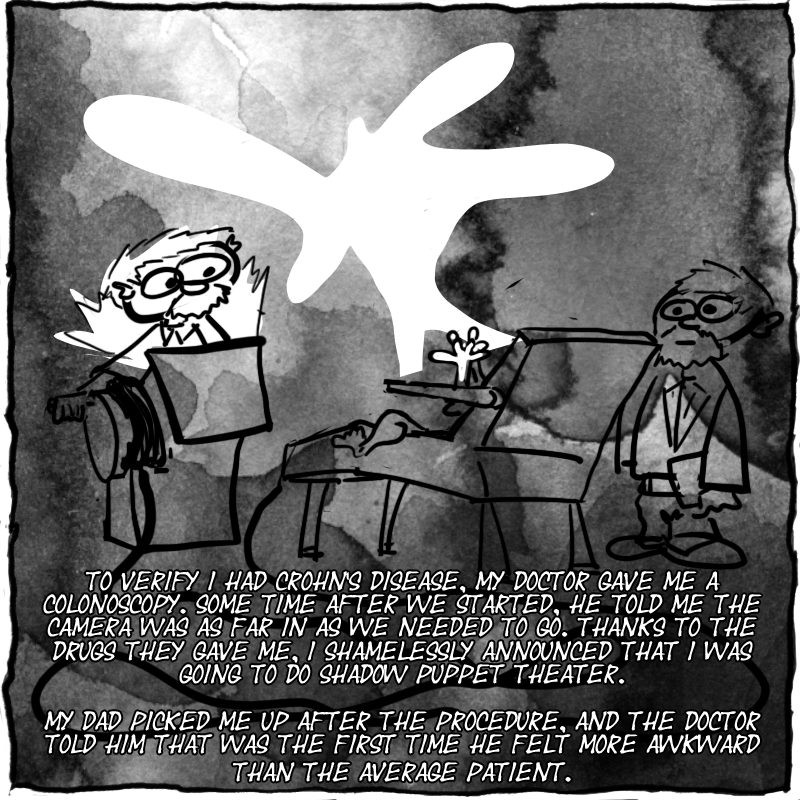
Drawn last December on a Large Wacom Tablet, and it's a true story. I'm not doing the text by hand at this time, and discover I love watercolors. At this time I'm just downloading watercolor brushes into photoshop, set size in the 2000's, and keep clicking once, hit undo, and reclicking until I find a placement I like. It's a hackjob, but it's all I know how to do at this time.
Drawn by hand, scanned into photoshop, took steps to remove the paper texture background and darken the ink lines. Still not my own handwriting, and slapping down photoshop brushes and seeing what sticks. The ink lines look nice and smooth on paper, but look roughly when in photoshop. I'm positive this has to do with the editing done beforehand, and I blew a few hours on google to find a perfect method - I was not successful.
steaksmoothie.com/?p=194
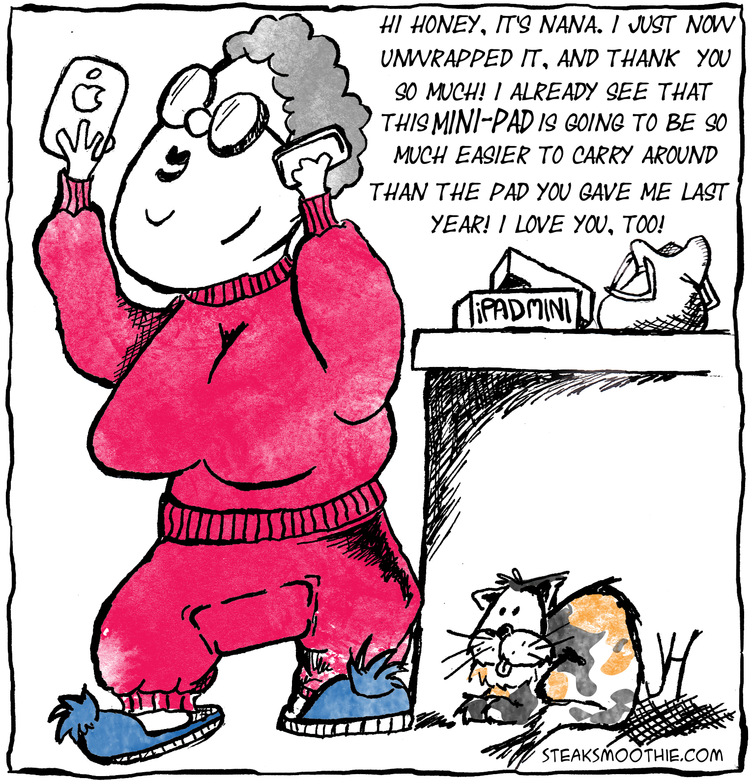
Linked this huge monster. I drew every frame by hand - one drawing per page of paper. Each scanned individually into photoshop, with many hours of 'how the hell do I do this' piecing it together and arranging it. This comic turned into a massive haphazard learning experience that has roughly 80 layers in photoshop! I learned several new tricks, but at the same time worry there's many more I could have used. I haven't done anything this intensive again yet.
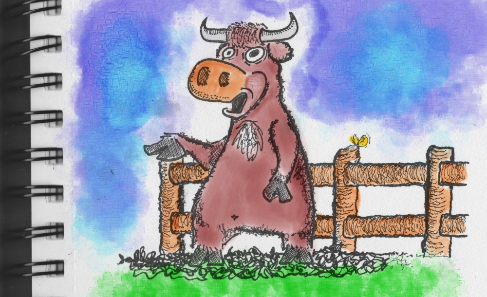
I replaced my large Wacom with a Small Intuous 5, because I found it more comfortable and drew this above comic. I kid you not, swear on my heart, a few days after I had this idea the news hit that pubic lice are endangered. I foretold the future! I barely colored it, because I'm not happy with my hackjob in photoshop with watercolor brushes.
I spend a whole weekend trying to find a new style and new ways to apply color. I find Corel Painter 12 and much better watercolor tools, and have a new direction.
My first quick doodle with Intuous 5 and Corel Painter 12. I haven't even touched all the buttons, but find the watercoloring much more authentic than my barbaric photoshop brush slapping. There is unfortunately, a lot less tutorials and FAQs on the internet for Corel Painter compared to Photoshop.
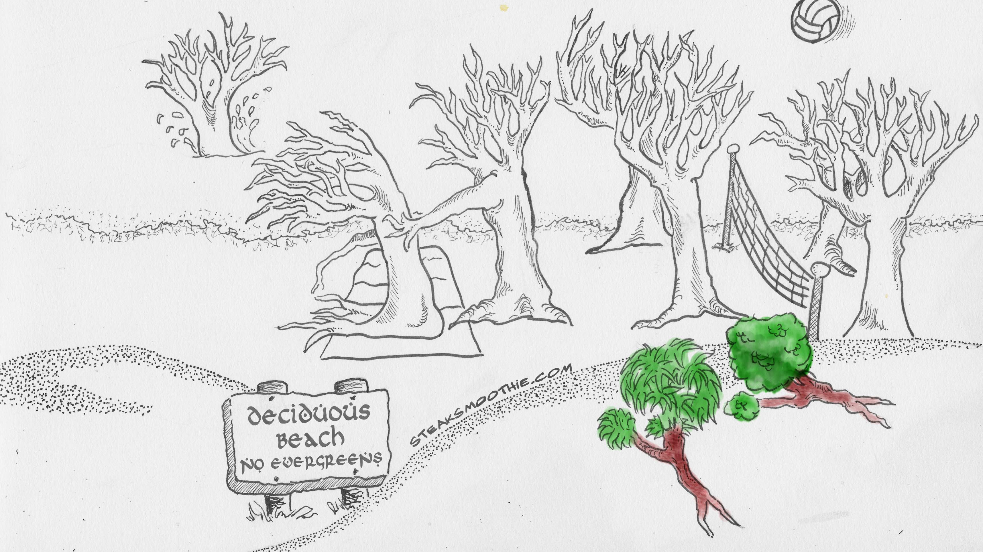
My latest full toon. Drew by hand, and scanned into photoshop. This time, I did not try to remove the paper texture or darken the ink lines, but didn't get far into coloring because there's so much to color and yet I had so little knowledge of Corel Paint at the time. I decided just to call it "done" for now and move onto my next new style. Besides, I don't want to keep churning out random ideas in single panels, I actually want to do a normal webcomic strip with reoccurring characters in a regular storyline.
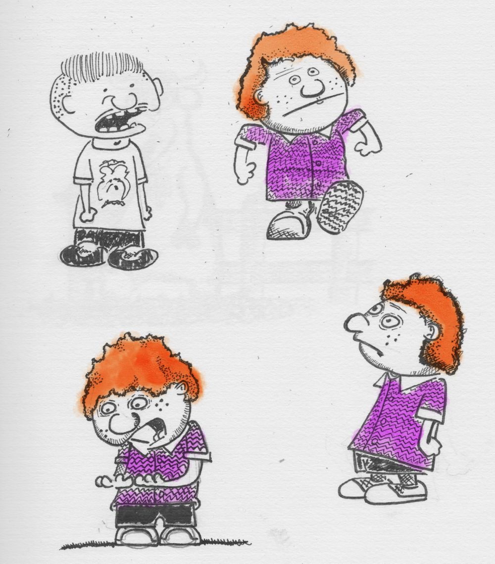
Now onto my doodles of the new style. Drawn by hand, scanned into photoshop, kept the faded ink lines and keep the paper background. In my eyes it looks stylish (but in the eyes of one casual observer, it looks sloppy). I like this style, but feel somethings missing. My wife and a few other friends say it looks great, but none of them are artist, and ya... ultimately that's why I'm here making this thread for you guys.
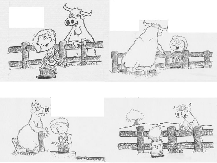
And I'll finish this off with the very rough draft of the debut comic I'm working on - 4 of 6 panels ink/scanned/arranged, the dialogue whited out. I plan on keeping the natural paper texture background, and watercoloring only 50% of the surface as not to overdo it.
So what do you guys think?
Also, thank you for whoever set up this forum and put that SAVE DRAFT button. I finished this entire thread, hit preview, and mistakenly hit the X on my browser instead of preview window. If I wasn't at work, I'd be freaking screaming. I started a new thread, saw "SAVE DRAFT" blink, and thought "what's that?" Five minutes later, whamo - found this draft. Awesome.
I decided to act on my life's regrets, and start cartooning again (held part time comics jobs in the 90s). I'm trying to embrace the new medium of the internet where the comics aren't being shrunk, and realize I really missed an opportunity in the past decade. No better time than now to catch up on lost time eh?
I still love to draw by hand, although I'm making progress with a small Intuous 5. Although I find many webcomics pleasing to the eye, I find the very smooth and monotonous line drawing lacking the organic aesthetics seen in comics such as Pogo, Bloom County, and Calvin & Hobbes. I'm slowly finding some brushes in Photoshop that look more like liquid ink, but then I'm not comfortable enough looking up while drawing down on the Intuous. I'm actually holding out for the Surface Pro as it's cheaper than Cintiq and more portable. In the mean time, I'm making it a point to draw a minimum of 30 minutes a day on paper.
My webcomic is still an infant, rolling around in it's own feces because I'm trying to find my style and technique. On top of that, I'm partly colorblind and trying to find a color scheme that looks good to me as well to non colorblinds. . So without further ado, let me regurgitate a few pieces so far, a bit of info about it, and if anyone has some pointers I will be busting out thank yous.
Drawn last December on a Large Wacom Tablet, and it's a true story. I'm not doing the text by hand at this time, and discover I love watercolors. At this time I'm just downloading watercolor brushes into photoshop, set size in the 2000's, and keep clicking once, hit undo, and reclicking until I find a placement I like. It's a hackjob, but it's all I know how to do at this time.
Drawn by hand, scanned into photoshop, took steps to remove the paper texture background and darken the ink lines. Still not my own handwriting, and slapping down photoshop brushes and seeing what sticks. The ink lines look nice and smooth on paper, but look roughly when in photoshop. I'm positive this has to do with the editing done beforehand, and I blew a few hours on google to find a perfect method - I was not successful.
steaksmoothie.com/?p=194
Linked this huge monster. I drew every frame by hand - one drawing per page of paper. Each scanned individually into photoshop, with many hours of 'how the hell do I do this' piecing it together and arranging it. This comic turned into a massive haphazard learning experience that has roughly 80 layers in photoshop! I learned several new tricks, but at the same time worry there's many more I could have used. I haven't done anything this intensive again yet.
I replaced my large Wacom with a Small Intuous 5, because I found it more comfortable and drew this above comic. I kid you not, swear on my heart, a few days after I had this idea the news hit that pubic lice are endangered. I foretold the future! I barely colored it, because I'm not happy with my hackjob in photoshop with watercolor brushes.
I spend a whole weekend trying to find a new style and new ways to apply color. I find Corel Painter 12 and much better watercolor tools, and have a new direction.
My first quick doodle with Intuous 5 and Corel Painter 12. I haven't even touched all the buttons, but find the watercoloring much more authentic than my barbaric photoshop brush slapping. There is unfortunately, a lot less tutorials and FAQs on the internet for Corel Painter compared to Photoshop.
My latest full toon. Drew by hand, and scanned into photoshop. This time, I did not try to remove the paper texture or darken the ink lines, but didn't get far into coloring because there's so much to color and yet I had so little knowledge of Corel Paint at the time. I decided just to call it "done" for now and move onto my next new style. Besides, I don't want to keep churning out random ideas in single panels, I actually want to do a normal webcomic strip with reoccurring characters in a regular storyline.
Now onto my doodles of the new style. Drawn by hand, scanned into photoshop, kept the faded ink lines and keep the paper background. In my eyes it looks stylish (but in the eyes of one casual observer, it looks sloppy). I like this style, but feel somethings missing. My wife and a few other friends say it looks great, but none of them are artist, and ya... ultimately that's why I'm here making this thread for you guys.
And I'll finish this off with the very rough draft of the debut comic I'm working on - 4 of 6 panels ink/scanned/arranged, the dialogue whited out. I plan on keeping the natural paper texture background, and watercoloring only 50% of the surface as not to overdo it.
So what do you guys think?
Also, thank you for whoever set up this forum and put that SAVE DRAFT button. I finished this entire thread, hit preview, and mistakenly hit the X on my browser instead of preview window. If I wasn't at work, I'd be freaking screaming. I started a new thread, saw "SAVE DRAFT" blink, and thought "what's that?" Five minutes later, whamo - found this draft. Awesome.
0
Posts
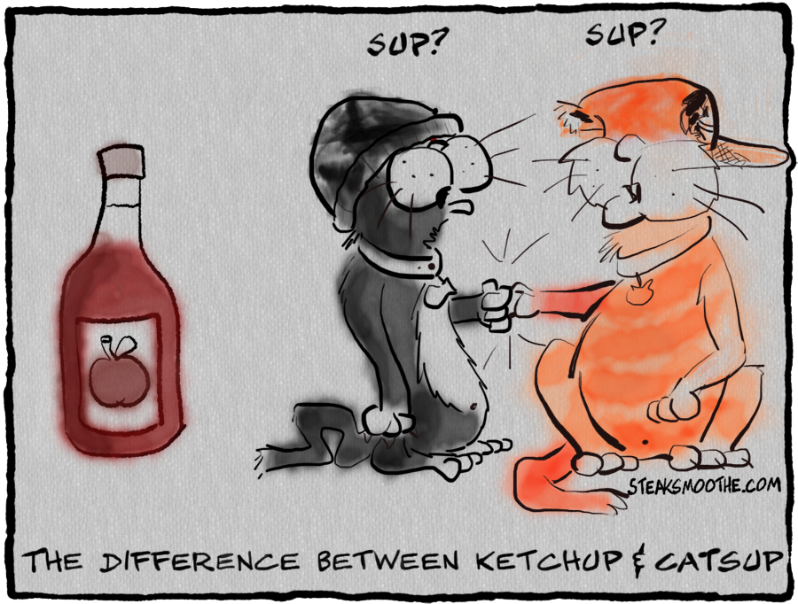
A couple things about your comic-ing, that are quick fixes. Your uploaded images are way WAY too big. Between 600-700 pixels wide is better for viewing on the forums. Also way too text heavy for my tastes. Rule of thumb is that if you can't communicate your idea/joke in a fast, direct way to the reader, you may need to go back to the drawing board. For example, the only one my eyes didn't just glaze over, was the ketchup one. Simple. To the point!!
The textured paper thing is not doing much for me. When scanning in handrawn stuff, you should take a minute and adjust the brightness/contrast to get rid of paper texture and blemishes. This will darken your blacks, making a nice contrast between the white and the ink!! Also, I know you're jumping into the digital realm, but the colors used/technique are not doing your lines any favors.
Welcome to the forums though, stick around and I'm sure you'll get some good advice!
INSTAGRAM
Brightness and Contrast will be my focus today. The current method was selecting a color range field (the background), then deleting it to create the white background, and then resize the image to try and smooth it out. It was having mixed results, thus I just stopped doing it for the current toon.
One thing I noticed while reading around, is that hand-inked drawings should be scanned as "line art", however I don't have that setting. I'm currently doing black-and-white-photograph, but maybe that's being too precise? edit in : someone that scans her watercolor art linked me to a few more pages to read. edit edit : Amazing in all the things I read, Image-Adjustment-LEVELS never came up. Issue solved!
https://www.dropbox.com/sh/5ss3191iycc94qv/KhjnQbesNd?m#f:fourjpg.jpg
became
https://www.dropbox.com/sh/5ss3191iycc94qv/KhjnQbesNd?m#f:fourleveledjpg.jpg
(image tag don't seem to link linked dropbox)
Ugh on the search for a coloring method. I really want the watercolors to work in some way, and struggle already with reds/browns greens/yellows to the point my wife has to look things over and see how much I have messed up.
Thanks for the to-do list!
The smallest bit of knowledge that had the greatest impact is that any drawing I do can be 'traced' in Illustrator to become vector art. I'm still butting heads learning water coloring, however throwing out flat colors and running Dodge & Burn to give it some shading isn't too bad after all.
Here's a hand drawing from a strip in progress :
Then converted into vector art in Illustrator, resized, then taken into photoshop for some simple coloring :
Real shame I don't get more than an hour or two a night to work on this, but hoping to have the entire comic done by the weekend.
I got the idea months ago, and decided to tackle it when I found out Youtube started back in Feb 14, 2005 - Valentines day. I finish it a day late, then google things to make sure I'm right - and learn I sorta was. Youtube was registered Feb 14, 2005, however the first video was two months later. I redid the wording in the last panel to drop the valentines day reference. There's a few things I want to fix, however it's been two weeks - I need to move on.
But there it is.
I don't feel comfortable coloring, and need to do some tutorials. I think I like my drawings being scanned and then vectorized - they resize nicely. And the masking multi-panel video I found was nice, however I think I have room for improvement.
Critique is of course, welcome.
But man, this is several weeks late.
With that, I finally got the first comic with what I hope to be reoccurring characters. Although it's a debut, I didn't introduce their names. I like to tell myself the debut of Calvin & Hobbes didn't have that either, however it was sorta named after them. Oh well, it helps me sleep at night.
If you do want them, here's a pretty good method for making them: http://pcweenies.com/2012/04/21/how-to-make-word-balloons-using-adobe-photoshop/
Or you could just google "word balloons photoshop".
Good luck going forward, perfect box borders will come with time.
Thank you and keep up the hard work!
PS The Youtube comic was good too.
MuddyParasol -- It's one of my pet peeves seeing the same repetitive angle combined with a static background, so I try to avoid it -- Thanks for noticing.
I don't know how someone linked names in the past, I'll figure it out in time.
I think the book title was a better joke now.
The speech bubble tutorial was perfect, thanks SeraphSword.
I also learned about Adobe CS5 GIF Export Options, and that dithering should be avoided. That took forever to figure out.
The interesting bit about this one was I verbally told the dialogue to several people over Skype. I learned less than half the people I know knew who Oscar was, but those that did know had a good laugh, as they didn't see it coming. Everyone however, felt a smidgen smarter learning about the differences.
I popped this one-off out too quickly, and then the very next day realized how much I hated the wording -- the doctor should be talking and filling up that deadspace. I decided against redoing it, since it'll serve as a reminder not to rush things.
It's actually based on a somewhat true story of a friend of mine who worked in the ER, and helped remove a mag-light from someone. She had coworkers that had to deal with a gerbil once, and agreed this is the only way it could be worse..although impressive. I should just draw her real story, where her supervisor asked the guy, "So you want us just to change out the batteries for you?".
I got back to my regular characters this weekend, and it was a simple one frame with a pun as a punchline. I looked at it, and realized puns are the cheap way out, and built on it to the point that I don't see it so much as funny, but a true scenario how "friends" try and talk me out of eating unhealthy by eating some of it for me. I actually got a part two to go with this I hope to have done before Saturday when I leave town for a week.