As was foretold, we've added advertisements to the forums! If you have questions, or if you encounter any bugs, please visit this thread: https://forums.penny-arcade.com/discussion/240191/forum-advertisement-faq-and-reports-thread/
Options
UNiCOMICS Arty thingys!
UNiCOMICS Registered User regular
Hello there! I was here a while ago showing some new stuff I have been working because I have been doing some kool comic stuff and I hope I have improved on my arty skillage I hope.. anyways ARTS and stuff
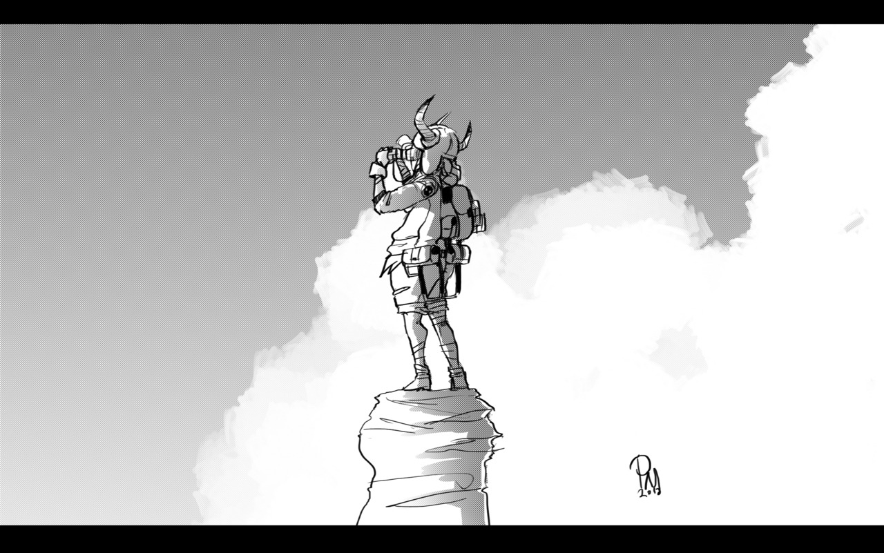
anyways Its good to be back, been wanting to come back just been mega busy and all, but I wanted to come back to improve on my art skills and make some new and awesome friends!
so yeah ENJOY!!
UNi
anyways Its good to be back, been wanting to come back just been mega busy and all, but I wanted to come back to improve on my art skills and make some new and awesome friends!
so yeah ENJOY!!
UNi
http://unicomics-chowkofsky.deviantart.com/ My DA
http://unicomics.tumblr.com/ My Visu-blog
http://theweeklythonk.tumblr.com/ My webcomic
http://unicomics.tumblr.com/ My Visu-blog
http://theweeklythonk.tumblr.com/ My webcomic
UNiCOMICS on
0
Posts
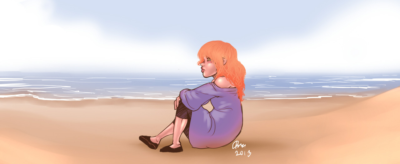
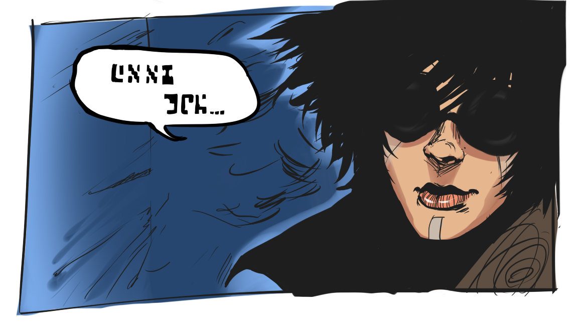
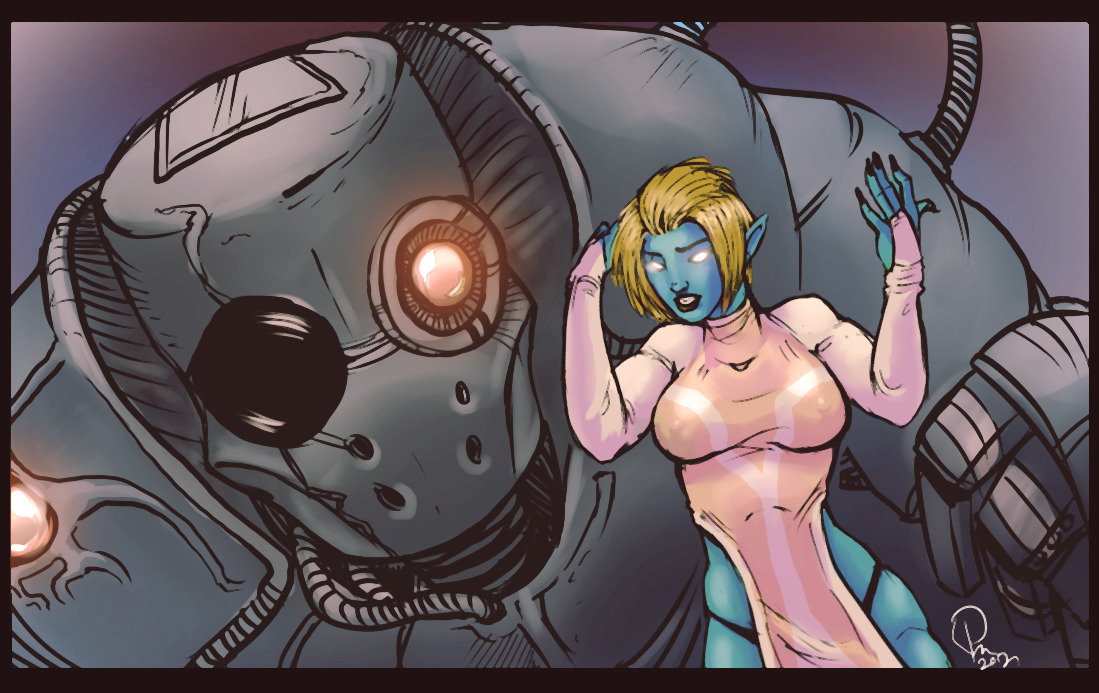
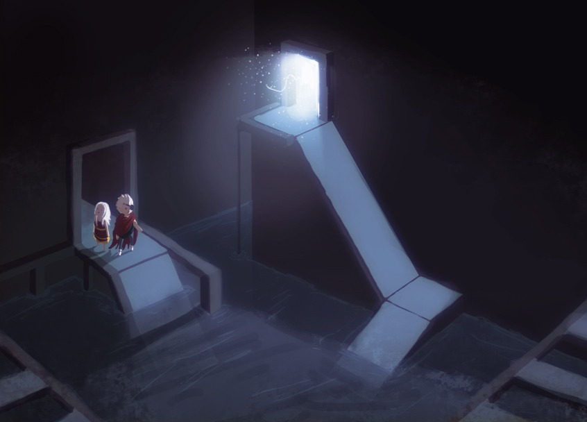
i like the last 2 the most, they actually seem to be of a higher skill level than the rest. the first and third one are kind of getting killed by sloppy black lines that really dont need to be there.
some of them work with the line work like the 2nd one because it has a simple cell shade thing, but when you render more realistically black lines just kill the depth and steal the attention away from whats going on inside the lines.
not to say that lines always look bad on a rendered piece but they have to be used very cleverly and subtly, like in darker areas they can thicker but in areas bathed in light they should be really thin or not there at all.
so basically if your gonna use lines go for very simplistic shading, if not then dont.
http://unicomics.tumblr.com/ My Visu-blog
http://theweeklythonk.tumblr.com/ My webcomic
You demonstrate movement, stance and atmosphere very well. I particularly enjoy the last one, both in style and in technique.