An update on recent technical problems and more from the admin: https://forums.penny-arcade.com/discussion/250292/on-technical-difficulties-mod-coverage-and-other-things/p1?new=1
Options
Iruka's Thread, Sketchbook Dumpin' since twenty ten Y'all.
Iruka Registered User, Moderator mod
 Registered User, Moderator mod
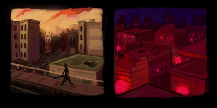
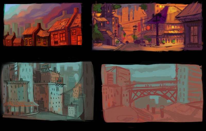
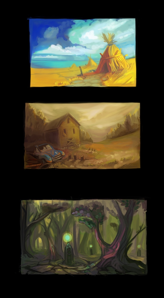
Alright, so as some people have seen I've been working on some environment thumnails. I know they arent much yet, but Im very outside of my comfort zone here. I need some thoughts on what I have going on.


Obviously, right now I haven't been too concerned with the perceptive, Mostly because perpective is boring and I hate it, and im trying to keep things kinda experimental. The better I get at working with it, though, probably the better these will get. I'm pretty bangin at making cubes in 3DS Max, so for finished pictures I would probably make a thumbnail, sketch in 3d, then paint, But if my thumbnails are weak its a bad place to start.
I'm mosly working to comic/animation backgrounds and not necessarily concept art painting, So Im kinda interested in finding more artists who arent like "HOOOLY SHIT LOOK AT THIS FUCKING MOOUUNNNTAIINNN and SPACCEEESHIPPPP" and are more like modest alleys and markets and stuff while still being interesting. I know some of you suggested some artists to me before, but more ideas on this front would be great. I would like my stuff to have moods and tell stories and not just be epic, or hyper detailed.
I'm also just interested to know more about how you feel about the thumbs above so I have an Idea of what to work on. So far Im just collecting refs and pretending I know what I'm doing. I know these are rough but hopefully its enough to get some simple thoughts.
Iruka on
+2
Posts
I think it's great that you're doing small relatively quick environment thumbs. whenever i do environments, i start of big and overambitious and end up with a disappointing result. Environments/ backgrounds are often seen as an afterthought by many (me included).
Drawingn-wise there are some wonky bits here and there, but the atmospehere you're capturing in some looks great!
Something I do to help myself is placing a blot of off-white and off-black, just off of the piece I'm working on. It helps to remind me "this is how far you can go". I used to do 100% black and 100% white, until I realized that it was forcing me to make my pieces too contrast-y. It's actually surprising sometimes how much the world is composed of midtones, with very few bits of super-dark and super-light. I usually wait until the very end of making a piece before adding in the darkest darks and lightest lights - this goes for both digital and traditional stuff. It prevents me from adding too much dark or too much highlight.
So, actually, your pieces are at the perfect stage right now to add the darker darks and lightest lights. You don't have to add them everywhere on the picture - and, actually, it wouldn't be a good idea to do that - but only in the places that would be darkest or lightest. Some pieces may need more shadow than highlight...the second one, for example, seems like more highlights would be good, and in the last piece, it seems like more shadow would be good, to really make the glowing parts pop.
What I would say is more about the comments at the bottom.
First thing is, even though yes, it's boring, you really should try to make a point of not shying away from getting down and dirty with learning perspective to the point where you know it backwards and forwards.
Knowing how to use 3d as a tool is all well and good, but a lot of times getting the scene to work not only involves having the perspective correct, but knowing when it needs to be altered for effect- ie: exaggerating fisheye distortion, fudging things a bit to fit a composition even though it might not be techincally correct (thought comes to mind of Orson Welles having to drill down two feet into a studio's concrete floor to get the composition he needed for a certain shot- sometimes slightly fudging the fact is just that important), etc. Plus, even with a base 3d mesh, you still need to be able to add in all that final detail and have it line up correctly- you can get away with a bit of wonkiness in a drawing from scratch, but if you've got an outline of a building that's a very rigid, perspective-correct cube shape, and put all the window sills are just a bit off in various ways, it's going to wind up being more of a disconnect than if you'd just drawn it all by hand to begin with.
I'm not sure if I recommended this back when you asked for cityscape references, but I'd suggest checking out the Avatar:TLA art book. Beyond just having a lot of background paintings, even more helpfully it has a lot of the pencil drawings for those paintings, complete with the vanishing points used. Maybe I'm just easily duped, but the only evidence I saw of computer stuff being used at that stage was photoshopping in some complicated window detail designs in once picture- the rest was just straight-up pencil work, and really drove home the importance of the artists really knowing their perspective shit when doing that kind of work.
On the 'for animation/comics' thing, you might benefit from composing the art more as layouts than individual 'environment' pieces that invite the comparison to concept art or straight up paintings. Reason being, as soon as you start designing to make the background functional, you've got some extra stuff to consider beyond just, 'does this look cool'- ie: where do the characters go, will pushing detail in this spot distract from the character action, is this is a surface the character has to interact with, and thus needs to be a tangible, sharply defined solid, or can it be pushed back/treated in a more painterly fashion? If you look through this Animation Background blog, you'll see a lot of background paints that are nicely rendered and solid pieces of work, but don't really hold up by themselves as interesting compositions when the characters have been removed.
Which isn't to say that doing individual environment pieces is bad, because it is very good practice just in a general painting sense- so really you should make a point of doing both. Nathan Fowkes wouldn't be half as good at doing backgrounds like this if he didn't stay in practice by constantly doing studies like these, after all. The point is more, it's perfectly possible to do some great painting that won't work as a background, and it's possible to do a great background that doesn't really work as a painting, and it's important that you have a sense for both.
Twitter
On perspective, do you have any suggestions on how to set up for drawing perspective from stratch in a digital work flow? I was never accurate with perspective, but at least I understand how to set up with rulers and shit. Is there a way to do it in PS without just making a giant canvas?
http://bacon.iseenothing.com/info/1_Perspective_Point.psd
Then just drag and drop it as a layer onto your canvas. This gives you a really quick way to set up your vanishing points. Unfortunately, it can get rather overcomplicated pretty quick, and isn't so great when you need to add new lines going to the VP that aren't there to begin with.
If you have CS or above (I don't at home, unfortunately, so I can't tell you how great a solution this may or may not be), you could try making similar setup, but with a group of a lines on individual layers, instead of a lot of lines baked into a single layer. Then, when you need a new line, you can just duplicate a layer and rotate it to the needed angle.
Twitter
I'm making up a little fake game in my head to assign myself some work. So I'll be doing some backgrounds with a purpose, and stuff like this:
The book isn't done, still needs refining and such.
The handle is curved I will have to fix that before I start going over it.
(this is very difficult to type with my curious cat blocking my screen)
INSTAGRAM
all dogs i've seen on mini leashes are on them because they're completely out of control.
so i'd keep it short if that's what you're going for!
and i love your recent stuff as well.
I'm a day late and a dollar short on this post (signed up for the forum today :P) but if it's perspective you're looking into, I still swear by David Chelsea's Perspective for Comic Book Artists (1997, Watson-Guptil Publications, NY; ISBN 0-8230-0567-4); I've got it next to everything Scott McCloud's ever written on my bookshelf. It laid out perspective in terms a layman like me can understand. The perspective grids at the back of the book were very helpful, but maybe you've already got a firm enough grasp of all that (I know I don't). For perspective in a digital setting, I've always deferred to overlaying a grid in PS. Admittedly, though, I don't do much at all with digital work, I don't have the computer for it just yet. This probably wasn't the best post for me to reply to then, huh? :P
I didnt do much else to the leash but clean up some odds and ends. I have one more little item to make (A dagger) but then I will probably start doing much more wild varieties and you'll see some more exaggeration on the concepts. These are like the 4 base items, essentially. I'm hoping that by the time I'm done rolling out images for the game, I wont have to go into detail explaining whats going on, you'll be able to sort of imagine whats happening and I can fill in the gaps. so excuse the lack of explanation for now, I prefer you all stab wildly at whats going on. It'll give me a better idea of how well I'm communicating visually.
I did my secret santa which I cant post... but I also did a collab with an awesome chick on DA named Psshaw. Colors=me, Lines=her.
I am in love with this, the colors, the design -- it's quite unique and awesome. Great job.
Tumblr/Artblog | DevArt
Heres some rough game stuff
I'd comment on the spiders, but I'm mortally afraid of arachnids, even on a computer screen:shock:. You have a good painterly quality to your buildups and sketches. You look like you're having fun (God forbid!) and exploring when you're doing these.
Your use of color may be (at least to me) your strongest attribute as an artist, evidenced especially in the monster, prop and costume designs you posted. The colors always "pop", and your use of complimentary colors in your modelling and understanding of palette selection is a great strength. Keep pushing the envelope with those colors, you have a good hand with them. I can't wait to see the "exaggerated" designs, there's no shame in not being able to immediately identify what an object's used for.
Scenario: the girl you sketched in the hoody feels to me like a free-runner/ adventurer sort. She finds the magnifying glass, which decodes the eldritch text in the tome (located in one of the creepy environs you rendered), some nightmarish-looking creatures were inadvertently summoned, and the leash is the only artifact that can hold them at bay, while the dagger is what smites them....not even close? :P
But anyway, love your color choice! I'm a sucker for twilight tones.
Agreed with this.
There's one little crit I have in general - it seems that in a few of the images you've posted in the past page or two, if you have a flat piece of fabric that curves (like the leash end, at the top of this page)...it looks a little off in the curved part...like it's either too thick, or the curve on one side doesn't match the curve on the other side, and makes it seem thicker in certain areas...or twisted differently, or whathaveyou.
Playing RPGs with my sis was always just an excuse for us to hang around and yak.
The city in the background is looking really slick and crisp, although I kind of wonder if that's working against the composition. The foreground characters are probably supposed to be the focus, but they're rendered in your trademark painterly style, which has few hard edges. There's also a limited amount of texture and detail in the foreground.
The city on the other hand is loaded with information. Like, really minute stuff like complex scaffolding. Details are one way to really draw the viewers eye to a focal point, but in this case it's kind of pulling the eye away from what we should probably be looking at.
It's a really sweet picture though.
Guess I can post this in here now too
INSTAGRAM
(Uh, my advice is... um... keep on keeping on.)