The new forums will be named Coin Return (based on the most recent vote)! You can check on the status and timeline of the transition to the new forums here.
The Guiding Principles and New Rules document is now in effect.

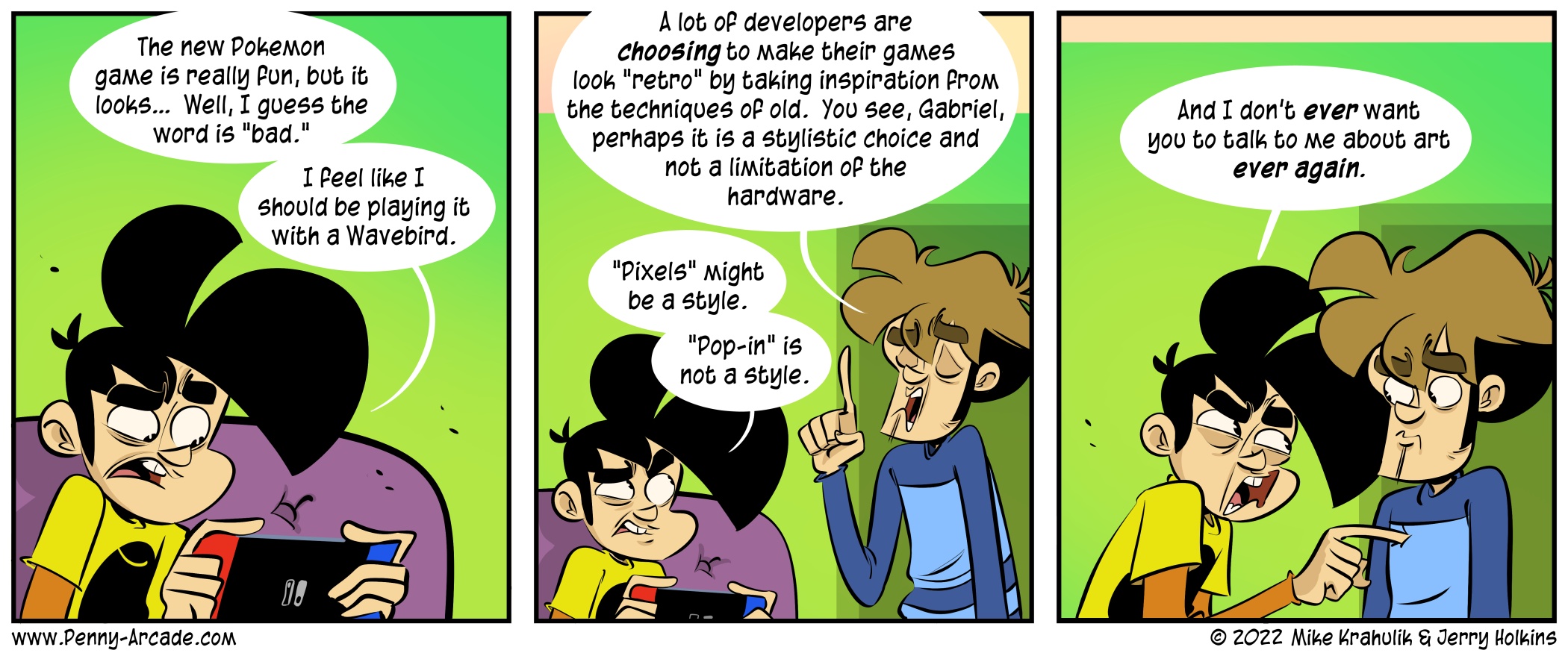
Penny Arcade - Comic - Artful Dodging

DogDog Registered User, Administrator, Vanilla Staff admin
edited January 2022 in The Penny Arcade Hub
imagePenny Arcade - Comic - Artful Dodging

Videogaming-related online strip by Mike Krahulik and Jerry Holkins. Includes news and commentary.

Read the full story here

Unknown User on

Posts

  • CuriousPencilCuriousPencil Registered User regular
    beHOLD the wrath and fury of the besmited artist, aka somehow "you can't teach my granny to suck eggs" idk why.

  • Golden YakGolden Yak Burnished Bovine The sunny beaches of CanadaRegistered User regular
    "I'll kill you. I'll kill your whole family.

    Actually that's too harsh. Let me walk that back.

    I won't kill your family. It'll just be you."

    H9f4bVe.png
  • DjiemDjiem Registered User regular
    edited January 2022
    I feel like the game looks both good and bad at the same time.

    The hardware limitations cause it to look bad on a technical level: object and texture pop-in. But the stylized look I love, the way it's colored like a painting, the really dark, contrasting shadows in the trees and mountains. The sky is just gorgeous.

    So yeah, if that game was running on more powerful hardware, and if the remaining pop-ins were replaced by fade-ins, I'd say it looks amazing.

    Ultimately though, it's really fun.

    Djiem on
  • BropocalypseBropocalypse Registered User regular
    To be honest, I'm not sure the technical side of games was ever the Pokemon company's strong suit

  • dennisdennis aka bingley Registered User regular
    Djiem wrote: »
    I feel like the game looks both good and bad at the same time.

    The hardware limitations cause it to look bad on a technical level: object and texture pop-in. But the stylized look I love, the way it's colored like a painting, the really dark, contrasting shadows in the trees and mountains. The sky is just gorgeous.

    So yeah, if that game was running on more powerful hardware, and if the remaining pop-ins were replaced by fade-ins, I'd say it looks amazing.

    Ultimately though, it's really fun.

    Tough, but fair.
    To be honest, I'm not sure the technical side of games was ever the Pokemon company's strong suit

    I don't think history really bears that out.

  • FireballDragonFireballDragon Registered User regular
    IMO, the graphical style invokes mental images of traditional Japanese paintings. Since the time period of this game is technically supposed to be in the Meiji era or so, it's pretty fitting. Pokémon was always meant to have a simplistic art style anyway. The designs don't have to be on the same level as Shin Megami Tensei, and I'd rather feel like playing it with a Wavebird than a PS1 controller, what with Final Fantasy VII's fucking LEGO graphics and all that...

  • SynthesisSynthesis Honda Today! Registered User regular
    To be honest, I'm not sure the technical side of games was ever the Pokemon company's strong suit

    Well, it's not Deadly Premonition 2.

    We're at a less-than-optimal point in Switch when it comes to resolutions over 720p (or at 720p), draw distance, anistropic filtering, and a few other things, sometimes even in titles specifically designed (and only appearing on) the Switch, and not just the Switch versions of current games that are also getting Playstation 4 and Xbox One releases. "Okay, it's not optimal. But it's not Deadly Premonition 2." As noted, it helps to evoke an art style that is particularly forgiving to the technical limitations.

  • LucascraftLucascraft Registered User regular
    I do like the art style of the game. But the world feels very empty. It does not feel like a game released in 2022. Gabe's assessment that it feels like a game he should be playing with a wavebird is correct. Because the gameworld looks like a Gamecube game. Again, not talking about the art style just to be clear. I'm talking about the gameworld itself.

    My biggest complaint about the game isn't the art or the game world either one though. My biggest complaint is the weird time travel thing. I'm not a fan of the MC being a kid from modern times who gets yoinked back in time by Arceus. It creates a weird time paradox, where the future basically creates itself in the past. I'm not that far yet, so maybe they address that or smooth it out a bit later. But from where I am in the early game, it definitely feels like "kid from the future goes back in time and invents Pokemon society as we know it today, thus creating his own existence."

  • Jgr9Jgr9 Registered User regular
    edited January 2022
    I haven't played it myself, but the biggest thing for me is My god the landscape (trees included) color palletes are ugly.

    That an the shape of the land still looks like early BotW previews with no attempt at shaping stuff or adding detail to look more natural.

    I'm also wondering why they used the BotW engine and not Mario Odyssey, but whatever they use doesn't excuse the awful color pallete choice, or poor world environment shaping.

    Somebody could do an amazing thing by replacing the ground textures in this game.

    Jgr9 on
  • jberryjberry longtime reader firsttime poster Fort Smith Ark USARegistered User regular
    (CW)TB wrote:
    if you think money is important

    whosoever thinks is lost

    oo pulled your knickers down laddie

    it were im sir the artful dodger the artful dodger did it sir

    the artful dodger eh

  • EnlongEnlong Registered User regular
    IMO, the graphical style invokes mental images of traditional Japanese paintings. Since the time period of this game is technically supposed to be in the Meiji era or so, it's pretty fitting. Pokémon was always meant to have a simplistic art style anyway. The designs don't have to be on the same level as Shin Megami Tensei, and I'd rather feel like playing it with a Wavebird than a PS1 controller, what with Final Fantasy VII's fucking LEGO graphics and all that...

    Well, we have a good example of a game that really does explicitly look like traditional Japanese paintings, and gets away with graphical limitations because of good use of that. That being Okami. I think PLA looks fine, but it doesn't really hit that stylized look that I get from Okami.

    That said, I'm kinda tired of the "this looks like a gamecube/PS2 game" as a bad thing. Because there are a bunch of games on those systems that still look great to this day.

  • furlionfurlion Riskbreaker Lea MondeRegistered User regular
    Enlong wrote: »
    IMO, the graphical style invokes mental images of traditional Japanese paintings. Since the time period of this game is technically supposed to be in the Meiji era or so, it's pretty fitting. Pokémon was always meant to have a simplistic art style anyway. The designs don't have to be on the same level as Shin Megami Tensei, and I'd rather feel like playing it with a Wavebird than a PS1 controller, what with Final Fantasy VII's fucking LEGO graphics and all that...

    Well, we have a good example of a game that really does explicitly look like traditional Japanese paintings, and gets away with graphical limitations because of good use of that. That being Okami. I think PLA looks fine, but it doesn't really hit that stylized look that I get from Okami.

    That said, I'm kinda tired of the "this looks like a gamecube/PS2 game" as a bad thing. Because there are a bunch of games on those systems that still look great to this day.

    But I assume when people say that they are not comparing it to the games that hold up, they are talking about the average game. Which, yeah PS2 can get pretty damn good, my personal favorite is FFXII, but the average does not hold up well.

    sig.gif Gamertag: KL Retribution
    PSN:Furlion
  • shadowysea07shadowysea07 Registered User regular
    Yes there are good looking games on the ps2 but ff12 is far from one of them if we are looking at vaan...

    That can be said of every generation though as it depends on the art direction on how well something holds up. Take paper mario for example. That still looks great and its a nintendo 64 title. Tales of Vesperia is another one that holds up well mostly because of its cell shaded art style people say.

Sign In or Register to comment.