The new forums will be named Coin Return (based on the most recent vote)! You can check on the status and timeline of the transition to the new forums here.
The Guiding Principles and New Rules document is now in effect.
[Update 20/03!] Goodbye aging obscurity and Hello! Magazine! [56kNo]
desperaterobots perth, ausRegistered User regular
dec 09: collected a bunch of stuff into a new post for posterity and, frankly, compliments, because I'm feeling bad about myself.
28/01
Been slack updating this thread. This is the WORST OP of any thread here. New things last page.
23/11
Everybody look at how fat I am! Facebook album of photos from my exhibition!
10/11
Exhibition in 2 days. Oh god oh god oh god oh god.
02/11
10 days until my exhibition opens. Actually feeling physically ill. Update page 8.
23/10
3 weeks til exhibition. Second last painting. City Stomper. Page 7.
13/10
Update on terrified Zomboid & UFO-Tripod-War Of The Worlds thing. Page 6!
29/09
Hey look a new thing wow jeez he looks upset? Page six.
21/09
Just thought I'd show you guys what I've been working on. Page five.
17/08
THE ROBOT FACTORY IS ALMOST COMPLETE PAGE FOUR YAY
22/07!
Post update Page 4! It's been a month since I started this painting, holy shit I'm slow.
03/07!
New painting update
22/06/08
I've started a new painting. In cinemascope! Page 3!
21/06/08
I found a bunch of doodles of big cities from work. Page 3!
19/06/08
New pix! Update page 3 wooooo.
15/06/08
OP becoming superbloaty so I'm going to update progress in new posts. So check out my new post wouldja? Please crit/opine/etc!
12/06/08!
So this painting just wasn't working the way I expected. I think huge canvas + low detail just doesnt work, and I wasn't... committing to this painting. I was afraid to take risks with colour and I wanted things to look comic bookish and pure and fuck it just wasn't working.
So I decided to dirty things up last night. It just felt like it needed more atmosphere.
Also, the idea of the 'mothership' hovering above everything wasn't working. The tripod legs in the background were cluttering up the space and dividing it and it just looked ... off. So now I'm hoping it reads as 'directly above foreground'. Still needs work though.
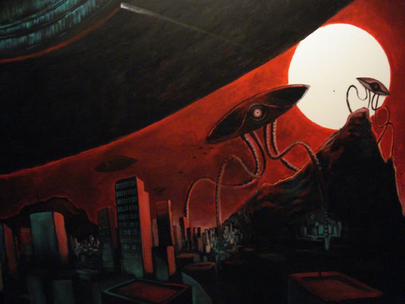
Thoughts? I think it's looking heaps better.
As of 28/05
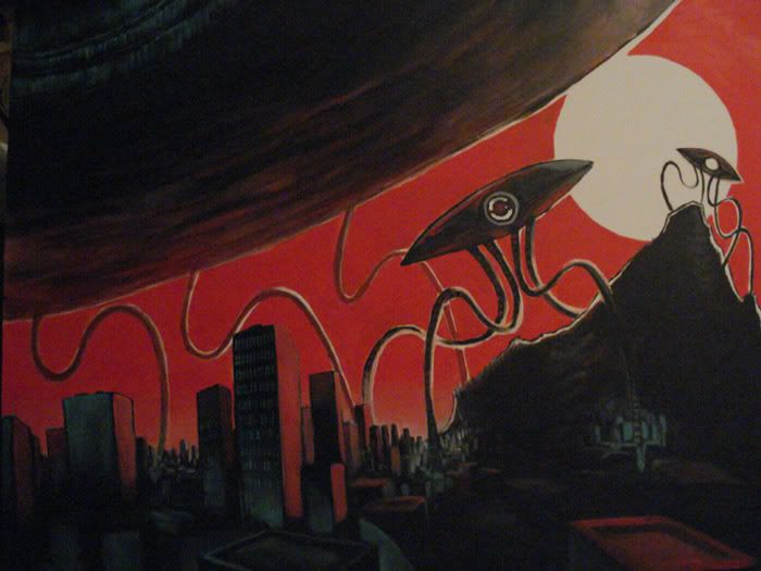
As of 24/05/08!
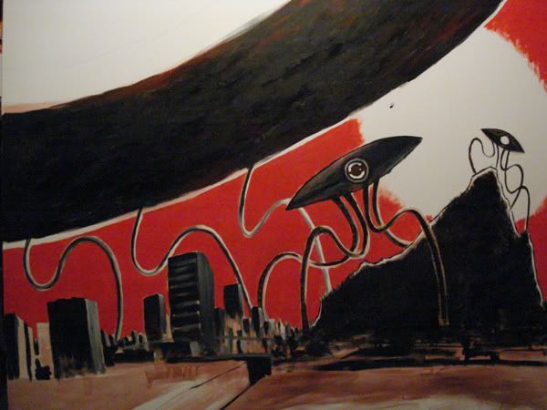
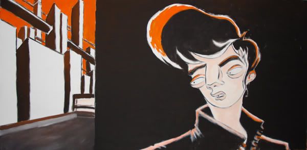
Here's the new thing I'm painting. It's quite large. I worked on it for about 4 hours tonight. I'm using a new paint that I'm not used to, Matisse Flow, its a lot thinner than the last paint I was working with and takes longer to dry, which is both good and bad... I'm finding it hard to get used to. I wanted this to be a simple and graphic as I could make it; 3 colours, simple shapes, no fucking around with rendering and lighting. I wanted to paint my original doodle, essentially.
But I couldn't help myself (mostly because the simple look felt cold and lazy) and at 1:30am started on more lighting/rendery stuff. I've stopped because I feel tired and want to watch six feet under. But here's what she looks like so far:
Originally started as this sketch:
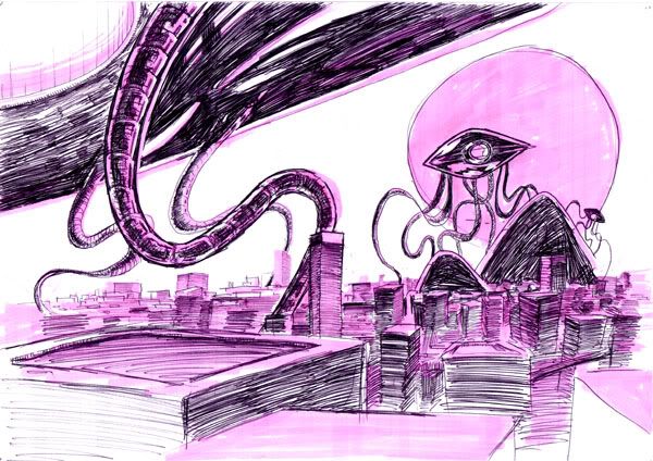
Work in progress, blah blah. Any crits on stuff so far?
Old update spoilered:
28/01
Been slack updating this thread. This is the WORST OP of any thread here. New things last page.
23/11
Everybody look at how fat I am! Facebook album of photos from my exhibition!
10/11
Exhibition in 2 days. Oh god oh god oh god oh god.
02/11
10 days until my exhibition opens. Actually feeling physically ill. Update page 8.
23/10
3 weeks til exhibition. Second last painting. City Stomper. Page 7.
13/10
Update on terrified Zomboid & UFO-Tripod-War Of The Worlds thing. Page 6!
29/09
Hey look a new thing wow jeez he looks upset? Page six.
21/09
Just thought I'd show you guys what I've been working on. Page five.
17/08
THE ROBOT FACTORY IS ALMOST COMPLETE PAGE FOUR YAY
22/07!
Post update Page 4! It's been a month since I started this painting, holy shit I'm slow.
03/07!
New painting update
22/06/08
I've started a new painting. In cinemascope! Page 3!
21/06/08
I found a bunch of doodles of big cities from work. Page 3!
19/06/08
New pix! Update page 3 wooooo.
15/06/08
OP becoming superbloaty so I'm going to update progress in new posts. So check out my new post wouldja? Please crit/opine/etc!
12/06/08!
So this painting just wasn't working the way I expected. I think huge canvas + low detail just doesnt work, and I wasn't... committing to this painting. I was afraid to take risks with colour and I wanted things to look comic bookish and pure and fuck it just wasn't working.
So I decided to dirty things up last night. It just felt like it needed more atmosphere.
Also, the idea of the 'mothership' hovering above everything wasn't working. The tripod legs in the background were cluttering up the space and dividing it and it just looked ... off. So now I'm hoping it reads as 'directly above foreground'. Still needs work though.

Thoughts? I think it's looking heaps better.
As of 28/05

As of 24/05/08!
Here's the new thing I'm painting. It's quite large. I worked on it for about 4 hours tonight. I'm using a new paint that I'm not used to, Matisse Flow, its a lot thinner than the last paint I was working with and takes longer to dry, which is both good and bad... I'm finding it hard to get used to. I wanted this to be a simple and graphic as I could make it; 3 colours, simple shapes, no fucking around with rendering and lighting. I wanted to paint my original doodle, essentially.
But I couldn't help myself (mostly because the simple look felt cold and lazy) and at 1:30am started on more lighting/rendery stuff. I've stopped because I feel tired and want to watch six feet under. But here's what she looks like so far:

Originally started as this sketch:

Work in progress, blah blah. Any crits on stuff so far?
Old update spoilered:
Oh, I forgot to say I did this the other day as a bit of fun:
OLD UPDATE BELOW:
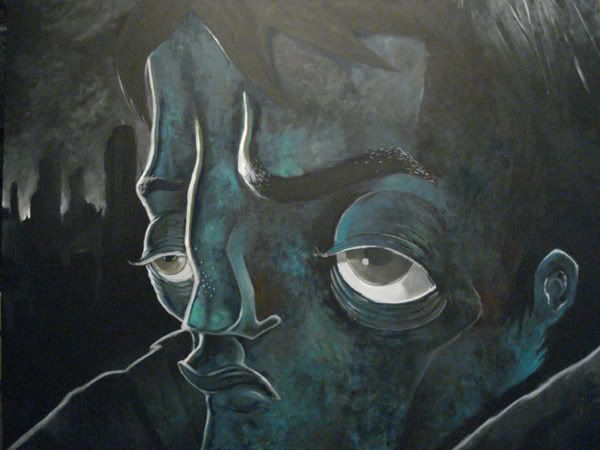
But I'm not sure, so I'd really appreciate your feedback. Here are some detail shots:
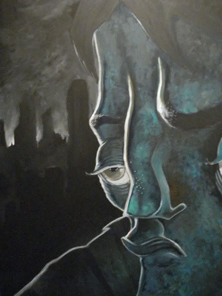
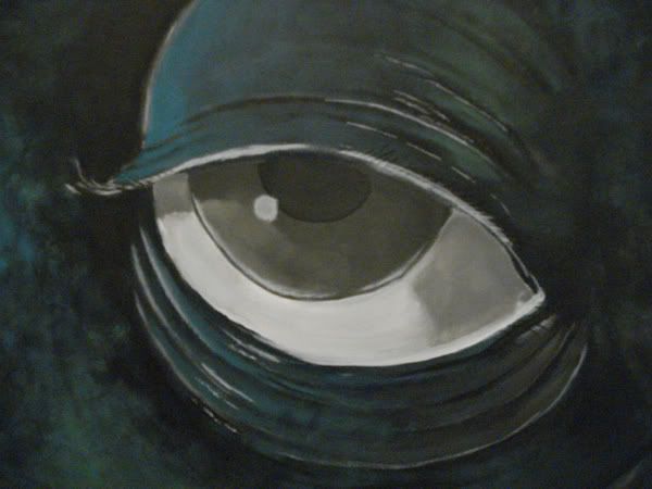
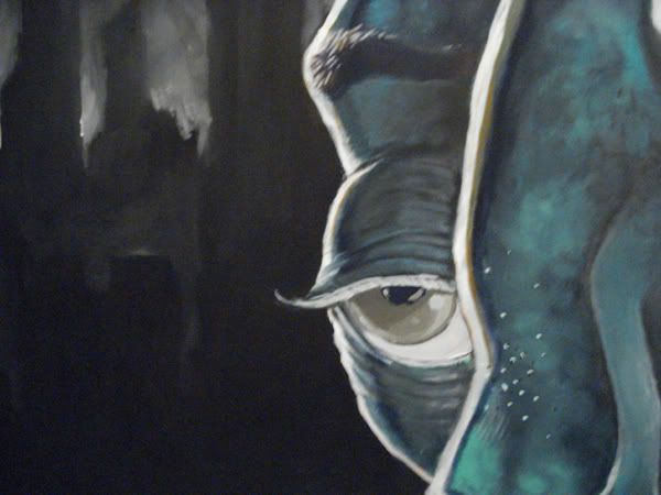
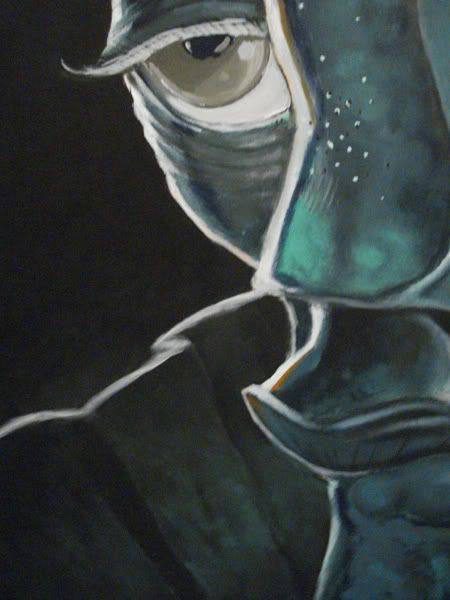
I think there's little bits and pieces I need to tidy up, but right now I'm kinda happy with it! And it's the largest painting I've ever done. Achievement Unlocked!
And here's how he came to be: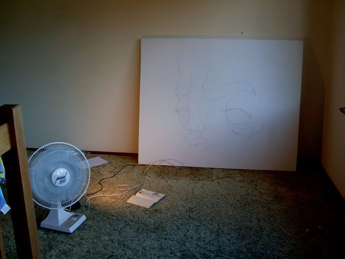
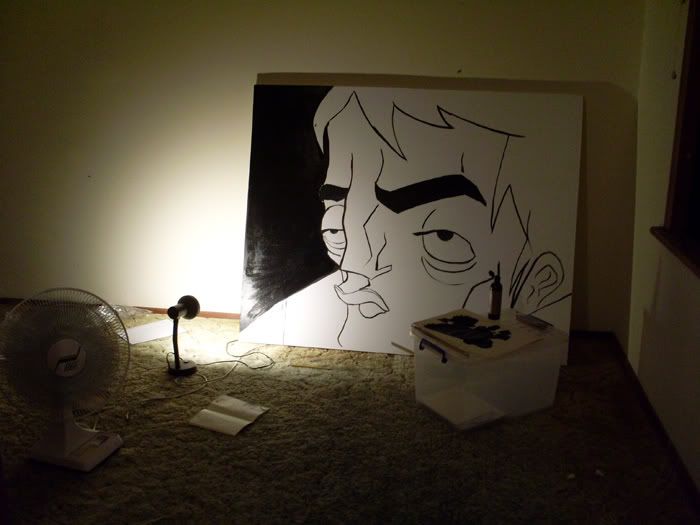
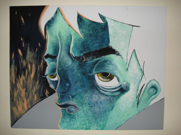
I moved house, and when I got to my new place I hung it up on a wall. It looked great! Then I started working on the hair and I quickly got annoyed. So I moved back into the face and I thought maybe the swirly scumbling technique looked kinda shitty so I attempted to smooth things out and make the texture more cross-hatchy. It looked awful. So I went back to swirly scumbled layers. What I wound up with was darker than I had intended, bluer than I had intended, and 'smoother' than I had intended. Honestly, I prefer the lighter, brighter version. But there's a lot in this I like, for now.
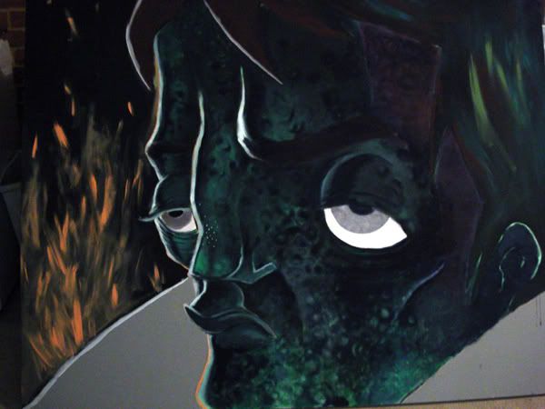
It looks darker than it is due to crummy lighting in my garage.
2 views because I couldn't get a good angle.
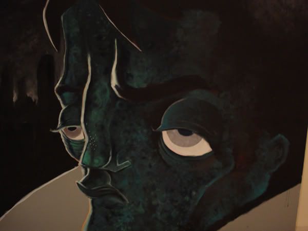
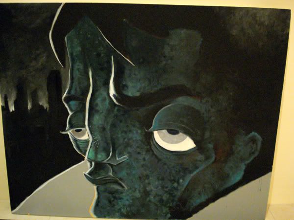
Cut back on the sparky orangey fire things because they were really an afterthought in the first place and never what I had originally intended. Replaced with a gloomy backlit cityscape because, hell, that's what I'm all about. Also felt it better suited the overall tone rather than some weird campside sparky nonsense. I think it helps with a sort of cartoony zombie london feel.
And here's something else I'm working on.
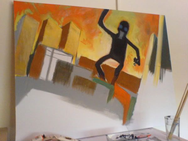
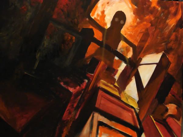
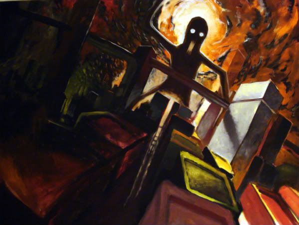
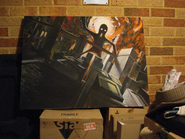
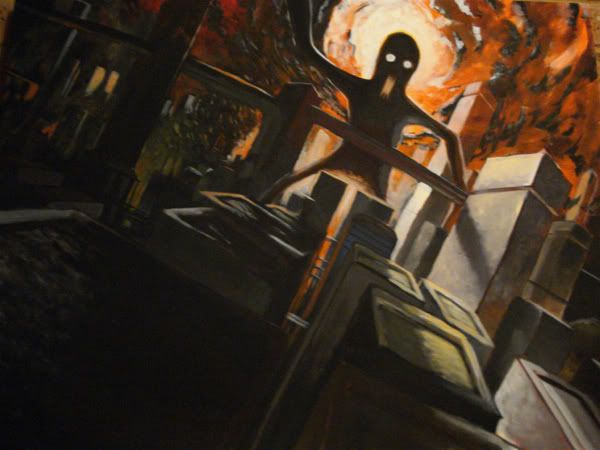
So as I've been working on this I've realised how terribly constructed my initial sketch was. I mean, the perspective was completely retarded and I've had to repaint lines all over the place. Also, the pose of the 'monster' guy is all limbs akimbo and the anatomy, even though its just a silhouette, is pretty abysmal. I'm taking this as a lesson to prepare my initial pencil line better before committing to paint and writing this one off a stylistic choice. 8-)
Other things I've recently done:
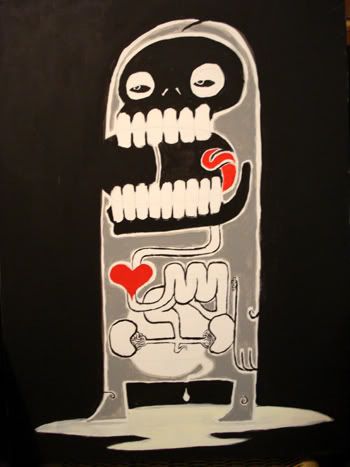
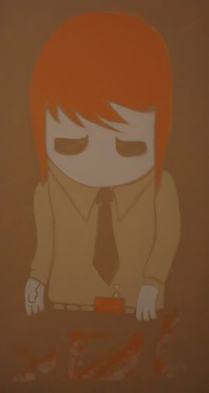
No seriously. I'm going to be sticking these up on a wall and inviting lots of people I like to come and JUDGE ME A NEW ONE, so I'd really appreciate any comments or criticisms.

OLD UPDATE BELOW:

But I'm not sure, so I'd really appreciate your feedback. Here are some detail shots:


I think there's little bits and pieces I need to tidy up, but right now I'm kinda happy with it! And it's the largest painting I've ever done. Achievement Unlocked!
And here's how he came to be:


I moved house, and when I got to my new place I hung it up on a wall. It looked great! Then I started working on the hair and I quickly got annoyed. So I moved back into the face and I thought maybe the swirly scumbling technique looked kinda shitty so I attempted to smooth things out and make the texture more cross-hatchy. It looked awful. So I went back to swirly scumbled layers. What I wound up with was darker than I had intended, bluer than I had intended, and 'smoother' than I had intended. Honestly, I prefer the lighter, brighter version. But there's a lot in this I like, for now.

It looks darker than it is due to crummy lighting in my garage.
2 views because I couldn't get a good angle.


Cut back on the sparky orangey fire things because they were really an afterthought in the first place and never what I had originally intended. Replaced with a gloomy backlit cityscape because, hell, that's what I'm all about. Also felt it better suited the overall tone rather than some weird campside sparky nonsense. I think it helps with a sort of cartoony zombie london feel.
And here's something else I'm working on.


So as I've been working on this I've realised how terribly constructed my initial sketch was. I mean, the perspective was completely retarded and I've had to repaint lines all over the place. Also, the pose of the 'monster' guy is all limbs akimbo and the anatomy, even though its just a silhouette, is pretty abysmal. I'm taking this as a lesson to prepare my initial pencil line better before committing to paint and writing this one off a stylistic choice. 8-)
Other things I've recently done:


No seriously. I'm going to be sticking these up on a wall and inviting lots of people I like to come and JUDGE ME A NEW ONE, so I'd really appreciate any comments or criticisms.
desperaterobots on
0
Posts
really cool work though.
But killer style, those cities are great.
And thanks for the encouragement. I really do draw a lot of people looking mildly irritated and I guess it's because I'm always mildly irritated at work. Hah. I really want to take some life drawing classes as I'm bad with full figures.
Awkward Teens On Their First Day At University.
Poster for a local band.
Dental plan! Lisa needs braces.
In the future, cars are nothing more than unfinished cubes!
Secret agent. This one is old.
Conference call with Giant Skull Monster. This canvas is sort of massive...
...Whereas this is the inside of a shoebox lid.
This is my latest painting. Yes, another sort of angry guy.
Terrible phonecam shot, but it's a small wacky landscape. I guess.
I look inside you and I see nothing.
Experiment with lighting from a doodle.
People have accused this painting of being a self-portrait. It scoffs in reply.
Digital painting from reference, my eyeball.
Old and terrible attempt at colouring/lighting one of my city doodles, presented for your amusement.
And that's it from us at the news desk.
EDIT: And to clean up the OP a bit, I'm dumping all my doodles from work in this spoiler.
A stunning future awaits you!
(Hi-Res version!)
Delectable!
That poor, mutated boy.
Kind of in a tribal/robot groove at the moment.
Thinking of painting this on a very large canvas I bought.
Sketchy movement thing.
More hipsters.
In communist Russia, Star Backgrounds You!
Ricky, a tit-obsessed co-worker.
And another Kleenex lid man.
War Of The Pink Highlighter Worlds
A Pay Rise, You Say?
Big arse city scape things - linked because they were raping my h-scroll on my crappy monitor.
Where's Wally's Geometric Cube House?!
Large city thing.
This guy is an asshole.
He is watching Funniest Home Videos.
Reach For The Rave Synth Laser!
Did you know?
Go Team Vague Look Of Arrogance!
This shade of lipstick was a bad choice. Actually, no, I look fucking great.
Comedy Gold!
Comedy Gold...?
I have a proposition for you.
Like, whut-evah.
Yes, I draw these at work.
For a label.
On a kleenex-lid.
This guy likes music with hand-claps.
So does this guy.
And this guy too.
I am not just an urban planner.
it feel alive. love the pic number 2.
keep it up, desperaterobots
Wait, was that gay sexual inyourendo?
Anyways, the guy is a artistic genius and needs to get the fuck away from Wes- from the call centre. Do it, fucktard, srsly.
My Portfolio Site
I wonder how many good concepts have been killed by some stupid fucker saying 'it looks too...' or 'it reminds me of the joker slash barbara streisand'
....One.
Just kidding baby, you're the tits.
Please feel free to comment, I'm completely starved of artistic peers!
I have applied more paint to canvas. Adore, admonish, belove or berate; the choice belongs to yee says me!
I was mostly referring to the Atlas statue in NY, lemme find a pic.....
Y'know that art deco look? I have to apologise for my lack of knowledge of art genres, I never did pay much attention during art history in high school.
A technique I use is lay down a very saturated color then go on top of it with a less saturated color. let some of the under color come through and it usually helps if the first color is about the same value or darker than the color on top.
EDIT: Also I recognise that they technically are not tripods as they have four legs. I never was good at maths.
My Portfolio Site
But I love them all the same.
yes
If its the thing up in the corner its a bright blue hole leading up into the mothership, which is what the whole big dark shape is. It looks brighter in real life; i'll try to take a better snap.
I do like it though....there's just elements there I'm not enjoying.